7 email marketing software for small businesses

Are you a start-up looking for affordable marketing tools?

Do you consider email marketing an effective marketing tool for your business?

You are on a right path. How? Though hundreds of new marketing tools and techniques have been invented till now, email – the oldest online marketing tool is still the king. How again? Read my post on What do you know about the email marketing? and you will know.

We know that email is comparatively cheaper than other marketing options available today. In the same sequence, email marketing software should also be affordable, right? In this article, I have compiled a list of 7 affordable email marketing software that you can use for your marketing campaigns.

1. Constant Contact
Constant Constant is one of the most popular email marketing software providing its services across the globe. The easy to use interface and a 60-day free trial makes it a beginner friendly email marketing service and software.

With Constant Contact, you have the separate control to manage the Email lists and contact list. You can create multiple email lists for different campaigns. Moreover, it’s hard to ignore the simple yet conversion friendly pre-loaded email templates.

As a customer support service, you can avail the live chat support, email support, community forums and a large library of resources.

The constant contact API provides the developers with an option to develop various integration solutions for the different Content Management Systems and eCommerce platforms. We have used the same API in our OpenCart Auto Subscribe extension to capture and sync the email addresses from an OpenCart store to the Constant Contact email list. This plugin helps the OpenCart store owners to build a strong email data right from their own online store.

Constant contact Pricing details: You can avail the free trial period of 60-days without any credit required. Later you can choose to upgrade to the paid plans which start from $20/month.

2. AWeber
AWeber is quite popular in the affordable section of email marketing software. With its 30-day trial offer and flexible pricing, it is one of the most used email marketing services among the small and medium-sized businesses.

With the AWeber subscription, you get the access to an efficient email marketing tool that can manage your email list, provide pre-loaded email templates, track the emails, and set autoresponders.

The customer support is quite responsive and you have various other options to sort out your grievances. Options like live chat support, email support, regular webinars, and tutorials effectively enhance support quality.

AWeber Pricing details: It is available for free 30-days trial after which you can opt from various plans as per your requirement. The starting plan would cost just $19/month.

3. MailChimp

MailChimp in the most popular among the small to medium sized business because of its free lifetime offer and very low-cost starting plan. Another factor responsible for MailChimp’s grown up popularity would be the high affinity for integration to various platforms like PrestaShop, OpenCart, Magento, and Shopify.

The PrestaShop MailChimp integrator module is one such example of a perfect integration to the PrestaShop platform. With this module, a PrestaShop store owner can configure the website forms to automatically capture and send the users’ email addresses to the MailChimp email list. It’s a useful email list builder.

The best features of MailChimp include:

  • Inbuilt email template creator
  • Merge tags
  • Automatic email responder
  • Email list segmenting into different groups
  • Segmenting based on time zones and geolocation
  • Custom delivery time – email scheduling

Moreover, the customer support is also one of the best with live chat, a huge library of resources, email support, and video tutorials etc.

MailChimp Pricing details: There is a free lifetime plan which allows you to send 12,000 emails for up to 2,000 subscribers. The paid subscription starts from only $10/month.

The free lifetime usage makes MailChimp as the best-rated email marketing software in my list here.

4. Mailigen

Mailigen is a Professional email marketing software-as-a-service which also offers mobile and social media marketing in more than 100 countries worldwide.  With internal knowledge base, Mailigen claims itself a perfect tutor of email marketing for local markets and help them grow globally. Furthermore, it offers the Application Programming Interface (API) integration to help developers develop Mailigen integration solutions with different platforms.

We have used the same API in our PrestaShop Mailigen integrator module for email data collection. This is the same module that I have mentioned in the MailChimp section. The same module works for both MailChimp and Mailigen.

Mailigen does not only provide the best email marketing controls but also helps you to test your emails using A/B testing. Here you can select two different email subject lines or whole email designs and test them to see which one gets a better response.

The most interesting feature is the behavior based marketing automation. Here you can set email campaigns that are automatically triggered by particular action or event. For example, Mailigen can be triggered to send a welcome email message to new subscribers when they complete the sign-up process for newsletter subscription powered by Mailigen. You can also set emails to greet customers on special occasions like birthdays, or festivals.

Mailigen Pricing details: The email marketing service offers a free 30-days trial period, after that, you can opt for upgrading to the paid plans starting from $25/month.

5. Go Daddy Express Email Marketing
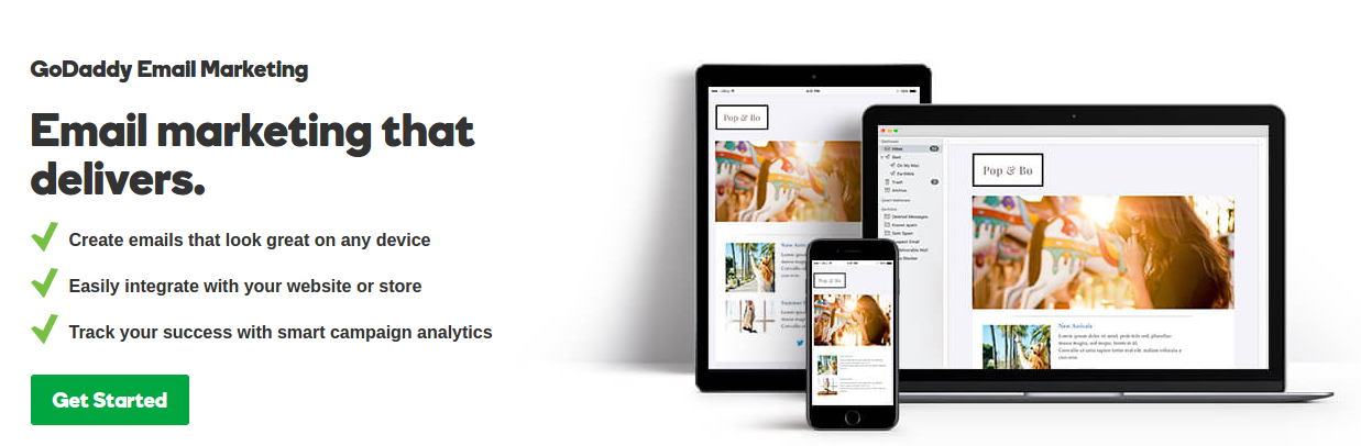
Go Daddy is a well-known name as a domain name registrar and web-hosting service. Go Daddy went a step ahead and started providing the email marketing services to assist the businesses in reaching out to their customers. The email marketing service is officially termed as Go Daddy Express email marketing.

Go Daddy has an efficient dashboard where you can create coupons, event information, and newsletters to share with your subscribers. The email list segmentation is used to group the subscribers so that more precise targeting can be achieved for a particular email campaign.

The option to add social button in your email campaign encourage the recipients to easily share your messages, coupons and event notifications with others in their social circle. In this way, Go Daddy is also an effective social media marketing tool.

Another unique aspect of Go Daddy Express Email marketing is the inbuilt library of Stock Images. You can use these images in your email campaign without any tension of license and usage rights.

Go Daddy Express Pricing details: The beginner plan starts from $6.99/month and increases to $9.99/month when you are renewing the service.

6. iContact

The international email marketing service provider is very popular among the small, medium and well as the premier businesses. It’s a perfect blend of email marketing software and a social media marketing tool.

With the option for users to create, track and send HTML-based emails and social media messages, iContact is the leading service in the US. The company has almost 70, customers and over 1,000,000 users across the world.

You would find iContact among the few email marketing software who offer Salesforce integration as well as Google Analytics integration. Moreover, it provides the API for developing the iContact integration solutions with different platforms like PrestaShop, OpenCart, and Magento.

Our OpenCart newsletter integrator plugin uses this API to synchronize the collected email list with the iContact account. So that the website owner need not manually add every email address to his iContact email list. It’s all done automatically and quickly, thanks to iContact API for that.

With free 600+ responsive, customizable, and inbox-friendly email templates, you will never feel the scarcity of best email designs. The built-in email editor with drag and drop feature makes the customization and email creation quick and effective. You can also create your own email templates from scratch.

iContact Pricing details: Apart from free 30-days trial, you have the option to select from various premium packs. The lowest plan starts from $10/month.

7. ConvertKit
If you are a professional blogger, author, or a marketer, ConvertKit is a special email marketing software for you. I was impressed by its simplicity of use yet it is a very powerful tool.

With easy content upgrade options and incentives with email signup forms, it also encourages the users to sing up for the subscriptions. You will find all the email list and email marketing controls like contact segmentation, auto-responders, and email scheduling.

It can be a great tutor for email marketing with a huge library of resources and knowledge base. Keep using, keep learning.

ConvertKit Pricing details: The premium plan starts from $29/month with a 30-days refund policy.

Liked This? You’ll Like These Too
5 things you probably didn’t know about eCommerce checkout

A checkout page is the only interface that actually brings the revenue for your business. It is a place where deals are closed and finally, sales are made in return for the payments done by the customers.

It’s really unfortunate to experience a bounce back from the checkout page, as it is the only page where users come when they are sure about finally buying from you. For any random reason, a set back from completing a checkout is not what you expect from your business.  Here, in this article, I am putting forward 5 things that you probably did not know about eCommerce checkouts and maybe, that’s why you might have failed to engage the customers.

1. Customers hate lengthy checkouts-

21 % of customers would abandon a shopping cart because checkout takes too long to complete- Stastisia

The length of a checkout page is a relative term. Some of us might say, having a multi-page checkout is lengthy, while other might agree that checkout pages asking too many entries are lengthy.  Both the scenarios have a ruthless contribution towards making a checkout process lengthy. The multi-page structure does the job by redirecting users from pages to pages to fill out all the checkout details.

Problem: Too many steps and too many details irritate the customers. They think of them as an obstacle that stops them from getting their desired product ASAP.

The positive mood of customers is directly proportional to the length of the checkout

Just imagine you standing in a departmental store’s checkout line, but before cashier takes the cash, he/she asks you to fill a form. Now, a few questions is not a problem; a biodata would definitely irritate you.

Solution: To deal with the multiple page re-directs, you can switch to the single page checkout system. A good single page checkout system lets you accumulate the whole checkout steps on a single page. This heavy accumulation is, however, effectively organized by segregation so that the page remains clean and clutter free.

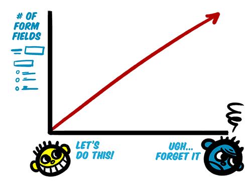
Despite everything being on a single page, it can be made clean and clutter free with segregation  and form field minimization

Moreover, you should ruthlessly minimize the amount of information you need. Ask only those details which are important. For a start, you can skip asking secondary email address, secondary phone number, ethnicity etc. You can read more for details on how to make your website-form design user-friendly.

2. Checkout on mobile devices is not same as on desktop-

We often ignore mobile checkouts thinking of it as a secondary requirement

The Greater number of articles and researches have been published on the subject of eCommerce checkout flow and UX optimization. However, there is currently quite a limited coverage on checkouts for mobile devices.

We often tend to do whatever we can do in our strength to make the checkout flow seamless. However, we hardly pay an attention to how the checkout flow will go if the user is buying on a mobile device. Just look at this statement from Google back in 2015:

According to Google, “more Google searches take place on mobile devices than on computers in 10 countries including the US and Japan”

Even Alibaba reported “more of their shoppers are purchasing on mobile than desktop”

Users today are using mobile devices more than desktop. Now, if you keep considering the checkout on mobile phones as same as on the desktop, it would not be wise on your part. With more and more customers using their mobile phones to shop online, checkout page optimization for mobile devices should be your first priority. To keep all those important conversions in your funnel, paying some extra attention to Responsive checkout, or Mobile app is a necessity today. Understanding of how an optimized mobile checkout looks like is very important here.

3. We have been forcing Guest checkouts-

For long we have been thinking about guest checkouts as an alternative to necessary account creation. For that reason alone eCommerce sites provide guest checkout options to all the users.

Guest checkout seems to be the obvious solution for new account fatigue, which does not asks customers to create an account or save any personal information to buy a product. However, guest checkout is not always a smart move for every eCommerce site. It actually results in more problems than it solves in few some cases.

  • It makes very difficult to review, modify, or track orders
  • Customers cannot re-order products using guest checkout
  • It becomes difficult for store owners to manage the returns, exchange, or refunds
  • Store owners won’t be able to follow up such customers
  • Store owners cannot provide guided checkout experience (Information pre-population, auto-suggestion etc)

The common convention among various eCommerce store owners is that guest checkout boosts the conversion rates. Moreover, asking for account creation is presumed as a barrier to the checkout process. I do not disagree with the convention completely. However, it depends on the scenario and the kind of information you need.

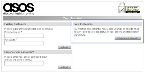
For example, ASOS never included a guest checkout, but still, they experienced a 50 % reduction in cart abandonments just by a simple modification in the login screen. It was how the earlier login screen looked:

Customers were forced to login or create an account earlier

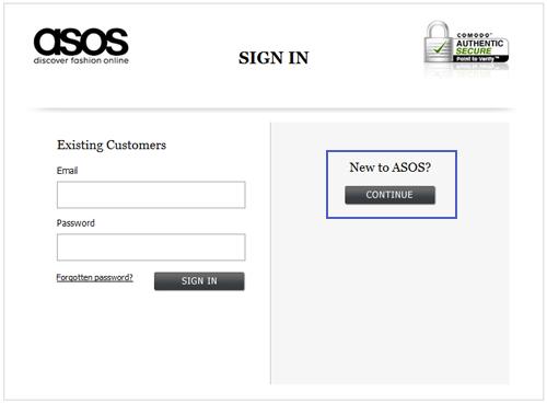
They did a small modification in the above page by simply adding a continue button for new customers.

The new login page did not ask for account creation, instead it allowed the customers to continue with the checkout process.

With the new modification, the users were not asked to create an account on the login page. They can now click on the continue button to proceed with the checkout process. However, it was wise addition which actually did not spare the customers from not having an account. They were asked to provide some information on the next page which was actually used for account creation. So customers still had to register.

The whole idea behind telling the story of ASOS is to explain how guest checkout is not always the only option and you can do a lot more with just simple tweaks in the process. So, the best way to decide whether you need the guest checkout or not is to consider the specific factors like, can your return manager process the guest orders, how much information do you need, how often customers repeat their purchase, and do you have a social login as another alternative to the guest checkout.

4. Social login at checkout page is a better alternative-

The above explanation on guest checkout has made it clear that a guest checkout is not always the best alternative. It brings me to our next point about the social login feature on eCommerce sites. We understand that sign-ups and user accounts are important for the website owners. Saved information in customer account can help boost eCommerce conversion rates up to a large extent.

With the same aim, social login on a checkout page provides easy choice for the users to create a user account that too without filling a registration form. It uses the information stored in social media accounts to automatically fetch the information required to create a user account on the site. So, if users do not want to create an account by themselves, a social login can do the same for them.

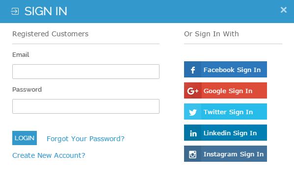
A social login for popular social media platforms like Google Plus, Facebook, and Twitter is a wise addition, plus a better alternative to the account registration and guest checkouts.

Social login as a better alternative to guest checkouts

5. Customers hate it when they commit errors-

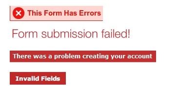
It’s very much frustrating when making a purchase to submit the form and trigger a validation error. That too with little, confusing, or not guidance on how to fix it.

When such validations with no guidance appear, the thing that comes to a customer’s mind is “Ahhh! now, what did I do wrong”.

In an ideal situation, user fills the checkout form with necessary information and tend to finish the job ASAP by submitting the form. However, people often make mistakes in the form-filling, and that where form validation come into the picture. A good form validation language is courteous and clear about the message it carries. Things that most of us probably don’t know about the checkout page validations are:

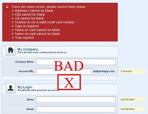
  • It will confuse the user if not shown in the correct place.
  • It will confuse the user if not shown on the right time.
  • It will confuse the user if not shown in the right color, and
  • It will confuse the user if not showing the clear message.

With these four points in mind, a checkout page validation is a crucial element that can either break or make the checkout experience of the clients. So,

  • Always use the inline validations in close proximity to the field that triggered it.
  • Show instant validation rather than a showing on top of the page after form submission.
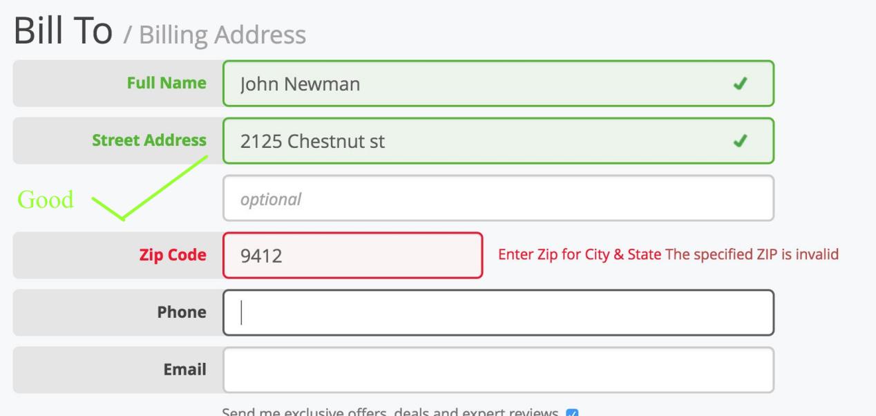
  • Show the errors in Red color and correct validations in Green
  • Write a clear message about the error and ways to fix it

User proper colors and proper proximity to show the form validation errors

Finally,

E-Commerce checkout is a broad subject and it is always in research by the experts. Innovations like single page checkout, Ajax shopping cart, Inline form validation, Social login etc. are all perfect examples of how eCommerce checkout is evolving day after day. There is a lot of information to talk about eCommerce checkouts. Certainly, next time when I write about it, I will get some more things and more advancements to write about the eCommerce checkouts.

Liked This? You’ll Like These Too
8 Awesome eCommerce checkout examples

A lot of effort goes into building the pages that convert. Content optimization, CTA optimization, navigation streamlining, everything we do is for driving conversions on the store. E-Commerce checkout is one such page whose conversion rate has a direct impact on your revenue generation.

In this post, I have compiled a list of the most inspirational eCommerce checkouts that can inspire you to learn some useful aspects from them. Each of the checkouts in this list consists of something that you take a cue from. It should give you a clear idea of how should you go about making your own checkout page conversion friendly like these websites. So let’s get inspired by these checkouts.

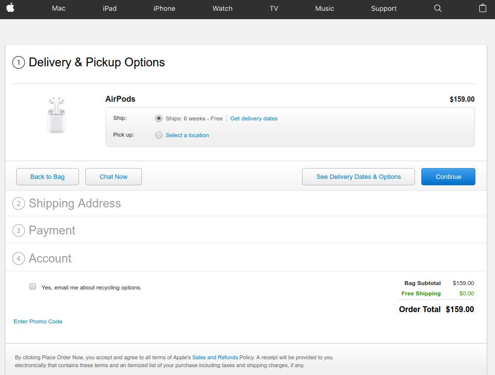
1. Apple’s checkout

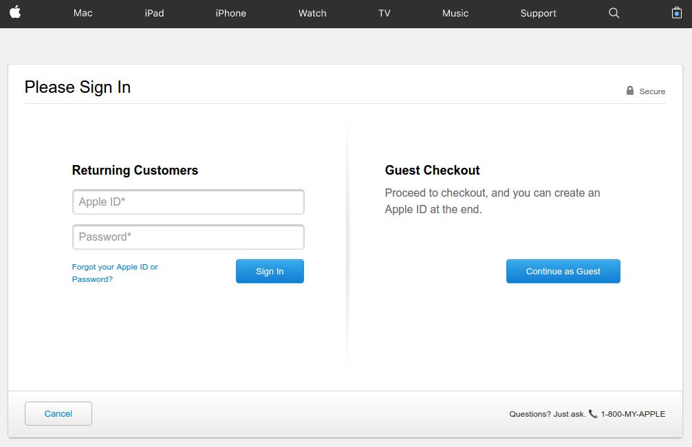
Apple’s checkout is a great example of providing alternate checkout options

Apple provides a very well organized checkout page that lays full attention on the call to action buttons with proper utilization of the white-spaces. The checkout page does a great job of appealing the users to complete the process even as a guest user.

Asking for necessary account registration to complete the checkout process is one of the most common reasons for cart abandonment. To work out this common issue, Apple provides guest check out option where shoppers are not required to necessarily create a user account by filling loads of information in the registration form.

If they already have an account, they can sign-in, and if not have an account, just continue with the guest checkout.

However, there is a flip side of the guest checkout that customer’s information will not be saved for future reference in the database. It means customers won’t be able to track their order. If that is not a problem for the customers, guest checkout is a useful feature to include in your checkout.

Also the post user login or Guest checkout steps are so simple and interactive. There is a chat option that you can use to clear your doubts right from the Apple’s representative. You can choose the delivery dates and options available, continue with the next steps.

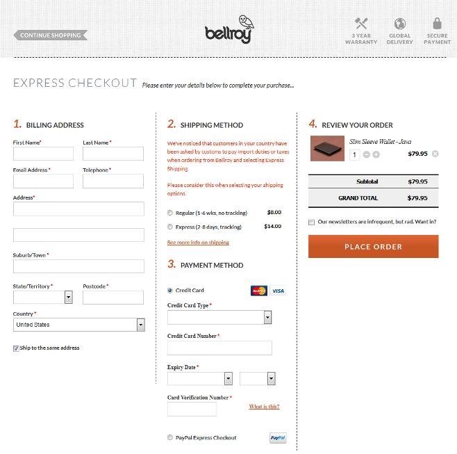
2. Bellroy’s checkout

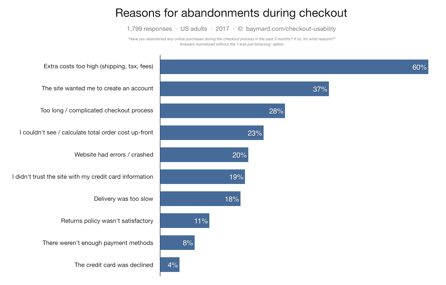
Lengthy checkout is one of the major reason for shopping cart abandonment. According to Baymard institute,

“27% of US online shoppers have abandoned an order in the past quarter solely due to a “too long/complicated checkout process”.

Bellroy handles this big issue a little different as compared to Apple. It provides a one-page checkout to its users compacting the whole checkout steps on a single page only. The one-page checkout structure makes the process smooth and shorter for the customers. Users can fill out the delivery address, billing address, select shipping options and provide payment details right from the same page.

The user experience has been further optimized by including a set of only the necessary details required to be filled-in.

Those eCommerce store owners who want to provide a simple, quick and easy checkout experience to the customers can utilize a one-page checkout structure and save time and efforts of the customers.

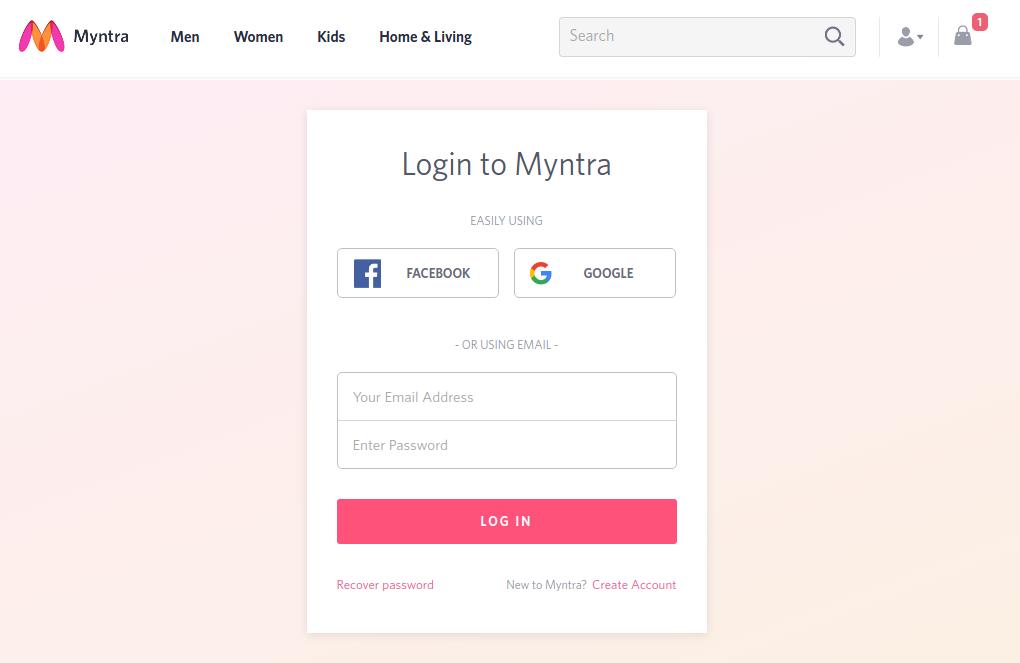
3. Myntra’s checkout  Caption:

Myntra goes well with its multi-step yet high converting checkout page

In case you are not a supporter of guest checkout or one-page checkout, you should take a cue from Myntra’s checkout page. It presents a perfect example of how you can make a multi-page checkout conversion friendly without guest checkout.

Here, instead of guest checkout, customers can continue as a registered user by logging-in using their Facebook, or Google account credentials without creating an user account on Myntra.

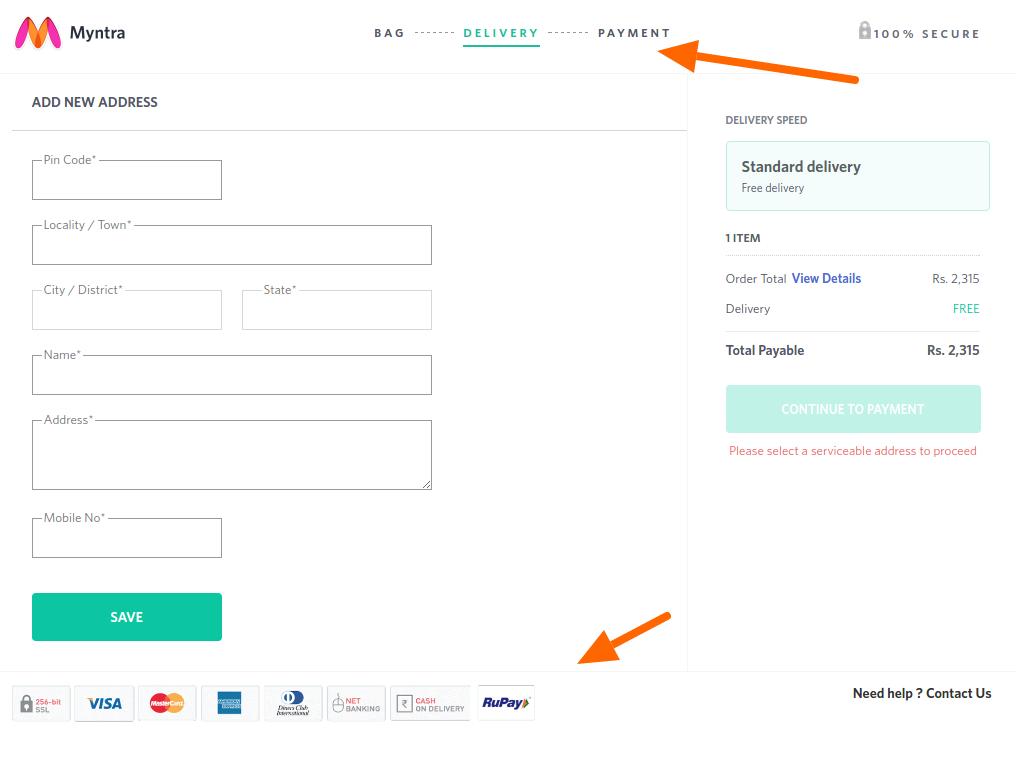
Moreover, when customers are completing the checkout process of Myntra’s multi-page checkout, they are provided with a clear idea of where they are and where they would be in the next step. It provides a transparent process that includes a progress bar on the top of the page, plus a logo of trust, and payment options logo at the footer keep the users well informed.

The guest checkout option provides the option to the users to register an account right after the checkout is completed. This is a nice touch to encourage account registrations without giving a burden to the customers.

4. Amazon’s checkout

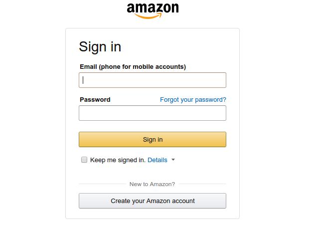
Amazon’s latest checkout emphasizes on account necessary registration

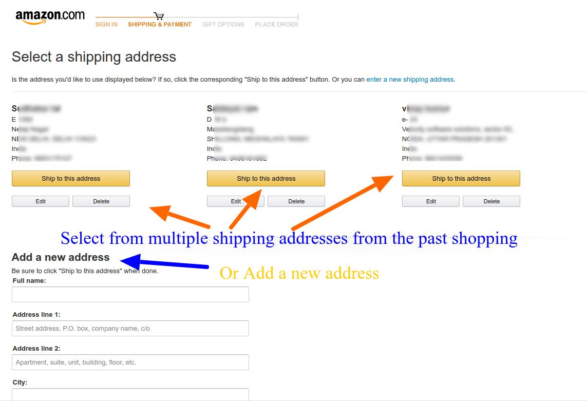
Amazon keeps testing its checkout process now and then. Currently, it is following a unique combination of traditional approach and it’s own peculiar call-to-actions. By highlighting the free two days shipping option on the product page itself, it reduces the task of shipping selection on the checkout page, plus an indirect promotion of Amazon’s prime service.

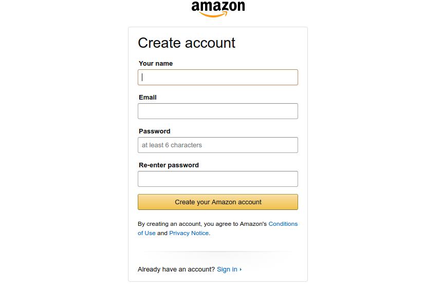
The common perception of an eCommerce checkout involves providing a lot of options like, Add to wishlist, continue shopping, guest checkout and so on. However, Amazon works on a different principle here. It emphasizes on creating a user account before you can proceed to the checkout page but provides a very quick and compact registration page.

Despite the necessary account registration, Amazon still have a high converting checkout

By doing so, Amazon makes sure that customers entering the checkout funnel are not distracted by the leaks and completes the checkout with a personalized user experience. If your customers do not mind filling a very small registration form, Amazon’s approach is is an inspiration for you.

Caution: Amazon acts as almost a monopoly in the eCommerce market for various categories. Customers preferring Amazon won’t find a hard time filing small registration form. It might not be a similar situation in your case. I would suggest a comprehensive A/B testing campaign before finalizing the decision.

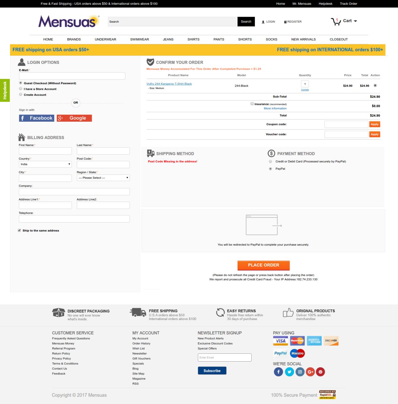
5. Mensuas’ checkout

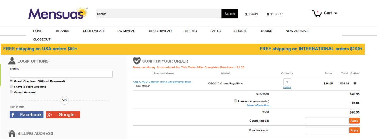
Mensuas have a single page checkout, with social login option

If account creation is not a preference for you, you might want to look at the checkout page of Mensuas. Mensuas is a leading destination in the US for fashionable underwear for men. Similar to Bellroy, Mensuas too provide a single page checkout to it, customers. However, it goes one step further by introducing social login on the checkout page. One can easily notice the emphasis on login options where you have multiple options to continue with the check out process- Guest checkout, User sign-in, and account registration.

In case you are a new user, you can either checkout as a guest user, create a user account, or just use the Facebook or Google login option for direct login using your social platform credentials. By clicking on any of the social login options, the user can instantly login to the user account without filling a registration form. Thus, saving the customers from a burden to create user accounts manually. Social login makes the checkout experience very smooth and handles multiple reasons for cart abandonment at once.

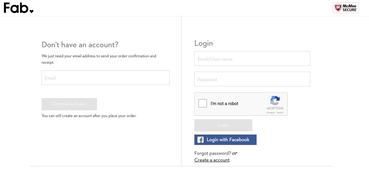
6. Fab’s checkout

Fab provides a multi-step checkout with Facebook login option

Fab utilizes a well optimized multi-step checkout that can be completed without creating a user account manually. If you don’t have a user account already, you can choose from guest checkout or the Facebook login option.

It efficiently utilizes the Facebook login to encourage user registrations which is an important aspect of learning from Fab’s checkout page. It understands the importance of user accounts and how they can be used to create repeat conversions. So, it pushes the users towards Login option without actually forcing them.

The checkout process after login or continuing as a guest presents some well-optimized forms for providing the billing, shipping and payment information. The forms ask only the necessary information and do not demand secondary information from the users.

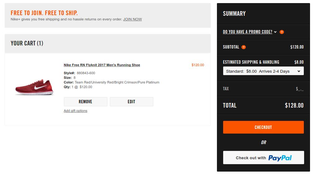
7. Nike Store’s checkout

Nike’s checkout is preceded by an optional Paypal express checkout

The speed of the process is a major concern that haunts every store owner. Nike handles the situation by cleverly integrating a PayPal checkout option which provides a more faster and secure checkout. Moreover, for using a Paypal customers need to login using their PayPal account which automatically brings the customers to logged in users’ club.

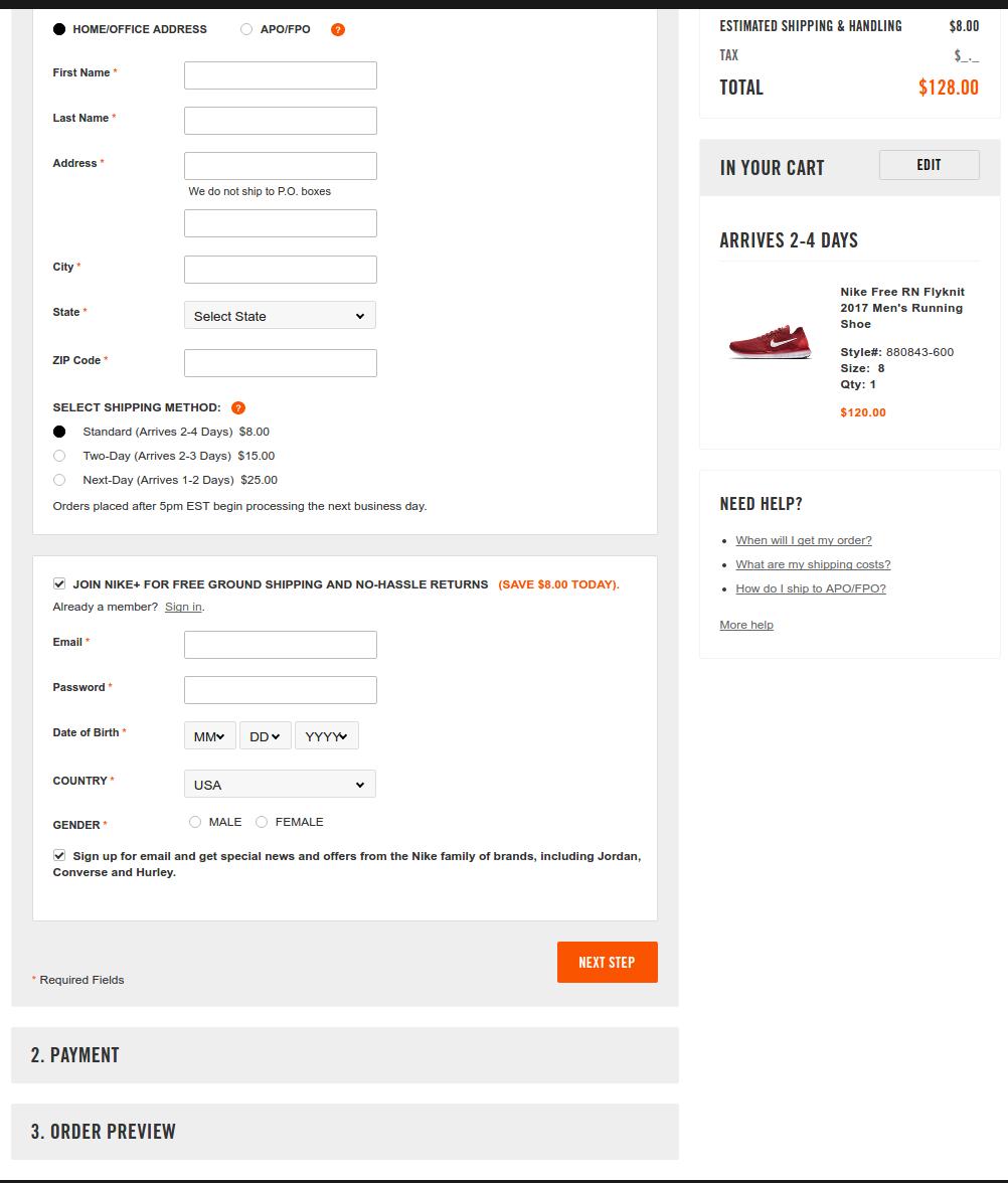
For the regular checkout interface, Nike goes with a partial one-page checkout structure. I am saying partial because all the steps are not unlocked at once on the page. You have to complete the previous step before moving to the next step.

Nike’s regular checkout is inspired by the single page structure

Here users can choose to continue with the checkout without logging in and create the user account at the later part. Furthermore, the shopping cart summary in the right column keeps the users well informed about the miscellaneous costs associated with the cart- Shipping charges, total cost, single item’s cost.

8. Jabong’s checkout

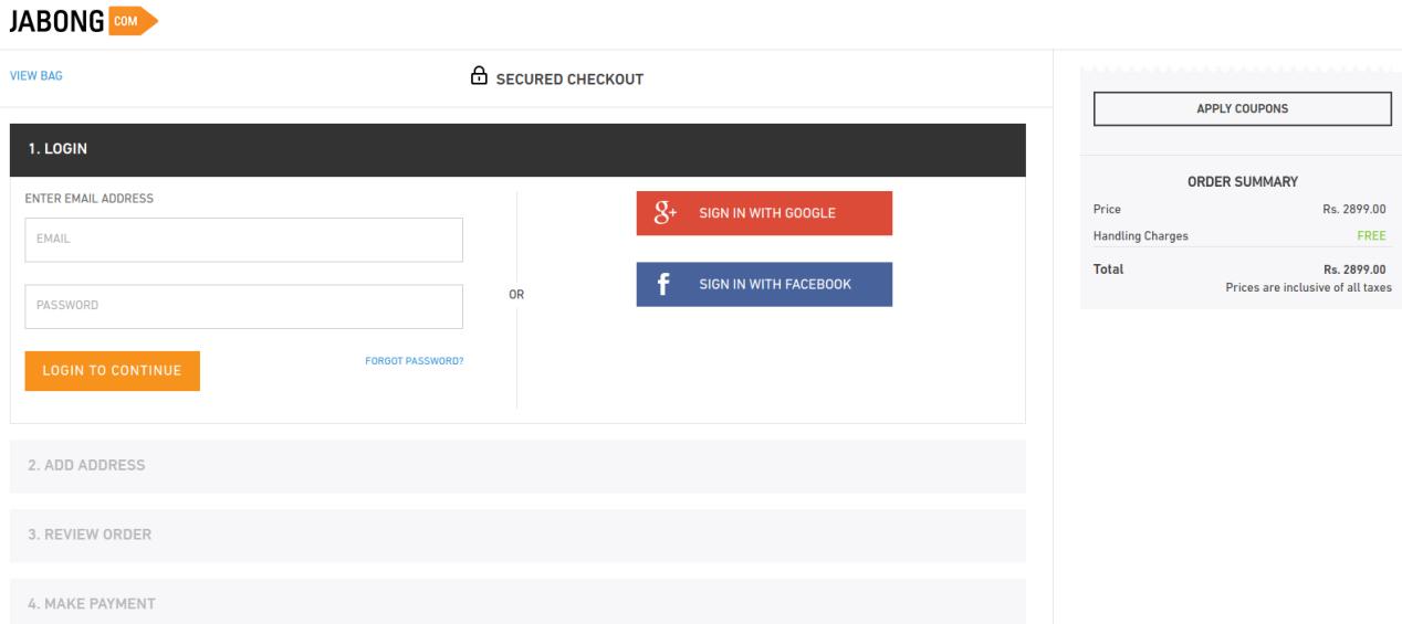
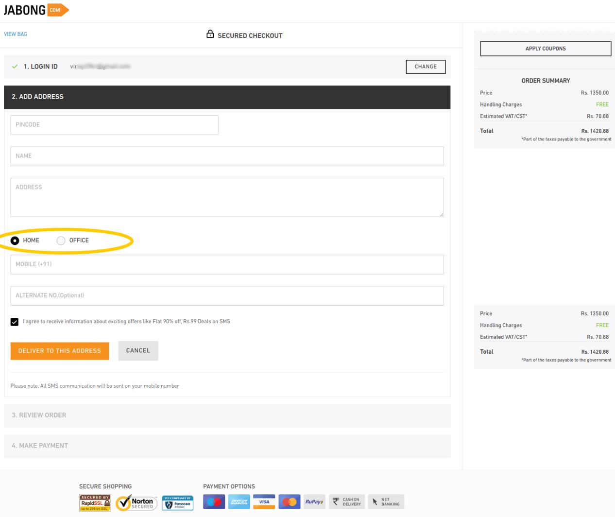
Jabong provides a streamlined check out process that keeps the users informed about the next steps plus allows multiple social login options. The further steps on the checkout page are well optimized to ask only few important details.

The most inspiring option that I found here was the option to specify if the shipping address is a home or office address. It helps the shopping site to deliver the items on a correct time, minimizing the chances for missing delivery. Furthermore, the alternate phone number field is an optional field which customers can choose to skip or provide. I have found this checkout as one of the fastest among the check outs I inspected.

The final takeaways

Summing up the entire case study, it is evident that whether you take UI or UX as the judging criteria, one page checkout is something that makes the process edgy. I will consolidate the entire features that make these checkouts best-of-their kind.

Single page checkout:

As per Baymard, complicated order processing contributes to around 28% of the cart abandonment. This is when a one page checkout can simplify the process for your customers.

Easy Signups:

Guest login options along with ease of signing up can make the checkout process effective. Along with this, social login options can give the checkout process of your site a notch-up feature. Almost all the eCommerce sites, be it an industry giant or a SME.

Implement upselling and cross-selling:

The check out pages should never provide an exit root and a dead-end to your customers. Instead, it should be used as an opportunity to generate additional revenue through upselling and cross-selling. Offering compelling reasons to the customers to browse the store right back is one of the best ways to achieve customer retention. You can do this by offering customers products related to the one that they ordered, or by giving them discounts on future purchases.

Mobile-friendly checkout:

With the latest Google update that emphasis on mobile-first indexing, it has become mandatory to make the entire mobile-responsive which includes the checkout process as well. Mobile commerce will account for almost 50% of the total online purchases by 2020 as per research. So, it inevitable to ensure that your mobile users get a flawless shopping experience. The checkout process of your site should be mobile-friendly as well. At the same time, it should never exclude any of the capabilities of the desktop site, such as social login option and one-page checkout. The mobile commerce experience should be identical to the desktop one in terms of the ability to browse, purchase and pay for products.

Source: baymard.com

Offer a variety of payment and shipping options:

Meeting your customers’ needs is the key to increasing your checkout’s efficiency. As per the result of Baymard’s studies, lack of shipping and payment options are another reasons for cart abandonment. So, you need to ensure that your prospective customers are able to pay and get the product delivered in whatever way is most convenient for them. Offer them as many payment and shipping methods as possible.

Ensure security:

Cyber security is possibly the biggest concern for the online shopping. The only way to keep the customers assured is by optimizing the UI of your site. The site’s design have a huge impact on the shoppers’ perception of your site’s security. An outdated-looking site will give customers the impression that the site is not reliable and will lead to a lot of them dropping off without purchase.

Conclusion

All these eight check outs are the best ones? It depends. I will leave that on our readers to decide, but I think they all have got something for us to learn from.

All of them do not insist on necessary account creation, except for the Amazon (Which was providing guest checkout a while ago). However, all of them including Amazon do inspire us to handle the first step of checkout wisely. While others handle the situation with guest checkout and social login, Amazon handles it through its compact registration form.

I like the approach of Mensuas, which provides the sign-up, sign-in, guest checkout and social login as well. Moreover, it’s single page checkout is well optimized in terms of form design.

Liked This? You’ll Like These Too
Why you should and shouldn’t sell on Amazon and eBay?

A casual view on online marketplaces like Amazon and eBay suggests that the platforms have been created for mutual profit. Store owners leverage increased exposure for their products and in return, the marketplace owners gain the never ending inventory and commission from the sales made by the sellers.

However, a closer look might not suggest the same for all. No doubt the mutual profit for both the entities still remain, but we are here concerned about should you really care about expanding your presence beyond your online store?

The question asked by me here is a conflicting one because we are the ones developing connectors for easy integration of PrestaShop stores with marketplaces like eBay, Etsy, and Amazon. The answer to this question depends on several factors. A decision to sell on a marketplace can be a boon for some, while it may not be the same for others. You need to consider several variables, that may include the type of products you sell, the level of competition in your domain, the fee Marketplaces charge and what restrictions they put on sellers.

In this post, we will discuss the pros and cons of selling on the popular marketplaces that will help you decide, whether you should sell or not on these platforms. So, you will have a choice of making some well-informed decisions on the part after reading this post.

Why should you sell on Amazon and eBay marketplaces?

Perks of starting a shop on eBay, Amazon or any marketplace

1. Improved sales by leveraging a high traffic website-

Amazon and eBay the two very popular eCommerce sites. Today, everyone knows the name of these websites, and before finalizing a purchase decision one simply does not forget to checkout the product on these sites.

Amazon alone draws an average of 197 million visitors in a month. So, why should you not leverage such a huge exposure to your products? Moreover, an unconfirmed claim from an Amazon executes suggest that an average of 50 % boost in the sales can be seen after joining Amazon marketplace.

2. Opportunities to win new customers-

On marketplaces, customers do not visit especially for a particular seller on the site. They were searching for their desired product and they found it on the marketplace site, other wise they could have just discovered it anywhere on any other site. Similarly, when a customers land on your product pages on the marketplace, it doesn’t mean they have come searching for your store. They were just searching for their desired product on the site and found it on your store.  Once, they have landed on your product page or your store page, even if it;s not your site, you can win new and repeat customers through your excellent product, service, and fulfilment.

3. Marketplaces are automatically in preference by many people-

A marketplace site is an all-in-one repository for diversity of products. One can find anything he wants on a single site. There are several customers who prefer to purchase everything they need from a single place only, and the places providing such opportunities are always in their preferences. The case is no different with why people prefer to visit shopping malls or departmental stores instead of a single shop.

The variety and all-in-one aspect draw a lot of customers towards marketplaces who prefer to do that kind of shopping. Moreover, the seamless checkout and fulfilment on these marketplaces bring additional layer of pros in the shopping experience. So, sellers on marketplace sites like eBay and Amazon are always in benefit with these kind of shoppers. While small eCommerce sites might not have that kind of traction.

4. Easy connection from your store to marketplace-

Marketplaces like Amazon and eBay does not necessarily want you to sell through their seller panel only. If you own an eCommerce site already, it could be a laborious task to manage your site and marketplace store separately. To overcome the situation, marketplaces provide some solutions for easy site integration.

For example, Amazon’s MWS allows an eCommerce site owner to connect his site with Amazon Seller central and sell directly from the eCommerce site on the Amazon marketplace. Similarly, there are solutions for eBay integration too. So, selling on Amazon and eBay can a seamless process for some eCommerce site owners too.

Why should you not sell on Amazon and eBay?

Do not forget to inspect the other side of the coin

The pros of selling on these popular marketplaces might suggest that it’s all good and you should start selling instantly. However, I will take this opportunity to also mention conditions when you might not feel good about selling on these platforms.

1. Exposure to a new set of expense:

As mentioned in the very beginning, both the entities on the marketplace site(Admin and seller) receive some mutual benefits. For sellers, it is all that have been mentioned in the previous points. While the marketplace admin receives his share of benefit in the terms of percentage deduction from each sale you make on the site.

Setting up a marketplace shop will surely improve your sales, but it will expose you to a new set of expense paid to the marketplace admin – marketplace commission/fee. The nature and range of the deduction can vary from marketplaces to marketplaces and category to category.

So, before signing up on Amazon or eBay, you must have a deep understanding of sales margin and nature of fees that you would pay. You can refer here for different fees charged on Amazon and eBay.

2. Marketplaces are all about products; not sellers:

Marketplaces don’t exist for the sellers. Though sellers are the crucial entities on the marketplaces, and it is because of the sellers why there are products on the site, marketplaces tend to help themselves first. They will promote the products and categories on the site rather than promoting a seller. That means, they may restrict you from promoting your shop or communicating with the customers.

Certain dictation can be seen in the case when they might be the sole entity to decide which product would go live and which product they would discontinue showing at anytime they want.

Additionally, if they find a popular product from your store receiving good orders, they might just decide to stock those products by themselves and act as a competitor for you for that product. And there would be nothing that could stop them from doing so.

Finally,

Selling on popular marketplaces like Amazon and eBay is a decision that should be made after considering some situations. Both the pros and cons explained here would definitely help you to make an informed choice. You can choose to sell on single marketplace or may also sell on multiple marketplaces at once. As a suggestion, you should have appropriate integration solutions by your side so that you can have your own site and sell on the marketplaces at the same time without any hassle.

You can now list the products and the descriptions at a few button click with the help of eBay integrators by Knowband. Knowband provides integrators for the various CMS platforms like Prestashop eBay Integration Addon, Magento eBay Integrator, eBay Magento 2 connector as well as OpenCart eBay Integration plugin.

Liked This? You’ll Like These Too
‘Chicken-and-egg’ problem of marketplace startups- 6 tips for building your own

Marketplace is one of the most profit generating business in the contemporary eCommerce market. Businesses are flourishing with the new approach where they do not have to invest in inventory of products, but still make huge profit from commissions earned from the sales made by sellers on the site. It’s all butter, isn’t it?

Undoubtedly, marketplace is a treasure of revenue generation, but like every precious treasure, it is also not so easy to acquire. Otherwise, we would be seeing every other site becoming a marketplace to hunt the treasure. From supply chain management, customer support, product quality, marketplace reputation to bringing the sellers and customers on the site, a marketplace is a challenging business.

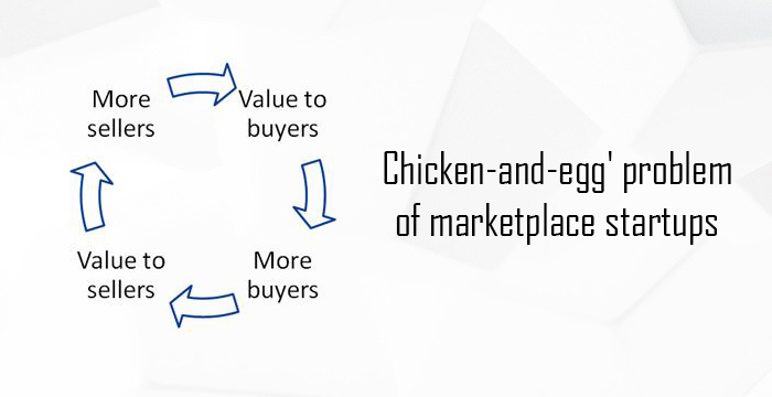
A marketplace business cannot acquire customers if there are no or only a few sellers on it, and would not be able to convince a seller to sign up if there are no customers on the site. That’s the chicken and egg problem of a marketplace where you get stuck between whom to bring first- sellers or the customers. Luckily, despite these challenges, successful marketplaces do exist.

In this post I have focused on how you can deal with the chicken and egg problem of the marketplace and understand why it’s not only about developing a marketplace site but developing a marketplace business on the whole.

What is the chicken-and-egg problem?

Which came first? Same can be said for seller and customers on marketplace sites

If there are buyers, but only a few sellers to fulfill the orders, stock won’t be enough to fulfill all the orders. So, the buyers will leave unhappy out of the product scarcity and probably not return back.

Yet, if there are no buyers on the site, how would you convince a seller to sign-up?

With no buyers for their products, seller’s won’t find your site beneficial for them. Even if they sign up, list their products, and wait for the buyers to come, there is no guarantee that a sale would be made soon enough. In case if they receive an order after months of listing, you can’t say if the product is still available in the stock with the seller, or it is fresh enough to maintain the quality. So, ultimately customers won’t get a quality service from the site, ruining the site’s name.

Supply is the biggest challenge behind a marketplace business. With this chicken-and-egg problem, it takes a while to build a marketplace business. A new platform generally lags in creating enough value for attracting new users. Whether, it is the customers or the sellers, they won’t join you until you have something valuable for them.

Certainly, this is a huge issue for your startup, but as I said, despite these blockages, successful marketplaces do exist. So, stay tuned because we are going to discuss how can you survive this tough time while getting traction and building your supply and consumer base in the long run. Here are the six tips:

1. It’s all about patience and a plan-

Have patience till you establish the both sides-seller and customer community

It’s a probable case that you might not see the signs of traction even after months of the startup. In this case, you should comprehensively reassess your business model and market. The nature of this time period is somewhat opposite to an inventory based eCommerce startup. There you build your own supply chain by stocking products by yourself. In marketplace, you need to build both the customer and seller communities; you will need more time to prove your value to both the sides.

It might take a few months for a marketplace to finally get and prove that value. However, in the meantime, you need to identify a niche for your business and start focusing on that very specific target. Used by most of the successful marketplaces, with niche market targeting your main investment would be the time spent in canvassing sellers. Etsy and Amazon are the two such examples, which started from a niche market (Vintage, handmade products, and books respectively) and later expanded to the broader section.

So, until you get to that level, you need to stay focused, steady and patient.

2. Take a close look on your initial investment-

Experts have different opinions on level of initial investment in marketplace promotion

The level of initial investment in a marketplace business is a matter of debate. Some experts say making big up front investment signals the entities that you are serious about the business and would stay focused in the long run. So there would be stability. It would also make your suppliers and producers comfortable about your intentions to keep the business running. Experts support this view by giving the examples of big upfront investments by several businesses like Microsoft’s launch of Xbox. They made a huge commitment by spending around $500 million for promoting the platform.

However, my views are inclined with the other side of the experts who believe in regulating the burn rate during the initial periods. You need to give yourself some time to build the value for your business first. The reason is, not everyone is Microsoft, who has no scarcity of dollars, plus an already build business value. While some businesses might score huge success with early big deals, you cannot buy the speed when it comes to building a marketplace. Regulating your investments in the initial period would save the fuel and take you furthermore on the runway.

So take a careful look at your initial burn rate. There is no need for big teams, and big offices early on. Most of the initial marketplace investments are made only in two functions: Developing the marketplace site, and building the supply chain base with buyers and sellers community.

3. Tighten your target on the niche market-

Focus on a target market and apply efforts to win that niche

Successful marketplaces may function as a repository for diversity of products and choices at the same place, but none of them has started in the same phase as they are there now. The example of Amazon and Etsy marketplace in the first point advocates this view. Etsy started as a destination for Vintage and handmade crafts and later expanded itself to other categories. Today, Etsy accepts integration even with stand-alone eCommerce sites and platforms. While Amazon started as an online bookstore and evolved as a huge marketplace of everything you can imagine buying. Even Amazon accepts integration with other eCommerce sites and eCommerce platforms.

Both of the entities tightened their focus in smaller vertical before they expanded into the bigger market. This narrow focus steadily became their largest USP and traction. Today, you won’t think of a better online place than Amazon to buy books , even if it is no more a mere bookstore and same goes to Etsy for handmade crafts.

The growth outside the niche would be an organic process that would develop in time. If the growth doesn’t start organically, you can help yourself to speed it up by targeting on seller acquisition efforts. You can prepare action plans targeting certain types of product categories and sellers, and then gradually expand outside the niche of the circle. You may use your geographical location as an advantage by first expanding the reach to local level before going for national and international level.

4. Focus on your niche users’ utilities-

Performance in the niche market decides the fate in the broader section

It is now an understood fact that successful marketplaces are built from a niche to the masses. During the niche period, it is important to optimize the experiences of your early on-boarders before you can start appealing the masses. By focusing on user engagement for your early adopters (both sellers and customers) you will increase the likelihood of being discussed by them in their circle, and that discussion would contain something promotional for you.

For example, Etsy did a fantastic job as a marketplace for handmade crafts which led to carry on its legacy even after it expanded to other categories. Amazon did a fantastic job as an online bookseller in the US before it evolved into a marketplace giant with a reach across the globe. And, a bit different but relevant example, Mc Donald’s did a fantastic job with its hamburgers in the US before expanding to other products and other countries.

All these entities, took a special care of their early adopters before the expansion, as a result, their legacy continued even with the new products and new audiences. So, before focusing on the broader section, make sure your marketplace performs excellently in the narrow section, ultimately taking you to the broader section organically and automatically.

5. Build the community with your Niche users-

A community of users can only be made if you focus on their utilities, and support them from time to time. Social media is the best platform to build a community. Utilize this platform to expand your reach to the users.

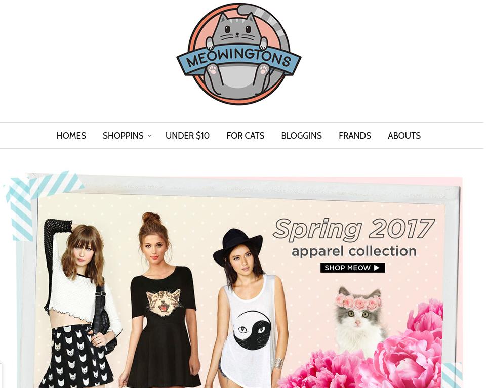
Meowingtons is a perfect example of how you can focus on your niche to take a leap to the broader section. It started with the thinking that out of the whole US population, there is a good share of women population. Out of the whole women population, there is a good share of women who like cats. So, it focused on the women who like cats an started selling the cat accessories, cat utilities, and cat theme accessories for women. Today, it is a successful startup with more than 5 lacs followers on different social media platforms.

6. Trust your vision, but follow the stats-

You might find people not believing in your vision. Do you need to stop right there?

The market is full of conceptions. Everybody have their way of doing things. You might get ridiculed by some of them regarding your vision. You will find people suggesting to back-off when your start doesn’t happen with that pace.

Well, when building your marketplace business, or expanding it to newer boundaries, you have got to believe in your vision, but do not have a blind faith in your ideas. If you are going right, you would definitely find the positive signals at different phases of the business. Keep a track on your development and re-asses the steps you have taken and how they have worked for you. Have a survey from your early adopters about their experiences, audit the repeat customers and repeat sales, track the pace of seller sign-ups and their views about the user experience on the site.

If there are no positive signs of traction, and stats are not in favor of your ideas, rethink about continuing further. You cannot make a successful marketplace business with just visions, you have to stay tuned with the stats and facts.

Having discussed some of the basic tips and tricks of starting an online marketplace, let us now take a look at how can you take care of this chicken-and-egg problem. Whether a huge chuck of customer base will attract the sellers or a large number of vendors will motivate the customers to shop from your site is still an issue.

Some of the strategists think that attracting the seller first is a better option. However, as per my personal experience, working on your niche market and creating a strong audience base as a single vendor site may help attracting the third-party vendors as well. And once the sellers will start pouring in, the product range will increase and store visitors will get more option to shop from your site. Here are some of the tips to deal with chicken-and-egg issue.

Final Say

Summing up the entire thing, I would discuss some of the key points that can help you take care of this problem for your online marketplace. Take a look:

Starting off the platform as a producer can help you dive into every nook and corner of the industry. Working at the ground level can help you identify the bottlenecks of your shopping store. Having a practical experience as a vendor can help you get the best from your third-party sellers.

Create a network of not just customers, but vendors as well in the very beginning. You can leverage the power of your network in the wrong run. When it comes to a marketplace, building a personal connection with your sellers is as important as having a strong customer relationship.

Acquire high-value users before you approach the vendors to be a part of your online marketplace. It’s kind of a vicious circle. The quality customer base and motivate the sellers to sell on your site. Moreover, a large number of sellers and product variety can give compelling reasons to the reluctant visitors to shop from your site.

It may sound conventional, but getting celebrity endorsements is definitely one of the ways to attract both sellers and end-users. Getting the partnership or endorsement from someone who has a fan base and help you channelize your long-term vision.

How to get the customers?

Discussed below are some of the strategies that can help you bring traffic and boost conversions of your site.

As mentioned earlier, focusing on the niche market and creating a strong customer base as a single-vendor site is a must. Incentivize your potential customers.
Instead of just focusing on customer acquisition, make sure that you take up steps for consumer retention. Follow up emails, social media engagement are some of the ways to keep them engaged.

How to get the third-party sellers to sell your site?

Once you have established yourself in the niche and the target market, attracting the sellers will get way more easier. Additionally, you can opt for the following tricks to increase the number of vendors of your site.

Finally,

The six tips we just discussed should allow you to give a correct start to your marketplace business. Building both sides of the marketplace simultaneously is a hard job than a one-sided inventory model, but once you reach the scale, things would start kicking and would establish your roots well and firm. Till then have a little patience, and give your business enough runway to fly high with both sides being well established.

Liked This? You’ll Like These Too
Ingredients for starting a Marketplace site on Magento

Magento offers almost everything one needs to build and manage an eCommerce site. It provides effective management for product showcasing, safe online transactions, shipping management, and eCommerce checkouts and much more. However, some management controls specific to a marketplace site are not included in the default features of Magento.

A marketplace site requires some additional features in addition to the regular eCommerce features supposed by an eCommerce platform. The additional features may  actively include:

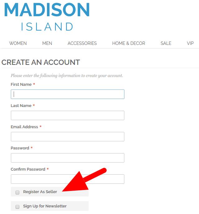
  • Management for seller account registration
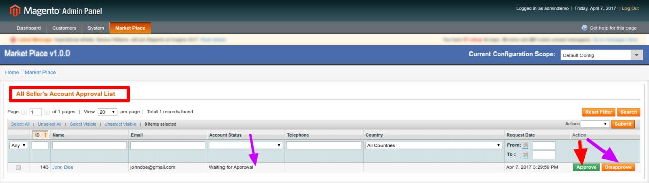
  • Management for seller account approval and declination
  • Management for different shops by different sellers
  • Management for Product upload by sellers
  • Management for Seller product approval or declination
  • Management for Marketplace Commissions
  • Management for Product Shipping by sellers
  • Management for mailing notifications to sellers and customers, and much more

These are some basic functions that should necessarily be managed by a marketplace site. Unfortunately, Magento does not possess these operations by default, as it was originally designed to serve as an inventory based eCommerce site. However, with the evolution of eCommerce model in the modern era, the eCommerce platform has greatly evolved itself for the B2B model of eCommerce. This led Magento developers across the community to present solutions in the form of marketplace extensions and marketplace addons which impart those missing marketplace features in the eCommerce platform.

A marketplace extension is basically a module that can be installed on an eCommerce platform to convert it into a marketplace site by adding the required specific functionalities to the eCommerce site. Some of the additional features I have already mentioned in the above points.

What makes a good marketplace extension?

Here, I am going to discuss some basic functionalities that should be possessed by a basic marketplace site. The aim behind mentioning these functionalities is to explain what fundamentals you should necessarily expect from a marketplace extension.

1. Seller account registration and management-

The main addition on a marketplace site is the involvement of sellers on it. Sellers on a marketplace site are those entities which differentiate it from an inventory based site. So, without sellers, there is no marketplace site at all. A good marketplace extension should effectively handle the seller registration and manage those seller accounts with the same efficacy.

  • It should allow sellers to register on the site

  • It should allow admin to approve/disapprove a seller account request

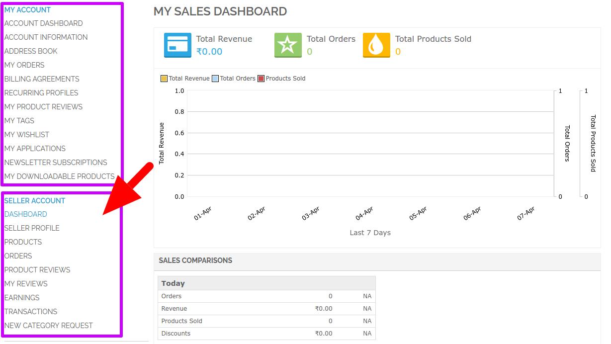
 -It should provide sellers with a niche-based dashboard to manage their shop

2. Seller product upload and management-

After seller account management, the next big thing that makes a marketplace site is the facility to sellers for uploading and showcasing their products on the site. A seller product management should provide both the sellers and the admin with certain access and functions.

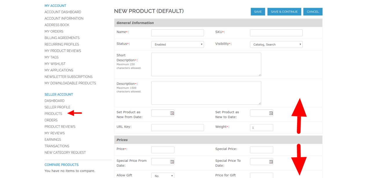
  • It should allow sellers to upload product listing on the site

  • It should allow admin to review and approve/disapprove a seller product upload

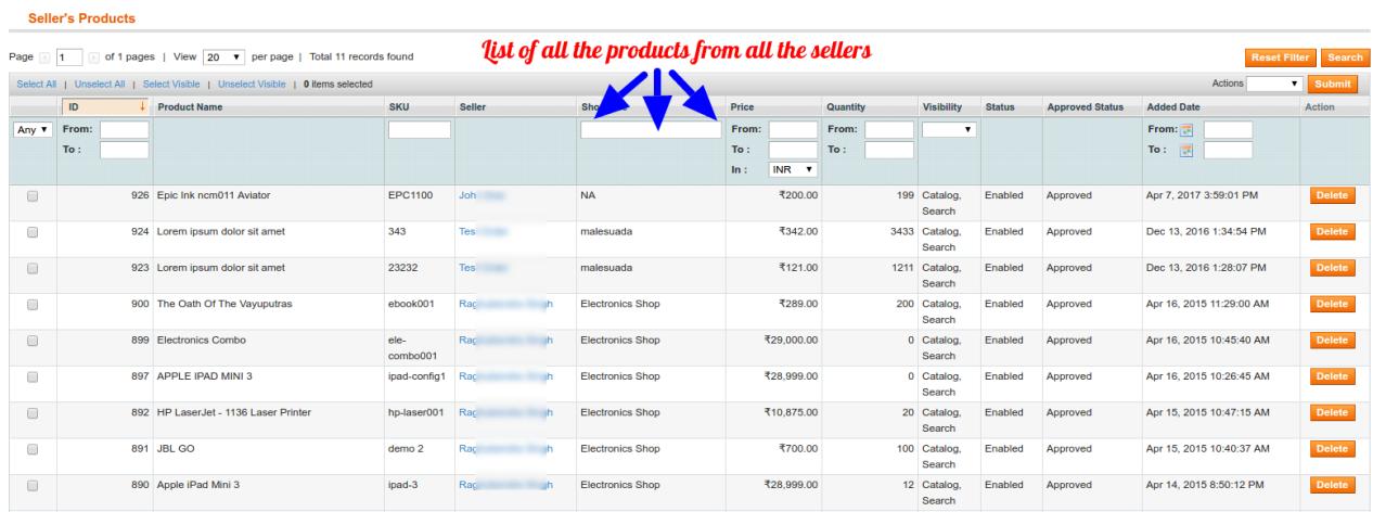
  • It should allow admin to view list of all products from all sellers, and activate/deactivate a product on the site when required.

3. Products order management-

A marketplace site receives orders for any of the products from any of the sellers on the site. A good marketplace extension provides all the required functionalities for the orders management both by the sellers and the admin of the site.

  • It should allow the sellers to see the list and details of all the orders they have received on the site

  • It should allow admin to see and manage the order details of all the orders received by the sellers

So, these are some basic functionalities that differentiate a marketplace site from an inventory based site. In addition to the fundamental operations explained above, a marketplace site requires much more to deal with the massive competition and growing requirements. This is where the marketplace addons come in the picture.

Marketplace addons-

The features and requirements of a good marketplace site are unlimited and keep on increasing with the time. Marketplace extensions developed by the community developers though include all the basic requirements, they cannot make a good marketplace site unless they are always in evolution.

Marketplace addons are those extensions which add new features and functionalities to a marketplace site. These extensions provide some useful features to the site which cannot be provided by a single marketplace extension. Thus, keeping the extension up-to-date with the new trends. So, in short,

  • If you want to convert your eCommerce site into a Marketplace site?- Use a Marketplace Extension
  • If you want to add new features to your Marketplace site? – Use a Marketplace Addon

Some examples of Marketplace addons-

Marketplace Addon for Admin-Seller support system-

A marketplace site in-houses several sellers on it. It is a known fact that difficult it can be to keep the sellers on the site. To keep the admin-seller relation healthy, the admin should always be available to address the queries, issues, and grievances of the sellers. A marketplace addon can be installed by the site admin to add a help-desk support system for the sellers, providing them easy interface to contact the admin in need.

Marketplace addon for Product Import/Export-

We have now understood that a marketplace extension adds up the functionality for the sellers to add products on the site and receive orders for the same. A marketplace addon for products import/export can make this task easy and quick for the sellers by allowing bulk export/import of the products on the site through CSV files. Thus, making it quick for the sellers to upload multiple products and their combinations in just a single click.

Marketplace addon for return management-

A marketplace site with a large number of sellers and customers deal with a huge number of product orders each day. It becomes difficult for a marketplace admin to manage product return, replacement, or refund requests for such a huge number of orders. To make it easier a marketplace addon for seller return management can be installed on the site which will allow customers to send the return/refund requests directly to the sellers from whom they have bought the product.

Finally, 

A marketplace site is a huge area of management. Like every other business platform, it has some challenges and perks too. Choosing a useful marketplace extension becomes and necessity when you are thinking of converting your store into a marketplace and do not want to stick with the challenges only. It’s not just about what features are included in the extension, it’s also about what other advancements and compliance it can offer you with the changing needs and demands.

So, choose an extension that can promise compliance and have ample addons to extend it’s functionalities so that you don’t have to end up in a dead end at later part of the business.

Liked This? You’ll Like These Too
What we know about email marketing and what we don’t know

Email has been in the game for a very long time. It is a valuable resource for marketing of the product and services. Though it seems to be a very simple task to use emails as a marketing tool, there is actually lot more than what it looks on the surface. Despite all these, it is the most simple and most accessible marketing tool one can always have by his side.

Here, I am going to break into points discuss why email marketing is still the kind of digital marketing and what we need to know about emails.

1. Email is comparatively cheaper than other marketing tools-

Companies spend billions on print ads and internet advertising. However, when it comes to email marketing only a small proportion of their budget is specified for emails. It doesn’t mean that companies do not take emails seriously, it’s just email marketing is cheap and you do not have to reserve a huge budget for it.

“compared to other media, email messages are dirt cheap to send. With TV you are spending on ad agencies, creative studios, and cable channels. With print ads, you are helping to keep newspapers and magazines alive. Direct mail costs more than $600 per thousand pieces. With email, there are almost no costs at all. But its low cost only makes the argument stronger that email marketing is the most cost-effective advertising method available today”– hbr.org

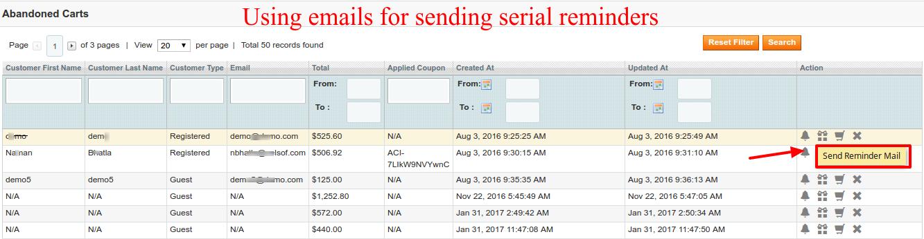
E-Commerce stores use emails to notify customers on various event, send offers and discounts, send account related data, send newsletters and abandoned cart serial reminders. For sending large volume of emails at a time, merchants implement features to integrate email marketing vendors such as MailChimp and Constant Contact on their stores, while some choose to just use these tool independently.

Leveraging emails for sending abandoned cart reminders to the customers

You don’t have to believe my words for it. Just look at this joint study from shop.org and Forrester Research that says ” 85 percent of US retailers consider email as one of the most effective tools for customer acquisition”.

Email might have become the oldest online marketing tactic, but it still remains a vital one. It’s relatively easy to perform an email marketing campaign rather than spending fortunes on print and internet advertisements. Undoubtedly, email marketing cannot replace the print and internet advertising, but it is always something that is more easy and cheaper.

2. Email is a better tutor of Marketing skills-

If you do not have enough experience, you often rely on trial and errors to learn more. Marketing, for example, is a similar field which teaches you various lessons in every success and failure. With some of the means of marketing, you can never be sure whether the money you invested is paying off.

With modern email marketing, there is no need for trial and errors in most of the cases. You have tools backing your marketing campaign which can be used to forecast the trends and requirements. They can suggest the right time to send emails when there would be better chances for better open rates. You can also measure the click-through rates and see if the emails are doing their jobs.

For example, with tools for Abandoned cart reminders, you can send automatic emails with offers, coupons, and simple reminders to those customers who have abandoned your carts for any random reason. It is a handy way to recover lost sales due to shopping cart abandonment.

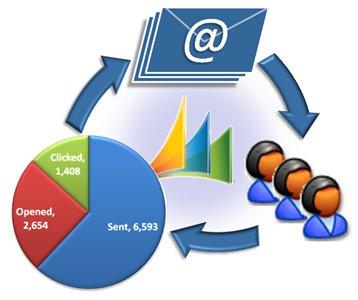
Email analytics to discover the performance of the campaign

In email marketing, you can discover exactly which emails have been clicked, by whom, what links were clicked on, and what part of your message was working. Thus, providing a greater insight into your marketing campaign and teaching you lessons in very campaign.

3. Emails are the mainstream and used by everyone-

If you ask anyone in your market if they use email, they will say yes for sure. Social Media marketing is a widely popular environment, but it cannot be said that every potential customer in your domain in on a social media channel.

With everyone not on a social media channel, email becomes the mainstream. Nearly everyone in your domain is believed to have an email account.

Moreover, 91 % of the email users check their emails at least once daily. It makes clear that ROI from emails could be comparatively as greater than social media marketing which is more costly than email marketing.

4. Emails are more direct way for broadcasting to relevant population-

Social media allows multi-way conversations between many to many users. Most of the time a broadcast through social media ends up with a huge population of audiences who are not even directly relevant.

Email, whereas is a more direct conversation that usually connects relevant people and does not involve additional participants. It might be considered as a drawback of email that limits the audiences for your broadcast. However, considering your efficacy to collect relevant email list and data, it cannot be a limitation. If you have effective tools to collect email data for your marketing, you might see that it is better to connect with few those who will be interested in your business, instead of a huge number of audiences who doesn’t even know about your business.

5. Emails are the driver of online and in-store sales-

Email marketing is so popular not just because it is easy and cheap, but because it is effective and drives sales. A study by Nielsen says that:

“28 percent of online shoppers subscribe to store or product emails simply to stay informed. 27 percent of online shoppers subscribe to store or product emails to save money.” 

A similar stat can be seen in a data from Deloitte that say 65 percent of customers find email coupons important in online grocery shopping.

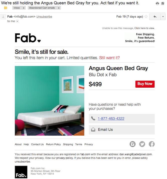
Online stores get a fair chance to attract customers through offers in emails

Email marketing is an effective way of reaching out to the customers and having a chance for bargaining with them. Even the biggest brands believe in email newsletters and reminders to attract customers towards their stores. So, email is everywhere and it cannot be ignored for sure.

Liked This? You’ll Like These Too
6 mistakes in website form design you should never make

UI (User Interface) and UX (User Experience) have an important role in conversion friendly web design. UI makes your website beautiful and UX concentrates on the usability and ease of the website. If any of these two are missing or not balanced, the result is bouncing customers. Website form design is that part of the web design that ensures seamless lead generation and information gathering with proper user satisfaction on a website. In this blog we will be focusing mainly on UX as UI is something which is very subjective and will be defined by your company’s branding guidelines or your choice of colors, banners and fonts.

Wikipedia Says:

“User experience design (UX, UXD, UED or XD) is the process of enhancing user satisfaction with a product by improving the usability, accessibility, and pleasure provided in the interaction with the product.”

We use different forms on our websites on almost every part. From feedback forms to Checkout Page everything has its purpose, and if they are not designed according to what they are meant for, they will fail to serve their purpose.

In this post, I will explain 6 such mistakes in a website form design that you should never commit if you want to avoid bounce backs, and worst user experiences on your website.

1. Requesting too Much Information from the user

“40% of people abandon a website that takes more than 3 seconds to load.” –kissmetrics. This is when the website slowed down by 1 sec, imagine what would be the reaction if your website wastes much more time than that by just asking unnecessary details to fill out on the forms.
So, don’t waste their time and your conversion by asking for ‘not so important’ information. Please note that there is a difference between ‘unnecessary’ information and ‘not so important’ information.

Information like ‘Ethnicity’ or ‘Place of Birth’ of the person may be deemed unnecessary for an eCommerce website but it might be important for a political party’s website. So this is also debatable and subjective, but I believe you got the idea.

‘Not so important’ fields can be:

  • Additional Email ID
  • Additional Phone Number
  • Date of Birth
  • Fax Number
  • Security question and answer
  • Social Security Number etc.

Even if you need these details it’s not necessary to ask at one go, you may always give an option to the user to update his/her profile. Think like Linkedin or Facebook they do not ask everything in one go, instead they first get you signed up with as little as 3-5 fields and then give you an option to update your profile later.

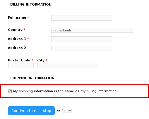
It’s all about presentation, so you should ask only the most crucial details that you need like: If you are using the form for feedback, then ask about their views and comments before asking their name or email id. Similarly, if it’s a checkout form, and you already have certain information about the user, then do not ask for those again, instead have them pre-filled on the form. For example, you can pre-populate the information in billing address from to auto-fill the delivery address form if both addresses are same.

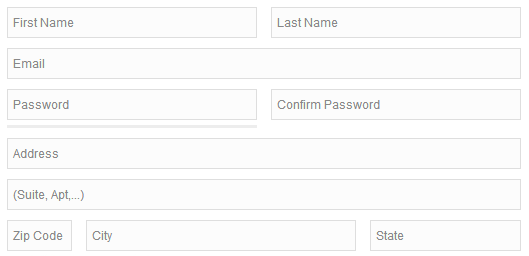
Information pre-population from one form to other can save time and effort of the users

2. Ambiguous or non-responsive label positioning-

Labels are used in the website forms to make it easy for the user to fill the information required. So ensure that labels are placed at a correct position that doesn’t confuse the user about what to fill in it. A proper label alignment is essentially required when you are designing a responsive form that serves to different screen sizes. Make sure that labels remain correctly aligned on all the screen sizes the form is being opened.

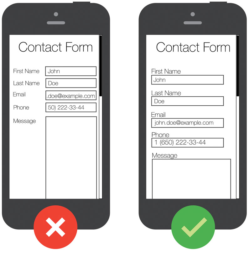
Mobile Contact Form
Most website forms use the same label placements on all the screen sizes which is not a recommended choice

Users on mobile use zoom to clearly see the labels on the forms so that they fill the correct information. However, as shown in the image above if you keep the same alignment on both the desktop and mobile versions of the form, it will hide all the labels while clicking on the form in zoom mode. It will force the user to zoom out the form each time he moves to the next entry.

A better option for handle this would be to use two different alignments on desktop and mobile version of the form. Make the labels top-aligned on mobile versions and keep it right aligned on the desktop.

3. Replacing labels with placeholders-

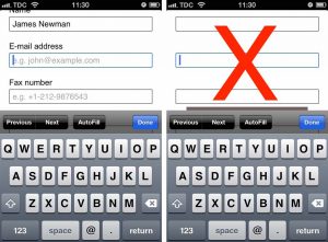
With HTML 5, placeholders in text attribute were a valuable addition. They are effectively used to provide a brief hint about an expected value in the field.

Placeholders provide a short hint about expected values in form field

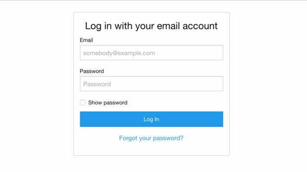
Typically a placeholder remains visible until the user clicks in the field. As soon as the user clicks in the field to type something, the placeholder vanishes. The usage of placeholders in website form design is highly confused with that of labels. Many designers use these placeholders instead of labels to describe the input fields hoping to get a cleaner design. This is a big mistake that compromises with the user experience.

Let’s take a situation when user fills a lengthy form like a checkout form. After filling the form, he might want to review the details before he can submit the form. Now, if there is no label in the form, he will just get confused about the details he has filled in.

Using placeholders in place of labels will confuse your customers especially in long forms

So, always use a label. Not using labels might be a space saver, but you will surprise to know how easily people forget what the label was once they fill the information in the field.

4. Using insufficient Spacing and distorted layout

Another big mistake we make in website form design is by placing too many elements on a single page. More are the number of elements on a single page more is the competition among them to draw attention.

The solution is to leave some breathing space between the elements by keeping white spaces. A proper flow for your users will be provided only when you keep ample spacing around the fields and different sections.

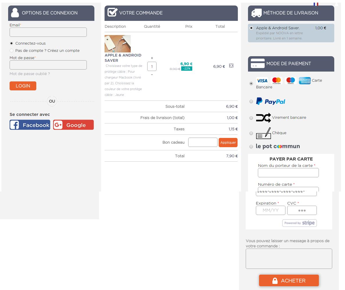
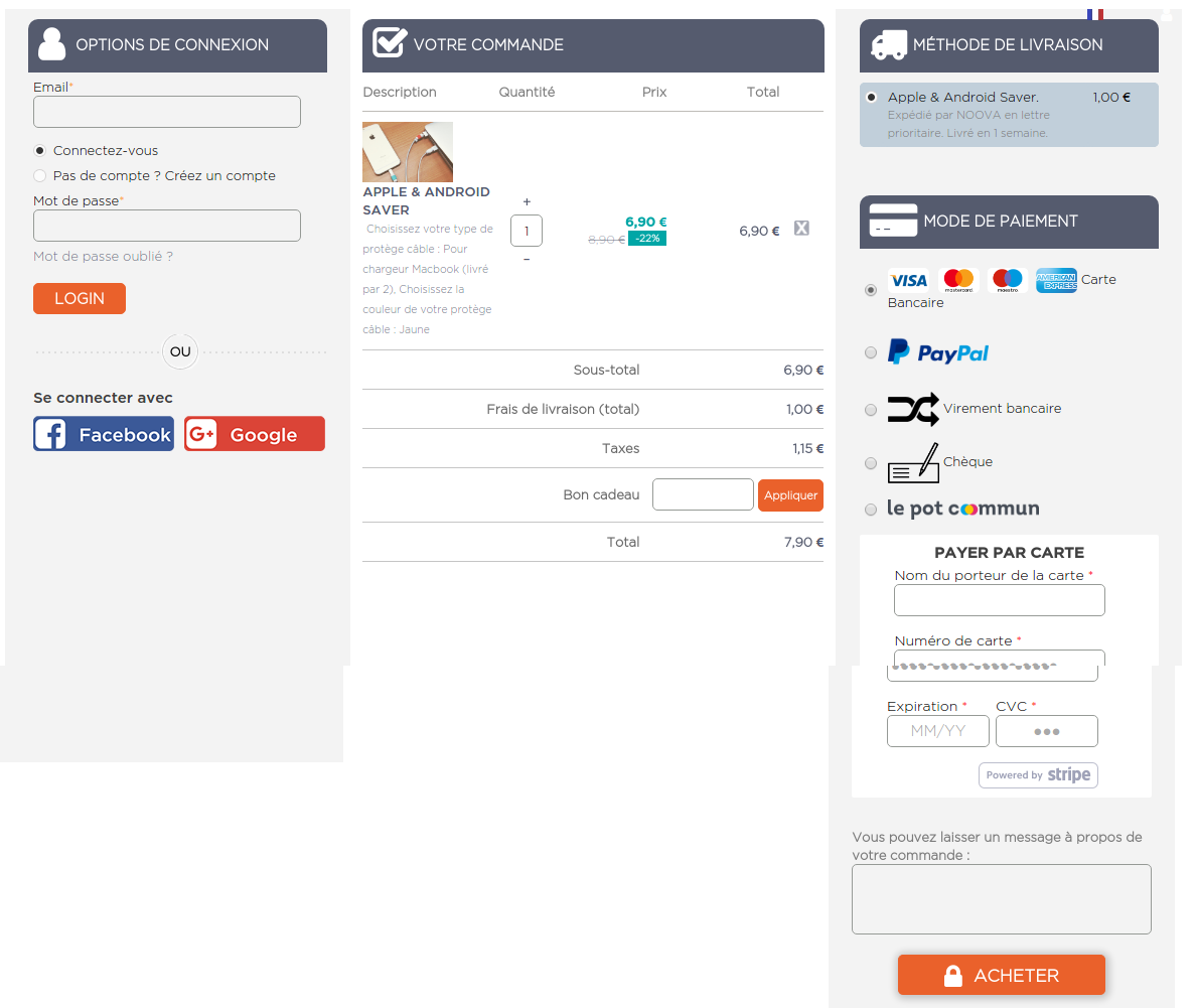
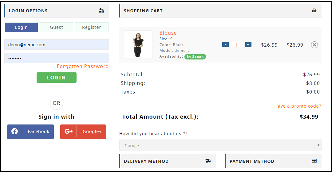
This single page checkout form shows how different sections can be segregated even if there are too many elements on a single page. The form uses section labels to separate different sections like Login Options, Billing Address, Confirm Order, Shipping Method, and Payment Method. Moreover, the three column layout makes the form even cleaner.

Segregating different sections will prevent cluttering between different sections

5. Uncertain error messages and input validations

While filling in the website forms, there are certain chances that users will commit some mistakes due to which form would not be submitted. Errors can occur by missing an entry, or filling an incorrect information etc. To tackle this website, designers use input validations that show the error message(s) while submitting the form. They use server side validations that generally waits for the server’s response to check the errors in the form. This is a bigger mistake that can even frustrate the user when they see an error message after submitting the form.

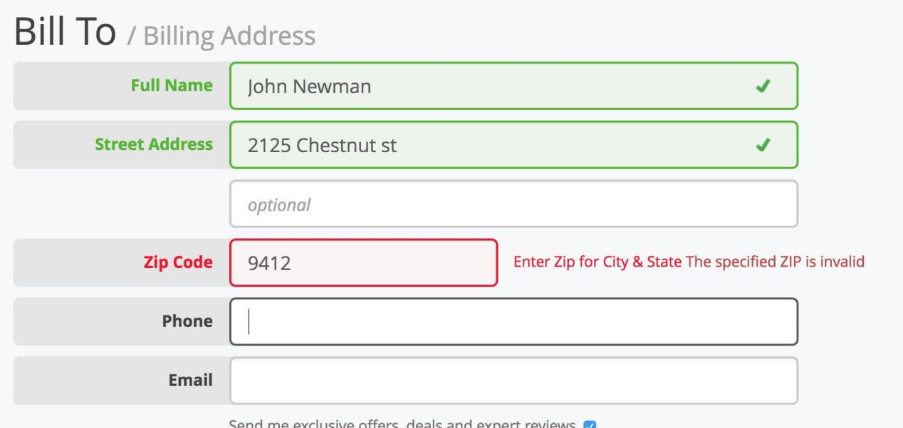
Instead, you can use user-side inline validation that tells on the spot if the user is filling an incorrect entry in a field. By doing so, users won’t miss if they have entered something wrong in a field.

Inline validation to check and show the errors on spot prevent the frustration post form submission

Moreover, do not use confusing statements in the validations messages. Just explain why the entry is wrong by describing how the correct entry would look like.

6. Using Captcha that are not designed for humans

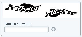
Captchas are used by the websites to prevent spam attacks by distinguishing a bot from humans. These captchas are assumed to present a challenge that would be easy for humans while bots cannot pass them. For spam prevention, sometimes, designers become so desperate that they integrate the captchas that are challenging even for the humans.

Captcha that prevent spam but frustrate human users

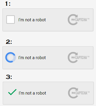
I understand the spam prevention is important, but captcha can be confusing and challenging for the users to decode them. You can use an alternate solution of so-called Google re-Captcha, which is a more advanced and simple version. The new Google re-Captcha just simply asks the user to click in a check box and verification is done without entering a difficult to see the text message.

Google re-Captcha is comparatively more user-friendly despite it is hard on bots

Finally,

User experience improvement is a continuous process that can only be achieved with regular updates using the best methods available. I hope outlining these design mistakes will help you achieve that improvement by not committing these mistakes on any of the forms you use on your website.

Related Stories:

7 Useful Tips for a User-Friendly Checkout

You would have often visited malls for shopping purpose. What did you look for after picking up your items? I am sure your eyes would have been searching for a short checkout line so that you could make a quick checkout.

Let me tell you my case, I went to a store a few days back, picked up some stuff and when it was time to go to the billing counter, I noticed the line was too long. I waited for a few minutes initially but couldn’t keep the patience for long. I left my items there and took an exit from the store.

In e-commerce, this is what we call as Cart Abandonment and a lengthy checkout process is one of the primary reasons for it. This is exactly what happened in my case too. When I realized the checkout would take a lot of time, I dropped the purchase idea.

This is why a simplified and a user-friendly checkout holds very high importance in the eCommerce space. When users find a checkout process lengthy or time-consuming, they abandon their cart and look for better alternatives.

Getting shoppers to your eCommerce store is not difficult, engaging them till the final payment process without disturbing the user experience, is. The checkout page is the most important part of this whole engagement game.

Through this article, I will enlighten you on how to optimize the checkout process and create a user-friendly checkout.

1. Make Account Registration Optional or at least Offer Social Login

Avoiding compulsory account creation is the primary step towards a user-friendly checkout. Do not compel users to signup when they look almost set to make the payment. Making registration process compulsory at the checkout page mostly results in cart abandonment, which causes high conversion loss.

Let the mandatory sign up process not be a hurdle in a successful conversion. Offer Guest checkout or introduce a Social Login option on the checkout page. This would help users in a quick checkout without hampering the checkout experience.

Read: 10 Benefits of Social Login in eCommerce

2. Allow Customers to Easily Update the cart

In many of the eCommerce websites, there is no option to update the product quantity right from the checkout page. Hence, if a customer wants to increase or decrease the product quantity, it leaves them with no choice except discarding their current checkout process, going back to the product page, updating the quantity and filling out the entire details again. This spoils the user experience.

So, make sure that you include the option to update the product quantity on the checkout page. Also, ensure that the back button takes the user to the previous page rather than discarding all their information.

3. Add a One Page Checkout

A one-page checkout also called as a single page checkout is also one of the important elements of a user-friendly checkout. Instead of asking users to navigate through multiple steps to fill the checkout form, make it a single step checkout process. It improves user experience, reduces the chances of cart abandonment and eventually leads to increased conversions.

Read: One Page Checkout vs Multi Page Checkout: Which is better and why?

Look out for Knowband’s One Page Checkout for PrestaShop, OpenCart One Page Checkout, Magento One Page Checkout, Magento 2 One Page Checkout.

Our One Page Checkout module incorporates all the checkout fields on a single page and helps merchants to allow a quick checkout facility to their customers. The module offers Guest Checkout, Social Login, Multiple Layout Designs, etc. Most importantly, it supports nearly all the major payment methods and shipping services.

4. Display the errors up-front

Mistakes happen very often while filling out the checkout fields and customers are not aware of it until they hit the submit button. They have to submit again and again until the entered inputs are found to be correct. This can be extremely frustrating and become a major barrier in a user-friendly checkout.

Use Inline Validation to counter this hurdle. It identified the inputs in real-time and displays whether the provided details are correct or not when the user switches from one field to another.

5. Display Checkout Progress

Use a progress bar to indicate at which step the customer is present and how many more steps does he or she need to go through before finally placing their order. It is always a good idea to keep visitors updated about their checkout progress.

Many a time, shoppers leave the purchase incomplete because they get tired of filling out the information when they are not aware of the checkout progress. So, give them a clear idea up-front of the number of steps that are needed to make through the checkout.

6. Provide Real-time Customer Support

Customers can have a lot of queries while they are on the checkout page, especially the new visitors. You never know what’s going through a customer’s mind during the purchase.

To assist them with their queries or help them with any trouble they are facing, provide them with real-time support. Adding a live chat option or customer support number would do a great job.

7. Thank Your Customers for Shopping with Your Brand

Leave a “Thank You” note for your customers as soon as they place their order along with the “Order Successful” message, obviously. This is a good sign to appreciate or thank your customers for showing trust in your brand. It improves customer loyalty.

Knowband provides “Better Thank You Page” module that converts a normal order success page into an effective marketing strategy. With the help of this module, the admin can encourage repeat purchases and improve customer retention by offering discounts to their customers for future purchase. It also encourages cross-selling.

Checkout PrestaShop Better Thank You Page, OpenCart Better Thank You Page, Magento Better Thank You Page

That’s all for a user-friendly checkout.

The Bottom Line

The journey from adding the product to the cart to the payment page needs to be smooth and convenient. Having a user-friendly checkout not only ensures more conversions but also keeps you ahead of your competitors. All that a customer craves for is a smooth checkout experience, provide them that.

If you find the above information helpful or have anything to add for a user-friendly checkout, do let me know in the comments below.

Moreover, you can visit our Knowband store and look for a number of checkout modules to help you with an optimized checkout process.

Related Stories:

Top 10 Checkout Page Optimization Practices to Increase Conversions

7 Crucial Tips for a Smooth Checkout Process

8 Checkout Page Mistakes that may be Killing your Conversions

5 eCommerce Mistakes that lead to Cart Abandonment

8 Awesome eCommerce checkout examples

The curse of abandoned carts on eCommerce- Face it or Prevent it?

If you run an eCommerce business, I am sure you must have heard of it. If am sure that you must have heard of the frustration that ends ups in a pile of failed potentials sales. I am talking about abandoned carts. The abandoned carts are a by-product of a very old trend that has followed the eCommerce market from the inception. Customers visit your website, add some product(s) in their virtual shopping carts and then disappear in the thin air- one thing to mention, they never return to claim their loaded shopping cart.

Should we ignore it?

Statistics from the last couple of years show that the percentage of shopping cart abandonments has risen exponentially to 70 % till date. It means that out of every 10 visitors, it’s a general site to see 7 of them not completing their order. It’s a statistics that is too big to be ignored, especially when it’s directly linked to your revenue generation. Now, the big question- there are uncountable reasons for why they abandon their shopping carts, so is it wise to spend the crucial time in preventing them from occurring? Or, should we look for the ways to face them so as to minimize the losses?

Prevent it VS Face it

Either of the ways mentioned in the above questions works on the same motive. That is, to minimize the losses and generate revenue from potential conversions. Must, say that ignoring any of the two ways is not a wise suggestion at all. A/B testing and heatmap tracking done on various websites suggest that most of the cart abandonments occur due to some key mistakes that are common in all of the websites. If we could rectify these key mistakes we can prevent the abandonments up to a very large extent. Here, I am going to mention these key points to prevent a major percentage of shopping cart abandonments. After that, we will look for the ways that you can adopt to face them after some uninvited abandonments forcibly occur on your site. There are few questions asked in the below point, you just need to ask yourself these questions.

  • Is your checkout process easier?

Ask yourself- why people choose eCommerce sites to shop over offline retails? The answer is very simple; it is very easy, convenient, and quick to shop online rather than visiting a physical market, buy things, and then carry them back home. If this is the major reason for why eCommerce sites are preferred over physical markets, then why to make it more difficult for your customers to shop on your site? The reference is on the checkout process. Making a checkout process easier would be an excellent starting point in your way to prevent shopping cart abandonments.

  1. Number of pages: Start with reducing the number of pages in your checkout process. For example, PrestaShop, OpenCart, and Magento, the major eCommerce platforms have generic checkout process in a multi-page structure. But, when introduced to the modules and extensions like one-page checkout module, the multi-page structure just vanishes and replaced by a simple one-page checkout structure. The one-page checkout will save your customers from the frustration of lengthy checkout process and frequent page loading. Thus, eliminating a very basic reason for customer frustration from your website.
  2. Compulsory account registration: This is another eCommerce trend that has proven to be one of the major reasons for customer frustration. Websites ask the visitors to create an account before they can place an order. Sometimes, even the tiniest distraction like filling a registration form, thinking of a new password and then remembering it, can prove to be a major reason for customer frustration. A study says that customers do not like to create an account because they fear to receive spam emails forcibly. Thus, they leave the site and search for someone who does not ask for these things.

Interestingly, they even find that someone very easily, because there are uncountable websites like yours and they are looking for ways to grab customers like these. The solution is, do not ask for compulsory registration, make it optional, allow guest checkout and save their information to create an account automatically. On the whole, just register the guest after checkout is completed.

  • Do you surprise them with the hidden cost?

Some eCommerce sites make a very blusterous mistake by hiding additional costs and conditions. They reveal these hidden terms and fees just at the time of final step in the checkout process. Trust me, it’s a blunder; not a pleasant surprise for your customers. Always be transparent with your customers in terms of pricing and fees related to your products. Make the shipping charges, additional fees, tax to be included, and all relevant information clear like crystal. Reveal all these information at the product pages itself, or you can show them at the very beginning of your checkout process.

If you try to trick your customers, they might fell once, but they will never come back to you and your website ever again.

  • Let’s face the abandoned carts if they arise somehow

Information in the sections till now were all related to how you can prevent some major reasons for shopping cart abandonment. It’s a harsh truth that despite all your efforts, some uninvited cart abandonments do occur, and you cannot do anything to stop them. So, why not to face them by converting these carts.

  • Remind them

Remind the abandoned customers that they have left something in their cart when they were last online with you. You can do this by sending reminder emails. The reminder emails are a smart way to curb the level of abandoned carts that have already occurred on your site. Just mind one thing that you have to remind them; not bully them. Don’t send messages like, “This is your last call to claim the cart” “hurry there is no time” “It’s now or never” etc. Be clever and polite about the reminder emails. Make something useful from the customer’s point of view.

You can send some offers with your emails. Like an exclusive discount coupon, free shipping or support etc. There is a good news for websites using Magento platform because a Magento abandoned cart extension is available that will provide all the help in the above-mentioned task. The Magento abandoned extension is capable of capturing all the abandoned carts on your store along with the customer’s information like email id, contents in the cart, time of cart abandonment and much more. This Magento extension uses the captured information to send automatic reminders to the abandoned cart customers. The emails can be sent either manually by the site admin, you can set a cron that will perform all the task from capturing the abandoned carts to sending the automatic serial reminders with offers or without offers.

Finally,

On the whole, it is possible to both prevent the shopping cart abandonment and face them at the same time. Extensions like Magento abandoned cart extension will help you fight the already occurred abandonments, while the tips in upper sections will help to prevent a major proportion of abandonments.

Liked This? You’ll Like These Too