
UI (User Interface) and UX (User Experience) have an important role in conversion friendly web design. UI makes your website beautiful and UX concentrates on the usability and ease of the website. If any of these two are missing or not balanced, the result is bouncing customers. Website form design is that part of the web design that ensures seamless lead generation and information gathering with proper user satisfaction on a website. In this blog we will be focusing mainly on UX as UI is something which is very subjective and will be defined by your company’s branding guidelines or your choice of colors, banners and fonts.
Wikipedia Says:
“User experience design (UX, UXD, UED or XD) is the process of enhancing user satisfaction with a product by improving the usability, accessibility, and pleasure provided in the interaction with the product.”
We use different forms on our websites on almost every part. From feedback forms to Checkout Page everything has its purpose, and if they are not designed according to what they are meant for, they will fail to serve their purpose.
In this post, I will explain 6 such mistakes in a website form design that you should never commit if you want to avoid bounce backs, and worst user experiences on your website.
1. Requesting too Much Information from the user
“40% of people abandon a website that takes more than 3 seconds to load.” –kissmetrics. This is when the website slowed down by 1 sec, imagine what would be the reaction if your website wastes much more time than that by just asking unnecessary details to fill out on the forms.
So, don’t waste their time and your conversion by asking for ‘not so important’ information. Please note that there is a difference between ‘unnecessary’ information and ‘not so important’ information.
Information like ‘Ethnicity’ or ‘Place of Birth’ of the person may be deemed unnecessary for an eCommerce website but it might be important for a political party’s website. So this is also debatable and subjective, but I believe you got the idea.
‘Not so important’ fields can be:
- Additional Email ID
- Additional Phone Number
- Date of Birth
- Fax Number
- Security question and answer
- Social Security Number etc.
Even if you need these details it’s not necessary to ask at one go, you may always give an option to the user to update his/her profile. Think like Linkedin or Facebook they do not ask everything in one go, instead they first get you signed up with as little as 3-5 fields and then give you an option to update your profile later.
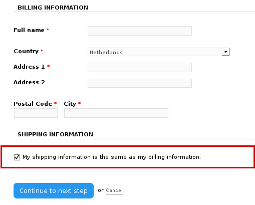
It’s all about presentation, so you should ask only the most crucial details that you need like: If you are using the form for feedback, then ask about their views and comments before asking their name or email id. Similarly, if it’s a checkout form, and you already have certain information about the user, then do not ask for those again, instead have them pre-filled on the form. For example, you can pre-populate the information in billing address from to auto-fill the delivery address form if both addresses are same.
2. Ambiguous or non-responsive label positioning-
Labels are used in the website forms to make it easy for the user to fill the information required. So ensure that labels are placed at a correct position that doesn’t confuse the user about what to fill in it. A proper label alignment is essentially required when you are designing a responsive form that serves to different screen sizes. Make sure that labels remain correctly aligned on all the screen sizes the form is being opened.
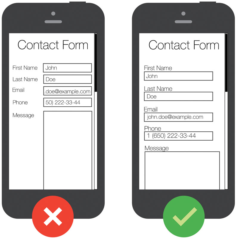

Users on mobile use zoom to clearly see the labels on the forms so that they fill the correct information. However, as shown in the image above if you keep the same alignment on both the desktop and mobile versions of the form, it will hide all the labels while clicking on the form in zoom mode. It will force the user to zoom out the form each time he moves to the next entry.
A better option for handle this would be to use two different alignments on desktop and mobile version of the form. Make the labels top-aligned on mobile versions and keep it right aligned on the desktop.
3. Replacing labels with placeholders-
With HTML 5, placeholders in text attribute were a valuable addition. They are effectively used to provide a brief hint about an expected value in the field.
Typically a placeholder remains visible until the user clicks in the field. As soon as the user clicks in the field to type something, the placeholder vanishes. The usage of placeholders in website form design is highly confused with that of labels. Many designers use these placeholders instead of labels to describe the input fields hoping to get a cleaner design. This is a big mistake that compromises with the user experience.
Let’s take a situation when user fills a lengthy form like a checkout form. After filling the form, he might want to review the details before he can submit the form. Now, if there is no label in the form, he will just get confused about the details he has filled in.
So, always use a label. Not using labels might be a space saver, but you will surprise to know how easily people forget what the label was once they fill the information in the field.
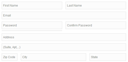
4. Using insufficient Spacing and distorted layout
Another big mistake we make in website form design is by placing too many elements on a single page. More are the number of elements on a single page more is the competition among them to draw attention.
The solution is to leave some breathing space between the elements by keeping white spaces. A proper flow for your users will be provided only when you keep ample spacing around the fields and different sections.
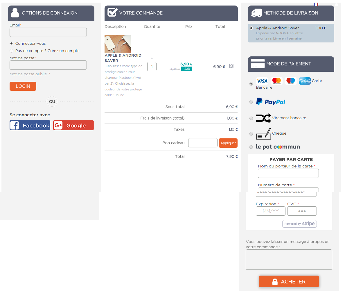
This single page checkout form shows how different sections can be segregated even if there are too many elements on a single page. The form uses section labels to separate different sections like Login Options, Billing Address, Confirm Order, Shipping Method, and Payment Method. Moreover, the three column layout makes the form even cleaner.
5. Uncertain error messages and input validations
While filling in the website forms, there are certain chances that users will commit some mistakes due to which form would not be submitted. Errors can occur by missing an entry, or filling an incorrect information etc. To tackle this website, designers use input validations that show the error message(s) while submitting the form. They use server side validations that generally waits for the server’s response to check the errors in the form. This is a bigger mistake that can even frustrate the user when they see an error message after submitting the form.
Instead, you can use user-side inline validation that tells on the spot if the user is filling an incorrect entry in a field. By doing so, users won’t miss if they have entered something wrong in a field.
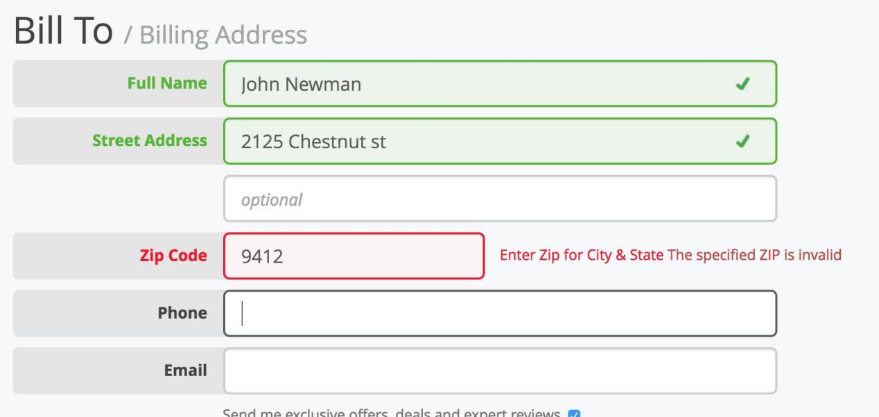
Moreover, do not use confusing statements in the validations messages. Just explain why the entry is wrong by describing how the correct entry would look like.
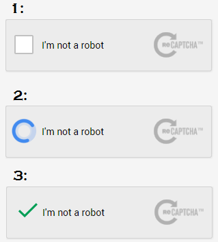
6. Using Captcha that are not designed for humans
Captchas are used by the websites to prevent spam attacks by distinguishing a bot from humans. These captchas are assumed to present a challenge that would be easy for humans while bots cannot pass them. For spam prevention, sometimes, designers become so desperate that they integrate the captchas that are challenging even for the humans.
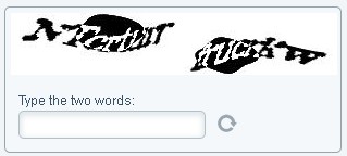
I understand the spam prevention is important, but captcha can be confusing and challenging for the users to decode them. You can use an alternate solution of so-called Google re-Captcha, which is a more advanced and simple version. The new Google re-Captcha just simply asks the user to click in a check box and verification is done without entering a difficult to see the text message.
Finally,
User experience improvement is a continuous process that can only be achieved with regular updates using the best methods available. I hope outlining these design mistakes will help you achieve that improvement by not committing these mistakes on any of the forms you use on your website.
Related Stories:
- 5 Site Elements that can Disappoint your E-Commerce Customers
- 5 surefire ways to gather email data on your online store
- 6 Checkout Page Mistakes that may be Killing your Conversions
- 6 Prompt Tips for Creating an Effective Promotion Campaign on Prestashop
- 6 Reasons you need a Magento Mobile App for your Fashion Store