
A checkout page is the only interface that actually brings the revenue for your business. It is a place where deals are closed and finally, sales are made in return for the payments done by the customers.
It’s really unfortunate to experience a bounce back from the checkout page, as it is the only page where users come when they are sure about finally buying from you. For any random reason, a set back from completing a checkout is not what you expect from your business. Here, in this article, I am putting forward 5 things that you probably did not know about eCommerce checkouts and maybe, that’s why you might have failed to engage the customers.
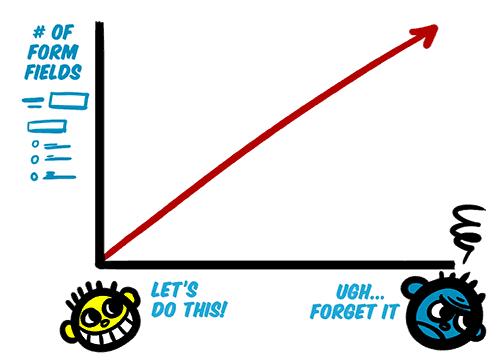
1. Customers hate lengthy checkouts-
21 % of customers would abandon a shopping cart because checkout takes too long to complete- Stastisia
The length of a checkout page is a relative term. Some of us might say, having a multi-page checkout is lengthy, while other might agree that checkout pages asking too many entries are lengthy. Both the scenarios have a ruthless contribution towards making a checkout process lengthy. The multi-page structure does the job by redirecting users from pages to pages to fill out all the checkout details.
Problem: Too many steps and too many details irritate the customers. They think of them as an obstacle that stops them from getting their desired product ASAP.
Just imagine you standing in a departmental store’s checkout line, but before cashier takes the cash, he/she asks you to fill a form. Now, a few questions is not a problem; a biodata would definitely irritate you.
Solution: To deal with the multiple page re-directs, you can switch to the single page checkout system. A good single page checkout system lets you accumulate the whole checkout steps on a single page. This heavy accumulation is, however, effectively organized by segregation so that the page remains clean and clutter free.
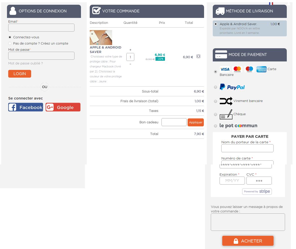
Moreover, you should ruthlessly minimize the amount of information you need. Ask only those details which are important. For a start, you can skip asking secondary email address, secondary phone number, ethnicity etc. You can read more for details on how to make your website-form design user-friendly.
2. Checkout on mobile devices is not same as on desktop-

The Greater number of articles and researches have been published on the subject of eCommerce checkout flow and UX optimization. However, there is currently quite a limited coverage on checkouts for mobile devices.
We often tend to do whatever we can do in our strength to make the checkout flow seamless. However, we hardly pay an attention to how the checkout flow will go if the user is buying on a mobile device. Just look at this statement from Google back in 2015:
According to Google, “more Google searches take place on mobile devices than on computers in 10 countries including the US and Japan”
Even Alibaba reported “more of their shoppers are purchasing on mobile than desktop”
Users today are using mobile devices more than desktop. Now, if you keep considering the checkout on mobile phones as same as on the desktop, it would not be wise on your part. With more and more customers using their mobile phones to shop online, checkout page optimization for mobile devices should be your first priority. To keep all those important conversions in your funnel, paying some extra attention to Responsive checkout, or Mobile app is a necessity today. Understanding of how an optimized mobile checkout looks like is very important here.
3. We have been forcing Guest checkouts-
For long we have been thinking about guest checkouts as an alternative to necessary account creation. For that reason alone eCommerce sites provide guest checkout options to all the users.
Guest checkout seems to be the obvious solution for new account fatigue, which does not asks customers to create an account or save any personal information to buy a product. However, guest checkout is not always a smart move for every eCommerce site. It actually results in more problems than it solves in few some cases.
- It makes very difficult to review, modify, or track orders
- Customers cannot re-order products using guest checkout
- It becomes difficult for store owners to manage the returns, exchange, or refunds
- Store owners won’t be able to follow up such customers
- Store owners cannot provide guided checkout experience (Information pre-population, auto-suggestion etc)
The common convention among various eCommerce store owners is that guest checkout boosts the conversion rates. Moreover, asking for account creation is presumed as a barrier to the checkout process. I do not disagree with the convention completely. However, it depends on the scenario and the kind of information you need.
For example, ASOS never included a guest checkout, but still, they experienced a 50 % reduction in cart abandonments just by a simple modification in the login screen. It was how the earlier login screen looked:
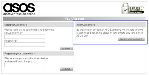
They did a small modification in the above page by simply adding a continue button for new customers.
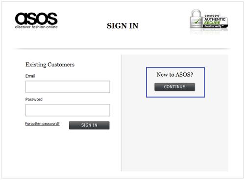
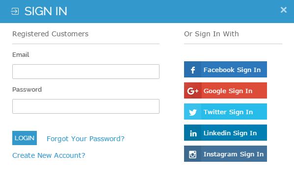
With the new modification, the users were not asked to create an account on the login page. They can now click on the continue button to proceed with the checkout process. However, it was wise addition which actually did not spare the customers from not having an account. They were asked to provide some information on the next page which was actually used for account creation. So customers still had to register.
The whole idea behind telling the story of ASOS is to explain how guest checkout is not always the only option and you can do a lot more with just simple tweaks in the process. So, the best way to decide whether you need the guest checkout or not is to consider the specific factors like, can your return manager process the guest orders, how much information do you need, how often customers repeat their purchase, and do you have a social login as another alternative to the guest checkout.
4. Social login at checkout page is a better alternative-
The above explanation on guest checkout has made it clear that a guest checkout is not always the best alternative. It brings me to our next point about the social login feature on eCommerce sites. We understand that sign-ups and user accounts are important for the website owners. Saved information in customer account can help boost eCommerce conversion rates up to a large extent.
With the same aim, social login on a checkout page provides easy choice for the users to create a user account that too without filling a registration form. It uses the information stored in social media accounts to automatically fetch the information required to create a user account on the site. So, if users do not want to create an account by themselves, a social login can do the same for them.
A social login for popular social media platforms like Google Plus, Facebook, and Twitter is a wise addition, plus a better alternative to the account registration and guest checkouts.
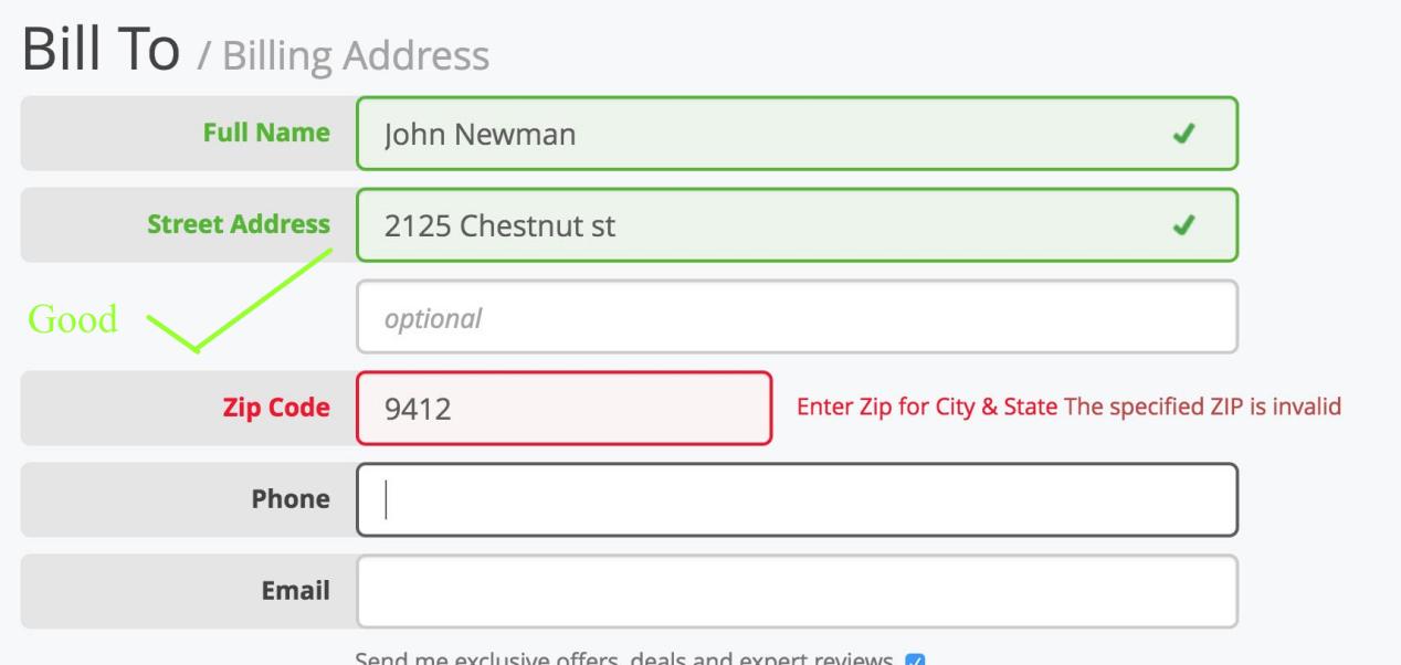
5. Customers hate it when they commit errors-
It’s very much frustrating when making a purchase to submit the form and trigger a validation error. That too with little, confusing, or not guidance on how to fix it.
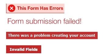
When such validations with no guidance appear, the thing that comes to a customer’s mind is “Ahhh! now, what did I do wrong”.
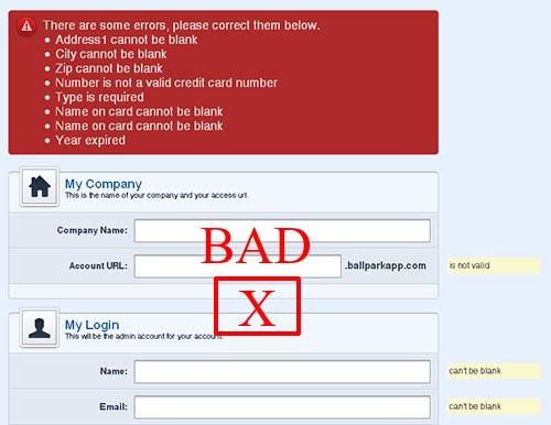
In an ideal situation, user fills the checkout form with necessary information and tend to finish the job ASAP by submitting the form. However, people often make mistakes in the form-filling, and that where form validation come into the picture. A good form validation language is courteous and clear about the message it carries. Things that most of us probably don’t know about the checkout page validations are:
- It will confuse the user if not shown in the correct place.
- It will confuse the user if not shown on the right time.
- It will confuse the user if not shown in the right color, and
- It will confuse the user if not showing the clear message.
With these four points in mind, a checkout page validation is a crucial element that can either break or make the checkout experience of the clients. So,
- Always use the inline validations in close proximity to the field that triggered it.
- Show instant validation rather than a showing on top of the page after form submission.
- Show the errors in Red color and correct validations in Green
- Write a clear message about the error and ways to fix it
Finally,
E-Commerce checkout is a broad subject and it is always in research by the experts. Innovations like single page checkout, Ajax shopping cart, Inline form validation, Social login etc. are all perfect examples of how eCommerce checkout is evolving day after day. There is a lot of information to talk about eCommerce checkouts. Certainly, next time when I write about it, I will get some more things and more advancements to write about the eCommerce checkouts.
Liked This? You’ll Like These Too