11 Checkout Page Strategies to Improve Conversion Rates

This is no secret that the checkout page of the site is one of the deciding factors that contributes to the customer’s purchase decision. Whether it is the checkout page or the payment options, there are a lot of reasons that can hamper your conversion rate. If you take a closer look at a customer’s behavior, you’d find that the majority of them select the product from the site and add them to the cart. It is then in the last step where they have to add in their details and make the payment where they bounce off the page. No e-merchant wants to lose a customer at the end of the entire procedure. Conversion Rate Optimization is a technique that lets you observe the behavior of the customer and modify the checkout page so that maximum number of them convert.

Looking at the conversions, this blog will detail you about 11 such checkout page strategies that will help you improve the conversion rate of your online store.

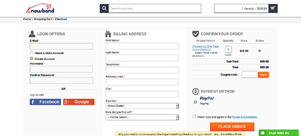
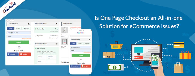
One Page Checkout
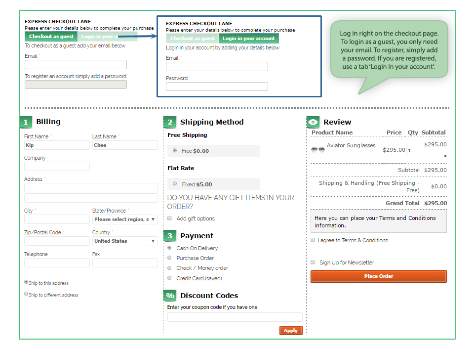
With advantages and disadvantages of both one page checkout as well as multi-page checkout, you should be focusing on simple checkout process that lets your customer feel good and saves their time as well. In fact, quick checkout is one way that does not give your customer to think a lot about their purchase and that’s where they hit the payment buttons. Keep everything short and crisp with minimal information being typed in, it is the drop-down menus that work quite well. For example, when you ask for the zip code, the rest of the details can be generated within that area and all that the customer has to do is – select from the drop downs.

Probably this is the first thing that makes a visitor or customer stay on the checkout page. From the CTA buttons properly placed on the top as well as on the bottom of the page to a streamlined page that has everything properly clustered, everything can be counted in order to make the page visually appealing. Some of the factors that come with the appearance of the checkout page include:

Security seals- if you want your customer to know that you’re trustworthy, you should incorporate security seals like VeriSign and TRUSTe. After all, nobody wants to let their money and efforts go down the drain.

Appropriate colors of the buttons- this might be an old practice to differentiate the color of the Call to Action (CTA) from the entire page but it still works. Let them decipher which button takes them to the next step.

Don’t be pushy for account creation

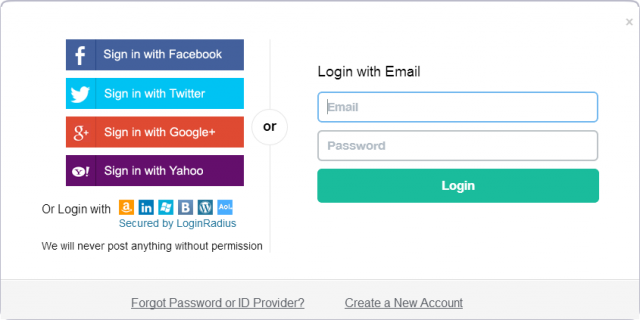
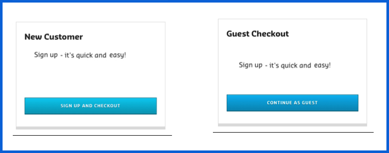
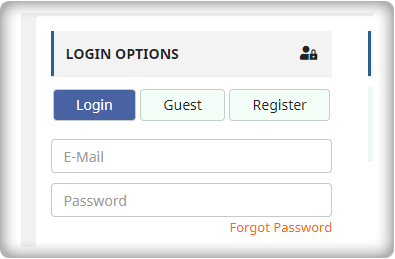
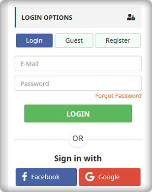
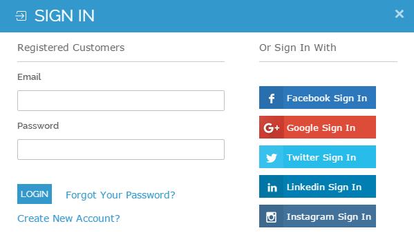
When you force your customer to become a customer by registering on the store, it might just annoy them. You can gather the details by also by asking them to login/sign up for their social media accounts. Every person has a Facebook or Google account which can be used as the login details. You can pick all the details from there and this won’t even look pushy from your side. Moreover, you can also keep an option of “Checkout as a Guest” on the page. This one scores more points than the other one.

Give an option to “Shop more” or “Continue Shopping” on the same page. Some customers are new to online shopping and land up on the checkout page once they add something to the cart whereas; they want to add more things at the same time. So, make sure you give an option to them that lets them go back to the landing page and pick everything that they wanted to one after the other. When the accessibility of the different pages at the store is within reach, a customer will surely convert.

Include proper links to the different pages

Another way of making your store come across as an accessible one, you can include important links on the checkout page. Some of them include the links to the FAQs, Shipping policies, privacy and refund policy pages to enable users to refer to them if they have any doubts. The option chatbots or the help box is an ideal option. It helps the customers when they get stuck or are in need of help.

Insert the option of printing the order summary after the transaction is done
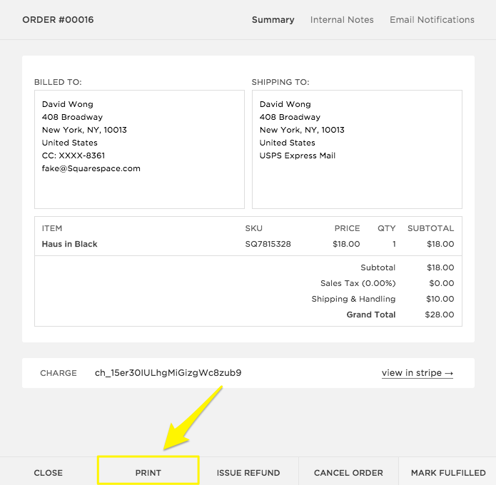
Once the customer converts and makes a purchase from your store, your job does not finish there. There are times when they want a copy of the transaction made in order to get it reimbursed or show it someone else. For those times, there should always be an option for them to print a copy of their purchase from the store. The percentage of such sales may be small but incorporating this feature will help you convert a variety of customers.

Recommendations should have their space

Showing the recommended products in the footer is an excellent strategy to increase sales. Just like Amazon gives a series of options that “customers bought these together” and other recommendations, you too should be doing something like this. When you insert the suggested products on the same page, there are chances that the customer picks both of them or more products on the go.

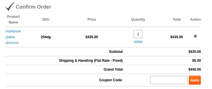
Avoid hidden charges

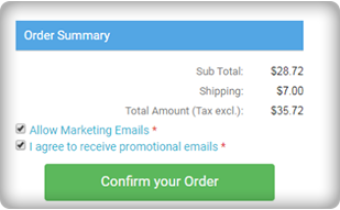
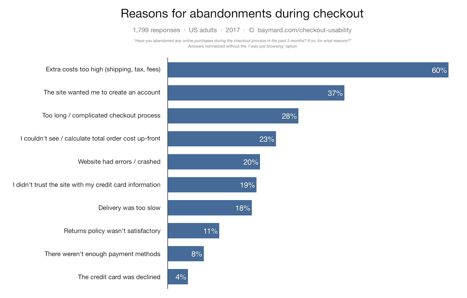
You know what leads to abandoned carts? Hidden charges do. One of the biggest reasons because of which you find your customers leaving the site is the surprise charges that make the entire a lot more than the shopper expected. Avoid such practices and give a heads up to the shopper about the money that’s included so that they’re prepared to pay that much. Clearly show your shipping, handling charges and tax fee. Nobody likes surprise additions in the charges for sure.

Give Users the Option to Update Quantity
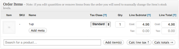
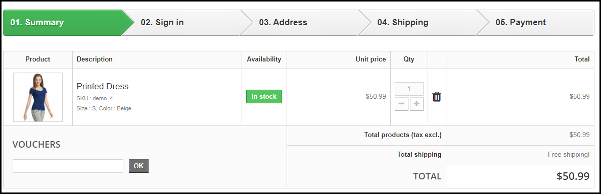
Allow users to add or remove cart items right on checkout page so that they don’t have to go back to do so. Making them go back to update their cart can possibly result in them leaving the process altogether. On the checkout page, make sure you still give an option to change the quantity of the product that your customer is going to buy. There are times when they later (of the shopping stage) feel that “this should be bought more” or “I should buy less of this” and that’s where the carts are abandoned because they have to go all the way back to the product page and make the changes. Hence, let them change it there.

Have a video

Videos are a great way to engage the customers and give them a better understanding of products that are a little complex. Incorporating a video of the products is a great way to increase the chances of conversion because a better understanding of the product creates a sense of credibility about your site and thus, leads to conversion.

Offer Free Shipping
If it is within your reach and doesn’t hamper your profits, offer free shipping. If you charge about $10 for an amount of $30, the conversions will be extremely low because who would want to spend an extra of $10 on such a small purchase? Free shipping is like Abra Kadabra for your conversions.
This is definitely not the end, but these are some of the most important ones. As you keep a track of the activities through A/B testing or using Heatmap tools, you’d be able to make changes according to the behavior of your customer.

Related Stories:

What eCommerce can learn from brick and mortar?

The online sales account for 8-10% of the total consumer spending. This figure is expected to shoot up to a massive amount of $6.7 trillion by 2020. The incredible statistics show the potential the virtual shops have in the future. Despite the growing awareness and the technological advancement of the consumers, the market share for the eCommerce companies is currently low. This is because, there are a lot of aspects in which the physical still has a upper hand.

In addition, over the past few years the eCommerce stores has given fresh competition to brick and mortar stores. Yet there are a lot of things that the online store can learn from physical shops. Listed below are some of the things that eCommerce can learn from brick and mortal. Scan on to know.

Focus on visual merchandising

Every purchase intention starts with window shopping. The products kept at the window might motivate the visitors to go inside and explore the store. The same goes true for the online shopping stores as well. A well-designed layout and front-end might attract the customers. Even if the store is digital, a neat and uncluttered interface can influence the customers to further browse the site.

Here are some of the takeaways from the brick and mortar store in this regards.

  • The visual appeal is the first thing that grabs the attention of the visitors. So, the product images with high resolution is a must. The graphical triggers should be able to grab the attention of the visitors.
  • The product description should be informative enough to fill-in for the sales person.
  • The seasonal influence is one of the ways to standout in the crowd. The layout of the website should be in accordance to the occasion.
  • The call-to-actions and other such buttons should be clearly visible and should motivate the customer purchase in.

Instant presence is a must

It is not just the visual branding that’s important. One of the trend that has seen a change in recent past is the customer buying behavior. While earlier the shoppers would rely on the word-of-mouth, the customers these days tend to make their purchases then and there. This has compelled the physical stores to open up their outlets at every nook-and-corner. This implies to the online shopping sites as well. As per a report, 54% of the American shopper would use their mobile devices to make their purchases. The eCommerce store owners need to bring their sites in the pockets of the customers. A mobile responsive website may be handy, but a mobile store can help you tap a larger audience. The mobile app builder for Android and iOS is one of the ways to convert your store into a mobile app. Offers your services to the customers whenever they require. Moreover, the location-based services is another factor that the online companies need to learn from the physical stores. Even the location-based mobile searches are on the rise. The content of your mobile app should be optimized in order to provide the answers to the questions being asked by the customers. The search volume of the queries such as ‘Where can I find…’ are high. So, optimize your site and application accordingly.

Personalize the shopping experience

The eCommerce giants such as Amazon has reaped result by including this aspect. Personalize the shopping experience of the customers and help them relate to the services offered by you. This is what the sales pitch at any shop is all about. In fact, 85% of the consumers think that personalization play a vital role in their purchase decision. Use the personal information of the customers to enhance their shopping experience. The online shoppers get distracted soon and never actually completes the transaction. Use their transaction history to send them personalize pitches. For instance, messages like ‘Get 10% off on this product in your cart’ can trigger the purchase intention of the buyers.

Let them bargain

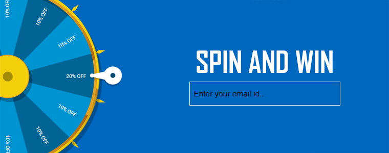
Hitting the bargain is the most intriguing factor for the shoppers while shopping offline. It won’t be wrong to state that the a discount coupon of 10-20% is usually taken for granted and may even be ignored. However, if the same discount will be well-appreciated if the customers get a feel of striking a deal. Offer the giveaways in an innovative way. The interactive pop-ups like spin and win or scratch coupons can help you tap this psychology of the shoppers.

Recreate the in-store feel

The biggest drawback of the online stores is that they lack the touch and feel of the products. While earlier bridging this gap was slightly difficult, with the technological advancements, this can now be done. LensCart is one of the best examples for the same. The option to try the glasses without actually trying them has provided them the competitive edge. Other than the product images, the product videos can provide a better clarity to the customers. Quick product delivery is another important aspect that eCommerce companies need to learn from brick and mortar stores. Providing options like one-day delivery and quick shipping options can enhance the user experience.

Guide the customers to the checkout page

Who would like to stand in long queues? The organized sections and multiple counters at the physical stores are aimed at driving the customers to the conversion funnel. The same funnel is to be followed by online shops as well. Make sure that your category pages are uncluttered and well-organized. Easy navigation coupled with filters should allow the customers to find their product easily. Instead of making the customers to fumble upon the lengthy sign-up process, improve the registrations with social media sign-up. The path from the product page to the payment gateway should be simple as well. One page checkout is the best way to motivate the customers to complete the transaction.

Wrap up

From personalized marketing to discount sale, traditional retailers have many options to spur their business growth. Even the e-retailers have a lot of tactics at their disposal to reduce abandoned cart and boost the conversions. Just a bit of learning from the conventional business models coupled with the advanced technology can help you take your eCommerce business to new heights.

4 Ways One Page Checkout can Help Optimize the eCommerce Store

One of the main objective of any store owner is to provide the customers with a better shopping experience. The eCommerce companies need to provide better connectivity to the customers with the web store. At the same time, in order to get a better and a larger traffic on the web store, a flawless transaction needs to be ensured. The online shoppers prefers to make purchases only if the web store offers easy approach and with minimal efforts.

One of the feature which enhances the user experience of the web store is One page checkout. The one page checkout functionality can be added to a Prestashop site with the help of Prestashop one page super checkout addon. The same extension is available for Magento, Opencart and other eCommerce platforms as well. The one page checkout extension enables the customers to complete their transaction and make the product purchase under the same page. The one step checkout is one of the best feature for reducing the exit rate at the checkout page. The customers are annoyed if they are redirected to lengthy checkout process in order to complete the purchasing. Thus, one page checkout makes sure that the customers can complete the purchase by filing up all the necessary details in one single page and provides the customers with easy approach to complete the purchase.

Let us discuss some ways in which super page checkout can help in optimizing the eCommerce stores.

1.  Better approach

The one step checkout is an easier approach provided to the customers to complete the transactions. The customers doesn’t have to be redirected to different pages in order to make purchase. The customers will like the idea of one page checkout as it reduces the time and effort consumed in reloading the web pages. The one page checkout even ensures the seller that they are able to enhance the much-needed the user experience, especially when they are a step away from making the payment.

2.  Convincing

The idea of using super page checkout is more convincing than the traditional idea where the customers has to be jumped from page to page filling out all the details. By using one step checkout module the seller can help the customer to make purchase and complete the process and save some healthy amount of their time and efforts. A better and convincing approach which helps the seller to directly interact with the customers and compel them to complete the transaction. The one page checkout helps in boosting the sales and generate immediate conversions.

3.  Time saving

The whole idea of shopping online is to save their time on transaction. About 1 in every 3 transactions gets canceled by the customers due to the time consumed during checkout. Hence, the stores must make sure that the customers doesn’t have to send a lot of time while trying to complete the transaction process. The one step checkout helps the customer in saving the time, while the seller can generate better sales and at the same time the rate of conversions are increased significantly.

4.  Instant purchase

One of the best feature provided by the super page checkout is instant purchase. Mostly a regular customer would store the necessary details of all the payment methods he chose. Thus, the store has already access to basic information of the customer’s account. Thus, all that customer needs to do is enter the security code and PIN number to complete the payment. The one step checkout encourages the idea of instant purchase.

Conclusion

The process of purchasing becomes little tough for the customers at many occasions. Thus, the web stores must always come up with better and innovative options to make the purchase of the customer easy and simple. Therefore, using different modules help ensures easy checkout and flawless transaction. The one page checkout helps in making it easy for the customers and at the same time enables the seller to boost the sales.

For more Information About Prestashop One Page Supercheckout module visit here:-

Module Link: https://www.knowband.com/prestashop-one-page-supercheckout

Youtube Link: https://www.youtube.com/watch?v=1yLcXToR6-g

User Manual Link: https://www.knowband.com/blog/user-manual/prestashop-one-page-supercheckout/

Related Stories:

5 Quickfire Prestashop Addons that can Boost your Conversions

E-commerce merchants crave for conversions, but conversions do not happen automatically. It requires your time, efforts and a well-structured strategy. If you are a Prestashop store owner and looking for some helpful addons to boost your conversions, you can try out the Prestashop addons that are listed below.

1. Spin and win popup module

The traditional approach of asking for visitor’s email addresses by offering them some deals and discounts doesn’t work any longer. This is why e-retailers come up with new ideas every now and then to increase customer engagement. And why shouldn’t they? Customer engagement is an important factor to drive more conversions.

Spin and Win popup is the recent approach followed by merchants to engage customers. The motive behind this is to provide a gamifying experience to users, make them earn some discount by spinning the wheel and capture their email addresses when they claim the deal. Prestashop Spin and Win pop-up addon is a 3-in-1 popup (Entry, Exit, and Email subscription popup) that focuses on engaging your users in a fun activity. When visitors enter your store, they are asked to spin the wheel to win some amazing discounts on your store. Curious to win discounts, users spin the wheel and provide their email addresses to claim the offer. This way, you get their email addresses which can prove to be very useful for your email marketing campaigns. You can display the spin and win popup even at the time when a visitor is attempting to take an exit from your store.

2. FB wall post

The introduction of Social media has made marketing much easier than before. E-retailers are utilizing the advantages of major social media platforms to boost up their business, where Facebook is on the top list.

Prestashop FB Wall Post addon is one such way for you to increase your e-commerce conversions. The FB wall post module helps in generating automatic wall posts as well as manual wall posts based upon the seller’s convenience. One of the very advantages of this module is that it enables the merchant to make the customers aware of the new products arrival. Moreover, you can select the category and the brands that you wish to display on the wall post.

3. Social loginizer

Imagine how frustrating it would be for a user if they have to go through a lengthy registration process every time they visit a new eCommerce website. The registration process is the door to enter the store. Would you like to make your users wait or get them inside as quickly as possible? The latter would arguably the most obvious answer. This is what the social login option does. It allows users to sign in directly with their social accounts such as through Facebook, Google, Twitter, etc.

Prestashop Social loginizer addon offers 15 log in options to visitors The Social login saves the time in filling up the lengthy registration forms. Social loginizer allows the store merchants to place the easy social login facility on various pages such as Home Page, Category Page, Product Page, Checkout page, etc. The availability of social login makes you gather your user’s data easily and you can get more insights into your customers like their age, location, gender, etc. This helps in target marketing. Social loginizer can be very effective in increasing your eCommerce conversions.

One page checkout


The checkout page of your eCommerce store decides whether the visitor would convert into a customer or not. It either leads to increased conversions or increased abandoned cart. A complicated checkout process is one of the major reasons for customer dissatisfaction that leads to cart abandonment. Customers find it tiring to provide their details on a number of pages. As a result, they just hit the exit button and leave your store. In order to overcome this problem, e-retailers are following the one-page checkout process that puts up all the checkout related fields on a single page.

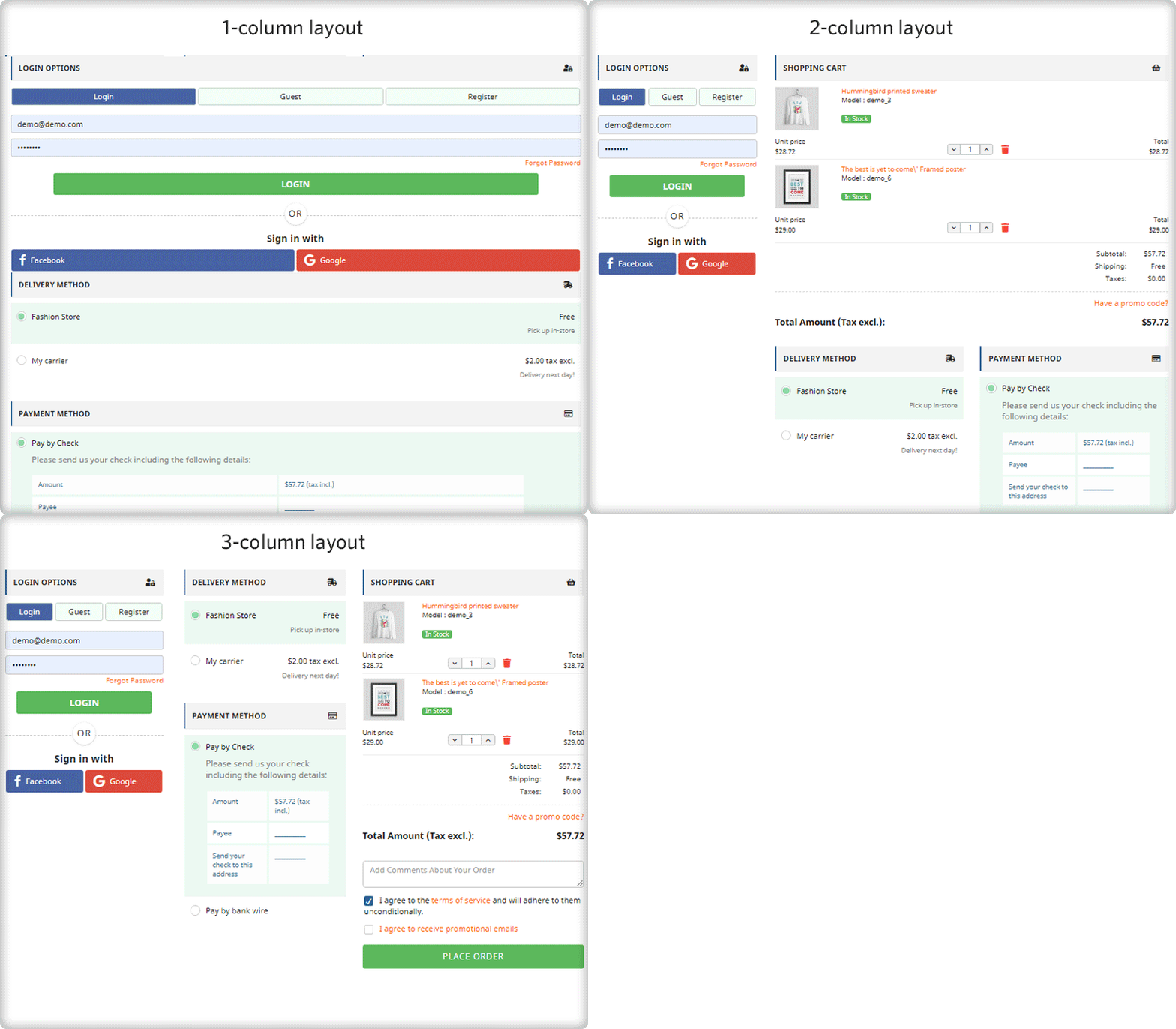
Prestashop one page super checkout focuses on providing a better checkout experience to your customers. It offers a social login option (Facebook login, Google login and PayPal login) to your users along with a guest checkout option. As a store merchant, you can offer multiple shipping and payment methods to reduce the possibilities of cart abandonment. Apart from that, you can choose multiple layout designs of your checkout page

5. FB store

The growing popularity of Facebook has led brands to promote their products on the largest social media platform today. With over 2.38 billion active monthly users, it has become a major platform for online businesses to market their products and earn more revenue. If you haven’t marked your brand’s presence on Facebook, you are seriously missing out on a great opportunity to gain more conversions.

Many brands have opened their Facebook stores to drive more sales. If you haven’t opened a facebook shop yet, open it today. It is a must if you are thinking to take your business to a large scale.

Prestashop FB Store module is a good approach to gain higher traffic and increase user engagement on your prestashop store. It helps you integrate your Facebook page to your Prestashop store and provides you various options to customize your Facebook shop. It increases your product visibility and makes you reach out your products in front of a wide facebook audience.

Conclusion

Expecting your conversion funnel to go up rapidly would be unwise. It takes the right tactics and the right approach to get more conversions. Take your time, brainstorm new ideas and come up with some amazing ways to improve your conversion rate. Above all, keep the user experience the topmost priority.

If you found these 5 Prestashop addons helpful to boost your conversions, do let us know by leaving a comment below.

You Might Also Like:

8 Checkout Page Mistakes that may be killing your eCommerce Conversions

The checkout page is the conversion deciding factor for any eCommerce website. If you are driving a good amount of traffic on your store but the conversions are hitting very low, there are probably some flaws in your checkout page.

Though checkout is not the only barrier (there can be some other factors as well such as the website UX), it is the most vital element among other elements on your eCommerce website.

A huge difference can be made in eCommerce conversions if online businesses rectify their checkout page mistakes. In this article, I have listed out 8 checkout page mistakes that may be killing your eCommerce conversions, along with their solutions.

Mistake 1 : No Guest Checkout option

Mandatory registration on the checkout page adds to the topmost reasons for shopping cart abandonment. Online shoppers feel annoyed when presented with a sign-up form during the checkout process.

Forcing visitors to create an account only increases the number of fields to be covered before making the payment. Some of the eCommerce stores even ask users to verify their account, leading to a troublesome checkout experience.

This can be avoided by offering the Guest Checkout facility. Guest Checkout allows users to get rid of the registration process and helps them make a quick checkout, enhancing your conversion rate.

Mistake 2: Not offering Social Login

Almost every eCommerce website today provides users with the facility to sign in using their social media accounts. Not having the social login option on the checkout page can affect your eCommerce conversions.

Providing the social login option eases up the registration task (single-click registration), maintains the checkout flow and allows users to get rid of remembering the password.

Most people remain logged in on their Facebook or Instagram. Hence, a social login option reduces the extra efforts put during the sign-up process by allowing users to sign-up with their existing social information.

Related:

10 Benefits of Social Login in eCommerce

Social Login Best Practices

Try out Knowband’s Social loginizer module that provides you with up to 15 social login options to implement on your eCommerce website. Check out:

Magento Social loginizer, Magento 2 Social loginizer, PrestaShop Social Loginizer, OpenCart Social Loginizer.

Mistake 3:  Not using the Progress Bar on the Checkout Page

Shoppers might give up the purchase idea if they are unaware of the number of checkout steps involved in the checkout process.

It is important to display which stage a customer is at present when they are on the track of completing their purchase. Showing the progress of the checkout puts up a clear picture in front of the user regarding how many fields they have covered and how many more they would have to go through before they could finally place their order.

Mistake 4: No Trust Factor

With too many online frauds taking place nowadays, online shoppers do not put their trust on a website so easily while making the payment. No matter how amazing your website looks, if customers feel a trust issue, they won’t make the payment. As simple as that.

To build customer’s trust, show off the security badges on the checkout page, and make customers feel relaxed. Add an additional security layer by making your website SSL certified.

Mistake 5:  Not having a Proper Return Policy

Online shoppers do have concerns regarding the products they purchase. There is always a doubt regarding a defective or an incorrect order getting delivered. And customers want to ensure what would happen in such cases.

This is where your return policy plays its part. If it is not satisfying enough from the customer’s point of view, they will not proceed further in their checkout.

Pay attention to your return policy and make sure they encourage users to make a purchase.

Related: 6 Pieces of Advice for an Effective eCommerce Return Policy

Mistake 6:  Not providing Multiple Payment Options

If you are still stuck with Credit Card and Debit Card only, you are surely missing out on huge eCommerce conversions. Limited payment options would not help you in the long run. Online shoppers look for varieties, be it for products or for the payment methods.

With digital wallets in trend, it would be wise to implement the major e-wallets in your store. It would provide your customers with a number of payment options to choose from and help them choose the preferred payment option while making the payment.

Mistake 7:  Not having a User-Friendly Checkout

A lengthy and complicated checkout process involving unnecessary fields adds to the frustration among online shoppers which is followed by cart abandonment.

It is, therefore, crucial to optimize your checkout page and make it user-friendly. One of the ways to do so is by upgrading your multi-step checkout to a one page checkout. A single page checkout puts all the checkout fields at one place.

Related: One Page Checkout vs Multi-Page Checkout

Knowband’s One Page Checkout is amongst our highest-selling modules that lets you simplify your checkout page and grab more eCommerce conversions. Check out this module for various eCommerce platforms-

PrestaShop One Page Checkout

OpenCart One Page Checkout

Magento One Page Checkout

Magento 2 One Page Checkout.

Mistake 8:  Checkout Page is not Mobile-Friendly

The majority of online shoppers these days browse a website through handheld devices. This is the reason why mobile apps are gaining huge popularity. However, with limited storage space, people avoid installing a lot of apps.

For shoppers using mobile devices to make a purchase, it is important to make the checkout page mobile responsive. For your information, around 1.6 billion people use mobile devices to shop online globally, says a report by Invesp. So you can imagine the impact it can have on your conversions.

Make sure that the checkout process works as conveniently on a mobile device as it does on the desktop.

Final Word

Put your feet in your customer’s shoes and think what could be the possible areas for improvement on your checkout page. Are you feeling satisfied? Is it hampering your checkout experience? If so, work on those factors to simplify the checkout experience of online shoppers.

Keep an eye on these 8 checkout page mistakes that could possibly kill your eCommerce conversions.

Found this useful? Drop your comments below.

Also, give a read to:

7 Useful Tips for a User-Friendly Checkout

How to Simplify the Online Shopping Experience of Customers?

One-page Checkout for eCommerce Stores, Is It a One Stop Solution for All Your Issues?

Here at Knowband, we get questions from all our clients looking to boost their checkout conversion rate, if they should switch to a one-page checkout?

Their aim with the question is simple; they want to get more check-out page conversions, fewer cart abandonment, and more sales. We respond by always saying this, “It depends”. It sometimes comes as a surprise to most customers to hear this reply. As we are selling a one-page checkout Extension, and still not pitching a sale to them. Maybe they expect an answer like “Yes, it is the best. You should use our one-page checkout”.

I wish it was this easy. We don’t pitch our solution with a blindfold, instead, we recommend them something that will help them understand if their issue can be solved by simply installing the one-page checkout module. Let’s just take a pause and inspect some pros and cons of one-step checkout and then decide, whether a one-page checkout is simply an all-in-one solution for all your issues?

The misunderstood part of the one-page checkout solution

This is a common misconception among the eCommerce store owners that the one-page checkout is one medicine to all the check-out-related cart abandonment issues. It’s really understandable. The Fewer steps a customer has to go through easier it will be for him to complete the process and checkout bounce backs will reduce.

However, that’s not always the exact case. The implementation of one-page checkout is definitely appealing, but it does not mean it is the solution to all your issues. Truth to be told, one-page checkouts have their own set of problems that should be addressed to make them more organized and informed for the customers. Simply, a one-page checkout solution can make your store, but can also break it with some negative impacts if you don’t know the correct way to implement it.

For the customers who inquire about our one-page checkout, often time we come to hear that they read some article or attended some event where they told it is better. Most likely these customers did not pry into their existing multi-step checkout process and neglect the mistakes they are already doing with their checkout. So, even if they go for a one-page checkout, they are more likely to repeat those same mistakes, and then blame the checkout solution for the breakdown.

Consider these factors before deciding your checkout page:

So, Which one should you consider, One-Page Checkout or Multi-Page Checkout?  An honest reply would be both. A one-page checkout can be really effective in the right conditions and with proper implementation. You need to make sure that it addresses the common issues of a one-page checkout and has handled them effectively.

The right conditions for deciding the right checkout process for your business can depend on the aspects like:

  • Niche
  • Customers
  • Price point
  • Product Type
  • Pain Points and
  • Solutions

For instance, if you are selling luxury items that already receive fewer sales due to the high price point, and you have a loyal base of old customers, then a multi-page checkout is a better choice here. It will guide the users through the checkout process and will convert better.

On the other hand, if you sell non-expensive items where there are more sales and you are also offering free shipping options, then a one-page checkout solution would be more effective here. It will be quick, give a faster way to review the products in the cart, show the free shipping option right away, and allow the shopper to make the payment straight on the same page.

Perform A/B testing for the best checkout page solution

These are just the example of two simple cases. However, the best way to know which option works best for you is to test, analyze, test, and iterate. A/B testing can be really helpful where you can test both the types of checkout (i.e. one-page checkout and multi-step checkout) at the same time and see which one pleases your customers better.

Be cautious while testing, because here you’ll be pitting the best against the best. You wouldn’t get the right results if you compared a well-optimized one-page checkout to a cluttered and unorganized multi-step checkout. So, always test an apple with another apple.

A simple recommendation would be to first optimize the current multi-page checkout as far as possible. Once, you have fully optimized the multi-step checkout, then compare it with a well-optimized checkout by testing them. It will give a fair chance to your multi-page checkout, or else, the one-page checkout solution will always overshadow it.

One-page checkouts still have some benefits by default

  • The one-page checkout is quick since everything is on a single page.
  • There are only a few steps for customers to complete on a one-page checkout solution.
  • Well-optimized checkouts provide the cart review option on the same page.
  • Shipping option selection is available on the same page in the one-page checkout module.
  • The one-page checkout offers payment options on the same page.
  • Some advanced checkouts offer social login options as well.

Features to look for while selecting a One-Page Checkout Solution

Optimization is one such thing that differentiates a checkout Page from another checkout solution. Whether you are talking about a multi-step checkout or a one-page checkout, it has to be well optimized.  You won’t be able to solve all of the problems with the checkout page by simply consolidating it onto a single page; you’ll still need to optimize it for cart abandonment issues.

A true one-page checkout developed to curb the checkout page abandonments must address the issues like these:

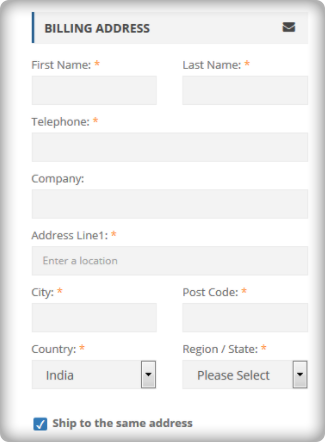
Length- The length of the checkout process does not merely depend on the number of pages, but the number of details a customer has to fill in to complete it. Make sure your one-page checkout does not ask the customers to fill in unnecessary and redundant details. You can segregate the mandatory and optional fields.

For example, you can reduce the billing or shipping address form size by removing the unnecessary fields like fax number, anyone from the phone or mobile number, etc.

Cart review and update- What most of the one-page checkout solutions miss is the option for the customers to review their cart and update the product quantity from the checkout page. However, there are Advanced one-page checkout solutions that do provide the cart review and update options. So make sure, your one-step checkout does provide this feature.

Guest checkout: Guest checkout is an important feature. On both the checkouts(i.e. one step checkout or multi-page checkout), if you miss providing a guest checkout option, then you may lose some business. So, make sure whichever checkout option you choose, you should offer the guest checkout.

Social Login: Social login option is more of a competitive advantage than an optimization. If you are not asking your customers to necessarily create an account and offering guest checkout, it’s optimization. However, if you are allowing them to sign up or log in with their Facebook or Google Account, it’s a competitive advantage. Our  PrestaShop one-page checkout offers social login through Facebook and Google to help you gain the most out of your checkout process.

Clutter-free design: What haunts most of the merchants while switching to one-page checkout is the design issue. A one-page checkout in-housing the whole checkout process on a single page is more likely to look congested and cluttered. Therefore, you must ensure that your checkout page does not only fits with your theme design but should also have enough white-spaces to segregate each element and section. For example, it would not be a nice look if the shipping section overlaps the payment section or any other section of the page.

We have tried our best

We have tried our best to optimize our one-page checkout modules for Magento, OpenCart, and PrestaShop in the best possible way. We have included all the options that have been mentioned in the previous point. Moreover, we have also tried it to have the best possible clutter-free design.

Check out how we eliminated all the one-page checkout-specific issues in our checkout modules.

We don’t say a one-page checkout is a one-stop solution to all your checkout page issues. However, a well-optimized one-step checkout can always provide an upper hand. Optimize your multi-step checkout to the best possible extent and then test it with the one-page checkout solution, the results will ensure you have the best checkout, no matter it’s one page or multi-page. Always choose the best for your brand.

Liked This? You’ll Like These Too

How we eliminated 3 crucial design drawbacks of a One-Page Checkout in our extension?

Updated on 31-Jan-2018 

One page checkout has been in the debate for a very long time now. The whole idea of simplified checkout revolves around the optimizing the shopping experience of the store visitor. The shopping site will lead to conversions only when the customers are able to complete their transaction effortlessly.

How can one page checkout optimize your site?

The online shoppers prefer to make purchases only if the web store offers easy to approach and with minimal efforts. Here are some of the ways in which the this feature can optimize the shopping site and enhance the user experience.

  • Most of the e-marketers advocate the incorporation of a single-page checkout as it is an easier approach for the customers to complete their transactions. The online shoppers prefer going with the idea of single page checkout as it reduces the time consumed in reloading the web pages.
  • The idea of using super page checkout is more convincing than the traditional idea where the customers have to be jumped from page to page filling out all the details. The e-sellers can help the customer complete their transaction with minimal effort. Even though the number of fields remains almost the same, the shoppers can view the length of the form left to be filled. This provides them a psychological motivation to complete the transaction.

There are dozens of articles on the topics like “Should you choose a one-page checkout?” “Pros and Cons of One Page Checkout” and so one. Most of these articles effectively address the drawbacks, but it seems like we have been promoting these drawbacks like they are there forever and cannot be taken down anyhow.

Let’s face the truth, every new introduction has some cons for sure. Gradually, with the development and research, these cons fade away for sure.

In this blog, I am going to address 3 such cons of a one-page checkout which we eliminated from our Magento one page checkout extension and also the PrestaShop One page checkout module. Most of these cons were never there in our checkout extension, as we took care of them while in the development and testing phase itself.

One page checkout fixed drawbacks

1. So much of details on a single page? It will be congested

Most of the checkout pages, when introduced in the past, had this problem. It was really a massive task to adjust everything from a multi-page checkout on a single page.

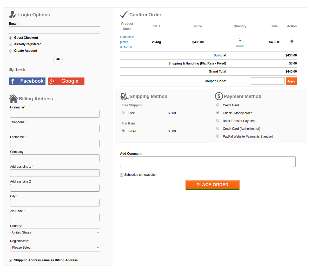
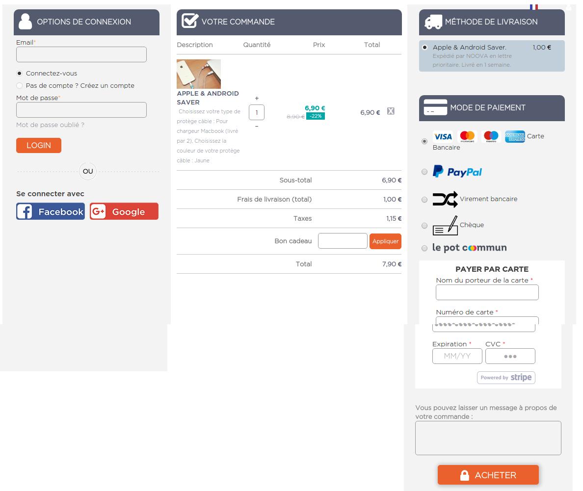
The most problematic challenge was to fit all those checkout elements on a single page and it should provide a full view of the whole checkout page as well. Moreover, all the checkout elements like login, delivery address form, billing address form, payment options, shipping options, and cart review should not overlap with each other, and neither they should overlap on themselves.  A lot of HTML, CSS, JavaScript, and Ajax were needed to be handled to keep the design all fine with the default as well as the third party Magento themes. But we intended to keep them as lesser as possible for faster page loading.

This is what we came up with:

A lot of HTML, CSS, JS, and Ajax were tweaked by our designers to fit all the elements neatly and clearly on a single page and also to keep the page loading time optimal. Moreover, thanks to our designers, after all these, there was sufficient space left to add the Social login option using Facebook and Google+ on our checkout page.

2. The form on the page are congested with no white-spaces and proper label usage

While designing the forms, the main aspects that we were looking for were:

  • Keeping the forms compact
  • All the necessary fields should be there
  • Fields should have proper white-spaces
  • Labels should not confuse the users
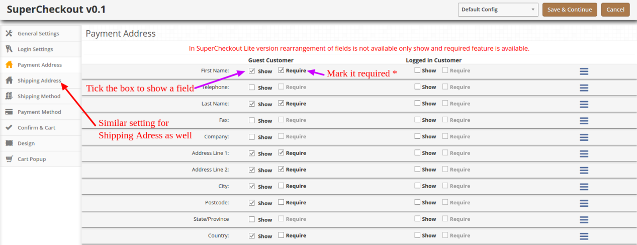
  • Admin should be able to choose which form field he wants to show on the page to customers.

Labels

Labels were coming out as a major concern here. If we would keep the labels by the side of the respective fields, the horizontal length of the form would give a very less space for the other sections on the page.

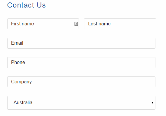
We also thought about a form design where we would skip the labels and use Placeholders in place of them. Something like this:

But, there was a problem in that. For considerably long forms like Billing and Address forms, if customer once filled the detail, and the later stage if he would want to re-check them, he would get confused about what actually are these details. Since the placeholder vanishes away as you type in, and there is no label as well, there always remains a confusion if my details are right or wrong.

We didn’t want your customers to get into such confusion and forget the main goal of making a purchase, that’s why we drop the idea. Otherwise, it could have saved a lot of space as well.

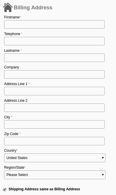
Finally, we decided to not to compromise with the user experience anyhow and we adopted the label placement above the fields as shown in this image:

It saved the horizontal space that we needed for other elements and also helped in one another feature which has been discussed below.

The necessary fields

After dealing with the label placement, the last thing in the forms that gave us a nightmare was to include every necessary field in the form. Problem is, the term necessary is quite relative here. A form field which is necessary for one store owner might be of no use to the other.

For example, the VAT number, and Company Name is a necessary field of a store owner who has a B2B selling business. All of your European business clients would also need this field for making the purchases on your store. On the other hand, a store owner who directly sells to the individual consumers would have no use of the fields like VAT Number and Company Name.

How we handled it?

It was a time to open our checkout extension a bit and give the store owners some easy yet crucial development access. We add a feature in our module, using which the admin can easily enable, disable, add, and delete a field from the checkout form. That too, without editing the code. All this can be done from the backend itself.

So, if any of the fields is not usable for a store owner, he can simply hide it with a simple click and save. No need to go through the complex Magento or PrestaShop codes to do this now.

3. Frequent page reload on cart update

Those multi-page checkouts have a dedicated page for editing the shopping carts. It was a challenge for us to include the shopping cart on the checkout page. Customers would frequently update the cart by increasing or decreasing the product counts, removing a product from the cart and so one.

All these requests required a page reload to update all the checkout details and information according to the latest cart status. If a product has been removed from the cart, we needed to update the total cost, cart product quantity, shipping methods and so on with it.

It would have become so irritating for the customers if the checkout page would reload every now and then. This challenge is faced by every one-page checkout development. However, we managed to fix it with the Ajax based shopping cart and form update request.

Now, with Ajax shopping cart and updates, if a customer changes anything in the cart, all the dependent details would get automatically updated without reloading the whole checkout page. Even the customer can apply a coupon code to the cart and page would validate the coupon without being reloaded.

This is how we solved these issues in our checkout extension. You can have a free demo to experience all these features of the extension. Free Demo one page checkout Magento and PrestaShop and OpenCart.

This functionality can be added to a Prestashop site with the help of Prestashop one page super checkout addon. The same extensions are available for Magento, Opencart and other eCommerce platforms as well. Whether you go for the Prestashop addon, Magento extension or OpenCart plugin, it enables the customers to complete their transaction and make the product purchase on the same page. It is one of the best features for reducing the exit rate at the checkout page. The customers are annoyed if they are redirected to lengthy checkout process in order to complete the purchasing. Thus, one-page checkout makes sure that the customers can complete the purchase by filing up all the necessary details in one single page and provides the customers with an easy approach to complete the purchase.

You Might Also Like:

5 things you probably didn’t know about eCommerce checkout

A checkout page is the only interface that actually brings the revenue for your business. It is a place where deals are closed and finally, sales are made in return for the payments done by the customers.

It’s really unfortunate to experience a bounce back from the checkout page, as it is the only page where users come when they are sure about finally buying from you. For any random reason, a set back from completing a checkout is not what you expect from your business.  Here, in this article, I am putting forward 5 things that you probably did not know about eCommerce checkouts and maybe, that’s why you might have failed to engage the customers.

1. Customers hate lengthy checkouts-

21 % of customers would abandon a shopping cart because checkout takes too long to complete- Stastisia

The length of a checkout page is a relative term. Some of us might say, having a multi-page checkout is lengthy, while other might agree that checkout pages asking too many entries are lengthy.  Both the scenarios have a ruthless contribution towards making a checkout process lengthy. The multi-page structure does the job by redirecting users from pages to pages to fill out all the checkout details.

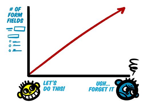
Problem: Too many steps and too many details irritate the customers. They think of them as an obstacle that stops them from getting their desired product ASAP.

The positive mood of customers is directly proportional to the length of the checkout

Just imagine you standing in a departmental store’s checkout line, but before cashier takes the cash, he/she asks you to fill a form. Now, a few questions is not a problem; a biodata would definitely irritate you.

Solution: To deal with the multiple page re-directs, you can switch to the single page checkout system. A good single page checkout system lets you accumulate the whole checkout steps on a single page. This heavy accumulation is, however, effectively organized by segregation so that the page remains clean and clutter free.

Despite everything being on a single page, it can be made clean and clutter free with segregation  and form field minimization

Moreover, you should ruthlessly minimize the amount of information you need. Ask only those details which are important. For a start, you can skip asking secondary email address, secondary phone number, ethnicity etc. You can read more for details on how to make your website-form design user-friendly.

2. Checkout on mobile devices is not same as on desktop-

We often ignore mobile checkouts thinking of it as a secondary requirement

The Greater number of articles and researches have been published on the subject of eCommerce checkout flow and UX optimization. However, there is currently quite a limited coverage on checkouts for mobile devices.

We often tend to do whatever we can do in our strength to make the checkout flow seamless. However, we hardly pay an attention to how the checkout flow will go if the user is buying on a mobile device. Just look at this statement from Google back in 2015:

According to Google, “more Google searches take place on mobile devices than on computers in 10 countries including the US and Japan”

Even Alibaba reported “more of their shoppers are purchasing on mobile than desktop”

Users today are using mobile devices more than desktop. Now, if you keep considering the checkout on mobile phones as same as on the desktop, it would not be wise on your part. With more and more customers using their mobile phones to shop online, checkout page optimization for mobile devices should be your first priority. To keep all those important conversions in your funnel, paying some extra attention to Responsive checkout, or Mobile app is a necessity today. Understanding of how an optimized mobile checkout looks like is very important here.

3. We have been forcing Guest checkouts-

For long we have been thinking about guest checkouts as an alternative to necessary account creation. For that reason alone eCommerce sites provide guest checkout options to all the users.

Guest checkout seems to be the obvious solution for new account fatigue, which does not asks customers to create an account or save any personal information to buy a product. However, guest checkout is not always a smart move for every eCommerce site. It actually results in more problems than it solves in few some cases.

  • It makes very difficult to review, modify, or track orders
  • Customers cannot re-order products using guest checkout
  • It becomes difficult for store owners to manage the returns, exchange, or refunds
  • Store owners won’t be able to follow up such customers
  • Store owners cannot provide guided checkout experience (Information pre-population, auto-suggestion etc)

The common convention among various eCommerce store owners is that guest checkout boosts the conversion rates. Moreover, asking for account creation is presumed as a barrier to the checkout process. I do not disagree with the convention completely. However, it depends on the scenario and the kind of information you need.

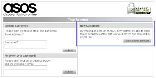
For example, ASOS never included a guest checkout, but still, they experienced a 50 % reduction in cart abandonments just by a simple modification in the login screen. It was how the earlier login screen looked:

Customers were forced to login or create an account earlier

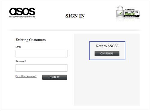
They did a small modification in the above page by simply adding a continue button for new customers.

The new login page did not ask for account creation, instead it allowed the customers to continue with the checkout process.

With the new modification, the users were not asked to create an account on the login page. They can now click on the continue button to proceed with the checkout process. However, it was wise addition which actually did not spare the customers from not having an account. They were asked to provide some information on the next page which was actually used for account creation. So customers still had to register.

The whole idea behind telling the story of ASOS is to explain how guest checkout is not always the only option and you can do a lot more with just simple tweaks in the process. So, the best way to decide whether you need the guest checkout or not is to consider the specific factors like, can your return manager process the guest orders, how much information do you need, how often customers repeat their purchase, and do you have a social login as another alternative to the guest checkout.

4. Social login at checkout page is a better alternative-

The above explanation on guest checkout has made it clear that a guest checkout is not always the best alternative. It brings me to our next point about the social login feature on eCommerce sites. We understand that sign-ups and user accounts are important for the website owners. Saved information in customer account can help boost eCommerce conversion rates up to a large extent.

With the same aim, social login on a checkout page provides easy choice for the users to create a user account that too without filling a registration form. It uses the information stored in social media accounts to automatically fetch the information required to create a user account on the site. So, if users do not want to create an account by themselves, a social login can do the same for them.

A social login for popular social media platforms like Google Plus, Facebook, and Twitter is a wise addition, plus a better alternative to the account registration and guest checkouts.

Social login as a better alternative to guest checkouts

5. Customers hate it when they commit errors-

It’s very much frustrating when making a purchase to submit the form and trigger a validation error. That too with little, confusing, or not guidance on how to fix it.

When such validations with no guidance appear, the thing that comes to a customer’s mind is “Ahhh! now, what did I do wrong”.

In an ideal situation, user fills the checkout form with necessary information and tend to finish the job ASAP by submitting the form. However, people often make mistakes in the form-filling, and that where form validation come into the picture. A good form validation language is courteous and clear about the message it carries. Things that most of us probably don’t know about the checkout page validations are:

  • It will confuse the user if not shown in the correct place.
  • It will confuse the user if not shown on the right time.
  • It will confuse the user if not shown in the right color, and
  • It will confuse the user if not showing the clear message.

With these four points in mind, a checkout page validation is a crucial element that can either break or make the checkout experience of the clients. So,

  • Always use the inline validations in close proximity to the field that triggered it.
  • Show instant validation rather than a showing on top of the page after form submission.
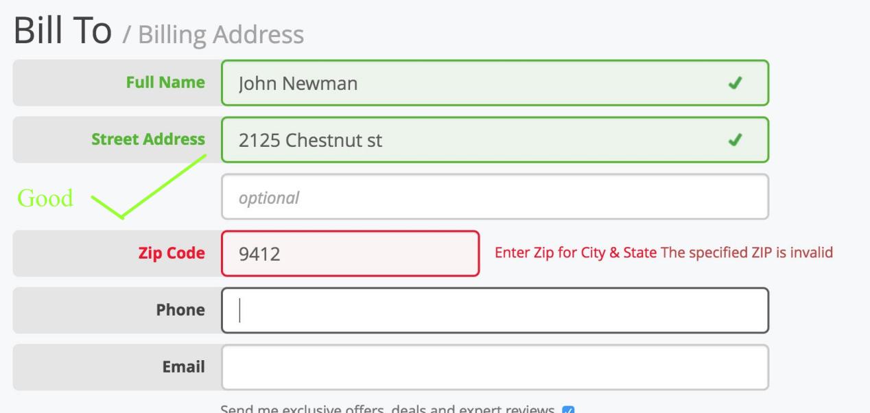
  • Show the errors in Red color and correct validations in Green
  • Write a clear message about the error and ways to fix it

User proper colors and proper proximity to show the form validation errors

Finally,

E-Commerce checkout is a broad subject and it is always in research by the experts. Innovations like single page checkout, Ajax shopping cart, Inline form validation, Social login etc. are all perfect examples of how eCommerce checkout is evolving day after day. There is a lot of information to talk about eCommerce checkouts. Certainly, next time when I write about it, I will get some more things and more advancements to write about the eCommerce checkouts.

Liked This? You’ll Like These Too

8 Awesome eCommerce checkout examples

A lot of effort goes into building the pages that convert. Content optimization, CTA optimization, navigation streamlining, everything we do is for driving conversions on the store. E-Commerce checkout is one such page whose conversion rate has a direct impact on your revenue generation.

In this post, I have compiled a list of the most inspirational eCommerce checkouts that can inspire you to learn some useful aspects from them. Each of the checkouts in this list consists of something that you take a cue from. It should give you a clear idea of how should you go about making your own checkout page conversion friendly like these websites. So let’s get inspired by these checkouts.

1. Apple’s checkout

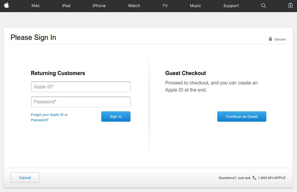
Apple’s checkout is a great example of providing alternate checkout options

Apple provides a very well organized checkout page that lays full attention on the call to action buttons with proper utilization of the white-spaces. The checkout page does a great job of appealing the users to complete the process even as a guest user.

Asking for necessary account registration to complete the checkout process is one of the most common reasons for cart abandonment. To work out this common issue, Apple provides guest check out option where shoppers are not required to necessarily create a user account by filling loads of information in the registration form.

If they already have an account, they can sign-in, and if not have an account, just continue with the guest checkout.

However, there is a flip side of the guest checkout that customer’s information will not be saved for future reference in the database. It means customers won’t be able to track their order. If that is not a problem for the customers, guest checkout is a useful feature to include in your checkout.

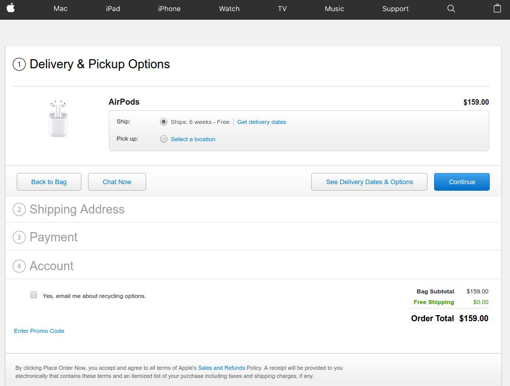
Also the post user login or Guest checkout steps are so simple and interactive. There is a chat option that you can use to clear your doubts right from the Apple’s representative. You can choose the delivery dates and options available, continue with the next steps.

2. Bellroy’s checkout

Lengthy checkout is one of the major reason for shopping cart abandonment. According to Baymard institute,

“27% of US online shoppers have abandoned an order in the past quarter solely due to a “too long/complicated checkout process”.

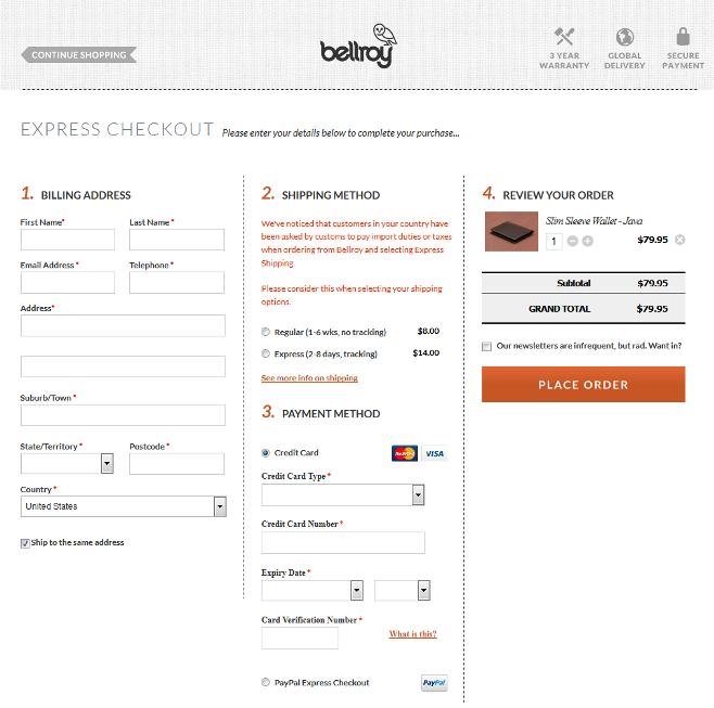
Bellroy handles this big issue a little different as compared to Apple. It provides a one-page checkout to its users compacting the whole checkout steps on a single page only. The one-page checkout structure makes the process smooth and shorter for the customers. Users can fill out the delivery address, billing address, select shipping options and provide payment details right from the same page.

The user experience has been further optimized by including a set of only the necessary details required to be filled-in.

Those eCommerce store owners who want to provide a simple, quick and easy checkout experience to the customers can utilize a one-page checkout structure and save time and efforts of the customers.

3. Myntra’s checkout  Caption:

Myntra goes well with its multi-step yet high converting checkout page

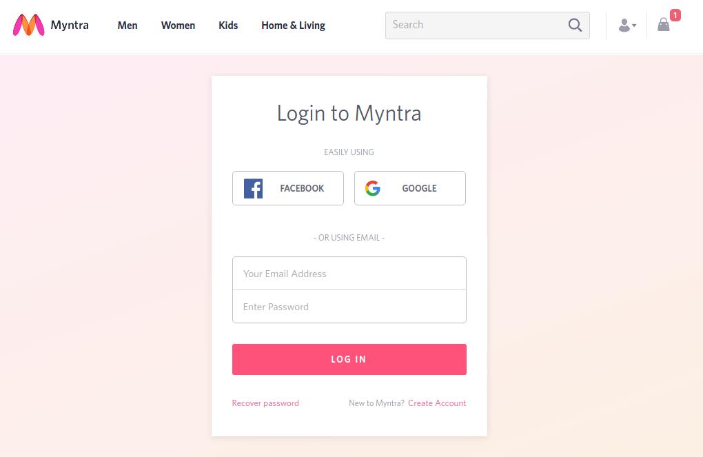
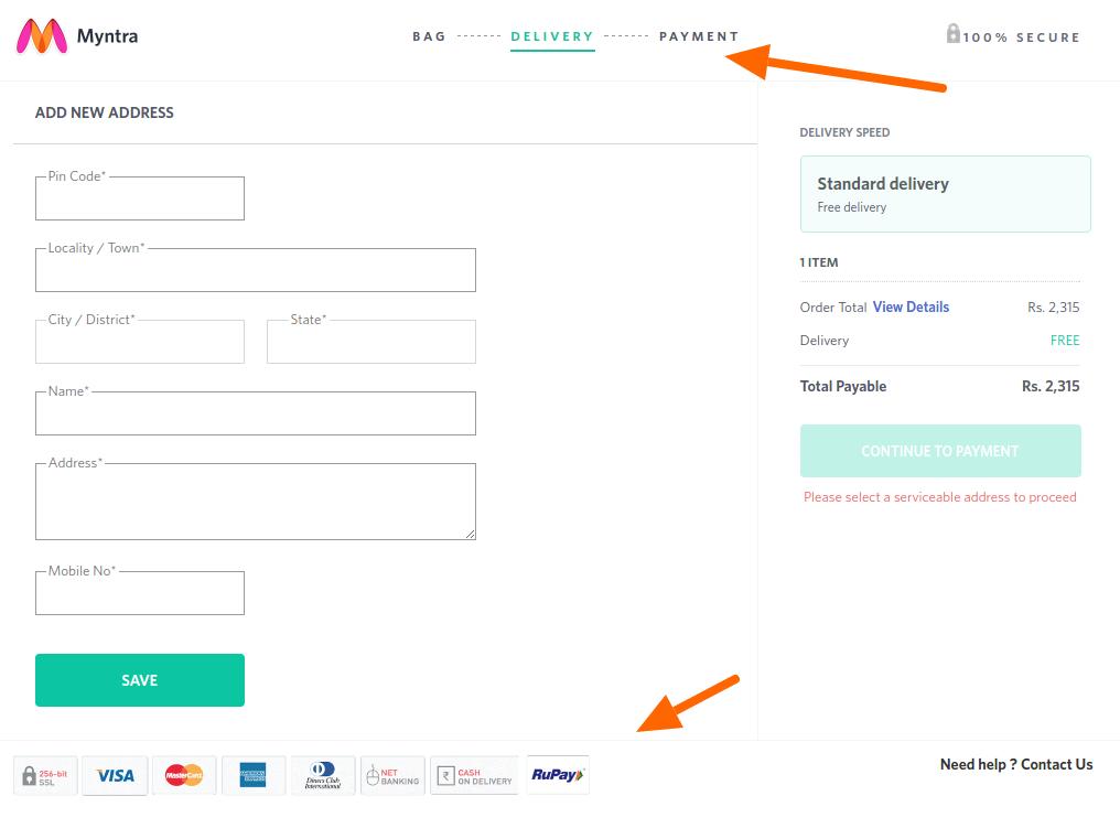
In case you are not a supporter of guest checkout or one-page checkout, you should take a cue from Myntra’s checkout page. It presents a perfect example of how you can make a multi-page checkout conversion friendly without guest checkout.

Here, instead of guest checkout, customers can continue as a registered user by logging-in using their Facebook, or Google account credentials without creating an user account on Myntra.

Moreover, when customers are completing the checkout process of Myntra’s multi-page checkout, they are provided with a clear idea of where they are and where they would be in the next step. It provides a transparent process that includes a progress bar on the top of the page, plus a logo of trust, and payment options logo at the footer keep the users well informed.

The guest checkout option provides the option to the users to register an account right after the checkout is completed. This is a nice touch to encourage account registrations without giving a burden to the customers.

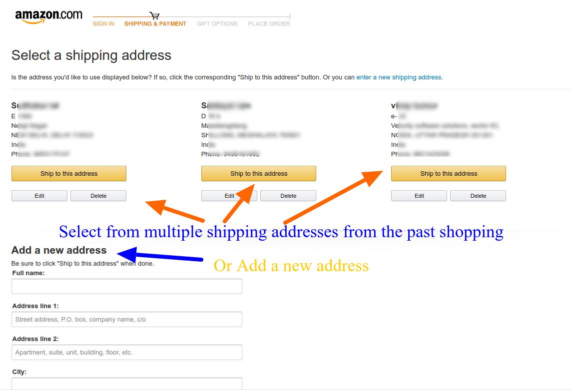
4. Amazon’s checkout

Amazon’s latest checkout emphasizes on account necessary registration

Amazon keeps testing its checkout process now and then. Currently, it is following a unique combination of traditional approach and it’s own peculiar call-to-actions. By highlighting the free two days shipping option on the product page itself, it reduces the task of shipping selection on the checkout page, plus an indirect promotion of Amazon’s prime service.

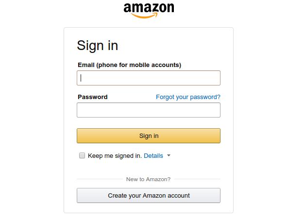
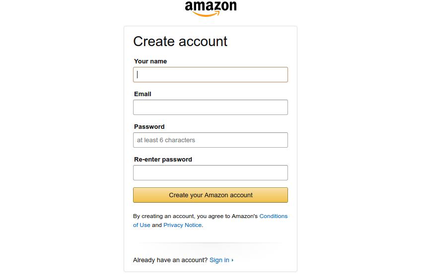
The common perception of an eCommerce checkout involves providing a lot of options like, Add to wishlist, continue shopping, guest checkout and so on. However, Amazon works on a different principle here. It emphasizes on creating a user account before you can proceed to the checkout page but provides a very quick and compact registration page.

Despite the necessary account registration, Amazon still have a high converting checkout

By doing so, Amazon makes sure that customers entering the checkout funnel are not distracted by the leaks and completes the checkout with a personalized user experience. If your customers do not mind filling a very small registration form, Amazon’s approach is is an inspiration for you.

Caution: Amazon acts as almost a monopoly in the eCommerce market for various categories. Customers preferring Amazon won’t find a hard time filing small registration form. It might not be a similar situation in your case. I would suggest a comprehensive A/B testing campaign before finalizing the decision.

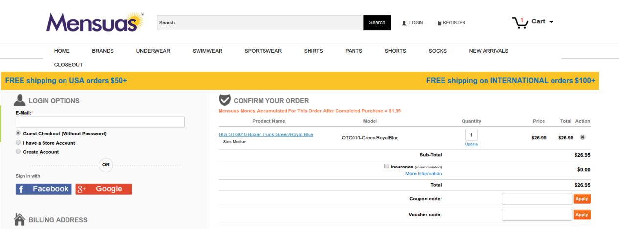
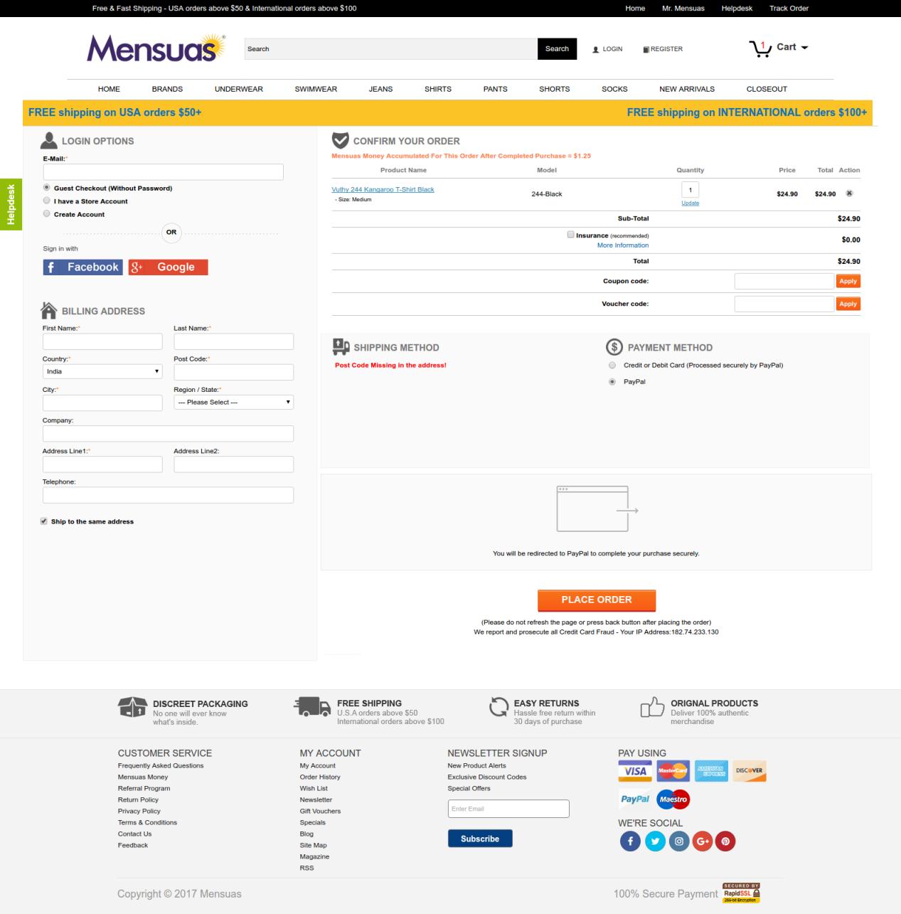
5. Mensuas’ checkout

Mensuas have a single page checkout, with social login option

If account creation is not a preference for you, you might want to look at the checkout page of Mensuas. Mensuas is a leading destination in the US for fashionable underwear for men. Similar to Bellroy, Mensuas too provide a single page checkout to it, customers. However, it goes one step further by introducing social login on the checkout page. One can easily notice the emphasis on login options where you have multiple options to continue with the check out process- Guest checkout, User sign-in, and account registration.

In case you are a new user, you can either checkout as a guest user, create a user account, or just use the Facebook or Google login option for direct login using your social platform credentials. By clicking on any of the social login options, the user can instantly login to the user account without filling a registration form. Thus, saving the customers from a burden to create user accounts manually. Social login makes the checkout experience very smooth and handles multiple reasons for cart abandonment at once.

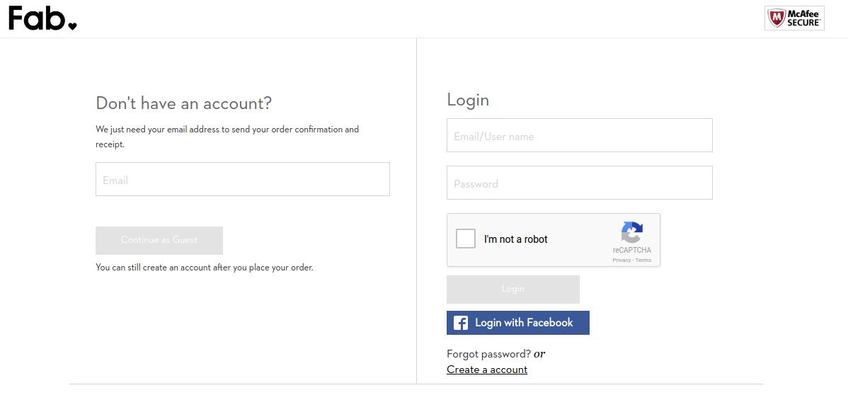
6. Fab’s checkout

Fab provides a multi-step checkout with Facebook login option

Fab utilizes a well optimized multi-step checkout that can be completed without creating a user account manually. If you don’t have a user account already, you can choose from guest checkout or the Facebook login option.

It efficiently utilizes the Facebook login to encourage user registrations which is an important aspect of learning from Fab’s checkout page. It understands the importance of user accounts and how they can be used to create repeat conversions. So, it pushes the users towards Login option without actually forcing them.

The checkout process after login or continuing as a guest presents some well-optimized forms for providing the billing, shipping and payment information. The forms ask only the necessary information and do not demand secondary information from the users.

7. Nike Store’s checkout

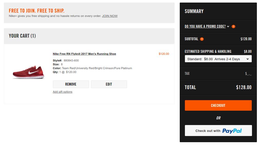
Nike’s checkout is preceded by an optional Paypal express checkout

The speed of the process is a major concern that haunts every store owner. Nike handles the situation by cleverly integrating a PayPal checkout option which provides a more faster and secure checkout. Moreover, for using a Paypal customers need to login using their PayPal account which automatically brings the customers to logged in users’ club.

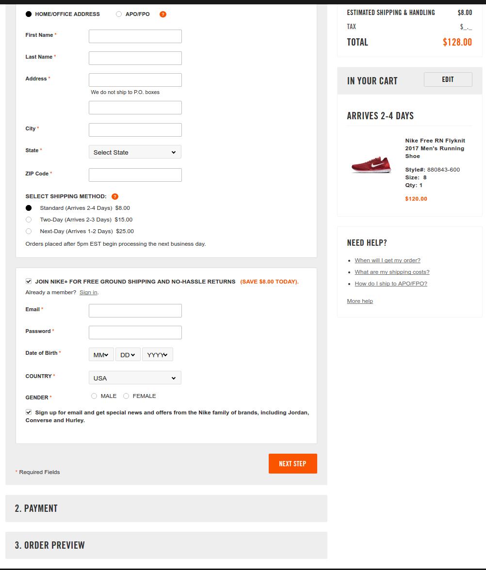
For the regular checkout interface, Nike goes with a partial one-page checkout structure. I am saying partial because all the steps are not unlocked at once on the page. You have to complete the previous step before moving to the next step.

Nike’s regular checkout is inspired by the single page structure

Here users can choose to continue with the checkout without logging in and create the user account at the later part. Furthermore, the shopping cart summary in the right column keeps the users well informed about the miscellaneous costs associated with the cart- Shipping charges, total cost, single item’s cost.

8. Jabong’s checkout

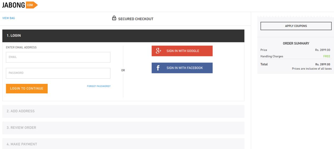
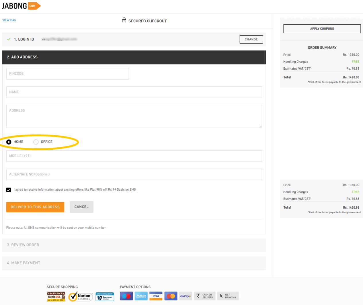
Jabong provides a streamlined check out process that keeps the users informed about the next steps plus allows multiple social login options. The further steps on the checkout page are well optimized to ask only few important details.

The most inspiring option that I found here was the option to specify if the shipping address is a home or office address. It helps the shopping site to deliver the items on a correct time, minimizing the chances for missing delivery. Furthermore, the alternate phone number field is an optional field which customers can choose to skip or provide. I have found this checkout as one of the fastest among the check outs I inspected.

The final takeaways

Summing up the entire case study, it is evident that whether you take UI or UX as the judging criteria, one page checkout is something that makes the process edgy. I will consolidate the entire features that make these checkouts best-of-their kind.

Single page checkout:

As per Baymard, complicated order processing contributes to around 28% of the cart abandonment. This is when a one page checkout can simplify the process for your customers.

Easy Signups:

Guest login options along with ease of signing up can make the checkout process effective. Along with this, social login options can give the checkout process of your site a notch-up feature. Almost all the eCommerce sites, be it an industry giant or a SME.

Implement upselling and cross-selling:

The check out pages should never provide an exit root and a dead-end to your customers. Instead, it should be used as an opportunity to generate additional revenue through upselling and cross-selling. Offering compelling reasons to the customers to browse the store right back is one of the best ways to achieve customer retention. You can do this by offering customers products related to the one that they ordered, or by giving them discounts on future purchases.

Mobile-friendly checkout:

With the latest Google update that emphasis on mobile-first indexing, it has become mandatory to make the entire mobile-responsive which includes the checkout process as well. Mobile commerce will account for almost 50% of the total online purchases by 2020 as per research. So, it inevitable to ensure that your mobile users get a flawless shopping experience. The checkout process of your site should be mobile-friendly as well. At the same time, it should never exclude any of the capabilities of the desktop site, such as social login option and one-page checkout. The mobile commerce experience should be identical to the desktop one in terms of the ability to browse, purchase and pay for products.

Source: baymard.com

Offer a variety of payment and shipping options:

Meeting your customers’ needs is the key to increasing your checkout’s efficiency. As per the result of Baymard’s studies, lack of shipping and payment options are another reasons for cart abandonment. So, you need to ensure that your prospective customers are able to pay and get the product delivered in whatever way is most convenient for them. Offer them as many payment and shipping methods as possible.

Ensure security:

Cyber security is possibly the biggest concern for the online shopping. The only way to keep the customers assured is by optimizing the UI of your site. The site’s design have a huge impact on the shoppers’ perception of your site’s security. An outdated-looking site will give customers the impression that the site is not reliable and will lead to a lot of them dropping off without purchase.

Conclusion

All these eight check outs are the best ones? It depends. I will leave that on our readers to decide, but I think they all have got something for us to learn from.

All of them do not insist on necessary account creation, except for the Amazon (Which was providing guest checkout a while ago). However, all of them including Amazon do inspire us to handle the first step of checkout wisely. While others handle the situation with guest checkout and social login, Amazon handles it through its compact registration form.

I like the approach of Mensuas, which provides the sign-up, sign-in, guest checkout and social login as well. Moreover, it’s single page checkout is well optimized in terms of form design.

Liked This? You’ll Like These Too