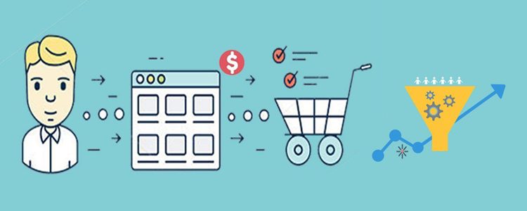
This is no secret that the checkout page of the site is one of the deciding factors that contributes to the customer’s purchase decision. Whether it is the checkout page or the payment options, there are a lot of reasons that can hamper your conversion rate. If you take a closer look at a customer’s behavior, you’d find that the majority of them select the product from the site and add them to the cart. It is then in the last step where they have to add in their details and make the payment where they bounce off the page. No e-merchant wants to lose a customer at the end of the entire procedure. Conversion Rate Optimization is a technique that lets you observe the behavior of the customer and modify the checkout page so that maximum number of them convert.
Looking at the conversions, this blog will detail you about 11 such checkout page strategies that will help you improve the conversion rate of your online store.
One Page Checkout
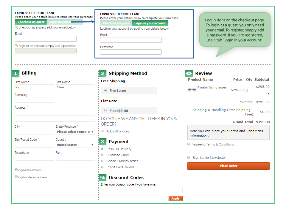
With advantages and disadvantages of both one page checkout as well as multi-page checkout, you should be focusing on simple checkout process that lets your customer feel good and saves their time as well. In fact, quick checkout is one way that does not give your customer to think a lot about their purchase and that’s where they hit the payment buttons. Keep everything short and crisp with minimal information being typed in, it is the drop-down menus that work quite well. For example, when you ask for the zip code, the rest of the details can be generated within that area and all that the customer has to do is – select from the drop downs.
Probably this is the first thing that makes a visitor or customer stay on the checkout page. From the CTA buttons properly placed on the top as well as on the bottom of the page to a streamlined page that has everything properly clustered, everything can be counted in order to make the page visually appealing. Some of the factors that come with the appearance of the checkout page include:
Security seals- if you want your customer to know that you’re trustworthy, you should incorporate security seals like VeriSign and TRUSTe. After all, nobody wants to let their money and efforts go down the drain.
Appropriate colors of the buttons- this might be an old practice to differentiate the color of the Call to Action (CTA) from the entire page but it still works. Let them decipher which button takes them to the next step.
Don’t be pushy for account creation
When you force your customer to become a customer by registering on the store, it might just annoy them. You can gather the details by also by asking them to login/sign up for their social media accounts. Every person has a Facebook or Google account which can be used as the login details. You can pick all the details from there and this won’t even look pushy from your side. Moreover, you can also keep an option of “Checkout as a Guest” on the page. This one scores more points than the other one.
Give an option to “Shop more” or “Continue Shopping” on the same page. Some customers are new to online shopping and land up on the checkout page once they add something to the cart whereas; they want to add more things at the same time. So, make sure you give an option to them that lets them go back to the landing page and pick everything that they wanted to one after the other. When the accessibility of the different pages at the store is within reach, a customer will surely convert.
Include proper links to the different pages
Another way of making your store come across as an accessible one, you can include important links on the checkout page. Some of them include the links to the FAQs, Shipping policies, privacy and refund policy pages to enable users to refer to them if they have any doubts. The option chatbots or the help box is an ideal option. It helps the customers when they get stuck or are in need of help.
Insert the option of printing the order summary after the transaction is done
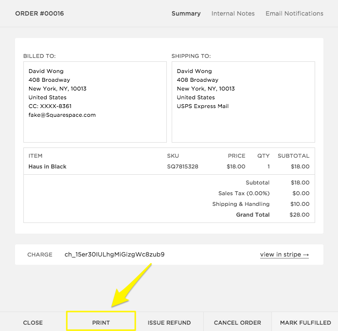
Once the customer converts and makes a purchase from your store, your job does not finish there. There are times when they want a copy of the transaction made in order to get it reimbursed or show it someone else. For those times, there should always be an option for them to print a copy of their purchase from the store. The percentage of such sales may be small but incorporating this feature will help you convert a variety of customers.
Recommendations should have their space
Showing the recommended products in the footer is an excellent strategy to increase sales. Just like Amazon gives a series of options that “customers bought these together” and other recommendations, you too should be doing something like this. When you insert the suggested products on the same page, there are chances that the customer picks both of them or more products on the go.
Avoid hidden charges

You know what leads to abandoned carts? Hidden charges do. One of the biggest reasons because of which you find your customers leaving the site is the surprise charges that make the entire a lot more than the shopper expected. Avoid such practices and give a heads up to the shopper about the money that’s included so that they’re prepared to pay that much. Clearly show your shipping, handling charges and tax fee. Nobody likes surprise additions in the charges for sure.
Give Users the Option to Update Quantity
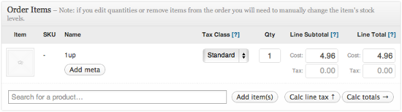
Allow users to add or remove cart items right on checkout page so that they don’t have to go back to do so. Making them go back to update their cart can possibly result in them leaving the process altogether. On the checkout page, make sure you still give an option to change the quantity of the product that your customer is going to buy. There are times when they later (of the shopping stage) feel that “this should be bought more” or “I should buy less of this” and that’s where the carts are abandoned because they have to go all the way back to the product page and make the changes. Hence, let them change it there.
Have a video

Videos are a great way to engage the customers and give them a better understanding of products that are a little complex. Incorporating a video of the products is a great way to increase the chances of conversion because a better understanding of the product creates a sense of credibility about your site and thus, leads to conversion.
Offer Free Shipping
If it is within your reach and doesn’t hamper your profits, offer free shipping. If you charge about $10 for an amount of $30, the conversions will be extremely low because who would want to spend an extra of $10 on such a small purchase? Free shipping is like Abra Kadabra for your conversions.
This is definitely not the end, but these are some of the most important ones. As you keep a track of the activities through A/B testing or using Heatmap tools, you’d be able to make changes according to the behavior of your customer.
Related Stories:
- 6 Checkout Page Mistakes that may be Killing your Conversions
- A PrestaShop Module to Divert Abandoned Carts towards Conversions
- Checkout Module for Reducing Shopping Cart Abandonments and Better Conversions
- How can you boost eCommerce Conversions with your site deals?
- How to drive eCommerce Conversions through email marketing?