
Updated on 31-Jan-2018
One page checkout has been in the debate for a very long time now. The whole idea of simplified checkout revolves around the optimizing the shopping experience of the store visitor. The shopping site will lead to conversions only when the customers are able to complete their transaction effortlessly.
How can one page checkout optimize your site?
The online shoppers prefer to make purchases only if the web store offers easy to approach and with minimal efforts. Here are some of the ways in which the this feature can optimize the shopping site and enhance the user experience.
- Most of the e-marketers advocate the incorporation of a single-page checkout as it is an easier approach for the customers to complete their transactions. The online shoppers prefer going with the idea of single page checkout as it reduces the time consumed in reloading the web pages.
- The idea of using super page checkout is more convincing than the traditional idea where the customers have to be jumped from page to page filling out all the details. The e-sellers can help the customer complete their transaction with minimal effort. Even though the number of fields remains almost the same, the shoppers can view the length of the form left to be filled. This provides them a psychological motivation to complete the transaction.
There are dozens of articles on the topics like “Should you choose a one-page checkout?” “Pros and Cons of One Page Checkout” and so one. Most of these articles effectively address the drawbacks, but it seems like we have been promoting these drawbacks like they are there forever and cannot be taken down anyhow.
Let’s face the truth, every new introduction has some cons for sure. Gradually, with the development and research, these cons fade away for sure.
In this blog, I am going to address 3 such cons of a one-page checkout which we eliminated from our Magento one page checkout extension and also the PrestaShop One page checkout module. Most of these cons were never there in our checkout extension, as we took care of them while in the development and testing phase itself.
One page checkout fixed drawbacks
1. So much of details on a single page? It will be congested
Most of the checkout pages, when introduced in the past, had this problem. It was really a massive task to adjust everything from a multi-page checkout on a single page.
The most problematic challenge was to fit all those checkout elements on a single page and it should provide a full view of the whole checkout page as well. Moreover, all the checkout elements like login, delivery address form, billing address form, payment options, shipping options, and cart review should not overlap with each other, and neither they should overlap on themselves. A lot of HTML, CSS, JavaScript, and Ajax were needed to be handled to keep the design all fine with the default as well as the third party Magento themes. But we intended to keep them as lesser as possible for faster page loading.
This is what we came up with:
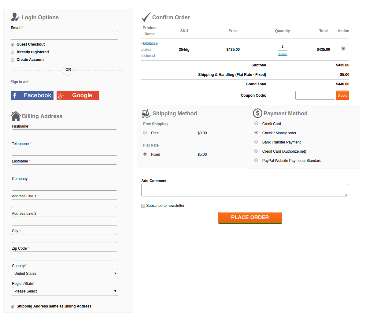
A lot of HTML, CSS, JS, and Ajax were tweaked by our designers to fit all the elements neatly and clearly on a single page and also to keep the page loading time optimal. Moreover, thanks to our designers, after all these, there was sufficient space left to add the Social login option using Facebook and Google+ on our checkout page.
2. The form on the page are congested with no white-spaces and proper label usage
While designing the forms, the main aspects that we were looking for were:
- Keeping the forms compact
- All the necessary fields should be there
- Fields should have proper white-spaces
- Labels should not confuse the users
- Admin should be able to choose which form field he wants to show on the page to customers.
Labels
Labels were coming out as a major concern here. If we would keep the labels by the side of the respective fields, the horizontal length of the form would give a very less space for the other sections on the page.
We also thought about a form design where we would skip the labels and use Placeholders in place of them. Something like this:
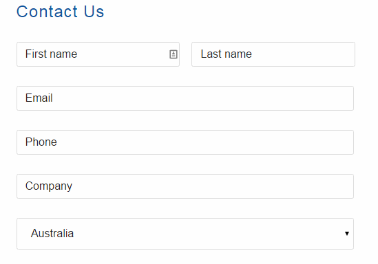
But, there was a problem in that. For considerably long forms like Billing and Address forms, if customer once filled the detail, and the later stage if he would want to re-check them, he would get confused about what actually are these details. Since the placeholder vanishes away as you type in, and there is no label as well, there always remains a confusion if my details are right or wrong.
We didn’t want your customers to get into such confusion and forget the main goal of making a purchase, that’s why we drop the idea. Otherwise, it could have saved a lot of space as well.
Finally, we decided to not to compromise with the user experience anyhow and we adopted the label placement above the fields as shown in this image:
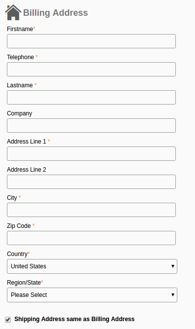
It saved the horizontal space that we needed for other elements and also helped in one another feature which has been discussed below.
The necessary fields
After dealing with the label placement, the last thing in the forms that gave us a nightmare was to include every necessary field in the form. Problem is, the term necessary is quite relative here. A form field which is necessary for one store owner might be of no use to the other.
For example, the VAT number, and Company Name is a necessary field of a store owner who has a B2B selling business. All of your European business clients would also need this field for making the purchases on your store. On the other hand, a store owner who directly sells to the individual consumers would have no use of the fields like VAT Number and Company Name.
How we handled it?
It was a time to open our checkout extension a bit and give the store owners some easy yet crucial development access. We add a feature in our module, using which the admin can easily enable, disable, add, and delete a field from the checkout form. That too, without editing the code. All this can be done from the backend itself.
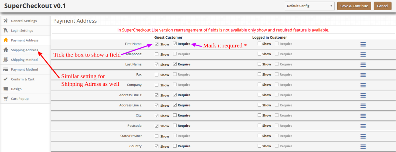
So, if any of the fields is not usable for a store owner, he can simply hide it with a simple click and save. No need to go through the complex Magento or PrestaShop codes to do this now.
3. Frequent page reload on cart update
Those multi-page checkouts have a dedicated page for editing the shopping carts. It was a challenge for us to include the shopping cart on the checkout page. Customers would frequently update the cart by increasing or decreasing the product counts, removing a product from the cart and so one.
All these requests required a page reload to update all the checkout details and information according to the latest cart status. If a product has been removed from the cart, we needed to update the total cost, cart product quantity, shipping methods and so on with it.
It would have become so irritating for the customers if the checkout page would reload every now and then. This challenge is faced by every one-page checkout development. However, we managed to fix it with the Ajax based shopping cart and form update request.
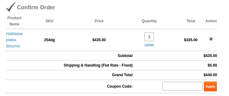
Now, with Ajax shopping cart and updates, if a customer changes anything in the cart, all the dependent details would get automatically updated without reloading the whole checkout page. Even the customer can apply a coupon code to the cart and page would validate the coupon without being reloaded.
This is how we solved these issues in our checkout extension. You can have a free demo to experience all these features of the extension. Free Demo one page checkout Magento and PrestaShop and OpenCart.
This functionality can be added to a Prestashop site with the help of Prestashop one page super checkout addon. The same extensions are available for Magento, Opencart and other eCommerce platforms as well. Whether you go for the Prestashop addon, Magento extension or OpenCart plugin, it enables the customers to complete their transaction and make the product purchase on the same page. It is one of the best features for reducing the exit rate at the checkout page. The customers are annoyed if they are redirected to lengthy checkout process in order to complete the purchasing. Thus, one-page checkout makes sure that the customers can complete the purchase by filing up all the necessary details in one single page and provides the customers with an easy approach to complete the purchase.
You Might Also Like:
- Beginning of a new era of easy checkout process with the emergence of Magento One Page Supercheckout Lite Module
- Enjoy A New Online Shopping Experience With This Magento One Page Supercheckout Extension
- Forget all checkout related worries with this Magento One Page Supercheckout Plugin
- How can One Page checkout improve your checkout process?
- Why do you need a One page Magento Checkout Extension?