A smooth eCommerce checkout is of paramount importance to enhance the online shopping experience of users. If not optimized, it can hamper the checkout flow and compel users to abandon their cart.
In this article, I have presented 7 crucial tips to optimize your eCommerce checkout process and provide a convenient checkout experience to your visitors.
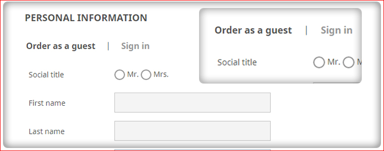
1. Provide Guest Checkout
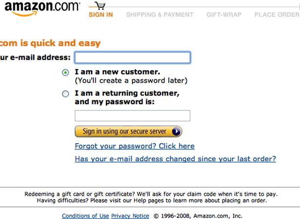
The mandatory registration form can be a barrier in an eCommerce checkout. It would be unwise if a customer looks all set for the purchase but is forced to abandon because of compulsory account creation.
This distraction can be avoided by offering Guest Checkout.
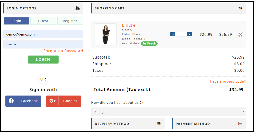
Guest Checkout enables a customer to check out comfortably without disturbing the checkout flow. It speeds up the checkout process and provides a smooth checkout experience to the users who do not want to receive promotional emails from your business.
Guest checkout is a one-stop solution for mandatory sign-ups and is an important element in your eCommerce checkout.
2. Offer Social Login
Along with Guest Checkout, providing visitors with a social login facility would make up a great idea for a smooth eCommerce checkout.
The registration task is tiresome for the online shoppers and they feel reluctant to sign-up many a time. The social login option, in this case, becomes a better alternative by speeding up the registration process.
Besides, social login removes password fatigue. Customers do not need to create and remember a different password every time. They would be able to log in easily with any of their preferred social media accounts.
Looking to add the social login options on your eCommerce website? Try out our Social Loginizer module that can incorporate up to 15 social login options on your site.
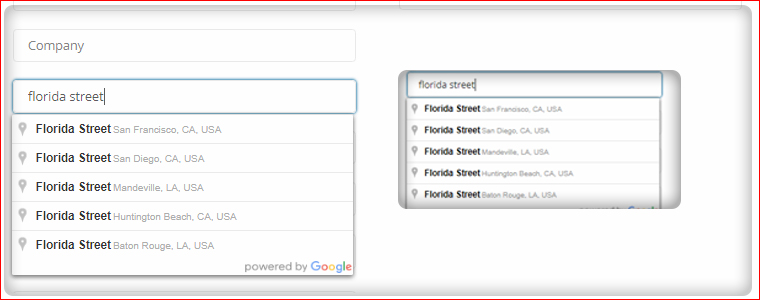
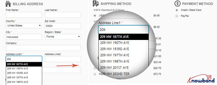
Save prospects’ time by auto-suggesting address when they start filling out the address fields.
Enable Google Autofill functionality. Once set up, it would start displaying the address suggestions in real-time, related to the keywords typed by the user. Upon picking the relevant address, the rest of the major address fields are automatically filled.
Google Auto-fill is essential for an optimized eCommerce checkout.
4. Use Inline Validation to Display Errors
Customers generally make mistakes while filling out the checkout fields, and more often than not, the errors are not identified until the customer hits the submit button.
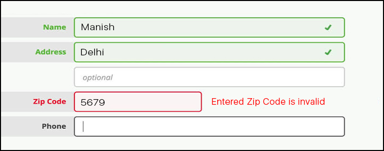
In many cases, customers are required to fill the entire details again and again till all the fields become error-free. This can be irking and hinder the checkout flow. Therefore, it is advised to use Inline validation.
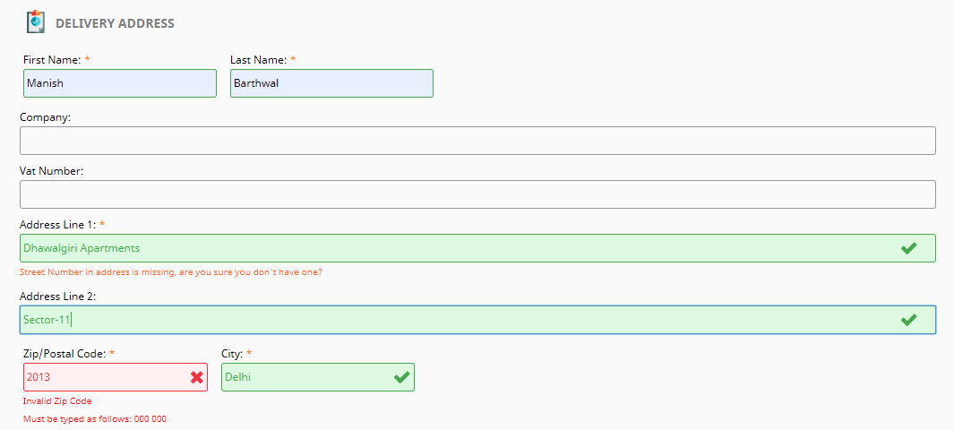
Inline validation checks the inputs in the form fields and indicates whether the inputs provided by the customer are correct or not when they switch between fields. If there is an error, it would display how it can be fixed.
5. Display Checkout Progress
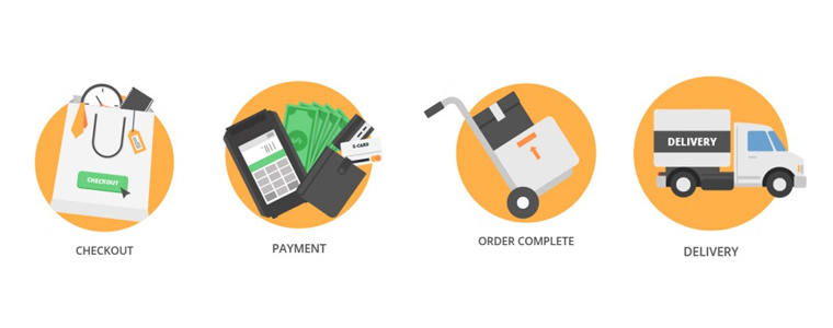
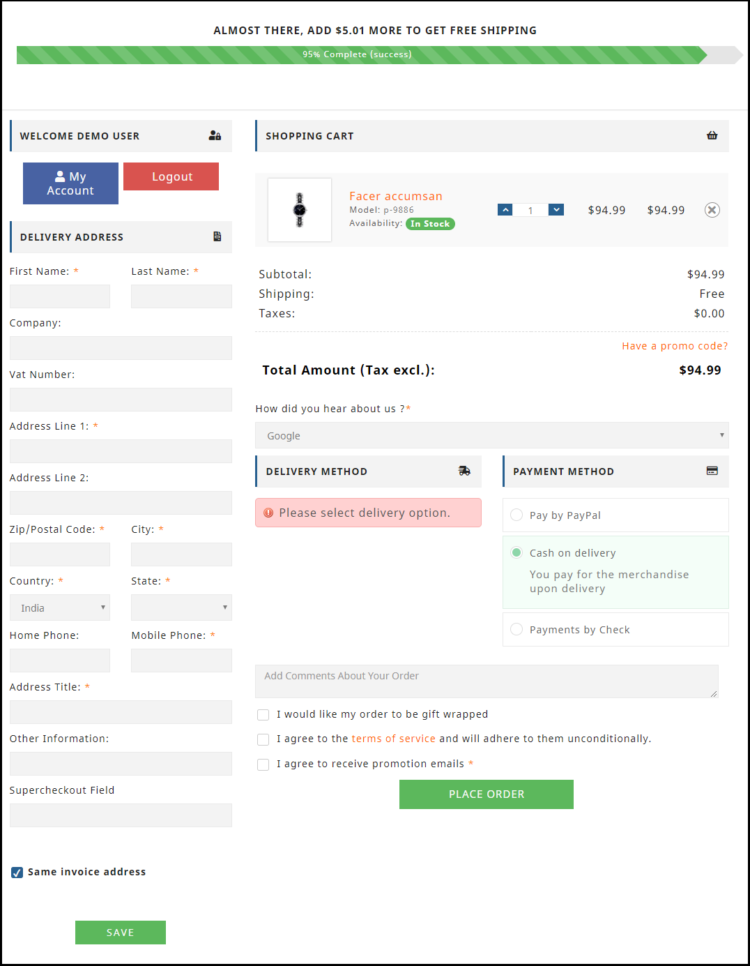
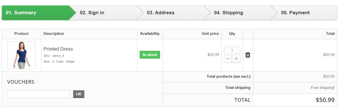
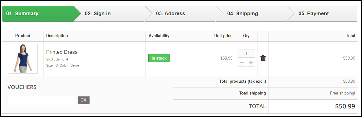
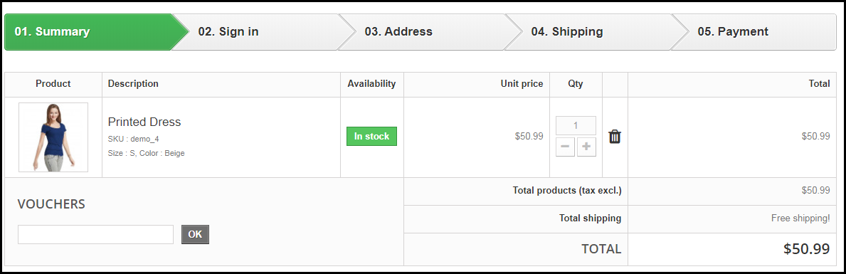
Use a progress bar to indicate at which stage of the checkout process is the customer present and how many further steps do they need to go through before they could finally place the order.
A progress bar presents the overall picture of the checkout process in front of the customer and gives them a clear idea beforehand of your eCommerce checkout.
6. Display Applicable Offers or Promo Codes
Customers often look for promo codes to avail discount on the products they are purchasing.
If there are some applicable promo codes, mention them on the checkout page else the visitor would hit the back button and start looking out for the offers on your website. It is time-consuming and can delay the conversion.
If you display the offers right on the checkout page, it would be easy for the prospects to know about your ongoing deals and hence it would create higher chances of conversions.
7. Do not stick to just Credit and Debit Card
With the introduction of e-wallets, also known as digital wallets, the payment method preference of the customers has changed. Sticking with only Credit or Debit Cards just won’t be enough.
Add multiple payment options on your eCommerce checkout so that a user has a number of options to choose from. Lack of payment modes might lead to cart abandonment.
Each and every step of your eCommerce checkout highly matters for providing a smooth checkout experience to the online shoppers. You need to ensure that every step is optimized and leading to a successful user-friendly checkout.
One small error can add the prospect into the list of abandoned cart users. Also, make sure that your eCommerce checkout is optimized for mobile devices as well. If it does not go well with the mobile format, you can lose out on huge mobile conversions.
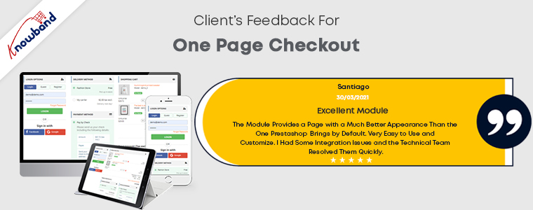
To make your checkout more convenient, you can think about using a One Page Checkout. I hope that the information I shared about having an optimized eCommerce checkout turned out to be useful for you.
This article revolves around Checkout optimization and provides you with 11 effective ways to optimize your eCommerce Checkout and bring more conversions.
Out of all the elements in an eCommerce website, the checkout page surpasses every other factor in terms of importance. It is the page that brings you conversions or you can say it is the place where visitors turn into customers.
Your website might have an attractive layout and a user-friendly interface. You may even have a wide range of products but it is only good enough to increase the traffic to your website. Yes, it is important but none of it matters if the high percentage of your website traffic is not making it past the checkout page.
Simply expressed, it refers to a high cart abandonment rate, which shows that customers are adding things to their carts but then declining to purchase once they reach the checkout stage.
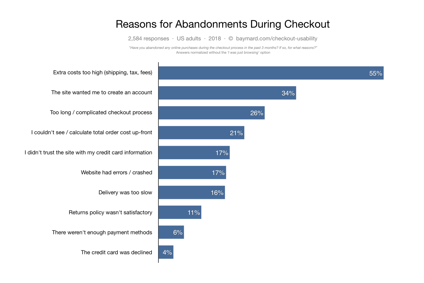
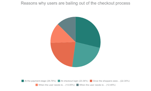
Cart abandonment can have multiple reasons. According to data gathered by the Baymard Institute, some of the causes of cart abandonment are listed below.
Did you know the average cart abandonment rate is 70%? Every 7 out of 10 customers abandon their cart for some reason. The percentage reflects that e-retailers lose out on huge sales due to shopping cart abandonment.
The best approach to reducing cart abandonment and increasing conversions is optimizing your checkout page, and this is what I am going to cover today.
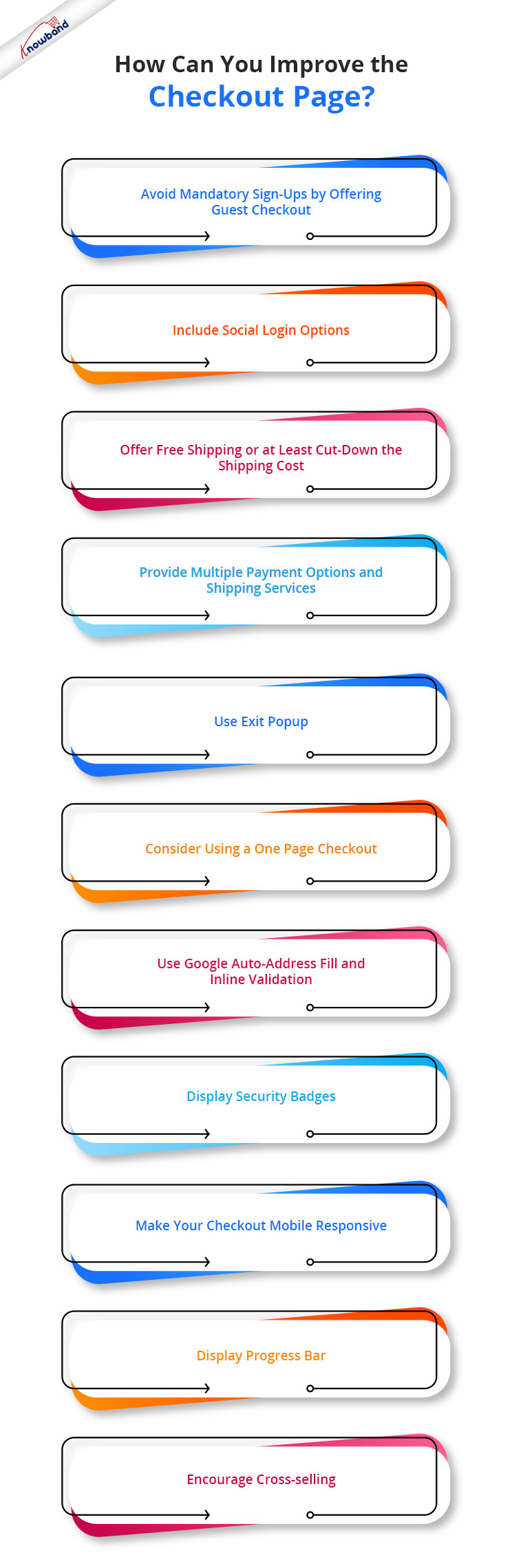
In this article, I will suggest the top 11 best checkout page optimization practices to recover your lost sales.
How to optimize your Checkout page?
To contribute to a smooth checkout process and provide your customers with a seamless checkout experience, consider the below-mentioned eCommerce checkout best practices.
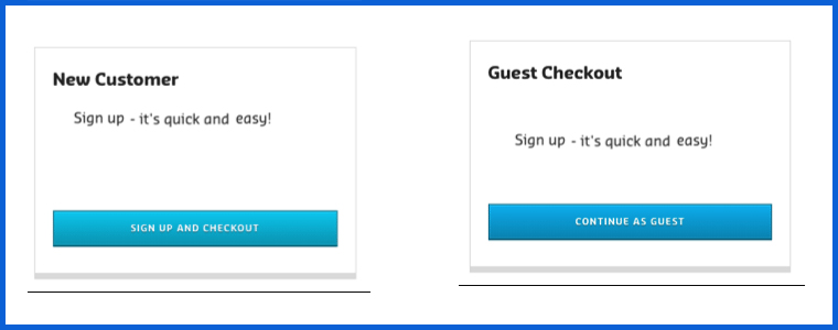
1. Avoid mandatory sign-ups by offering Guest Checkout
If we look from a merchant’s point of view, it is quite understandable that they want to obtain customer data for their marketing campaigns but they also need to understand that not everyone wants to be a part of their campaigns, promotions or newsletters.
The percentage of such customers might be low, but it does make an impact on your sales.
So, skip the mandatory registration process and provide a Guest Checkout facility on your eCommerce website, avoiding the need to create an account. It is one of the best practices for eCommerce checkout optimization.
2. Include Social Login options
While some visitors do not want to register, some feel reluctant to sign-up. The checkout flow is broken and the customer experience is hampered when a registration form is displayed on the checkout page.
Since some websites follow a lengthy registration process, it might compel the visitors to abandon their cart and leave the store.
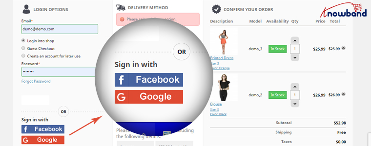
You can help such visitors by offering them the social login facility, basically something like Facebook login and Google login.
Social login paves the way for a quick checkout by speeding up the registration process, and it also maintains the checkout flow.
It is a single-click registration, considering that the visitor is already logged in to the social network he or she is using to sign in on the website.
Social login is among the effective checkout optimization strategy.
You can try out our Social Loginizer module if you want to offer multiple social login options to your visitors. It offers up to 15 social login options.
3. Offer Free Shipping or at least cut down the shipping cost
Another eCommerce checkout optimization practice would be to provide a free shipping facility to the customers.
High shipping cost has remained to be a disappointment for online shoppers and it is to be of no doubt why it is the major reason for shopping cart abandonment in Baymard’s study.
The extra added amount at the final checkout step unwillingly forces customers to abandon their cart. Some e-commerce stores charge a heavy shipping amount and it is enough to turn away the interest of the customer from the purchase.
To reduce the possibility of cart abandonment and persuade prospects to make a purchase, offering free shipping can be an ideal way.
Free shipping can surely enhance the chances of conversion. It gives customers a sense of joy when the product amount remains the same throughout.
And you do not need to compromise on your profit. You can slightly adjust the product price to absorb the shipping cost.
PrestaShop website owners can try out our Free Shipping Manager and set up their shipping rules to provide free shipping.
4. Provide Multiple Payment Options and Shipping Services
Adding to the checkout page best practices is to expand your payment and shipping options.
Around 6% of the online shoppers abandon the checkout page due to the lack of payment modes and some 4% are left with no choice but to purchase as their credit card gets declined. So approximately, 10% of the people are having payment-related issues.
It can be overcome by offering multiple payment options. It is also important because different customers have their trust attached to different payment modes.
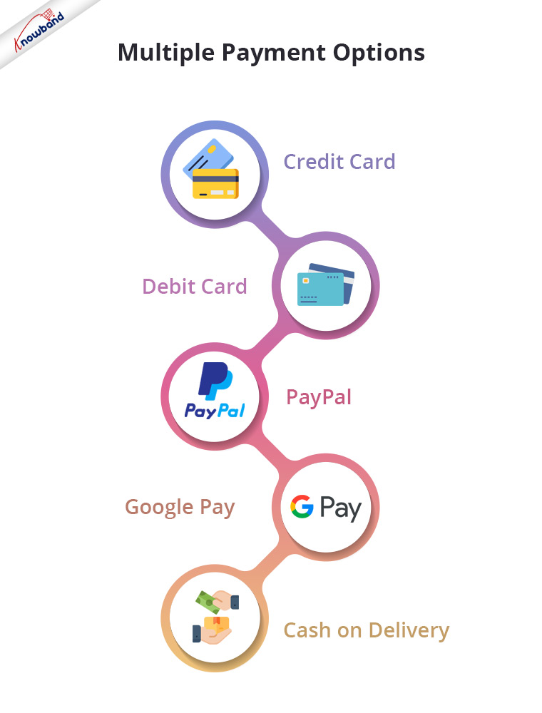
So, let the people choose their desired payment mode from a variety of payment options. It will result in a higher conversion rate. Apart from Credit Card and Debit Card, you must include digital wallets like PayPal, Google Pay, etc. and Cash on Delivery.
Similarly, you should provide people with multiple shipping services. Different shipping stores have different delivery times, so let the users decide how quickly they want their item to get delivered.
Some shipping service providers even guarantee a 1-day delivery and this can be very helpful, especially for a user who wants to receive his/her order within 24 hours.
5. Use Exit Popup
Another checkout optimization tactic would be enticing the shoppers with some attractive offers and discounts when they are about to leave your website after almost making it through the entire checkout process.
Even when you are unable to pinpoint the precise reason why the user is leaving the checkout page, you should try your hardest right up until the very end to persuade them to make a purchase.
It can be done by using the Exit popup functionality. It tracks the mouse movement of the user and displays your store offers as soon as the user intends to take an exit.
Try out Knowband’s Exit Popup. It is a feature-rich module that has so much to offer to make your popup effective. Most importantly, you can enable the exit popup functionality for multiple pages, not just for the checkout page. Check out-
One of the best ways to optimize your checkout process is by implementing a Page Checkout on your website, also called a single page checkout.
This checkout optimization simplifies the checkout process by placing all the checkout fields on a single page. It offers an easy, fast and convenient checkout, and results in a better conversion rate.
I am not undermining the multi-page checkout process but I feel One Page Checkout has a slight upper hand over the multi-step checkout.
To know the in-depth analysis of both the checkout processes, read:
Our One Page Checkout module offers Guest Checkout, Social Login (Facebook, Google and PayPal), supports multiple payment methods and shipping services, and whatnot.
It is a perfect solution to all your checkout problems. We have-
7. Use Google Auto-address fill and Inline Validation
Save users’ time and allow them to check out quickly by enabling the Google Auto-address to full functionality on your website.
It displays the address suggestions as soon as the visitor types his/her address in the address field. Upon picking up an address, the rest of the address fields are filled automatically.
You should also include the option to use the shipping address for the billing address as well.
Along with autofill, enable Inline Validation(also called Data validation). It helps a user to identify the mistake while putting up the details on the checkout fields. When the user switches between fields, it checks whether the inputs provided by the user are correct or not.
Both of these methods play a crucial part in eCommerce checkout optimization.
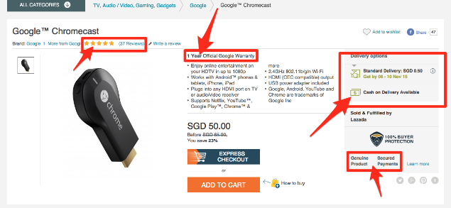
8. Display Security Badges
People often doubt the security level of a website, especially new visitors. They do not trust a site easily and hence they feel a bit of concern when providing their payment details.
Image Source: Conversion Monk
Make visitors feel that your website is trustworthy and their payments are secured. Display them the trust seals. It can include the logos of the payment options, security badges from Norton, McAfee, Padlocks, or even a short text that reads “Fast and secure payment”.
You must also add an SSL Certificate to your website to maintain the trust throughout.
9. Make your Checkout Mobile Responsive
Today, most people prefer to do online shopping via their mobile devices.
According to a report by Statista, 72.9% of all retail e-commerce is expected to be generated via m-commerce, by 2021 and this is the main reason why online businesses are paying more focus towards convenient mobile browsing to ensure their visitors enjoy a seamless checkout experience not only from desktop but also from a hand-held device.
So, make sure your checkout page is mobile responsive if you want to gain high conversions from mobile devices.
A mobile-friendly checkout page is an essential factor in checkout page optimization.
10. Display Progress Bar
Though I suggested above to have a one-page checkout, you can continue with the multi-step checkout process if you aren’t a fan of a single-page checkout but make sure it displays a progress bar.
A lengthy checkout process can often irk users if they have no idea how long the checkout process is going to take.
Help them by displaying a progress bar/progress indicator so that it is clear beforehand what steps they need to go through to complete the checkout.
People are less likely to abandon the checkout page if they can see their checkout progress.
11. Encourage Cross-selling
When you talk about checkout optimization, cross-selling can never be neglected. Right after the user makes a purchase, display their related products that would go well with their purchase.
Besides, you can at least encourage customers to shop for more by thanking them and providing them with a coupon code for their next purchase.
Optimization of checkout pages is not limited to a few set tactics. You will find plenty of ways to optimize your checkout page, however, I found the above-suggested methods to be the most helpful but it is not as easy as it seems.
Checkout optimization takes a lot of effort and time. You need to keep doing A/B testing at regular intervals to identify what works out the best for you.
Remember even a slight decrement in the abandoned carts can add up a huge amount to your total revenue.
That’s it. If you liked these 11 Checkout Page Optimization best practices. Feel free to add any point which you feel can help in providing a seamless checkout experience.
For any assistance regarding the module functionality, you can reach out to us at support@knowband.com
The checkout page is the conversion deciding factor for any eCommerce website. If you are driving a good amount of traffic on your store but the conversions are hitting very low, there are probably some flaws in your checkout page.
Though checkout is not the only barrier (there can be some other factors as well such as the website UX), it is the most vital element among other elements on your eCommerce website.
A huge difference can be made in eCommerce conversions if online businesses rectify their checkout page mistakes. In this article, I have listed out 8 checkout page mistakes that may be killing your eCommerce conversions, along with their solutions.
Mistake 1 : No Guest Checkout option
Mandatory registration on the checkout page adds to the topmost reasons for shopping cart abandonment. Online shoppers feel annoyed when presented with a sign-up form during the checkout process.
Forcing visitors to create an account only increases the number of fields to be covered before making the payment. Some of the eCommerce stores even ask users to verify their account, leading to a troublesome checkout experience.
This can be avoided by offering the Guest Checkout facility. Guest Checkout allows users to get rid of the registration process and helps them make a quick checkout, enhancing your conversion rate.
Mistake 2: Not offering Social Login
Almost every eCommerce website today provides users with the facility to sign in using their social media accounts. Not having the social login option on the checkout page can affect your eCommerce conversions.
Providing the social login option eases up the registration task (single-click registration), maintains the checkout flow and allows users to get rid of remembering the password.
Most people remain logged in on their Facebook or Instagram. Hence, a social login option reduces the extra efforts put during the sign-up process by allowing users to sign-up with their existing social information.
Mistake 3: Not using the Progress Bar on the Checkout Page
Shoppers might give up the purchase idea if they are unaware of the number of checkout steps involved in the checkout process.
It is important to display which stage a customer is at present when they are on the track of completing their purchase. Showing the progress of the checkout puts up a clear picture in front of the user regarding how many fields they have covered and how many more they would have to go through before they could finally place their order.
Mistake 4: No Trust Factor
With too many online frauds taking place nowadays, online shoppers do not put their trust on a website so easily while making the payment. No matter how amazing your website looks, if customers feel a trust issue, they won’t make the payment. As simple as that.
To build customer’s trust, show off the security badges on the checkout page, and make customers feel relaxed. Add an additional security layer by making your website SSL certified.
Mistake 5: Not having a Proper Return Policy
Online shoppers do have concerns regarding the products they purchase. There is always a doubt regarding a defective or an incorrect order getting delivered. And customers want to ensure what would happen in such cases.
This is where your return policy plays its part. If it is not satisfying enough from the customer’s point of view, they will not proceed further in their checkout.
Pay attention to your return policy and make sure they encourage users to make a purchase.
If you are still stuck with Credit Card and Debit Card only, you are surely missing out on huge eCommerce conversions. Limited payment options would not help you in the long run. Online shoppers look for varieties, be it for products or for the payment methods.
With digital wallets in trend, it would be wise to implement the major e-wallets in your store. It would provide your customers with a number of payment options to choose from and help them choose the preferred payment option while making the payment.
Mistake 7: Not having a User-Friendly Checkout
A lengthy and complicated checkout process involving unnecessary fields adds to the frustration among online shoppers which is followed by cart abandonment.
It is, therefore, crucial to optimize your checkout page and make it user-friendly. One of the ways to do so is by upgrading your multi-step checkout to a one page checkout. A single page checkout puts all the checkout fields at one place.
Knowband’s One Page Checkout is amongst our highest-selling modules that lets you simplify your checkout page and grab more eCommerce conversions. Check out this module for various eCommerce platforms-
The majority of online shoppers these days browse a website through handheld devices. This is the reason why mobile apps are gaining huge popularity. However, with limited storage space, people avoid installing a lot of apps.
For shoppers using mobile devices to make a purchase, it is important to make the checkout page mobile responsive. For your information, around 1.6 billion people use mobile devices to shop online globally, says a report by Invesp. So you can imagine the impact it can have on your conversions.
Make sure that the checkout process works as conveniently on a mobile device as it does on the desktop.
Final Word
Put your feet in your customer’s shoes and think what could be the possible areas for improvement on your checkout page. Are you feeling satisfied? Is it hampering your checkout experience? If so, work on those factors to simplify the checkout experience of online shoppers.
Keep an eye on these 8 checkout page mistakes that could possibly kill your eCommerce conversions.
As per a data shared by Business Insider, the U.S. online shoppers, in particular, are abandoning their carts during the payment phase. This is a common scenario on both desktop and mobile platforms. Here are some of the phases according to the survey from where the users tend to leave the cart without completing the payment procedure.
46.1% of cart abandonment occur at the payment stage
37.4% occur at checkout login
35.7% occur once the shoppers see shipping costs
20.9% occur when the user needs to enter their billing address
20% occur when the user needs to enter their shipping or delivery address
Data Source: Business Insider
In one of our previous articles, “Abandoned Cart: Biggest lie you probably believe to be true“, we discussed that hardly 30-40 % of the visitors actually have an intention to buy when they are adding a product to the online virtual shopping cart. Having said that tapping that market of the prospective customer can effortlessly boost your sales. While most of the eCommerce business opt for email marketing in order to convert those visitors into the lead, the Checkout page optimization is a frequently overlooked area for online retailers.
The blog is a compilation of some of the optimization tricks to reduce the abandoned cart. Gear your store with these tips and make sure that no opportunity is left untapped for your business.
Go for a one page checkout
The whole idea of shopping online is to remove the unwanted hassles and get everything at a click of a button. No one would go for online shopping if they don’t get rid of the long queue and waiting hours. Thus, making the checkout process simpler and convenient is the need of the hour. Make the call-to-action on the page clear by removing the clutter. The entire process should be self-explanatory and as precise as possible. One page checkout addon help you manage the fields you want to show in your page and customize the buttons. However, make sure that you keep everything transparent. Do not surprise the users with extra charges and shipping costs.
Minimize the insecurity of checking out
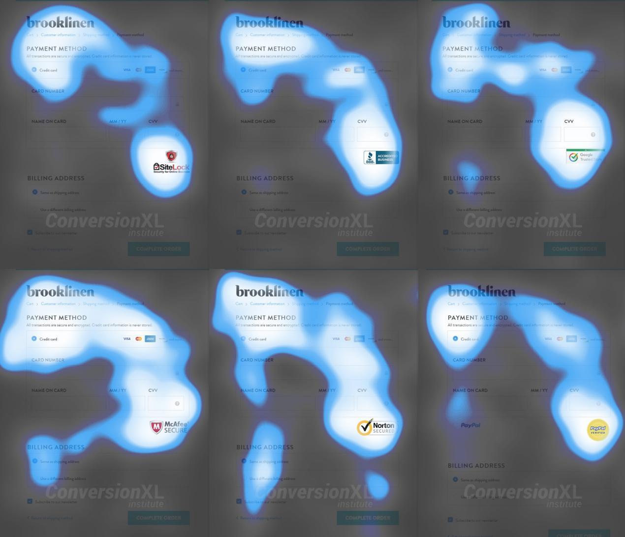
Building the trust factor at the payment gateway is the key to trigger the users to go further. The payment process is a sensitive part of online shopping and users tend to get worried about the security. The trust signals is very obvious, but is not always implemented on the websites. As per an article of conversionxl.com, an eye-tracking test showcased a general pattern of observation on the checkout page. These maps tell us that all trust badges were pretty noticeable.
Img Source: Conversionxl.com
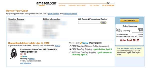
Some of the trust signals that were recommended after the eye-tracking analysis are shown in the image below.
Img Source: Conversionxl.com
Offer refund and replacement option
The money back and replacement guarantee is a must for the users as they don’t get the touch and feel of the products. Reducing the fear associated with online purchases is the essential to reduce abandoned cart and enhance sales. There is always a risk that the product will be returned by the customer, so, return guarantee is a must. Make the entire return process flawless by using an efficient extension. Prestashop Return Manager Addon is one such tool that can manage the return request placed by registered or Guest customer on a PrestaShop store. Thus, it provides you a great way to influence repurchase and revisits.
Make the form quick and easy to fill
As mentioned above, the long and tedious checkout process is the biggest turn off for the customer. The form should be concise and simple. Do not ask for too many information from the customer. The form should be restricted to the front fold only. Online shoppers hate to commit, so, ask for account creation during the payment process.
Get the email address before the person proceeds to the checkout process
Having mentioned the above point, there is one more factor that needs consideration. The email ids of the shoppers are essential whether he is a registered user or a guest. The reason being even if all the other factor is aligned in the right place, 100% conversion is not guaranteed. So, you need to keep inviting the shoppers with your sales pitches. Ask the user to enter their email address in the starting. They can later choose whether they want to check out as a guest or create an account. This way you’ll get the email ids without even annoying the customer. Use email marketing for the abandoned carts and win more conversions.
Conclusion
Whether you have your own eCommerce store or you have delved into a marketplace scenario, reducing and handling the abandoned cart is the key to boost sales. For the PrestaShop marketplace, you can install PrestaShop marketplace extensions to make the process simpler. Optimize your checkout process and make sure that make sure that your website stands out in the crowd.
You would have often visited malls for shopping purpose. What did you look for after picking up your items? I am sure your eyes would have been searching for a short checkout line so that you could make a quick checkout.
Let me tell you my case, I went to a store a few days back, picked up some stuff and when it was time to go to the billing counter, I noticed the line was too long. I waited for a few minutes initially but couldn’t keep the patience for long. I left my items there and took an exit from the store.
In e-commerce, this is what we call as Cart Abandonment and a lengthy checkout process is one of the primary reasons for it. This is exactly what happened in my case too. When I realized the checkout would take a lot of time, I dropped the purchase idea.
This is why a simplified and a user-friendly checkout holds very high importance in the eCommerce space. When users find a checkout process lengthy or time-consuming, they abandon their cart and look for better alternatives.
Getting shoppers to your eCommerce store is not difficult, engaging them till the final payment process without disturbing the user experience, is. The checkout page is the most important part of this whole engagement game.
Through this article, I will enlighten you on how to optimize the checkout process and create a user-friendly checkout.
1. Make Account Registration Optional or at least Offer Social Login
Avoiding compulsory account creation is the primary step towards a user-friendly checkout. Do not compel users to signup when they look almost set to make the payment. Making registration process compulsory at the checkout page mostly results in cart abandonment, which causes high conversion loss.
Let the mandatory sign up process not be a hurdle in a successful conversion. Offer Guest checkout or introduce a Social Login option on the checkout page. This would help users in a quick checkout without hampering the checkout experience.
In many of the eCommerce websites, there is no option to update the product quantity right from the checkout page. Hence, if a customer wants to increase or decrease the product quantity, it leaves them with no choice except discarding their current checkout process, going back to the product page, updating the quantity and filling out the entire details again. This spoils the user experience.
So, make sure that you include the option to update the product quantity on the checkout page. Also, ensure that the back button takes the user to the previous page rather than discarding all their information.
3. Add a One Page Checkout
A one-page checkout also called as a single page checkout is also one of the important elements of a user-friendly checkout. Instead of asking users to navigate through multiple steps to fill the checkout form, make it a single step checkout process. It improves user experience, reduces the chances of cart abandonment and eventually leads to increased conversions.
Our One Page Checkout module incorporates all the checkout fields on a single page and helps merchants to allow a quick checkout facility to their customers. The module offers Guest Checkout, Social Login, Multiple Layout Designs, etc. Most importantly, it supports nearly all the major payment methods and shipping services.
4. Display the errors up-front
Mistakes happen very often while filling out the checkout fields and customers are not aware of it until they hit the submit button. They have to submit again and again until the entered inputs are found to be correct. This can be extremely frustrating and become a major barrier in a user-friendly checkout.
Use Inline Validation to counter this hurdle. It identified the inputs in real-time and displays whether the provided details are correct or not when the user switches from one field to another.
5. Display Checkout Progress
Use a progress bar to indicate at which step the customer is present and how many more steps does he or she need to go through before finally placing their order. It is always a good idea to keep visitors updated about their checkout progress.
Many a time, shoppers leave the purchase incomplete because they get tired of filling out the information when they are not aware of the checkout progress. So, give them a clear idea up-front of the number of steps that are needed to make through the checkout.
6. Provide Real-time Customer Support
Customers can have a lot of queries while they are on the checkout page, especially the new visitors. You never know what’s going through a customer’s mind during the purchase.
To assist them with their queries or help them with any trouble they are facing, provide them with real-time support. Adding a live chat option or customer support number would do a great job.
7. Thank Your Customers for Shopping with Your Brand
Leave a “Thank You” note for your customers as soon as they place their order along with the “Order Successful” message, obviously. This is a good sign to appreciate or thank your customers for showing trust in your brand. It improves customer loyalty.
Knowband provides “Better Thank You Page” module that converts a normal order success page into an effective marketing strategy. With the help of this module, the admin can encourage repeat purchases and improve customer retention by offering discounts to their customers for future purchase. It also encourages cross-selling.
The journey from adding the product to the cart to the payment page needs to be smooth and convenient. Having a user-friendly checkout not only ensures more conversions but also keeps you ahead of your competitors. All that a customer craves for is a smooth checkout experience, provide them that.
If you find the above information helpful or have anything to add for a user-friendly checkout, do let me know in the comments below.
Moreover, you can visit our Knowband store and look for a number of checkout modules to help you with an optimized checkout process.