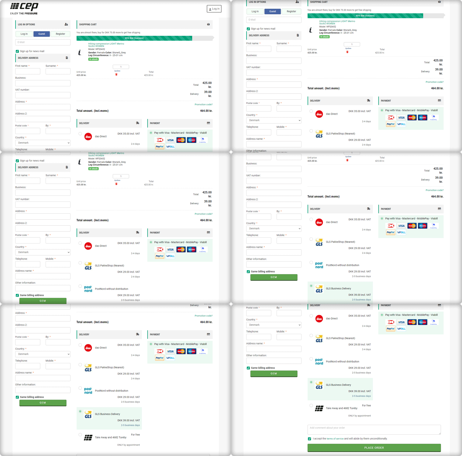
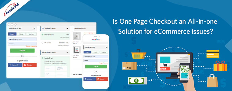
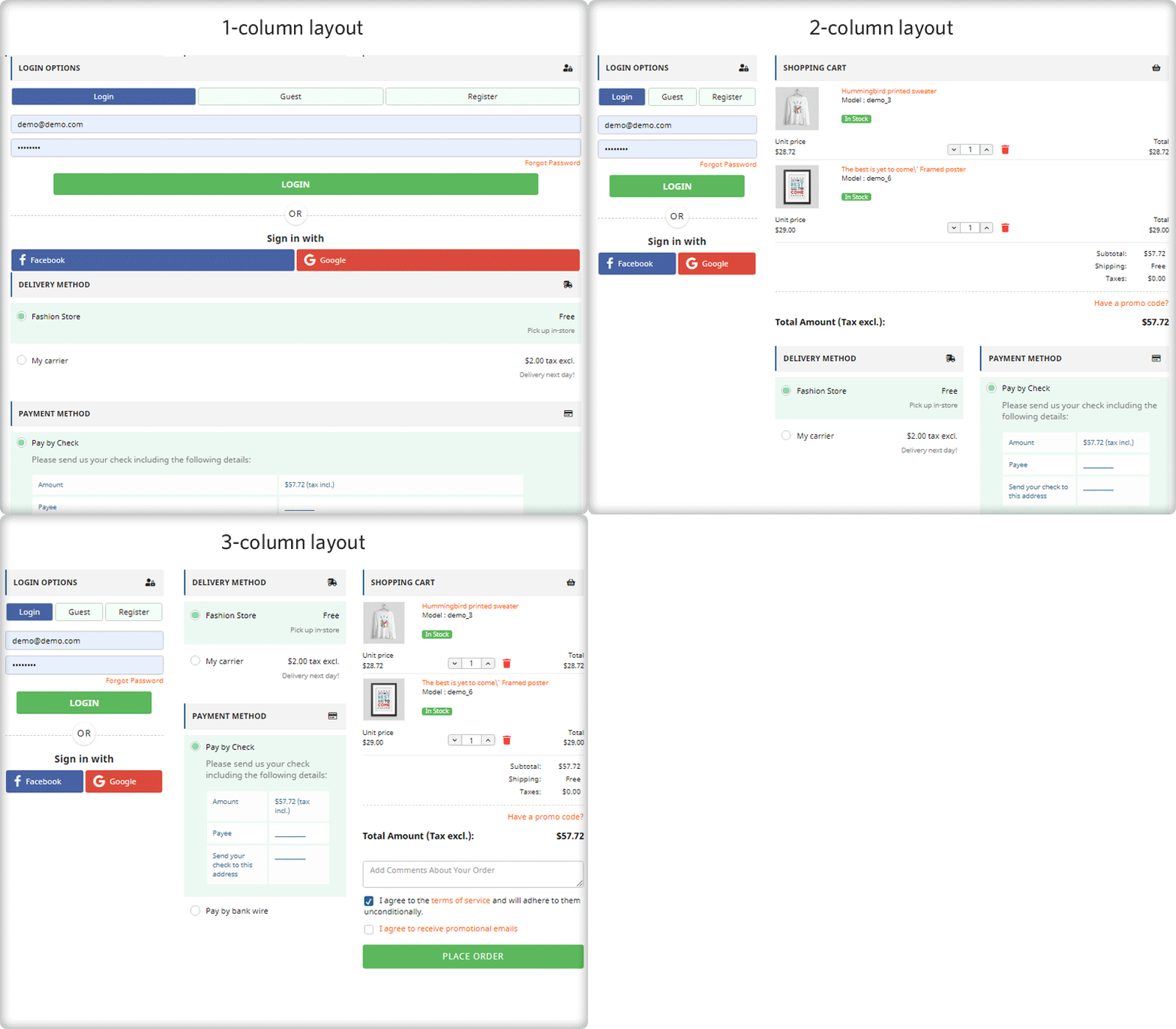
One Page Checkout is a smart way to put all the fields into a single page and present it to the customer in a sleek and clear format. It is like a box designed to keep your accessories separately but together. A Denmark-based company, CEP Sport added the One Page Checkout Module to their website and they have configured it in a well-designed manner.
The layout customization is quite simple and the addition of the progress bar keeps the user engaged. This article describes how beautifully you can create the Checkout page with One Page Checkout Module and implement the same on your eCommerce website like CEP Sport just did on their website.
What is CEP Sport?
CEPsport.net is a distributor of the German brand CEP and is operated by SportSupport ApS. CEP has the best sportswear on the market in terms of design, feature, and compression. They are even athletes who enjoy being able to move. It is well-supported by the most cutting-edge sports products in the market.
Implementation of One Page Checkout module in CEP Sport Website
From product page to checkout page, every eCommerce website design requires the best UI and UX. It is important to optimize the landing page but more needful to have a checkout page that does not add up to cart abandonment. CEP Sport has chosen KnowBand’s One Page Checkout module for their checkout page and we are glad that they trusted our module for the best Checkout Page Solution.
One Page Checkout has several features that make it best among the other available choices.
-> Visit CEP Sports Store and have a look at their Checkout Page Design by yourself: Click Here
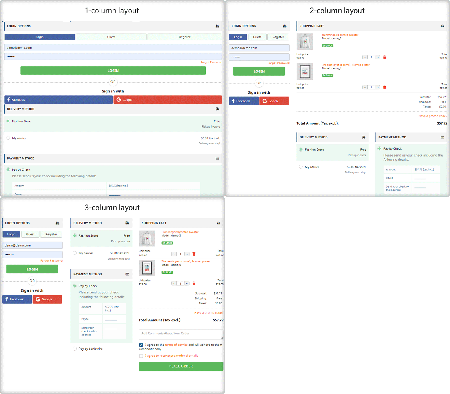
It has a 3-Column Layout with a custom layout design
The Checkout page of CEP Sport has a 3-column layout design and the module provides customization features for the layout.
How layout can be customized? It allows you to choose a layout design (1-column, 2-column, 3-column). And, you can shuffle the fields and reposition them with drag and drop functionality.
In the picture below, you can see that the checkout page is customized and CEP Sport has designed it according to their requirement.
Shopping Cart CTA
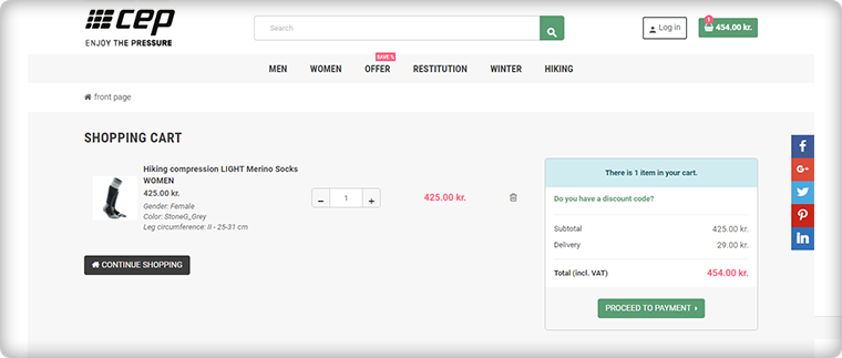
To reach the checkout page, it is important to have clear CTA (Call-to-action) buttons. The website is incorporated with proper CTAs.
Customers can proceed to the checkout page by clicking on the button ‘Proceed to Payment’ and it will redirect them to One Page Checkout.
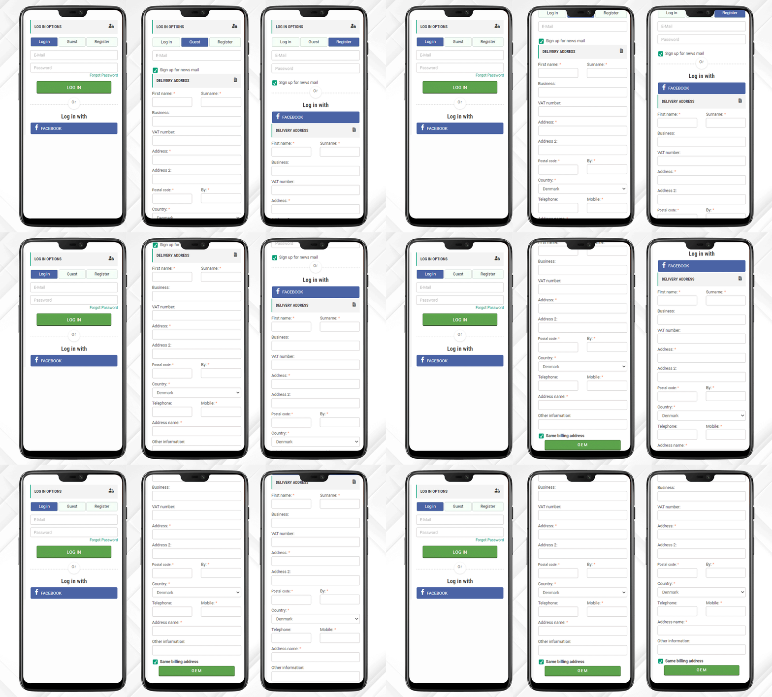
Login, Guest Checkout, New Registration
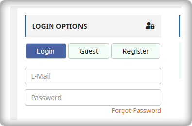
Once, the customer reached the checkout page he/she has to register himself and if he is in rush then Guest Checkout is also available.
One Page Checkout has three options:
Log-in via email
Guest Checkout
Register as a New User
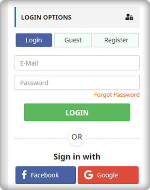
Log-in and Register with Social Media Account
Registration with a Social Media account like Facebook is quite handy and one does not have to remember the password for every eCommerce site. If a customer is registering via Facebook then he only has to provide the delivery address.
And, Checkout Process is sorted!
After registration, login can be done by entering the E-Mail Address and Password or a user can log-in by Facebook account.
Just one click and you are done!
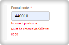
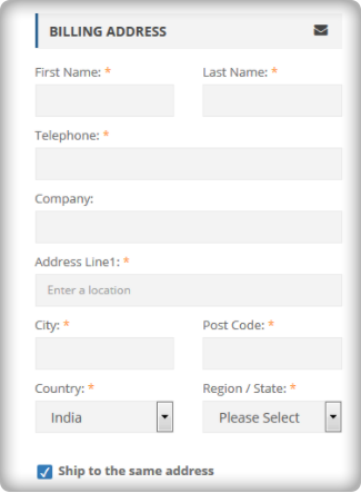
I am Mandatory* and You just filled in the wrong details
The mandatory fields can be highlighted with the Asterisk mark (*). Also, it immediately indicated the errors made by a user during the form filling process, called inline validation.
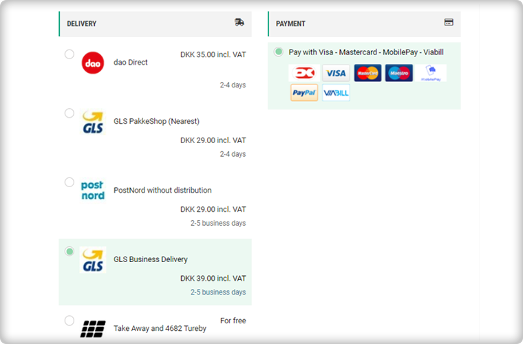
Delivery and Payment Methods
The Single Page Checkout of the CEP Sport website has several shipping choices and Payment Gateways. Along with every shipping method, extra charges (if applicable) are displayed. It is also possible to specify a particular payment gateway with a specific shipping method.
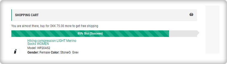
Progress Bar shows the user’s success
This helps the customer to measure the registration progress. If you think this is not necessary then you should know that a human brain works better if it knows how much work is left.
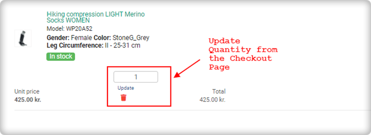
Update product quantity on Checkout Page
Another feature that makes it the client’s choice is the quantity update option. One Page Checkout allows customers to update the product quantity on the checkout page itself.
Add an extra field to collect more information
If a customer wants to add any comment about the order then he has an additional field for the same. Admin can add custom fields in the checkout page to collect information from the customer that can be used during email marketing for personalized email.
Since all the information is added correctly by the customer or the guest visitor.
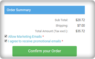
Now, he/she can place the order!
Why do you need One Page Checkout in your online store?
We have had a successful tour of the CEP Sport website’s One Page Checkout. Now, it is time to understand the value of a single page checkout over the default multiple Page checkout available on eCommerce platforms. The One Page Checkout appears to be simpler because it displays all the fields on a single page before the form filling process. Guest checkout and social media login options are proven methods that increase registrations on the online store. It has a statistics analysis tab that shows the conversion rate and bounce rate of the checkout page. Several features make the One Page Checkout Module the client’s first choice for the checkout page.
KnowBand team is always available to help you with eCommerce solutions. We have 100+ modules available for eCommerce platforms like OpenCart, PrestaShop, Magento, WooCommerce, and Shopify. Visit KnowBand Store to explore more.
Get in touch at support@knowband.com and discuss your website requirements with our experts.
Here at Knowband, we get questions from all our clients looking to boost their checkout conversion rate, if they should switch to a one-page checkout?
Their aim with the question is simple; they want to get more check-out page conversions, fewer cart abandonment, and more sales. We respond by always saying this, “It depends”. It sometimes comes as a surprise to most customers to hear this reply. As we are selling a one-page checkout Extension, and still not pitching a sale to them. Maybe they expect an answer like “Yes, it is the best. You should use our one-page checkout”.
I wish it was this easy. We don’t pitch our solution with a blindfold, instead, we recommend them something that will help them understand if their issue can be solved by simply installing the one-page checkout module. Let’s just take a pause and inspect some pros and cons of one-step checkout and then decide, whether a one-page checkout is simply an all-in-one solution for all your issues?
The misunderstood part of the one-page checkout solution
This is a common misconception among the eCommerce store owners that the one-page checkout is one medicine to all the check-out-related cart abandonment issues. It’s really understandable. The Fewer steps a customer has to go through easier it will be for him to complete the process and checkout bounce backs will reduce.
However, that’s not always the exact case. The implementation of one-page checkout is definitely appealing, but it does not mean it is the solution to all your issues. Truth to be told, one-page checkouts have their own set of problems that should be addressed to make them more organized and informed for the customers. Simply, a one-page checkout solution can make your store, but can also break it with some negative impacts if you don’t know the correct way to implement it.
For the customers who inquire about our one-page checkout, often time we come to hear that they read some article or attended some event where they told it is better. Most likely these customers did not pry into their existing multi-step checkout process and neglect the mistakes they are already doing with their checkout. So, even if they go for a one-page checkout, they are more likely to repeat those same mistakes, and then blame the checkout solution for the breakdown.
Consider these factors before deciding your checkout page:
So, Which one should you consider, One-Page Checkout or Multi-Page Checkout? An honest reply would be both. A one-page checkout can be really effective in the right conditions and with proper implementation. You need to make sure that it addresses the common issues of a one-page checkout and has handled them effectively.
The right conditions for deciding the right checkout process for your business can depend on the aspects like:
Niche
Customers
Price point
Product Type
Pain Points and
Solutions
For instance, if you are selling luxury items that already receive fewer sales due to the high price point, and you have a loyal base of old customers, then a multi-page checkout is a better choice here. It will guide the users through the checkout process and will convert better.
On the other hand, if you sell non-expensive items where there are more sales and you are also offering free shipping options, then a one-page checkout solution would be more effective here. It will be quick, give a faster way to review the products in the cart, show the free shipping option right away, and allow the shopper to make the payment straight on the same page.
Perform A/B testing for the best checkout page solution
These are just the example of two simple cases. However, the best way to know which option works best for you is to test, analyze, test, and iterate. A/B testing can be really helpful where you can test both the types of checkout (i.e. one-page checkout and multi-step checkout) at the same time and see which one pleases your customers better.
Be cautious while testing, because here you’ll be pitting the best against the best. You wouldn’t get the right results if you compared a well-optimized one-page checkout to a cluttered and unorganized multi-step checkout. So, always test an apple with another apple.
A simple recommendation would be to first optimize the current multi-page checkout as far as possible. Once, you have fully optimized the multi-step checkout, then compare it with a well-optimized checkout by testing them. It will give a fair chance to your multi-page checkout, or else, the one-page checkout solution will always overshadow it.
One-page checkouts still have some benefits by default
The one-page checkout is quick since everything is on a single page.
There are only a few steps for customers to complete on a one-page checkout solution.
Well-optimized checkouts provide the cart review option on the same page.
Shipping option selection is available on the same page in the one-page checkout module.
The one-page checkout offers payment options on the same page.
Some advanced checkouts offer social login options as well.
Features to look for while selecting a One-Page Checkout Solution
Optimization is one such thing that differentiates a checkout Page from another checkout solution. Whether you are talking about a multi-step checkout or a one-page checkout, it has to be well optimized. You won’t be able to solve all of the problems with the checkout page by simply consolidating it onto a single page; you’ll still need to optimize it for cart abandonment issues.
A true one-page checkout developed to curb the checkout page abandonments must address the issues like these:
Length- The length of the checkout process does not merely depend on the number of pages, but the number of details a customer has to fill in to complete it. Make sure your one-page checkout does not ask the customers to fill in unnecessary and redundant details. You can segregate the mandatory and optional fields.
For example, you can reduce the billing or shipping address form size by removing the unnecessary fields like fax number, anyone from the phone or mobile number, etc.
Cart review and update- What most of the one-page checkout solutions miss is the option for the customers to review their cart and update the product quantity from the checkout page. However, there are Advanced one-page checkout solutions that do provide the cart review and update options. So make sure, your one-step checkout does provide this feature.
Guest checkout: Guest checkout is an important feature. On both the checkouts(i.e. one step checkout or multi-page checkout), if you miss providing a guest checkout option, then you may lose some business. So, make sure whichever checkout option you choose, you should offer the guest checkout.
Social Login: Social login option is more of a competitive advantage than an optimization. If you are not asking your customers to necessarily create an account and offering guest checkout, it’s optimization. However, if you are allowing them to sign up or log in with their Facebook or Google Account, it’s a competitive advantage. Our PrestaShop one-page checkout offers social login through Facebook and Google to help you gain the most out of your checkout process.
Clutter-free design: What haunts most of the merchants while switching to one-page checkout is the design issue. A one-page checkout in-housing the whole checkout process on a single page is more likely to look congested and cluttered. Therefore, you must ensure that your checkout page does not only fits with your theme design but should also have enough white-spaces to segregate each element and section. For example, it would not be a nice look if the shipping section overlaps the payment section or any other section of the page.
We have tried our best
We have tried our best to optimize our one-page checkout modules for Magento, OpenCart, and PrestaShop in the best possible way. We have included all the options that have been mentioned in the previous point. Moreover, we have also tried it to have the best possible clutter-free design.
We don’t say a one-page checkout is a one-stop solution to all your checkout page issues. However, a well-optimized one-step checkout can always provide an upper hand. Optimize your multi-step checkout to the best possible extent and then test it with the one-page checkout solution, the results will ensure you have the best checkout, no matter it’s one page or multi-page. Always choose the best for your brand.
A lot of effort goes into building the pages that convert. Content optimization, CTA optimization, navigation streamlining, everything we do is for driving conversions on the store. E-Commerce checkout is one such page whose conversion rate has a direct impact on your revenue generation.
In this post, I have compiled a list of the most inspirational eCommerce checkouts that can inspire you to learn some useful aspects from them. Each of the checkouts in this list consists of something that you take a cue from. It should give you a clear idea of how should you go about making your own checkout page conversion friendly like these websites. So let’s get inspired by these checkouts.
1. Apple’s checkout
Apple’s checkout is a great example of providing alternate checkout options
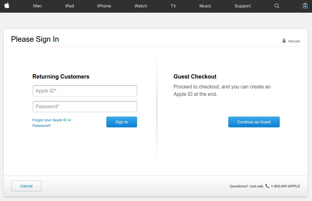
Apple provides a very well organized checkout page that lays full attention on the call to action buttons with proper utilization of the white-spaces. The checkout page does a great job of appealing the users to complete the process even as a guest user.
Asking for necessary account registration to complete the checkout process is one of the most common reasons for cart abandonment. To work out this common issue, Apple provides guest check out option where shoppers are not required to necessarily create a user account by filling loads of information in the registration form.
If they already have an account, they can sign-in, and if not have an account, just continue with the guest checkout.
However, there is a flip side of the guest checkout that customer’s information will not be saved for future reference in the database. It means customers won’t be able to track their order. If that is not a problem for the customers, guest checkout is a useful feature to include in your checkout.
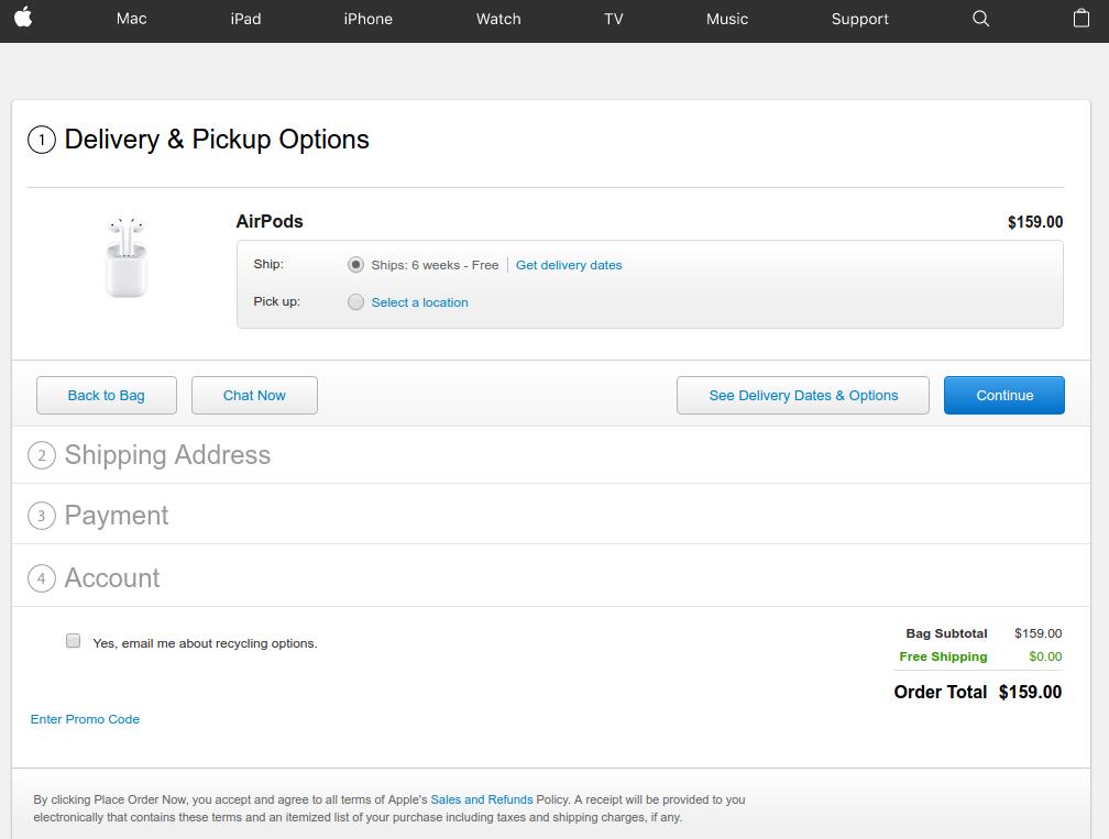
Also the post user login or Guest checkout steps are so simple and interactive. There is a chat option that you can use to clear your doubts right from the Apple’s representative. You can choose the delivery dates and options available, continue with the next steps.
2. Bellroy’s checkout
Lengthy checkout is one of the major reason for shopping cart abandonment. According to Baymard institute,
“27% of US online shoppers have abandoned an order in the past quarter solely due to a “too long/complicated checkout process”.
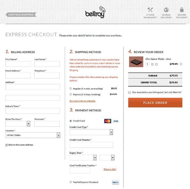
Bellroy handles this big issue a little different as compared to Apple. It provides a one-page checkout to its users compacting the whole checkout steps on a single page only. The one-page checkout structure makes the process smooth and shorter for the customers. Users can fill out the delivery address, billing address, select shipping options and provide payment details right from the same page.
The user experience has been further optimized by including a set of only the necessary details required to be filled-in.
Those eCommerce store owners who want to provide a simple, quick and easy checkout experience to the customers can utilize a one-page checkout structure and save time and efforts of the customers.
3. Myntra’s checkout Caption:
Myntra goes well with its multi-step yet high converting checkout page
In case you are not a supporter of guest checkout or one-page checkout, you should take a cue from Myntra’s checkout page. It presents a perfect example of how you can make a multi-page checkout conversion friendly without guest checkout.
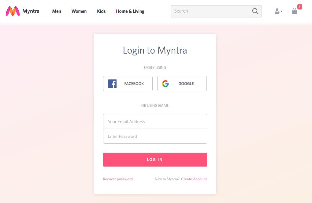
Here, instead of guest checkout, customers can continue as a registered user by logging-in using their Facebook, or Google account credentials without creating an user account on Myntra.
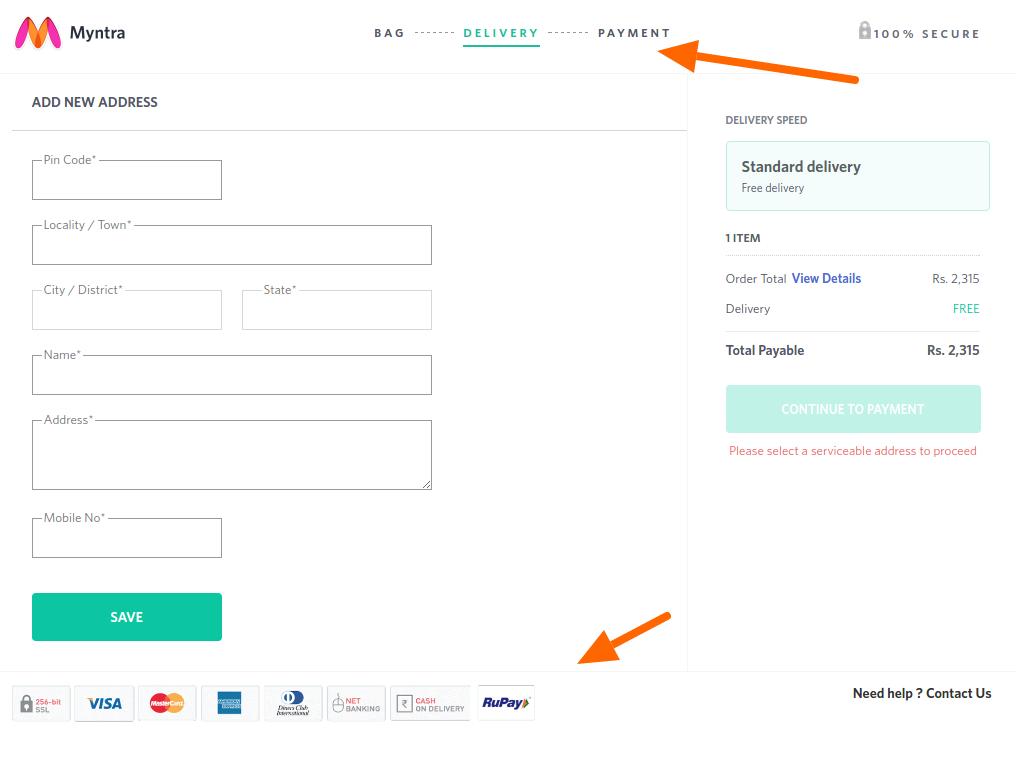
Moreover, when customers are completing the checkout process of Myntra’s multi-page checkout, they are provided with a clear idea of where they are and where they would be in the next step. It provides a transparent process that includes a progress bar on the top of the page, plus a logo of trust, and payment options logo at the footer keep the users well informed.
The guest checkout option provides the option to the users to register an account right after the checkout is completed. This is a nice touch to encourage account registrations without giving a burden to the customers.
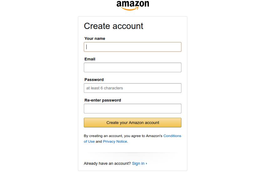
4. Amazon’s checkout
Amazon’s latest checkout emphasizes on account necessary registration
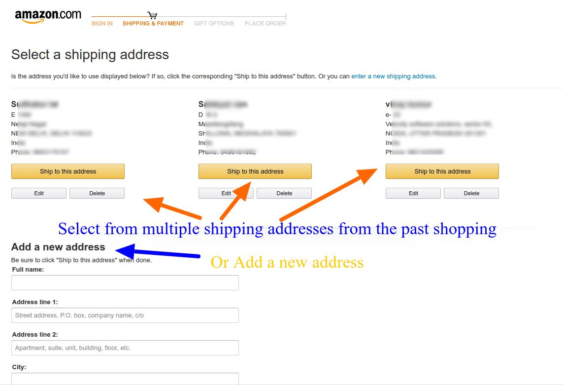
Amazon keeps testing its checkout process now and then. Currently, it is following a unique combination of traditional approach and it’s own peculiar call-to-actions. By highlighting the free two days shipping option on the product page itself, it reduces the task of shipping selection on the checkout page, plus an indirect promotion of Amazon’s prime service.
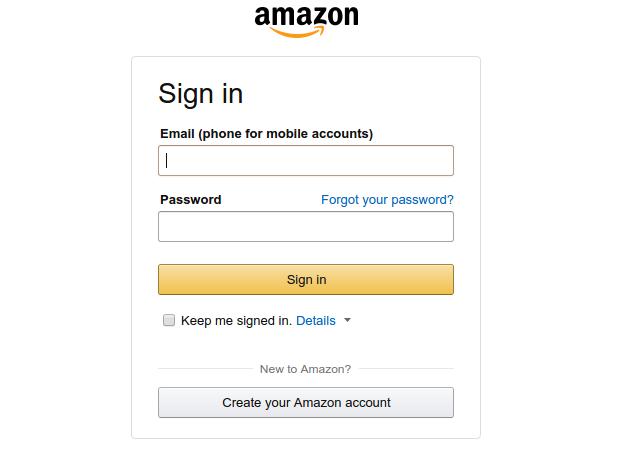
The common perception of an eCommerce checkout involves providing a lot of options like, Add to wishlist, continue shopping, guest checkout and so on. However, Amazon works on a different principle here. It emphasizes on creating a user account before you can proceed to the checkout page but provides a very quick and compact registration page.
Despite the necessary account registration, Amazon still have a high converting checkout
By doing so, Amazon makes sure that customers entering the checkout funnel are not distracted by the leaks and completes the checkout with a personalized user experience. If your customers do not mind filling a very small registration form, Amazon’s approach is is an inspiration for you.
Caution: Amazon acts as almost a monopoly in the eCommerce market for various categories. Customers preferring Amazon won’t find a hard time filing small registration form. It might not be a similar situation in your case. I would suggest a comprehensive A/B testing campaign before finalizing the decision.
5. Mensuas’ checkout
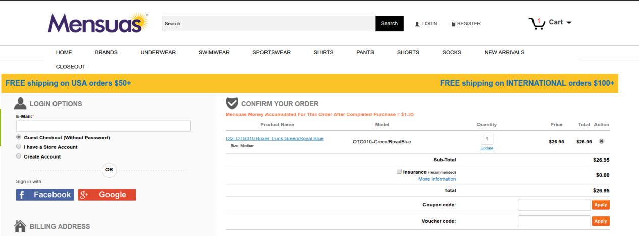
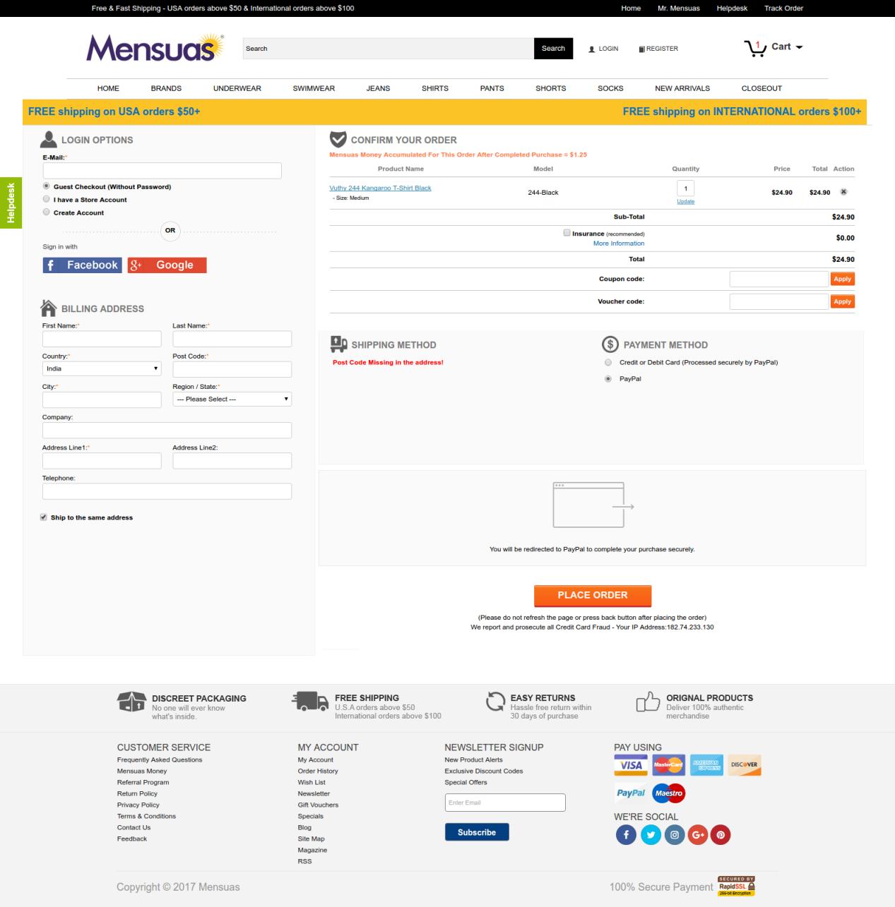
Mensuas have a single page checkout, with social login option
If account creation is not a preference for you, you might want to look at the checkout page of Mensuas. Mensuas is a leading destination in the US for fashionable underwear for men. Similar to Bellroy, Mensuas too provide a single page checkout to it, customers. However, it goes one step further by introducing social login on the checkout page. One can easily notice the emphasis on login options where you have multiple options to continue with the check out process- Guest checkout, User sign-in, and account registration.
In case you are a new user, you can either checkout as a guest user, create a user account, or just use the Facebook or Google login option for direct login using your social platform credentials. By clicking on any of the social login options, the user can instantly login to the user account without filling a registration form. Thus, saving the customers from a burden to create user accounts manually. Social login makes the checkout experience very smooth and handles multiple reasons for cart abandonment at once.
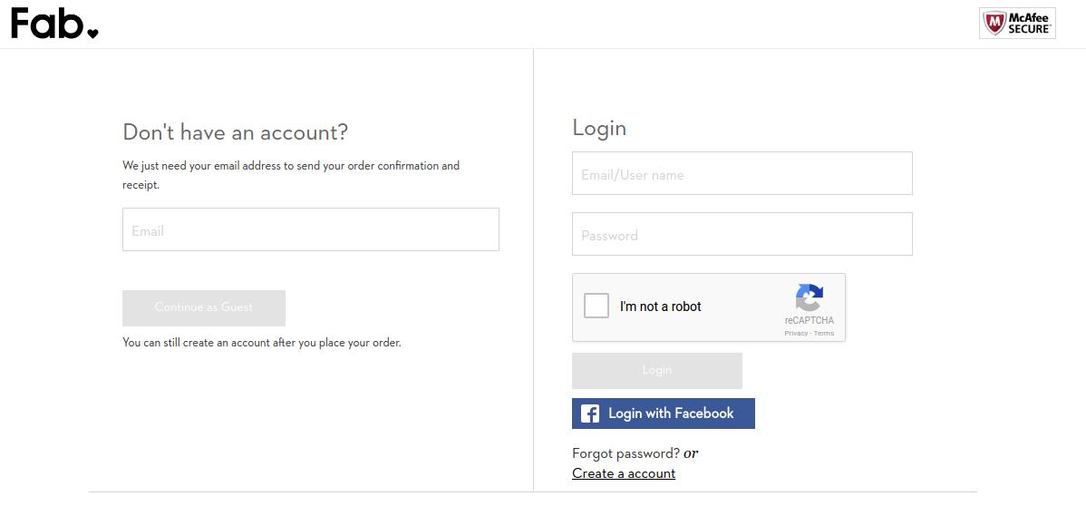
6. Fab’s checkout
Fab provides a multi-step checkout with Facebook login option
Fab utilizes a well optimized multi-step checkout that can be completed without creating a user account manually. If you don’t have a user account already, you can choose from guest checkout or the Facebook login option.
It efficiently utilizes the Facebook login to encourage user registrations which is an important aspect of learning from Fab’s checkout page. It understands the importance of user accounts and how they can be used to create repeat conversions. So, it pushes the users towards Login option without actually forcing them.
The checkout process after login or continuing as a guest presents some well-optimized forms for providing the billing, shipping and payment information. The forms ask only the necessary information and do not demand secondary information from the users.
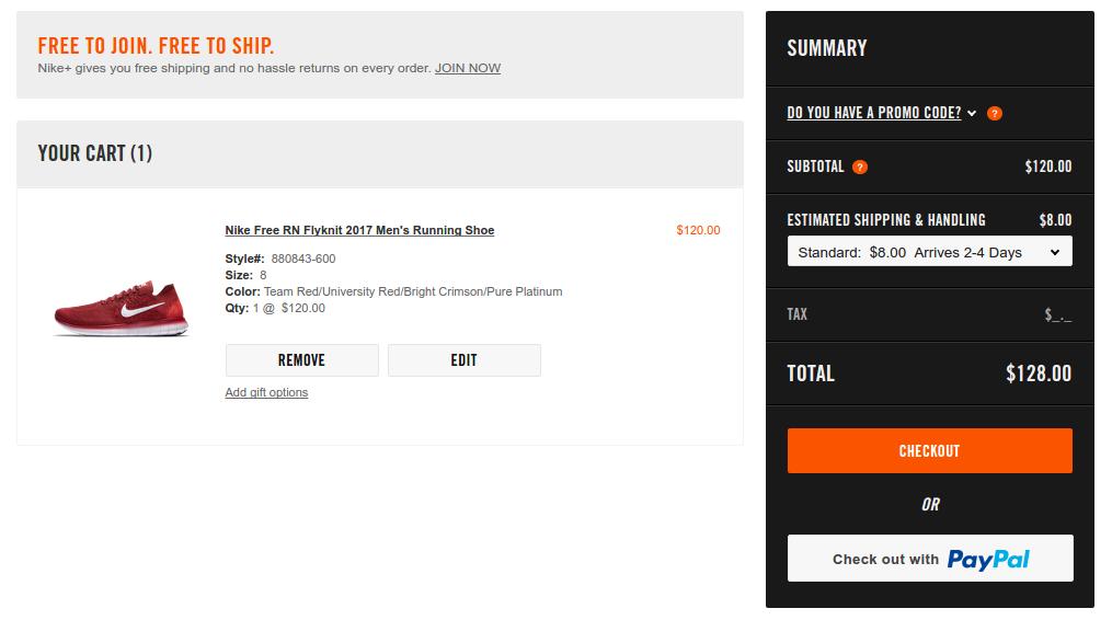
7. Nike Store’s checkout
Nike’s checkout is preceded by an optional Paypal express checkout
The speed of the process is a major concern that haunts every store owner. Nike handles the situation by cleverly integrating a PayPal checkout option which provides a more faster and secure checkout. Moreover, for using a Paypal customers need to login using their PayPal account which automatically brings the customers to logged in users’ club.
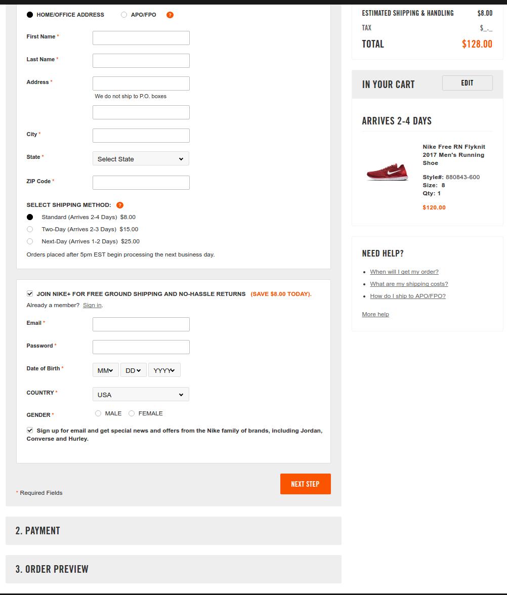
For the regular checkout interface, Nike goes with a partial one-page checkout structure. I am saying partial because all the steps are not unlocked at once on the page. You have to complete the previous step before moving to the next step.
Nike’s regular checkout is inspired by the single page structure
Here users can choose to continue with the checkout without logging in and create the user account at the later part. Furthermore, the shopping cart summary in the right column keeps the users well informed about the miscellaneous costs associated with the cart- Shipping charges, total cost, single item’s cost.
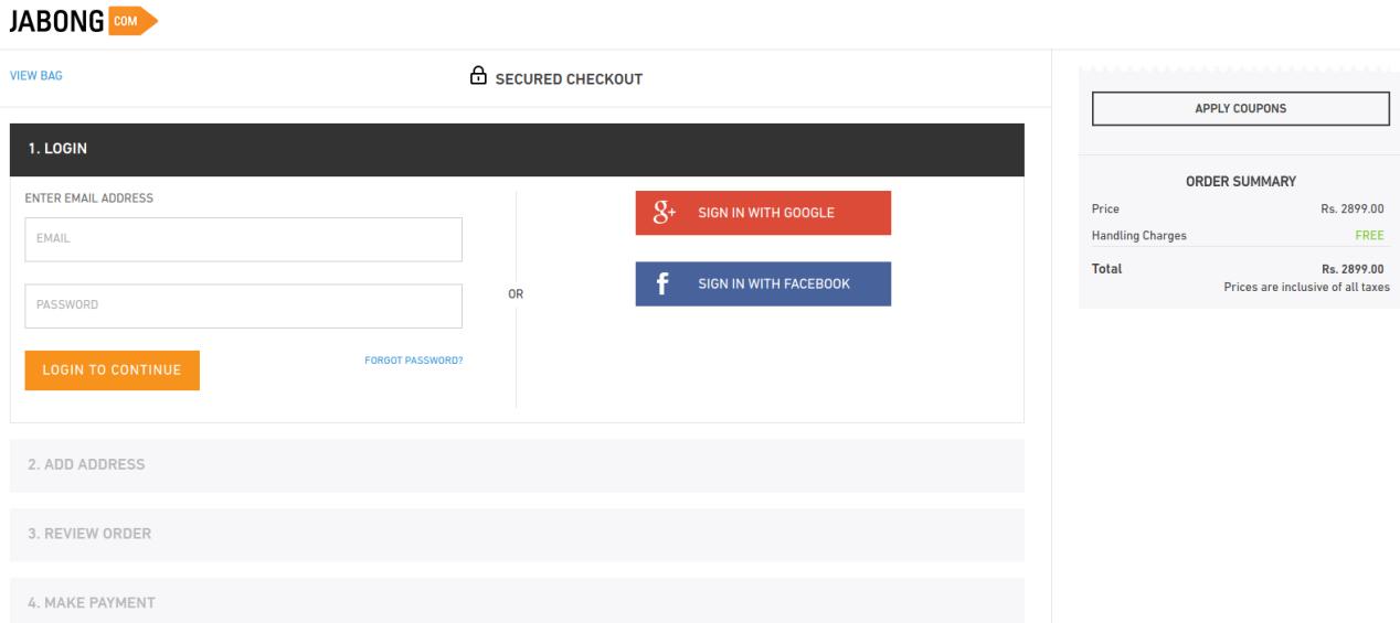
8. Jabong’s checkout
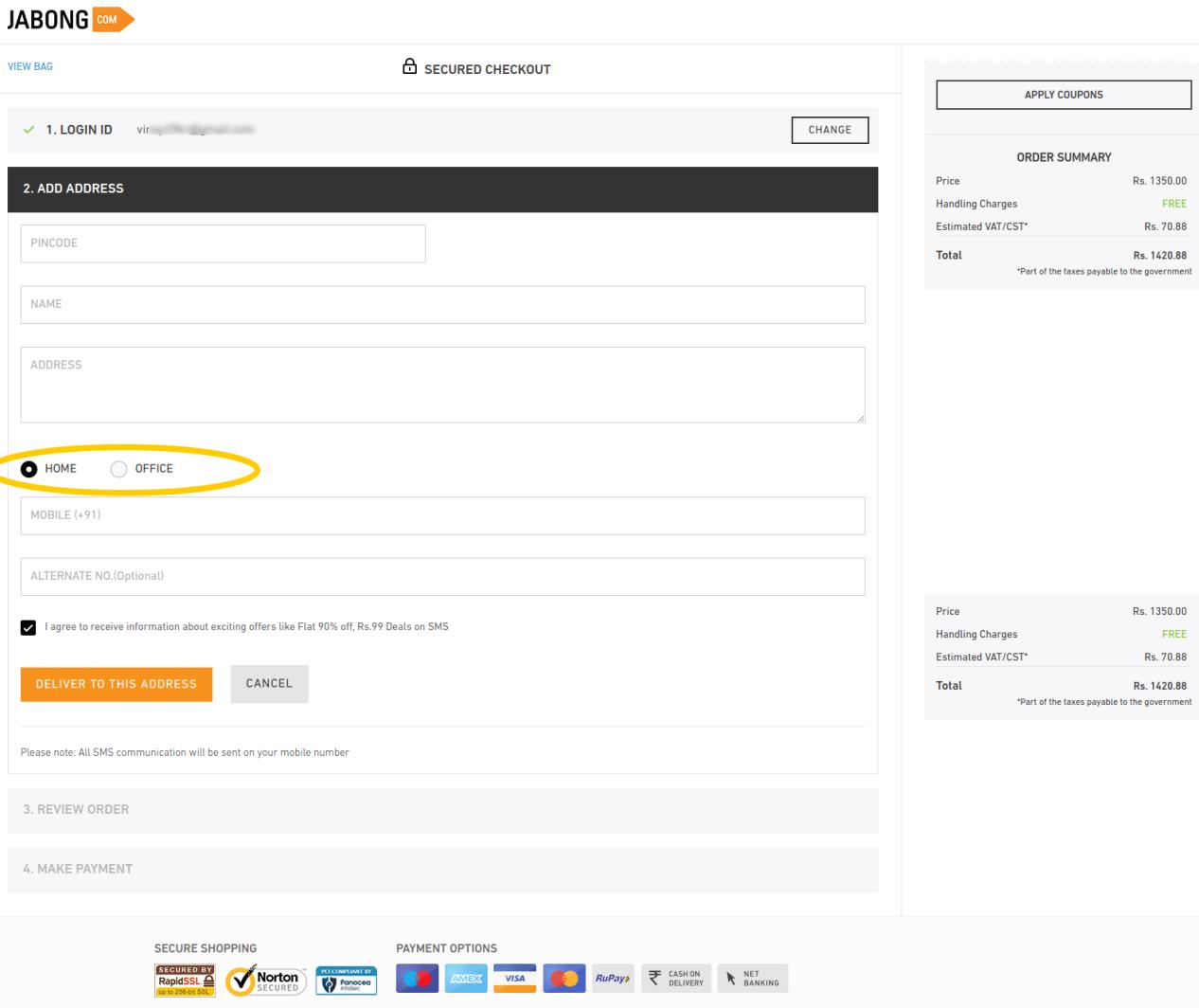
Jabong provides a streamlined check out process that keeps the users informed about the next steps plus allows multiple social login options. The further steps on the checkout page are well optimized to ask only few important details.
The most inspiring option that I found here was the option to specify if the shipping address is a home or office address. It helps the shopping site to deliver the items on a correct time, minimizing the chances for missing delivery. Furthermore, the alternate phone number field is an optional field which customers can choose to skip or provide. I have found this checkout as one of the fastest among the check outs I inspected.
The final takeaways
Summing up the entire case study, it is evident that whether you take UI or UX as the judging criteria, one page checkout is something that makes the process edgy. I will consolidate the entire features that make these checkouts best-of-their kind.
Single page checkout:
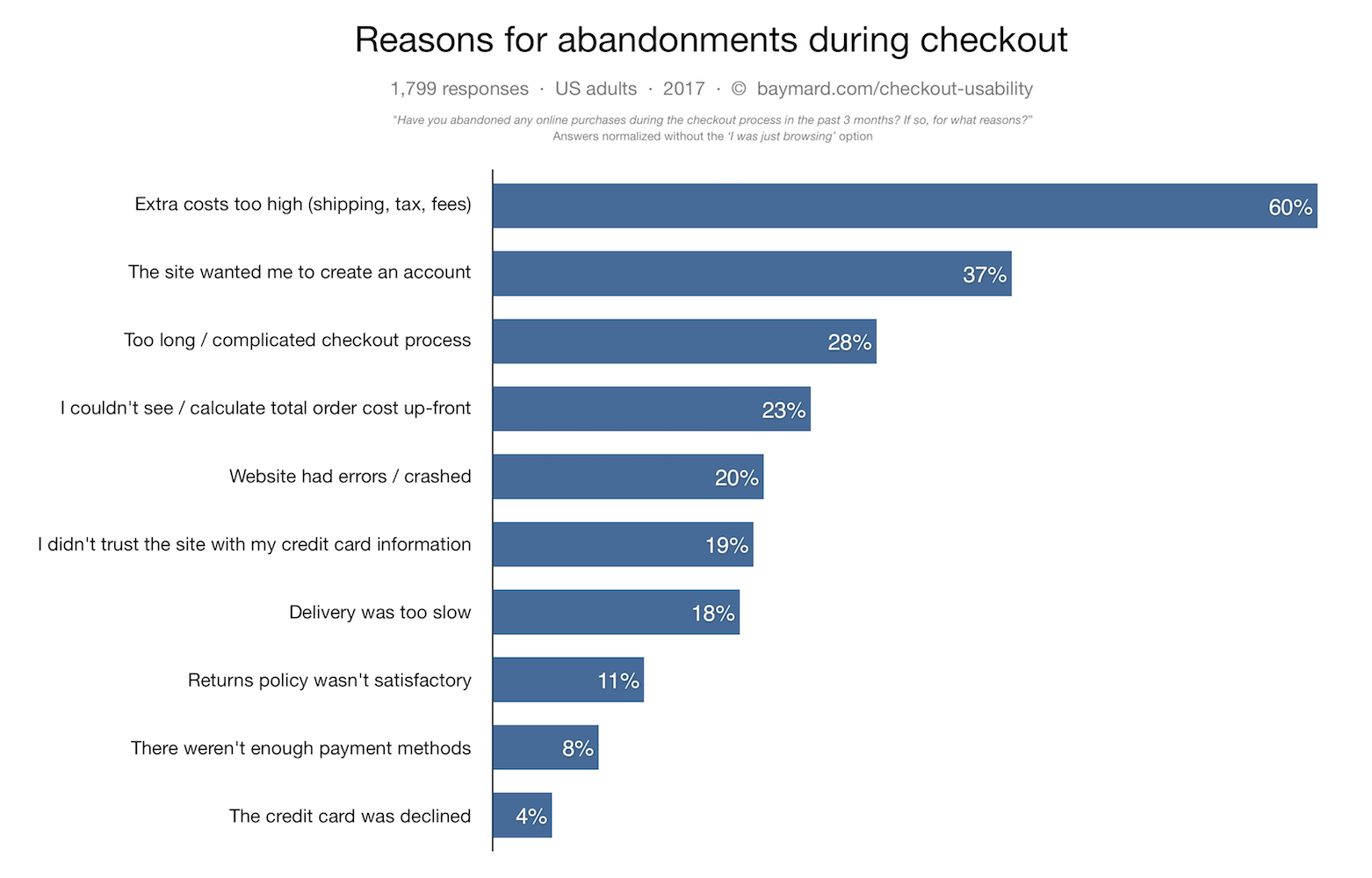
As per Baymard, complicated order processing contributes to around 28% of the cart abandonment. This is when a one page checkout can simplify the process for your customers.
Easy Signups:
Guest login options along with ease of signing up can make the checkout process effective. Along with this, social login options can give the checkout process of your site a notch-up feature. Almost all the eCommerce sites, be it an industry giant or a SME.
Implement upselling and cross-selling:
The check out pages should never provide an exit root and a dead-end to your customers. Instead, it should be used as an opportunity to generate additional revenue through upselling and cross-selling. Offering compelling reasons to the customers to browse the store right back is one of the best ways to achieve customer retention. You can do this by offering customers products related to the one that they ordered, or by giving them discounts on future purchases.
Mobile-friendly checkout:
With the latest Google update that emphasis on mobile-first indexing, it has become mandatory to make the entire mobile-responsive which includes the checkout process as well. Mobile commerce will account for almost 50% of the total online purchases by 2020 as per research. So, it inevitable to ensure that your mobile users get a flawless shopping experience. The checkout process of your site should be mobile-friendly as well. At the same time, it should never exclude any of the capabilities of the desktop site, such as social login option and one-page checkout. The mobile commerce experience should be identical to the desktop one in terms of the ability to browse, purchase and pay for products.
Source: baymard.com
Offer a variety of payment and shipping options:
Meeting your customers’ needs is the key to increasing your checkout’s efficiency. As per the result of Baymard’s studies, lack of shipping and payment options are another reasons for cart abandonment. So, you need to ensure that your prospective customers are able to pay and get the product delivered in whatever way is most convenient for them. Offer them as many payment and shipping methods as possible.
Ensure security:
Cyber security is possibly the biggest concern for the online shopping. The only way to keep the customers assured is by optimizing the UI of your site. The site’s design have a huge impact on the shoppers’ perception of your site’s security. An outdated-looking site will give customers the impression that the site is not reliable and will lead to a lot of them dropping off without purchase.
Conclusion
All these eight check outs are the best ones? It depends. I will leave that on our readers to decide, but I think they all have got something for us to learn from.
All of them do not insist on necessary account creation, except for the Amazon (Which was providing guest checkout a while ago). However, all of them including Amazon do inspire us to handle the first step of checkout wisely. While others handle the situation with guest checkout and social login, Amazon handles it through its compact registration form.
I like the approach of Mensuas, which provides the sign-up, sign-in, guest checkout and social login as well. Moreover, it’s single page checkout is well optimized in terms of form design.
Ignoring your checkout process on your PrestaShop store for a while? It is time to make amends and work towards the improvement of the online shopping experience for your targeted customers. Your clients might be scratching their heads when making a purchase on your eCommerce store due to which your business suffers a significant drop in conversion rates and product sales.
To set yourself apart from the competition, don’t puzzle your online shoppers with a complicated checkout process. Find a checkout page that allows you to remove unnecessary fields or steps. Instead, find the best PrestaShop checkout solution to delight your customers and eliminate any doubt they may have.
A non-engaging checkout solution brings fewer sales and site traffic. It would be an altogether different story with the help of these five amazing PrestaShop extensions by the Knowband store.
Nothing comes as a respite for eCommerce store owners other than the news of getting improved checkout functionality at no cost at all. With the presence of the PrestaShop checkout module (free version), there are no longer multi-page checkout formalities. Everything has been consolidated into a one-page checkout solution.
The PrestaShop checkout addon provides a complete cart summary to shoppers for better customer engagement and product sales. It consists of multiple payment and shipping methods for store owners to boost the interest of their online shoppers for doing shopping through your online store. Further, it works independently of other available third-party extensions and gives a satisfactory user experience to your PrestaShop store customers.
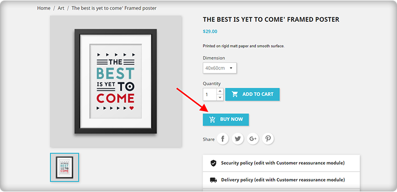
You can seamlessly provide amazing quick checkout functionality to your customers without making changes in your existing shopping cart while purchasing a single product. Some top-notch features of this PrestaShop One-click checkout (Buy Now) extension are as follows:
Seamless and quick customization facility.
Fully mobile responsive design for enhanced functionality for smartphones, tablets, and other mobile-based devices.
Compatible with all types of themes.
Translation facility for 17 languages.
Independent working to provide seamless functioning with third-party modules.
With the Single-Page PrestaShop checkout module, it is now much easier to customize the checkout process for your online store by displaying/hiding the various checkout fields. It consists of a brilliant drag-and-drops feature for layout customization that makes changing much easier and faster.
There are various functionalities like integration of desired payment and shipping method, SEO friendly and SSL secure design, in-built social media integration, guest checkout, social media log in, Google auto-address fill, mobile responsive design, compatibility with all browsers, and other such features. Grab this module for once and provide an amazing checkout experience to your targeted customers.
the PrestaShop One Page Checkout addon allows the owner to see the abandoned checkout statistics and checkout behavior report. In addition, PrestaShop allows you to display the product prices with or without taxes on the checkout page.
The module is a best seller with 5000+ downloads on the Knowband store and 9000+ downloads on the addon store.
These numbers can tell you how impactful it is!
Click here to explore the module features and free demo.
4. PrestaShop checkout page analytics
Customer tracking is an important part to provide a seamless checkout experience for online shoppers. It gives a clear insight into the reasons or steps that are causing your customers to abandon their cart. Store owners will get a full report in terms of monthly, weekly, and annual statistics with PrestaShop checkout page analytics to improve their merchandise revenue, customer loyalty, and conversion rates.
This PrestaShop checkout page analytics module also allows customers to record email id and cart details in order to assist shoppers who experienced technical issues or problems during the checkout process. Once you have all the essential statistical information with you, it will be much simpler for you to recover your abandoned carts and lost sales opportunities.
5. PrestaShop checkout payment fee addon
To show additional fees which are charged by various payment methods on your store, you need to install this PrestaShop checkout payment fee addon extension. The module can show percentage-based or fixed price-based additional fees that are charged by each payment method.
Besides this, there are other amazing functionalities like enabling/disabling currency conversion, compatibility with all payment methods having additional fees, quick installation, and configuration, and other such features.
Wrapping Up:
These PrestaShop checkout addons by Knowband have all the required features and functionalities that can easily set your cash counter on fire. Once you have the support of these above-mentioned PrestaShop checkoutaddons, you can easily win the decisive battle of conversion rates, product sales, and site traffic. Don’t miss this opportunity to get the initial business lead for your online store.
Which PrestaShop checkout addon should you choose?
If you’re testing first, start with the free One Page Checkout. If most of your sales come from single-product purchases, the One Click Checkout addon reduces friction faster than a full checkout overhaul. Stores with high cart abandonment should prioritise Checkout Page Analytics first, you need the data before you can fix the problem. Updated September 10, 2026