Web Push Notifications: 5 Best Practices to Boost eCommerce Conversions

Web Push Notification is a widely adopted method used by eCommerce merchants to reach out to the prospects and drive more conversions. It creates a communication channel between the brand and the customers to deliver important or useful information to the latter. Through this article, we will try to understand the tactics behind using Web Push Notifications and how marketers are using this channel to boost eCommerce conversions.

What are Web Push Notifications?

Web Push Notifications, also known as the Browser Notifications or Web Browser Push Notifications are messages that appear on a subscriber’s device even if he or she is not present at your website. Web Push Notification is a smart marketing strategy to engage with your audience(subscribers) and increase conversions without being an annoyance.

Browsers that currently support Web Push Notifications are Chrome, Firefox, Opera and Safari. These notifications can be sent across mobiles and desktops.

How Do Web Push Notifications work?

For Website Push Notifications to work, your visitors/users need to subscribe to your notifications. When they land on your website, a popup appears asking users to allow/approve or deny receiving updates from your end, and only if they click on the latter, you would be able to send them notifications. Web Push Notifications do not require users to provide their email address.

Web Push Notifications- Best Practices to Increase Conversions

Having an eCommerce website? Here are the 5 best practices for marketers to increase conversions and scale-up their revenue using Browser Push Notifications.

1. Announcing a Limited-time Sale

Online shoppers do get a bit excited when they hear about a flash sale, especially from a store from where they shop regularly. You can use this to your advantage and announce a limited-time sale as soon as the sale goes live.

You can create urgency to purchase by mentioning how long will the sale last, in your notifications. It increases the open rate and maximizes the chances of conversion. You can also try adding the coupon code too in the same if there’s any.

2. Announcing New Arrivals

Another one in the best practices for web push notifications would be making your subscribed audience aware of your newly introduced products. Not only it provides free marketing but also generates curiosity in the online shoppers to check out what’s new in the store.

For example, if you deal with electronics or mobile gadgets, you can send web push notifications regarding the arrival of new smartphones on your store.

3. Let Customers know when a product is Back in Stock

Loyal customers wait patiently for the product to be available again in the store. And nothing gives them more happiness than seeing the product which was out of stock earlier, back in stock. Though there is a sense of excitement to see the “Buy Now” option, there is also the fear of missing out on the purchase. You never know when a product goes out of stock again.

Website push notifications make sure that your customers are not missing out on the product that they wished to buy, and they are informed as soon as it is back in stock. This pushes the customer to make a quick purchase, enhancing your conversion rate.

4. Recover Abandoned Carts
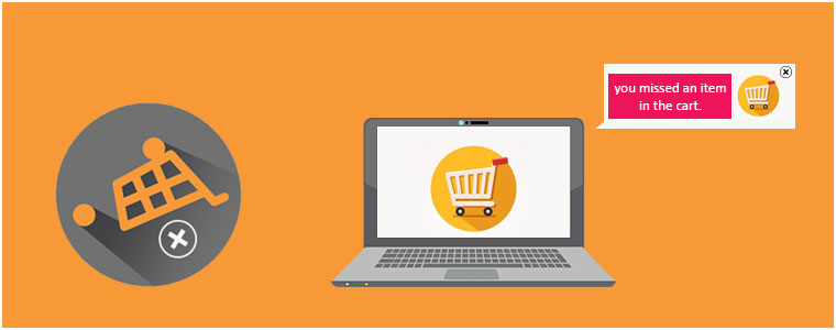
Adding to the list of best practices for web push notifications is sending out alerts to the abandoned cart users. Many times, a user just adds an item to the cart but does not buy. This leads to cart abandonment. Though there can be multiple reasons for cart abandonment, you can take a follow-up by asking the abandoned cart users to complete the purchase by sending out notifications regarding the pending items in the cart.

Abandoned Cart Web Push Notifications make a great way to recover the lost sales and increase conversions.

Related: 12 Ways to Reduce Shopping Cart Abandonment

5. Inform buyers when there is a price drop

Customers have an option to negotiate the product price in a brick-and-mortar store. Unfortunately, such an option is not available for an online store. This is why customers rejoice when they witness a price drop while shopping online. Through browser push notifications, you can let the prospects know as soon as the price drops below than what it was during their last visit.

These types of notifications are very effective to trigger impulse buying, encouraging customers to buy their desired product at a price lower than the original price. It leads to more conversions and creates higher sales.

The Bottom Line

Web Push Notifications create higher engagement and this is the reason why they are also known as engaging push notifications. They are effective and provide you with excellent opportunities to make the best use of it to increase conversions in your eCommerce website.

Looking to add the Web Push Notifications functionality on your website? Check out Knowband’s Web Push Notification module that will cover almost all your major requirements. The Web Push Notification lets you send-

Flash Sale Notifications

Product Price Alert Notifications

Product Back in Stock Alert Notifications

Abandoned Cart Reminder Notifications

Order Status Update Notifications
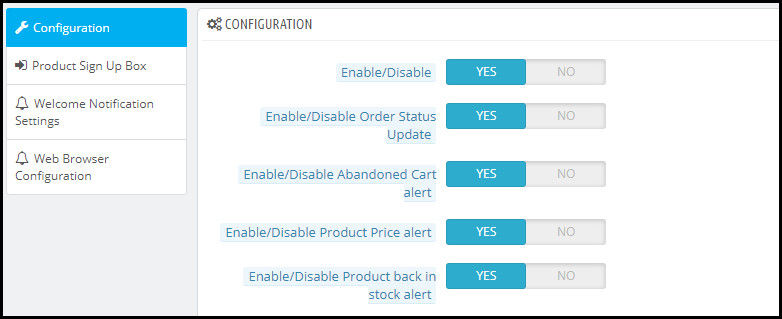
Apart from this, you can create multiple web push notification templates of your own choice. You also get the option to send a notification immediately or at a fixed time.

KnowBand currently offers this module to Prestashop, Magento, and Magento 2 platforms. Check out to know their complete features and benefits:

PrestaShop Web Push Notification

Magento Web Push Notification extension

Web Push Notification for Magento 2

Hope you liked knowing about the “Web Push Notifications Best Practices to Increase Conversions” and got an idea of different types of web push notifications you can use for your website.

Also Read:

7 Major Benefits of Using Web Push Notifications in eCommerce

11 Checkout Page Optimization Practices to Increase Conversions

8 Simple Tips to Reduce Product Returns in eCommerce

Returns are a part of the e-commerce space. If you run an eCommerce website, you will have to deal with the horror of product returns. As per the return rate stats collected by Invesp, at least 30% of the products ordered online are returned. Though eCommerce returns cannot be eradicated, it can be controlled.

In this article, I will provide you with 8 simple tips to reduce product returns in eCommerce. Before I start, let’s try to figure out some of the reasons why customers place a product return request.

1. Product ordered is incorrect

2. Product has a size issue

3. Product delivered is defective

4. Product failing to match customer’s expectations

The above-mentioned reasons are common for most of the eCommerce businesses. Considering the reasons, let’s now try to understand how to reduce returns in eCommerce.

How to Reduce Product Returns?

I have put forward eight simple yet effective ways to control customer returns. Let’s begin.

1. Provide a Brief and Accurate Product Description

Briefly describe all your products with accurate information to reduce product returns. Do not mislead your customers into believing something which the product doesn’t hold true. Provide them with a clear idea of what they will be receiving. Be specific about measurements.

Unlike physical stores, customers cannot touch a product when they shop online. So, ensure you are providing a detailed description if you do not want to face the product returns.

2. Encourage Customer Ratings and Reviews

Reviews and Ratings are the most effective return prevention techniques.

Reviews play an important role in the customer’s buying decision. The chances of a consumer making purchases almost get doubled if the product they are thinking to purchase has good ratings defined. Ratings help prospects get an idea of the product, whether it is worth buying or not. For example, a product having a 4+ rating(out of 5) will capture fewer returns as compared to a product having a rating around 2 or 3.

Apart from ratings, allow user comments as well on every product. Comments help potential customers know the reviews of the people who have already purchased that product. Well yes, there will be some negative comments that can discourage them from purchasing the product but the positive comments can boost confidence in a consumer and encourage them to go for the purchase.

Either way, you will at least, create an environment that will less likely attract product returns. Moreover, if you are having negative comments in higher numbers, it is a sign for you to understand that the product itself has flaws.

3. Use High-Resolution Photos

Product photos create a picture in the mind of consumers about how the product will look when they receive it physically. It is the primary reason why customers opt for the purchase in the first place.

Low pixel photographs can restrict a prospect from buying a product. Also, if there is a colour difference between the products listed on the website and when a customer receives it, the possibility of customer returns increases. The stats shared by Invesp says that 22% of the online shoppers return a product because it looked different when they received it.

So make sure to use high-resolution photos to eliminate colour differences, and most importantly, do not over-edit your product pictures.

4. Proper Size Guides

An incorrect sized product is one of the major reasons for product returns.

Mostly, people remain confused about the product size. They are in doubt until the product arrives and keep thinking about whether it would fit them or not.

Place size guides on every product page to avoid confusion regarding the product size. Customers want to be sure about the size before they finally confirm the order. Having a proper size guide decreases the possibility of a product return.

Want to add a size chart on your product pages? Check out Knowband’s Size Chart module that is available for PrestaShop, OpenCart, Magento and Magento 2.

PrestaShop Size Chart Addon

OpenCart Size Chart Extension

Magento Size Chart Extension

Magento 2 Size Chart Extension

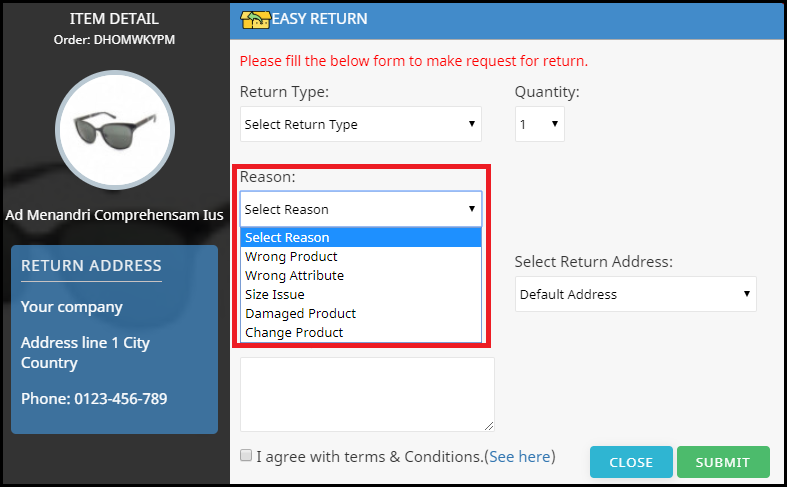
5. Ask for the Reasons for Return

One of the best ways to reduce eCommerce return rate is by knowing the reasons behind the return request. Ask your customers what went wrong and try to rectify those issues. It creates an indirect communication between you and your customers and helps you understand the defect in your product.

In your product return form, provide an option where customers can mention their issue. In fact, add some of the common return reasons on your own so that customers can pick it easily while placing a return request.

6. Enhance your Customer Support

Customer can have n number of questions before or after receiving the product. It can be about an issue in the product or maybe they want to clear some doubts regarding the product.

Excellent customer service is highly important to address the concerns of your customers. Ensure you are providing sufficient mediums to your customers to connect with you. For example, you can provide a direct live chat option along with your support mail and customer support contact number.

You should also add a FAQ section on the product pages to eliminate customers’ doubts regarding the product.

7. On-time Delivery

Today, customers want the product to reach them as soon as possible. With services like Prime Delivery which guarantees product delivery within a single day, it has become important for the eCommerce businesses to match the same set of expectations for their customers.

You simply cannot make your customers wait for too long. The estimated delivery time should not be more than 3-4 days. If it is taking too long to deliver, customers will cancel the order mid-way.

8. Ensure Good Packaging

The products might be in good condition when they leave the warehouse but are they getting delivered in the same state to the customers? This does happen often. Customers receive damaged products and sometimes due to improper packaging, it puts them in doubt regarding the product, that eventually leads to them placing a return request.

Pack your items carefully and tightly so that they do not slide during transportation. This can help you reduce the return rate on your website.

Final word

Genuine problems in a product should surely be considered for a return but you should pay focus to the issues that can arise the product return possibility. You cannot do anything with what’s not in your hand, but whatever can be done from your end to avoid product returns, you must do it.

Reducing your e-commerce returns even by a slight margin would help you save a huge operational cost.  Follow these 6 tips to reduce customer returns on your e-commerce store.

Finding it difficult to manage your e-commerce returns?

Read: 5 ways to Manage eCommerce Returns

You may also like to read:

6 Pieces of Advice for an Effective eCommerce Return Policy

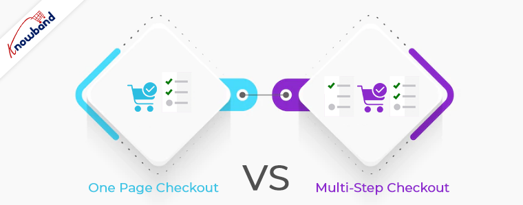
One Page Checkout vs Multi-Page Checkout

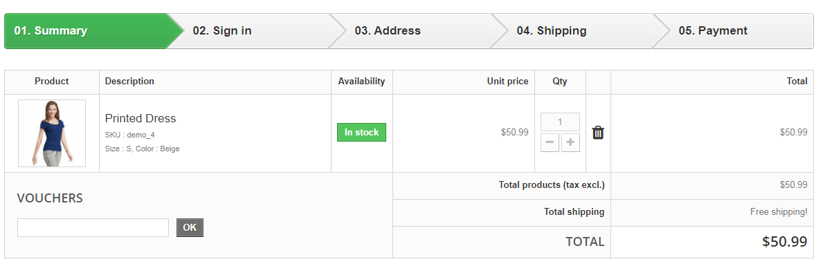
The success of your eCommerce business does not depend on how many people visit your website but on how many of them convert. The more conversions you get, the more revenue you make and it majorly depends on your checkout page.

Which checkout process do you follow? One Page Checkout or Multi-Page Checkout?

Customers desire a simplified checkout experience. A long and complicated checkout hampers the shopping experience which eventually results in cart abandonment. For a convenient checkout process, website owners are shifting towards one-step checkout, leaving the traditional multi-step checkout process behind.

The debate revolving around a One-page checkout vs Multi-page checkout is never-ending. While some eCommerce professionals prefer one-step checkout, some feel a multi-step checkout is a better option.

In this article, I will put forward the differences between the checkout process and help you make a better choice.

One Page Checkout

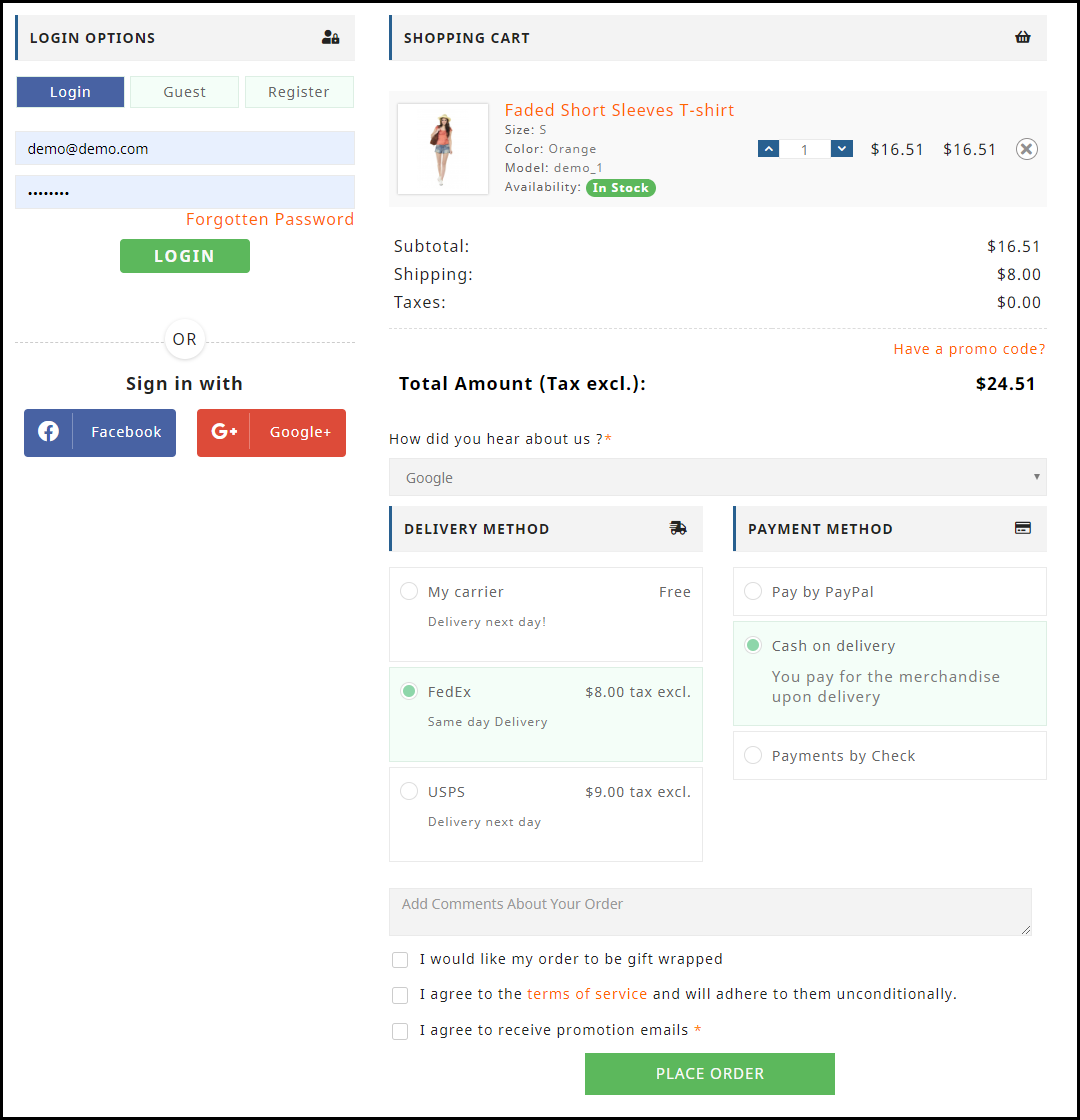
One Page Checkout puts up all the elements of a standard checkout process on a single page and lets the customers fill out the checkout fields in any particular order.

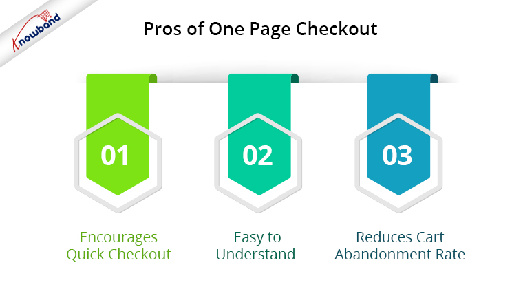
Pros of One Page Checkout

1. Encourages Quick Checkout

With all the checkout-related details upfront, it allows customers to check out quickly. They get rid of clicking multiple times to head towards the next step (in the case of multi-step checkout) and can enter all their details regarding billing, shipping, and payment on the same page.

2. Easy to Understand

A one-step checkout makes the page design simple and easy to understand and presents a clear picture in front of the customers. This also makes it easy for them to verify their details since they do not need to switch between pages.

3. Reduces Cart Abandonment Rate

An intricate checkout is one of the main reasons for shopping cart abandonment. It is therefore important to optimize your checkout process and provide customers with a smooth checkout experience- One Page Checkout is the best way to do that.

Recommended Read: 10 Benefits of Social Login in eCommerce

Cons of One Page Checkout

1. Slow Loading

Displaying a high volume of content on a single page can cause slow loading on your website. A slow checkout can turn away your visitors and make them search for the product on your competitor’s store.

2. Uncomfortable

Customers who are familiar with a multi-page checkout might not find the one-page checkout comforting.  A long checkout form can seem clunky and might discourage a customer from making the purchase.

Multi-Page Checkout

A multi-page or multi-step checkout breaks down the entire checkout process into several pages. Customers have to fill in their details on each page separately to finish the checkout process.

Pros of a Multi-Page Checkout

1. Customers Feel More Secure

Filling all the required details step by step makes customers feel more secure about their purchase, especially if they are purchasing something expensive.

2. Layout Looks Clean

The layout of a multi-step checkout does not look bulky since the checkout fields are divided into several pages which makes the layout clean and uncluttered.

Recommended Read: 8 Checkout Page Mistakes that may be Killing your Conversions

Cons of Multi-Page Checkout

1. Lengthy and Time-Consuming

Because of more number of pages, shoppers find multi-page checkout a lengthy and time-consuming process. Ultimately, customers run out of patience and are compelled to abandon their shopping carts. What’s worse is they decide to purchase from a different store.

2. Difficulties in Correcting Information

Mistakes happen very often while filling out the checkout fields. In a multi-page checkout, customers are left with no choice except to return to the previous page and correct the information. On many e-commerce websites, there is no option to edit and customers are asked to fill in the entire details again. This causes frustration among customers and creates a high chance of cart abandonment.

One Page Checkout vs Multi-Step Checkout: Which one to choose?

If you are in a dilemma about which one has better benefits, I would say- Go with a single-page checkout. These days, a single-page checkout is overtaking multi-page checkout because store owners are more focused on providing customers with a way to complete their transactions in one go rather than asking them to follow several steps.

Consider this: You go to an offline store. After you are done picking what you want, you go to one of the billing counters to make the payment. Tell me which counter do you look for? The counter is less crowded and takes less time for you to make the payment and check out from the store, right? Similar is the case with online stores. Shoppers want to check out as early as possible.

One Page Checkout by Knowband

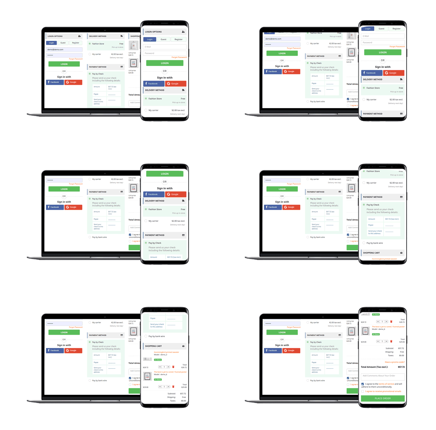
Our One-page checkout offers various rich features that enhance your store’s checkout process and make it fast and convenient. The module is available for PrestaShop, OpenCart, Magento and Magento 2.

PrestaShop One Page Checkout

OpenCart One Page Checkout

Magento 2 One Page Checkout

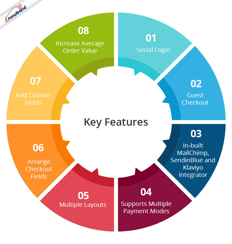
Key Features of One Page Checkout Module

1. Social Login

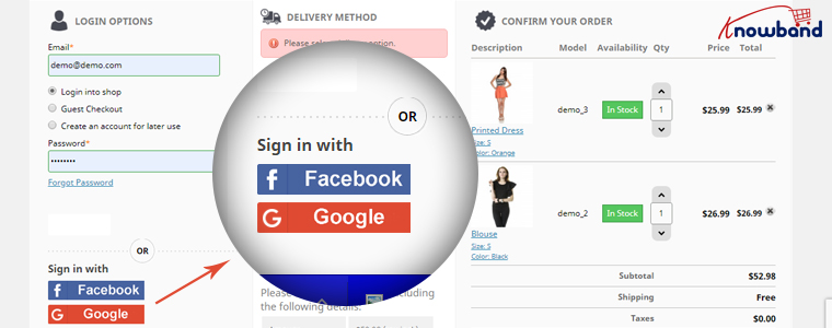
One page Quick Checkout offers social login options that allow users to register on your store with their Facebook, Google and PayPal accounts

2. Guest Checkout

Visitors who want to shop from your store without getting registered can make a purchase easily with the Guest Checkout option.

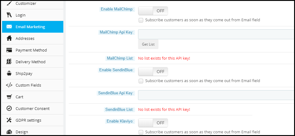
3. In-built MailChimp, SendinBlue and Klaviyo Integrator

You can collect the email address of your subscribers directly from the respective email service providers as soon as they log in to your store or subscribe to your newsletters.

4. Supports Multiple Payment modes and Shipping Services

Apart from Credit and Debit cards, Our Quick Checkout module supports various payment methods such as PayPal, PayU, Stripe, Sage Pay, Mobilpay, Ogone, Pago Facil, QuickPay, First Data, Paysera, Braintree, Checkout, etc.

Besides, it supports various shipping services such as Mondial Relay, So Colissimo, Ulozenka Delivery,  LP Express 24 Delivery, Webshipr, Zasielkovn Delivery, Paczkomaty InPost, Paczka w Ruchu, etc.

5. Multiple Layouts

One Page Fast Checkout module offers 3 layout designs: 1-column, 2-column, and 3-column. You can customize the layout accordingly.

6. Arrange Checkout Fields

Set the checkout fields’ priority with the drag and drop feature. Pick a checkout field and drop it to the desired position.

7. Add custom fields

If you want to add some additional fields to your checkout page, you can do it easily with the One Page Fast Checkout module.

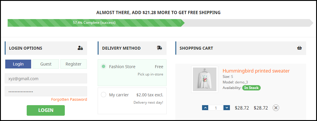
8. Increase Average Order value by displaying a Free shipping banner

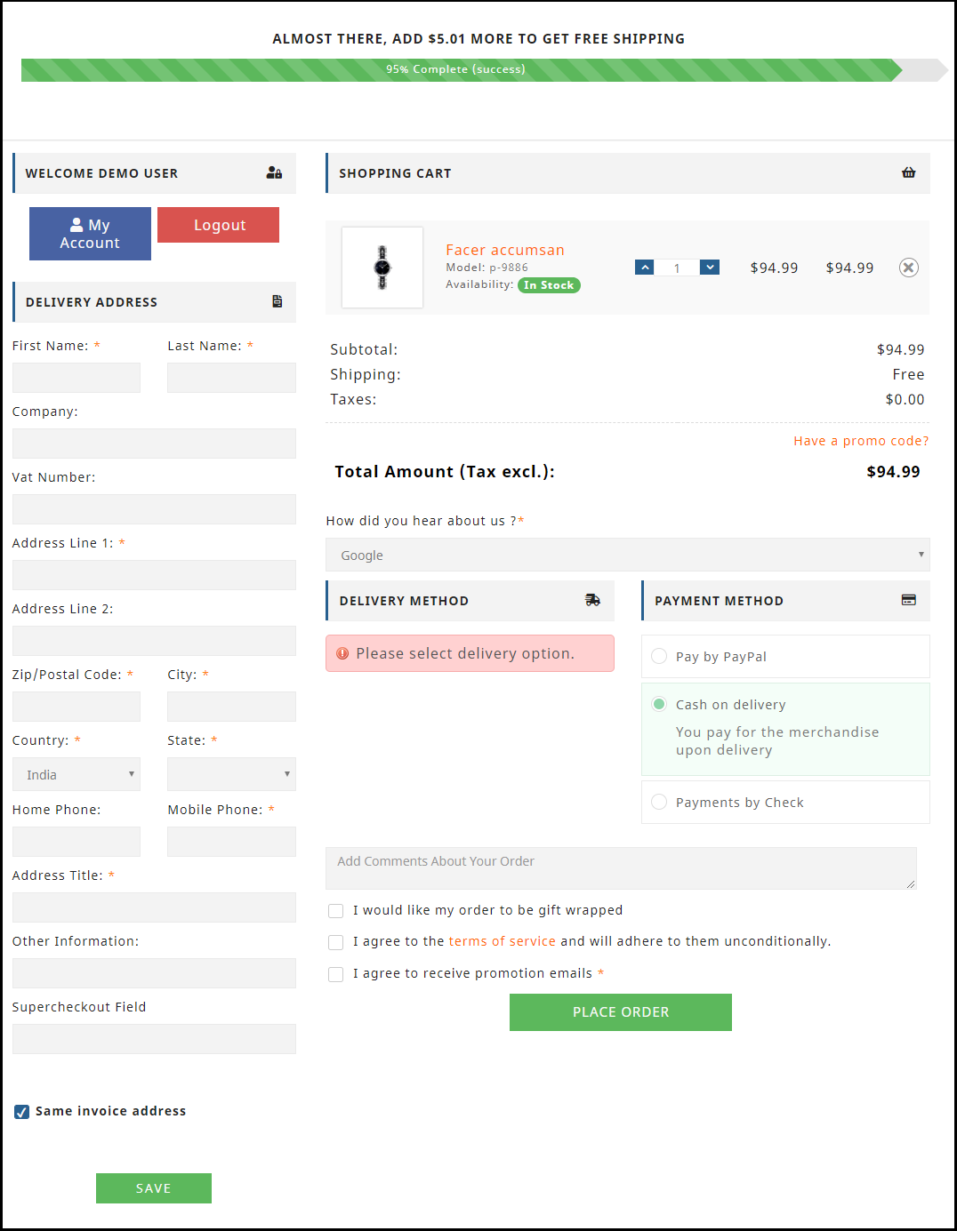
This feature is specifically for the PrestaShop platform where the admin can specify the minimum amount for the customers to avail of the free shipping facility. If the customer’s cart amount is lesser than the specified amount, he or she will be displayed the extra amount they need to shop for if they want to get free shipping. This eventually increases your average order value.

9. Choose Total Price Display Methods

The e-merchant can now select from a variety of approaches for how to show the total cost of the items on the checkout page. From the One Page SuperCheckout addon’s back office, the store admin can select the PrestaShop default price, price inclusive of tax, price exclusive of tax, or both inclusive and exclusive of tax.

10) Track Customer Checkout Behaviour

In order to eliminate the pointless processes that are annoying the clients, the admin can evaluate the percentage of data filled or skipped by online users who abandoned their cart.

One page checkout is GDPR compatible and has a fully mobile responsive layout. It has multi-lingual support.

Final Thoughts

Whether you follow one step checkout or a multi-step checkout process, make sure to maintain the checkout flow. Ask for relevant information only. Get into the zone of your customers and try to figure out what changes you can make to improve the customer experience.

At the end of the day, it is totally your call. If you have some more points to add to this article, do let me know in the comments below. I would like to know your take as well. What do you prefer for your eCommerce website?

11 Checkout Page Optimization Practices to Increase Conversions

This article revolves around Checkout optimization and provides you with 11 effective ways to optimize your eCommerce Checkout and bring more conversions.

Out of all the elements in an eCommerce website, the checkout page surpasses every other factor in terms of importance. It is the page that brings you conversions or you can say it is the place where visitors turn into customers.

Your website might have an attractive layout and a user-friendly interface. You may even have a wide range of products but it is only good enough to increase the traffic to your website. Yes, it is important but none of it matters if the high percentage of your website traffic is not making it past the checkout page.

Simply expressed, it refers to a high cart abandonment rate, which shows that customers are adding things to their carts but then declining to purchase once they reach the checkout stage.

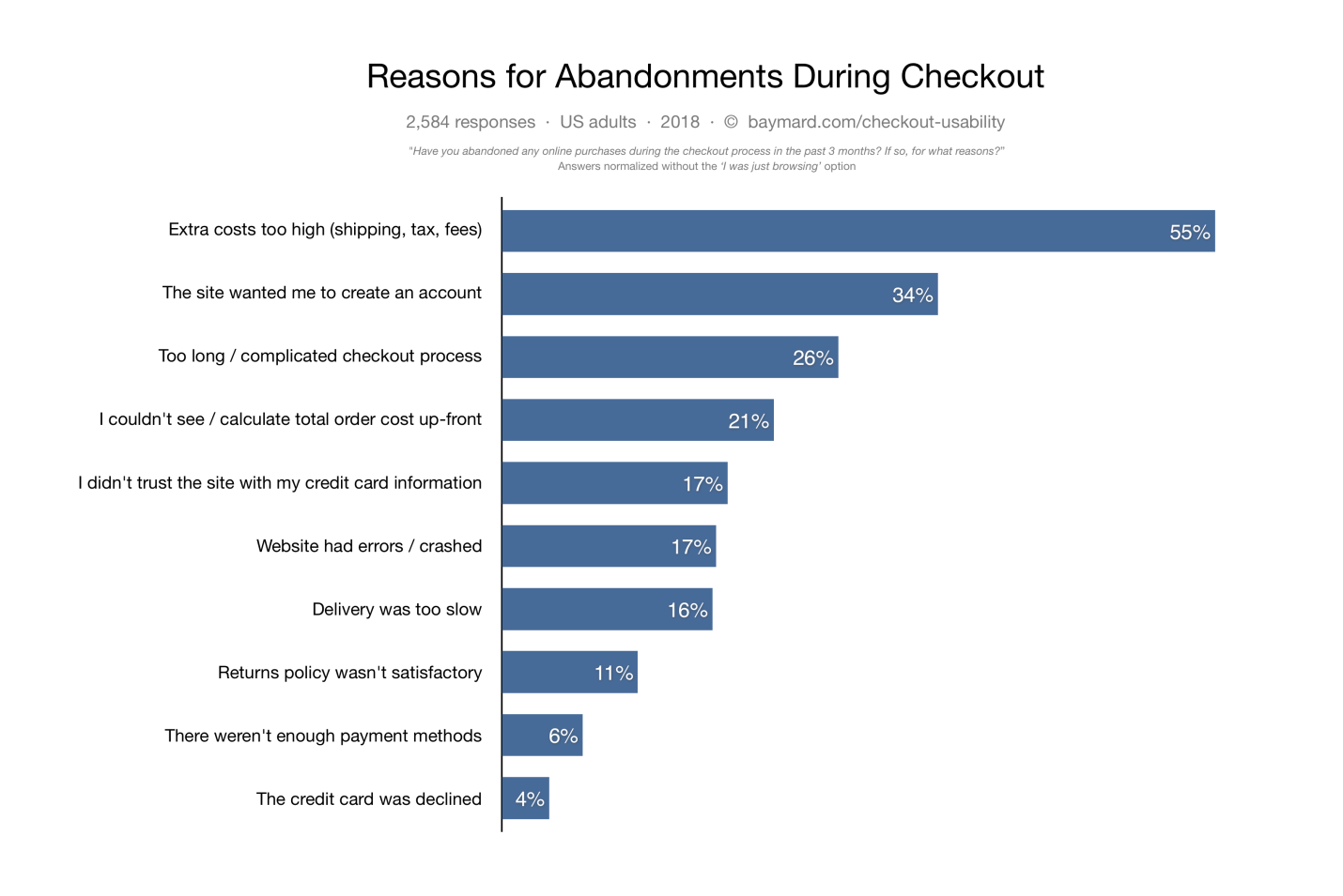
Cart abandonment can have multiple reasons. According to data gathered by the Baymard Institute, some of the causes of cart abandonment are listed below.

Did you know the average cart abandonment rate is 70%? Every 7 out of 10 customers abandon their cart for some reason. The percentage reflects that e-retailers lose out on huge sales due to shopping cart abandonment.

The best approach to reducing cart abandonment and increasing conversions is optimizing your checkout page, and this is what I am going to cover today.

In this article, I will suggest the top 11 best checkout page optimization practices to recover your lost sales.

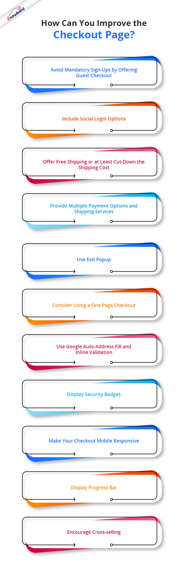
How to optimize your Checkout page?

To contribute to a smooth checkout process and provide your customers with a seamless checkout experience, consider the below-mentioned eCommerce checkout best practices.

1. Avoid mandatory sign-ups by offering Guest Checkout

If we look from a merchant’s point of view, it is quite understandable that they want to obtain customer data for their marketing campaigns but they also need to understand that not everyone wants to be a part of their campaigns, promotions or newsletters.

The percentage of such customers might be low, but it does make an impact on your sales.

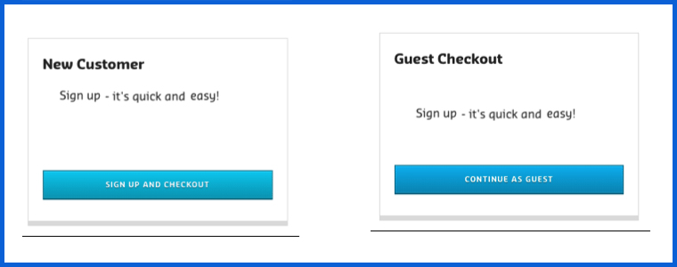
So, skip the mandatory registration process and provide a Guest Checkout facility on your eCommerce website, avoiding the need to create an account. It is one of the best practices for eCommerce checkout optimization.

2. Include Social Login options

While some visitors do not want to register, some feel reluctant to sign-up. The checkout flow is broken and the customer experience is hampered when a registration form is displayed on the checkout page.

Since some websites follow a lengthy registration process, it might compel the visitors to abandon their cart and leave the store.

You can help such visitors by offering them the social login facility, basically something like Facebook login and Google login.

Social login paves the way for a quick checkout by speeding up the registration process, and it also maintains the checkout flow.

It is a single-click registration, considering that the visitor is already logged in to the social network he or she is using to sign in on the website.

Social login is among the effective checkout optimization strategy.

You can try out our Social Loginizer module if you want to offer multiple social login options to your visitors. It offers up to 15 social login options.

The Social Loginizer module is available for PrestaShop, OpenCart, and Magento 2. Check out-

This might also interest you:

Recommended Blogs: 10 Benefits of Social Login in eCommerce

3. Offer Free Shipping or at least cut down the shipping cost

Another eCommerce checkout optimization practice would be to provide a free shipping facility to the customers.

High shipping cost has remained to be a disappointment for online shoppers and it is to be of no doubt why it is the major reason for shopping cart abandonment in Baymard’s study.

The extra added amount at the final checkout step unwillingly forces customers to abandon their cart. Some e-commerce stores charge a heavy shipping amount and it is enough to turn away the interest of the customer from the purchase.

To reduce the possibility of cart abandonment and persuade prospects to make a purchase, offering free shipping can be an ideal way.

Free shipping can surely enhance the chances of conversion. It gives customers a sense of joy when the product amount remains the same throughout.

And you do not need to compromise on your profit. You can slightly adjust the product price to absorb the shipping cost.

PrestaShop website owners can try out our Free Shipping Manager and set up their shipping rules to provide free shipping.

Related: Free Shipping Strategies: Why to offer? What to offer? When to offer?

4. Provide Multiple Payment Options and Shipping Services

Adding to the checkout page best practices is to expand your payment and shipping options.

Around 6% of the online shoppers abandon the checkout page due to the lack of payment modes and some 4% are left with no choice but to purchase as their credit card gets declined. So approximately, 10% of the people are having payment-related issues.

It can be overcome by offering multiple payment options. It is also important because different customers have their trust attached to different payment modes.

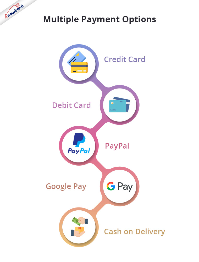
So, let the people choose their desired payment mode from a variety of payment options. It will result in a higher conversion rate. Apart from Credit Card and Debit Card, you must include digital wallets like PayPal, Google Pay, etc. and Cash on Delivery.

Similarly, you should provide people with multiple shipping services. Different shipping stores have different delivery times, so let the users decide how quickly they want their item to get delivered.

Some shipping service providers even guarantee a 1-day delivery and this can be very helpful, especially for a user who wants to receive his/her order within 24 hours.

5. Use Exit Popup

Another checkout optimization tactic would be enticing the shoppers with some attractive offers and discounts when they are about to leave your website after almost making it through the entire checkout process.

Even when you are unable to pinpoint the precise reason why the user is leaving the checkout page, you should try your hardest right up until the very end to persuade them to make a purchase.

It can be done by using the Exit popup functionality. It tracks the mouse movement of the user and displays your store offers as soon as the user intends to take an exit.

Try out Knowband’s Exit Popup. It is a feature-rich module that has so much to offer to make your popup effective. Most importantly, you can enable the exit popup functionality for multiple pages, not just for the checkout page. Check out-

PrestaShop Exit Popup

OpenCart Exit Popup

Magento 2 Exit Popup

6. Consider using a One Page Checkout

One of the best ways to optimize your checkout process is by implementing a Page Checkout on your website, also called a single page checkout.

This checkout optimization simplifies the checkout process by placing all the checkout fields on a single page. It offers an easy, fast and convenient checkout, and results in a better conversion rate.

I am not undermining the multi-page checkout process but I feel One Page Checkout has a slight upper hand over the multi-step checkout.

To know the in-depth analysis of both the checkout processes, read:

One Page Checkout vs Multi-Page Checkout

Our One Page Checkout module offers Guest Checkout, Social Login (Facebook, Google and PayPal), supports multiple payment methods and shipping services, and whatnot.

It is a perfect solution to all your checkout problems. We have-

One Page Checkout for PrestaShop

OpenCart One Page Checkout

OpenCart One Page Advanced Checkout

One Page Checkout for Magento 2

7. Use Google Auto-address fill and Inline Validation

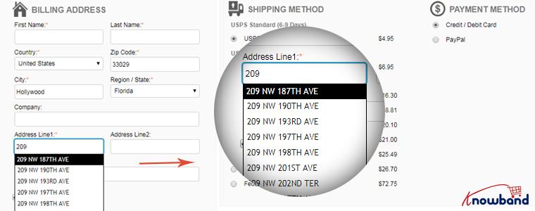
Save users’ time and allow them to check out quickly by enabling the Google Auto-address to full functionality on your website.

It displays the address suggestions as soon as the visitor types his/her address in the address field. Upon picking up an address, the rest of the address fields are filled automatically.

You should also include the option to use the shipping address for the billing address as well.

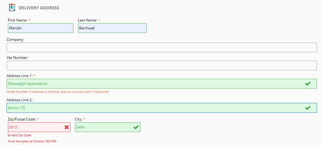
Along with autofill, enable Inline Validation(also called Data validation). It helps a user to identify the mistake while putting up the details on the checkout fields. When the user switches between fields, it checks whether the inputs provided by the user are correct or not.

Both of these methods play a crucial part in eCommerce checkout optimization.

8. Display Security Badges

People often doubt the security level of a website, especially new visitors. They do not trust a site easily and hence they feel a bit of concern when providing their payment details.

Image Source: Conversion Monk

Make visitors feel that your website is trustworthy and their payments are secured. Display them the trust seals. It can include the logos of the payment options, security badges from Norton, McAfee, Padlocks, or even a short text that reads “Fast and secure payment”.

You must also add an SSL Certificate to your website to maintain the trust throughout.

9. Make your Checkout Mobile Responsive

Today, most people prefer to do online shopping via their mobile devices.

According to a report by Statista, 72.9% of all retail e-commerce is expected to be generated via m-commerce, by 2021 and this is the main reason why online businesses are paying more focus towards convenient mobile browsing to ensure their visitors enjoy a seamless checkout experience not only from desktop but also from a hand-held device.

So, make sure your checkout page is mobile responsive if you want to gain high conversions from mobile devices.

A mobile-friendly checkout page is an essential factor in checkout page optimization.

10. Display Progress Bar

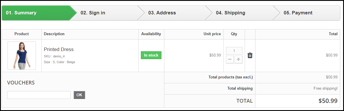
Though I suggested above to have a one-page checkout, you can continue with the multi-step checkout process if you aren’t a fan of a single-page checkout but make sure it displays a progress bar.

A lengthy checkout process can often irk users if they have no idea how long the checkout process is going to take.

Help them by displaying a progress bar/progress indicator so that it is clear beforehand what steps they need to go through to complete the checkout.

People are less likely to abandon the checkout page if they can see their checkout progress.

11. Encourage Cross-selling

When you talk about checkout optimization, cross-selling can never be neglected. Right after the user makes a purchase, display their related products that would go well with their purchase.

Besides, you can at least encourage customers to shop for more by thanking them and providing them with a coupon code for their next purchase.

Related: A complete guide to Cross-selling and Upselling in eCommerce

The Bottom Line

Optimization of checkout pages is not limited to a few set tactics. You will find plenty of ways to optimize your checkout page, however, I found the above-suggested methods to be the most helpful but it is not as easy as it seems.

Checkout optimization takes a lot of effort and time. You need to keep doing A/B testing at regular intervals to identify what works out the best for you.

Remember even a slight decrement in the abandoned carts can add up a huge amount to your total revenue.

That’s it. If you liked these 11 Checkout Page Optimization best practices. Feel free to add any point which you feel can help in providing a seamless checkout experience.

For any assistance regarding the module functionality, you can reach out to us at support@knowband.com

Pagination vs Infinite Scrolling

Pagination or Infinite Scrolling, which would be better? This thought has struck website owners many times and they still get stuck in a dilemma when it comes to choosing between any one of the UX patterns for their website.

In this article, I will share deep insights into both these processes and help you choose the better one for your website. Before we delve into the Infinite Scroll vs Pagination debate, let’s try to understand both.

What is Pagination?

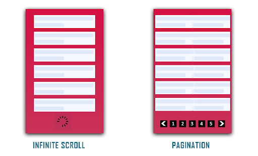
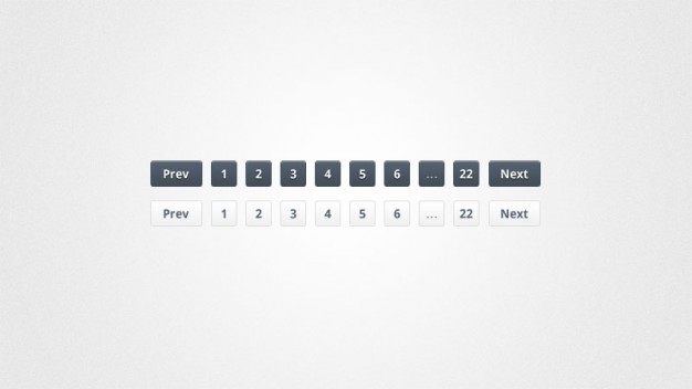
Pagination is the process of breaking large content into smaller chunks. It divides your website content into discrete pages and forms a  sequential numbering at the end of a page.

A common example of Pagination is the Google search result. Every time you search for something on Google, it displays n number of results that are divided into several pages.

Pros of Pagination

Talking about the benefits of Pagination, here are some of them.

Better Conversions
“Conversion” is the major factor that has kept online businesses sticking to the Pagination process. Pagination proves to be extremely helpful for users who have entered your website with a purchasing mindset rather than just browsing through the content.

Better Control

With Pagination, you can reach the footer of the website or the top section conveniently, therefore, providing better control to browse the content.

Easy tracking and bookmarking

Pagination makes it easy to track how much content has been consumed. Consider Google search results or Amazon, for example, if you have gone through some pages already, you do not need to go through them again. You can directly jump to a specific page and also bookmark it for later use.

Cons of Pagination
Talking about the cons of Pagination-
Breaks the flow

Pagination obstructs seamless browsing. It breaks the flow of a visitor by asking him/her to navigate to the next page to browse further and disturbs the user experience.

More clicks and loading time

Users get tired after clicking on the “next’ button or switching between pages multiple times. Not only it is tiring but users also get irked by the page loading process.

What is Infinite Scrolling?

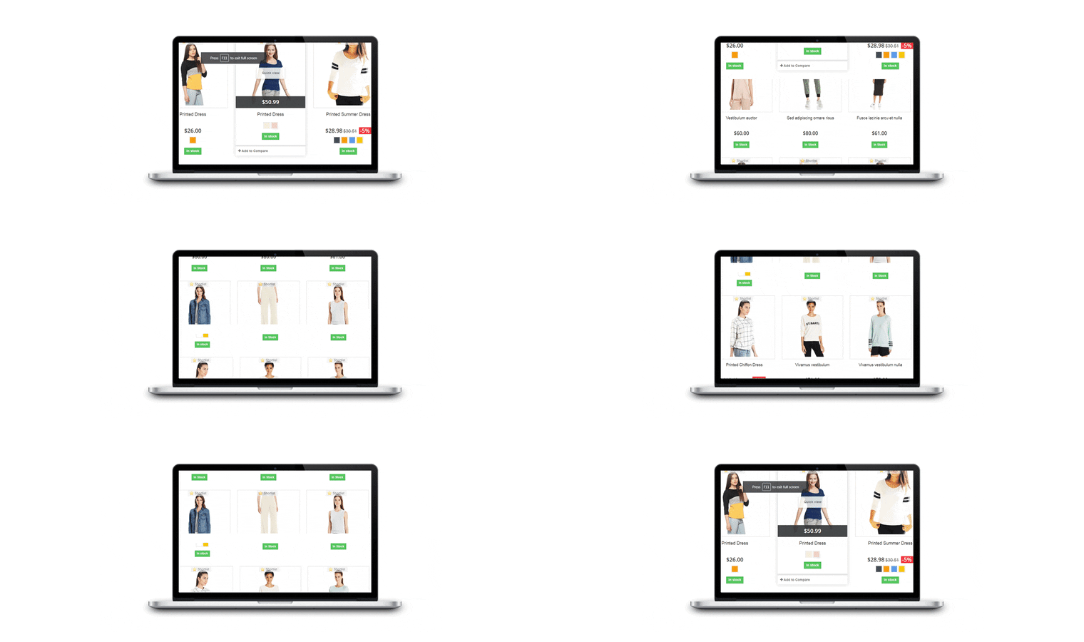
Infinite scrolling or continuous scrolling is a single-page scrolling that goes on endlessly with no certain finish line. It loads the overall content on a single page and offers a continuous flow of browsing. With Infinite Scrolling, the next page content or say the next set of products are loaded automatically within the same page as the user scrolls down. It is also known as Progressive loading and endless scrolling.

Social media sites like Facebook and Instagram are some of the best examples of Infinite scrolling.

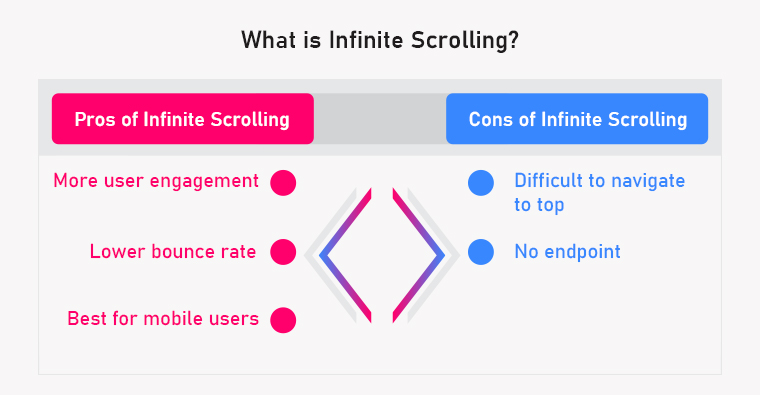
Pros of Infinite scrolling

Talking about the benefits of Infinite Scrolling, here are some of them.

More User Engagement

The primary purpose of Infinite Scrolling is to engage users and make them stay longer on the website and it does that job perfectly. It is adopted by those website owners who have content exploration as their primary focus. It also makes browsing fun.

Infinite scrolling keeps the user flow and engages your audience towards your content, hence creating more user engagement.

Recommended Read: Infinite Scroll Optimization: You enrol while they scroll

Lower Bounce Rate

With more user engagement, the average time spent by a user on your website, increases, which eventually reduces the bounce rate.

Best for mobile users

Infinite scrolling provides an amazing browsing experience to mobile users, especially on the mobile app. Since most of the website traffic today is generated through mobile, Infinite scroll makes the best fit for your business as it is more intuitive and user-friendly.


Recommended Read: How can Infinite Scroll benefit your eCommerce site?

Cons of Infinite scrolling

Difficult to navigate to top

When users keep scrolling down, they usually dig so deep that navigating to the top becomes a daunting task.

Also, users cannot bookmark a page in Infinite Scrolling. They will have to consume the entire content again when visiting for the next time.

No endpoint

Continuous scrolling makes a user feel bored after a point and compels them to take an exit.

In addition to that, a user looking for the footer section on your website can find continuous scrolling quite frustrating as it becomes challenging to reach the endpoint of the page.

Pagination vs Infinite Scrolling: The Final Call

Since you have understood both Pagination and Infinite Scrolling now along with their pros and cons, it is time to decide which one can be a better option for your website/store.

When to use Infinite Scrolling and When to use Pagination?

Considering all the factors, here is my take on Paging vs Progressive loading:

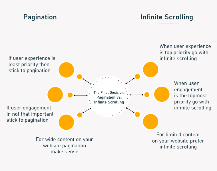
1. If the user experience and user engagement are your topmost priority, go with Infinite Scrolling else stick to Pagination.

2. If you have limited content on your website that a user can reach the endpoint after a certain time, prefer Infinite Scrolling. Pagination would make sense if you have wide content.

In the end, it is your call depending on your business and requirements. Both Paginare effective in producing quality results. Keep doing A/B testing at regular intervals and figure out the most effective one.

If you are thinking to implement the Infinite Scroll feature on your website, check out our Infinite Scroll module.

Infinite Scroll module by KnowBand

The Infinite Scroll module by Knowband is a feature-packed plugin that generates automatic loading on the product listing page. It provides easy navigation through the product catalogue.

The infinite Scroll module is a modern replacement for Pagination System and offers seamless browsing.

Features of Infinite Scroll

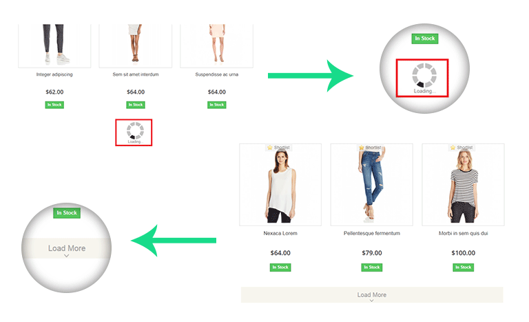
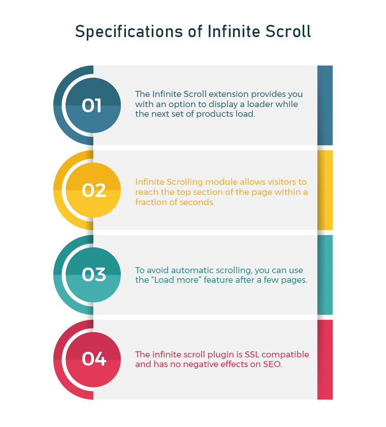
1. The Infinite Scroll extension provides you with an option to display a loader while the next set of products load. The loading animation keeps the interest of the users while they wait for the page to load. It tends to keep users on the website which probably would not happen in the case of Pagination where users have to keep loading pages manually.

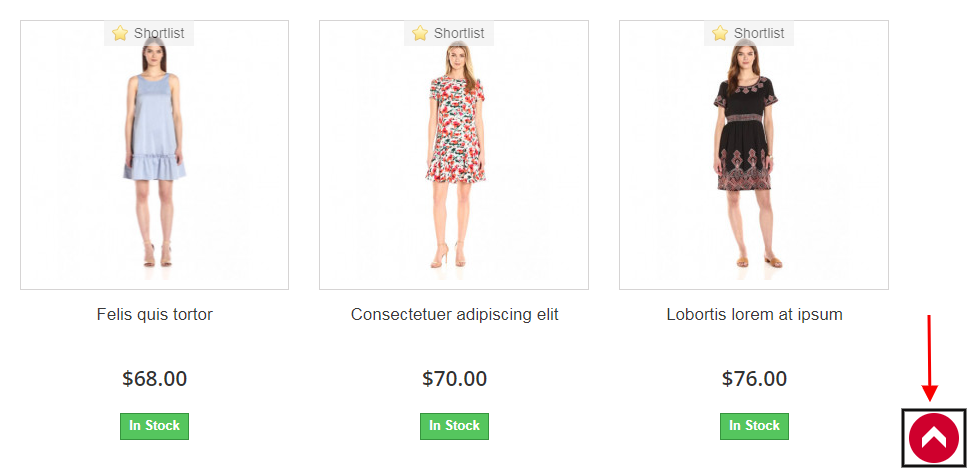
2. Infinite Scrolling module consists of a “Go to top” button that allows visitors to reach the top section of the page within a fraction of seconds.


One of the cons of Infinite Scrolling that we discussed above was it is difficult to navigate to the top of the page. The “Go to top” button in the Infinite Scroll module eliminates this problem.

3. To avoid automatic scrolling, you can use the “Load more” feature after a few pages. This is helpful for users who do not want to witness continuous scrolling for a longer duration.

4. You can also create a message box at the end of your product results which confirms to your visitor that the results have ended.

5. Infinite scroll plugin doesn’t affect your SEO and is SSL compatible

Knowband offers the Infinite Scroll modules for Prestashop, Magento, Magento 2 and OpenCart.

Final Words:

Businesses are always seeking methods to improve the customer experience. Online firms have been compelled to develop innovative concepts as a result of the intense rivalry in the e-commerce market. One of the finest strategies for that is click reduction. It is effective in lowering bounce rates, increasing average site time and user engagement, and vastly improving user experience. For any assistance in these modules, you can reach out to us at support@knowband.com

Related and Popular Posts:

One Page Checkout vs Multi-Page Checkout: Which is better and why?

10 Benefits of Social Login in eCommerce

Top 10 Checkout Page Optimization Practices to Increase Conversions