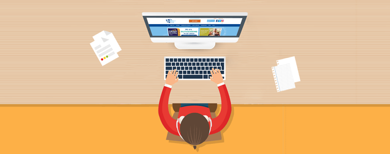
From the product page to contact forms, every single aspect of your website could potentially lead to a user’s decision to make a purchase. If you want to create trust with your clients, investing in a professional website is a must, and improving that trust is essential if you want your e-commerce store to succeed.
When building an e-commerce website, web design is critical. Successful web design for e-commerce is all about using the appropriate colors, fonts, pictures, words, and graphics to attract visitors to make a purchase. The design of your e-commerce website should attract prospective customers, provide an excellent user interface, and show your shop in the best light.
1. Think Like a website visitor
Your website should not have any content which makes them feel uncomfortable when you expect them to share sensitive information like credit card details. The point is, if you want your visitors to take you seriously, you need to convince them that you take yourself seriously, and competent web design is the best way to do that. Optimize the checkout page design from a visitor’s point of view.
2. Keep it Simple
The web design of the checkout page plays a pivotal role because it is the page that decides your fortune. Try to keep the design of the checkout page simple. Utilize maximum white spaces while designing the checkout page but keep it clean. Various layout designs are available for making the One Page Checkout appear clean, easy to navigate, which makes the purchase easy no matter what you are selling.
3. Show relevant Product Image on Checkout Page
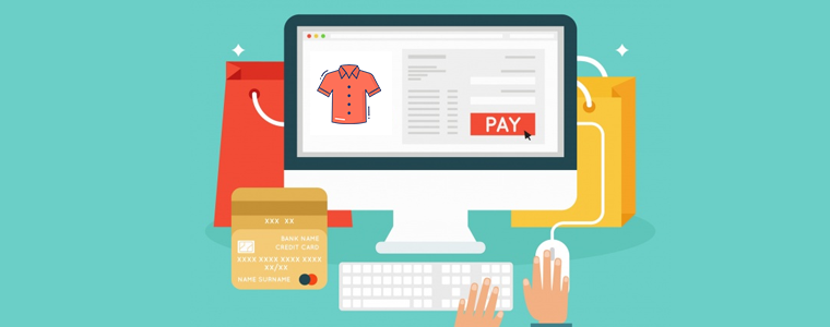
In the world of web design, it is observed that photos improve conversions and that is even more true when it comes to e-commerce. If there are no pictures of the product they choose to buy (or only a single picture of poor quality), they will feel more reluctant to make the purchase, and as a result, the conversions will tank.
No one is going to buy the sight of a commodity unseen. You need to show them what they’re buying through high-quality product images if you want people to purchase your product.
4. Use color as an advantage
Different colors inspire different feelings and every color has its significant emotion attached to it. Play with those emotionally inspiring colors while designing your website pages to make your customers feel attached throughout the shopping. Use scale, contrast, and harmony to make it more appealing.
You can add bright and colorful buttons like red for the ‘buy now’ button which is well known for excitement and passion. The point is, color is one of the most important tools in your design toolbox, and it can have a major effect on your e-commerce design if you know how to use it.
5. Have a systematic approach:
Whether you are using a single page checkout or a multiple-step checkout, the web page design of the checkout page should have indicators that navigate the customer to the next step and informs them about the progress of the process.
On both, One Page Checkout and Multi-Step checkout, it’s useful to place a progress meter while making the layout design. If you place all of the elements on one page, it looks interactive. Studies suggest that the systematic approach by delineating the stages lead to higher conversions.
6. Use Security badges
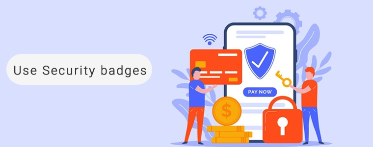
People, especially new visitors, often question the security level of a website. They do not easily trust a website and often feel a little skittish sharing their payment information. Make them feel that the website is trustworthy and that their payments are safe. Show them the security badges to build faith. It may include the payment choice logos, Norton, McAfee, Padlocks security badges, or even a short text that reads ‘Quick and safe payment’.
The website should be designed keeping this in mind and do not forget to take an SSL certificate because a secured website can maintain trust throughout.
7. Don’t distract expected clients
After all the efforts you have put to entice the customer, do not distract them when they are about to make the final checkout. Every eCommerce web design includes functionality for showing relevant products for cross-selling.
Displaying related product images on the checkout page can put a full stop to the potential lead. This can be a distraction if not done right. Avoid doing any such mistake which can cost you a potential customer.
8. Optimize and make it mobile responsive

It is official now, as the most common way to browse the inter-webs, mobile has surpassed desktop and also shopping requires that.
If you want to catch consumers who want to shop on their phones or tablets, you need to ensure that your website design is completely mobile responsive. Millennial prefer mobile shopping and a checkout page which is not mobile responsive and slow loading can kill conversion. Make web design and UI mobile friendly.
9. Consider using One Page Checkout
A clunky checkout page can kill conversions and sales. You need to make the process of buying as easy, straightforward, and pain-free as possible to accomplish your goal.
Consider using One Page Checkout and make it crystal clear about the procedure: what data you need to process the transaction (and where they need to enter it), the various delivery options available (and how much they cost), and what to do in case their order is troublesome or they need to make a return. When the purchase is complete, guide your clients to a confirmation page so that they know it’s all gone through.
One Page Checkout offers Guest checkout, social login, multiple layout options, several payment gateways, shipping choices, and much more. Its layout design appears to be simple. You can replace the existing checkout page with One Page Checkout which specially designed to make the process simpler.
10. Allow Guest Checkout
A mandatory registration before purchase seems annoying. You can make the registration process optional for the visitors with the One Page Checkout by giving Guest Checkout as a choice. Having a popup saying ‘Sign in to build an account is irritating!!’
People on the One Page Checkout would like to share information to keep the track of shipment. If a user is in a rush, then you can help them buy in less time with guest checkout. The One Page Checkout module allows your clients to checkout from the checkout page as visitors.
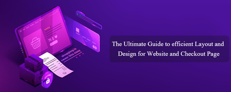
Wrapping Up
It can be tricky to design an e-commerce website and the checkout page, but now that you know the top e-commerce checkout page web design tips, you have everything you need to design a website that not only looks great but converts like crazy.
Then what are you waiting for? Redesign your website and give a new look to your online store with these tips. Contact us at support@knowband.com for any eCommerce support.
Recommended Read: