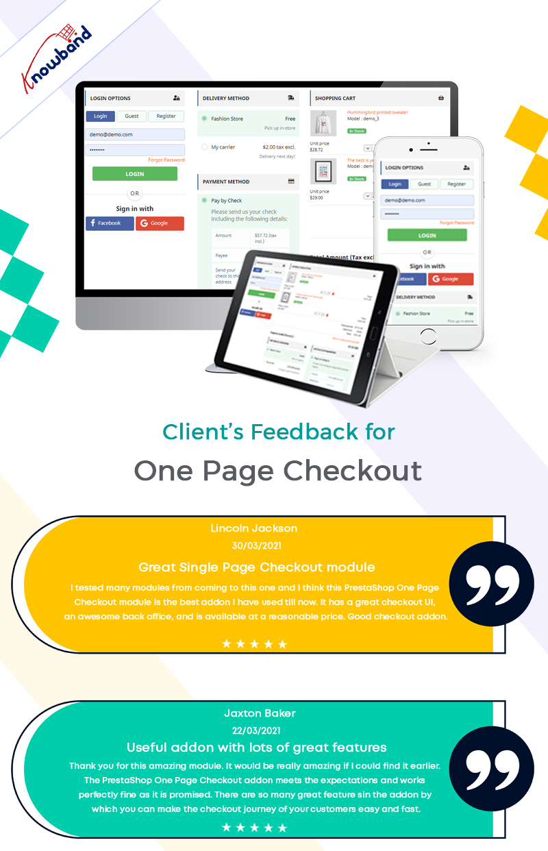
The unwritten law of eCommerce is that every extra step during checkout lowers the possibility of purchase. The monitoring of the cart abandonment rate shows this assumption is logical. A huge number of people abandon the cart on the checkout screen, which results in a considerable loss. To cut losses, online retailers are looking for ways to reduce the client path in the checkout procedure. A new alternative that eCommerce companies use to simplify their checkout is one page checkout.
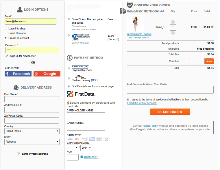
As the name suggests, a one step checkout will show every required component on one page while checking out. All the information, such as the payment and delivery methods, billing and shipping addresses, etc are present on this screen. The single-step checkout method reduces cart abandonment as customers fill in all the required fields on one page.
The Importance Of One Page Checkout
A one step checkout can make it easy for customers to use an e-commerce platform to complete their transactions. More companies are moving to e-commerce sites as more consumers shop online. E-commerce businesses need to create a quick, easy, and enjoyable online experience for clients. From browsing to checking out the checkout process should be seamless.
To speed up the e-commerce checkout process and save customers time, many stores have converted to a one page checkout strategy. Every customer wants to save time, and even if they save a few minutes, they will still be happy with the outcome. Reducing cart abandonment due to the drawn-out checkout process is what we hope to achieve. To achieve this goal, consider using a one page checkout.
How to Optimize a Single Page Checkout?
It is not enough to improve your checkout process once. For the continuous traffic to come into the store, you need to keep the one page checkout up to date. Optimize the checkout procedure by improving its layout, design, and functionality. The factors affecting the conversion on the website are numerous. Therefore, periodic optimization of the checkout funnels and update of single-page checkout is in need.
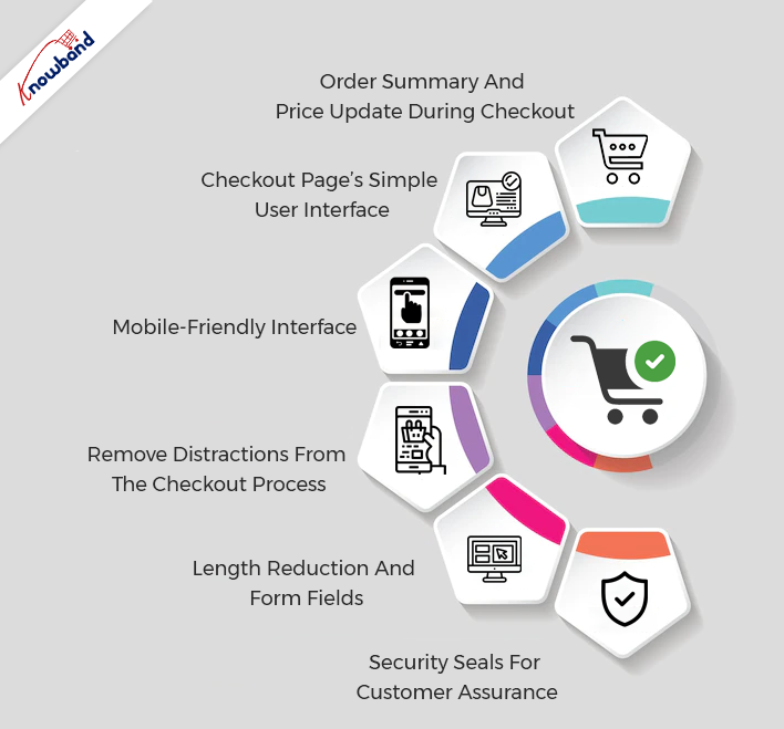
Order Summary And Price Update During Checkout
The customer should be able to update the order quantity during the checkout using single page checkout. The new updated price after changing the number of products should be accessible to the client in the checkout funnel. Being able to access the updated price of the order motivates the customers to stay on the checkout page. Receiving accurate and updated costs helps the customer to manage their orders easily and makes the purchase easy for them.
Checkout Page’s Simple User Interface
The checkout page should be clean and should not have any unwanted elements. Whenever a new customer navigates to the checkout page, it should look clean and accessible to them. Making the layout of the one-page checkout attractive is a priority, but it should not cause clutter on the checkout page. The fields that the customer needs to fill in should be clear and specific fields should be present for each piece of the required information.
The navigation on the checkout screen should be convenient as too many elements on the checkout screen can confuse the customers. The products should be on display along with the proper information on the single page checkout interface. This aids proper decision-making for the customers while making the purchase.
Mobile-Friendly Interface
A large number of the population shop online, so the eCommerce modules need to be mobile-responsive. The one-page checkout should be mobile responsive and work without any hassle on mobile. To make your website accessible to all customer groups, it is important to make the checkout mobile-friendly.
Remove Distractions From The Checkout Process
There should not be any element on the one step checkout screen that can distract the customer from making a purchase. Promotions, advertisements, and other extra information should not be present for the customer when they are about to make a payment. Regardless of promotions, when a customer is about to purchase, the one-page checkout module is useful. It is so as it enhances the purchasing experience. The single page checkout makes the checkout procedure fast and smooth.
Length Reduction And Form Fields
The form fields on the single page checkout screen should be present above or in front of the information labels. The most relevant and necessary fields should be present on the checkout screen. We can disable unnecessary fields from the admin panel of the one step checkout module. The lower number of fields speeds up the checkout process using one page checkout.
The length of all the information fields is not the same, so their sizing is according to need. This makes the checkout screen look clear and seamless, which also enhances the customer experience.
Security Seals For Customer Assurance
The security seals should be on display in such a manner that they should not make the checkout page overcrowded. The placement of trust and security seals is important as it develops trust in the customers. Using the one-page format, these seals are presented cleanly and without being invasive. These trust seals assure the customers and help in gaining their faith so that they can be sure while making purchases.
Final Words
Please contact Knowband for additional information about this plugin. When it comes to the module, if you have any worries or problems, we will help you happily. Additionally, we can help you with your custom projects based on your business needs. We have several top-notch plugins that are available on our website, so feel free to check out their features. We would appreciate hearing from you if you have an interest in any of our products, drop us an email at support@knowband.com.
One page checkout on websites is present for finishing the checkout process swiftly. All the important information is present on one page. This includes the order total, shipping and billing addresses, product information, payment methods, and delivery choices. The Fast Checkout pluginis the opposite of multi-step checkout, which breaks the checkout process into several phases.
The goal of a simplified checkout is to enhance the customer’s experience by making the transaction as quick and easy as humanly possible. Store owners will be able to boost sales as a result of the implementation of this module.
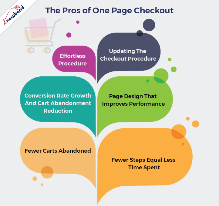
The Pros of One Page Checkout
Effortless Procedure
Using the One Step Checkout extension, you can streamline the checkout process for your store by putting all the information fields on a single page. Quick checkout addon can help your customers complete their transactions more quickly by allowing them to fill out all of the information at once. Both conversions and the checkout process improve as a result.
Updating The Checkout Procedure
The One Page Checkout is more user-friendly than the more popular multi-page checkout. Additionally, by having every stage of the checkout process on one page, the chance of cart abandonment can be significantly decreased. The procedures for finalizing the purchase will be simpler for users to follow.
The checkout process becomes faster up by utilizing One Page Supercheckout. One Step Checkout makes it easier for customers to go on to the next phase of the checkout process.
Conversion Rate Growth And Cart Abandonment Reduction
Conversion rates can increase dramatically with a straightforward checkout. It guarantees that if you use a single-page checkout, your conversion rate will be high. Suppose two companies use single-page checkout and multi-step checkout respectively. The one that is using the one-page checkout will surely have more conversions.
Ecommerce websites need a fast checkout process. Furthermore, a transaction in the normal multi-page checkout takes under 2 minutes. But with single page checkout, the process takes only a minute.
Page Design That Improves Performance
Waiting for many pages to load is something nobody enjoys. Your customer can become irritated and leave your cart if the checkout procedure is complex and lengthy. You can’t afford that to happen. If you’ve installed the One Step Checkout extension, your customers may place their orders from a single page! Conversion rates at your store will increase as a result, improving the entire purchasing experience.
Using the Responsive one page checkout extension in your store has numerous other benefits in addition to those already discussed. The entire shopping experience will improve as a result of this module, which will significantly increase conversions.
Fewer Carts Abandoned
Online shoppers sometimes abandon their purchases before reaching the checkout step. By reducing the checkout process to a single page, you can increase conversion rates and decrease the number of cart abandonments. When customers arrive at the checkout page, they should not find it difficult to complete the payment form. Since the single-page checkout brings all the information in one place, it takes less than a minute to complete payment.
Fewer Steps Equal Less Time Spent
Customers wouldn’t need to browse various websites to preview their baskets. Single Page checkout includes the pages where they enter their personal information, make payments, etc. The checkout process will be quicker because the payment will be completed in a single step rather than requiring many pages. On the same screen, customers may also alter and update their information.
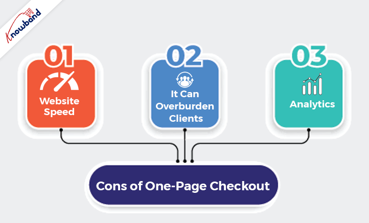
Cons of One Step Checkout
Website Speed
The website may take longer than usual to load when there are too many items on one page. Customers always want to make speedy purchases. Therefore, you should make sure that your checkout page not only works well but also loads rapidly. If not, you can lose customers who will not be investing their important time on the slow checkout page.
It Can Overburden Clients
When customers are on checkout, then the checkout page should look clean and with minimal important information. It’s critical to remember that asking customers to fill in all the shipping, payment, and billing choices on one page at once may confuse them. It’s ideal to ensure that you optimize the checkout page and remove all the superfluous information to give your customers more focus. The checkout page should not consist of any unnecessary elements. It should be clean and offer a smooth purchasing experience for the customer.
Analytics
It is harder to identify and access the reasons why customers want to stop shopping. Identifying the reason for abandoning the cart gets harder when there is a one page checkout. The reasons behind the drawbacks that we need to consider for later development become very difficult. Making the appropriate changes and modifications to the quick checkout module will get harder in the future.
Final Words
If you want to know more about the simplified checkout module, then we will be happy to assist you with it. If you have any concerns or issues regarding the fast checkout module features, then please contact us at support@knowband.com. We will also assist you with any custom requirements as per your business demands. We can make modifications to the One Step Checkout module and also help you with your customization demands. Kindly contact Knowband for the same and we will be happy to assist you with it.
A lot of effort goes into building the pages that convert. Content optimization, CTA optimization, navigation streamlining, everything we do is for driving conversions on the store. E-Commerce checkout is one such page whose conversion rate has a direct impact on your revenue generation.
In this post, I have compiled a list of the most inspirational eCommerce checkouts that can inspire you to learn some useful aspects from them. Each of the checkouts in this list consists of something that you take a cue from. It should give you a clear idea of how should you go about making your own checkout page conversion friendly like these websites. So let’s get inspired by these checkouts.
1. Apple’s checkout
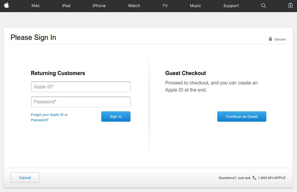
Apple’s checkout is a great example of providing alternate checkout options
Apple provides a very well organized checkout page that lays full attention on the call to action buttons with proper utilization of the white-spaces. The checkout page does a great job of appealing the users to complete the process even as a guest user.
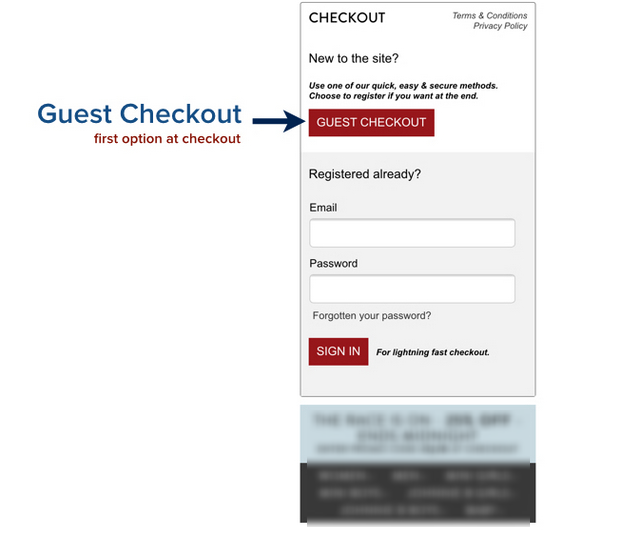
Asking for necessary account registration to complete the checkout process is one of the most common reasons for cart abandonment. To work out this common issue, Apple provides guest check out option where shoppers are not required to necessarily create a user account by filling loads of information in the registration form.
If they already have an account, they can sign-in, and if not have an account, just continue with the guest checkout.
However, there is a flip side of the guest checkout that customer’s information will not be saved for future reference in the database. It means customers won’t be able to track their order. If that is not a problem for the customers, guest checkout is a useful feature to include in your checkout.
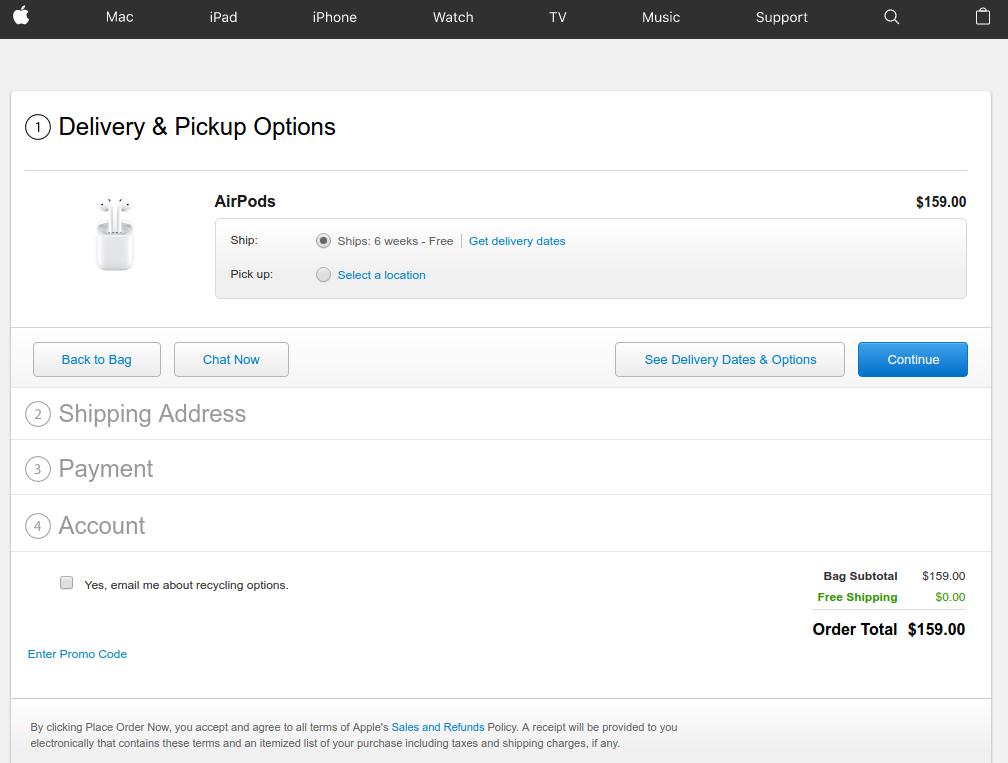
Also the post user login or Guest checkout steps are so simple and interactive. There is a chat option that you can use to clear your doubts right from the Apple’s representative. You can choose the delivery dates and options available, continue with the next steps.
2. Bellroy’s checkout
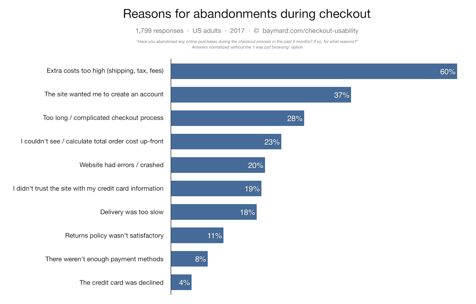
Lengthy checkout is one of the major reason for shopping cart abandonment. According to Baymard institute,
“27% of US online shoppers have abandoned an order in the past quarter solely due to a “too long/complicated checkout process”.
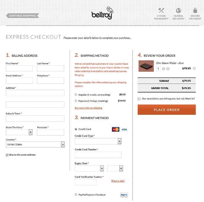
Bellroy handles this big issue a little different as compared to Apple. It provides a one-page checkout to its users compacting the whole checkout steps on a single page only. The one-page checkout structure makes the process smooth and shorter for the customers. Users can fill out the delivery address, billing address, select shipping options and provide payment details right from the same page.
The user experience has been further optimized by including a set of only the necessary details required to be filled-in.
Those eCommerce store owners who want to provide a simple, quick and easy checkout experience to the customers can utilize a one-page checkout structure and save time and efforts of the customers.
3. Myntra’s checkout Caption:
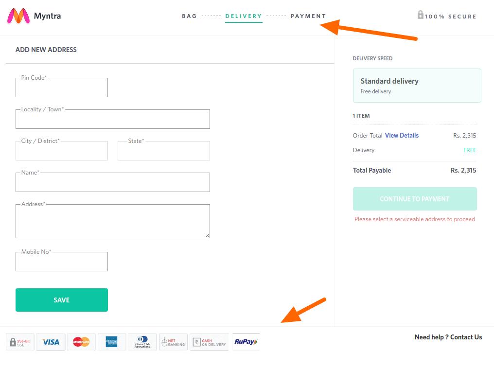
Myntra goes well with its multi-step yet high converting checkout page
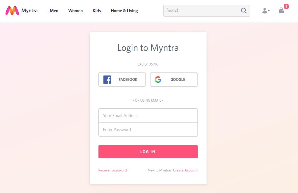
In case you are not a supporter of guest checkout or one-page checkout, you should take a cue from Myntra’s checkout page. It presents a perfect example of how you can make a multi-page checkout conversion friendly without guest checkout.
Here, instead of guest checkout, customers can continue as a registered user by logging-in using their Facebook, or Google account credentials without creating an user account on Myntra.
Moreover, when customers are completing the checkout process of Myntra’s multi-page checkout, they are provided with a clear idea of where they are and where they would be in the next step. It provides a transparent process that includes a progress bar on the top of the page, plus a logo of trust, and payment options logo at the footer keep the users well informed.
The guest checkout option provides the option to the users to register an account right after the checkout is completed. This is a nice touch to encourage account registrations without giving a burden to the customers.
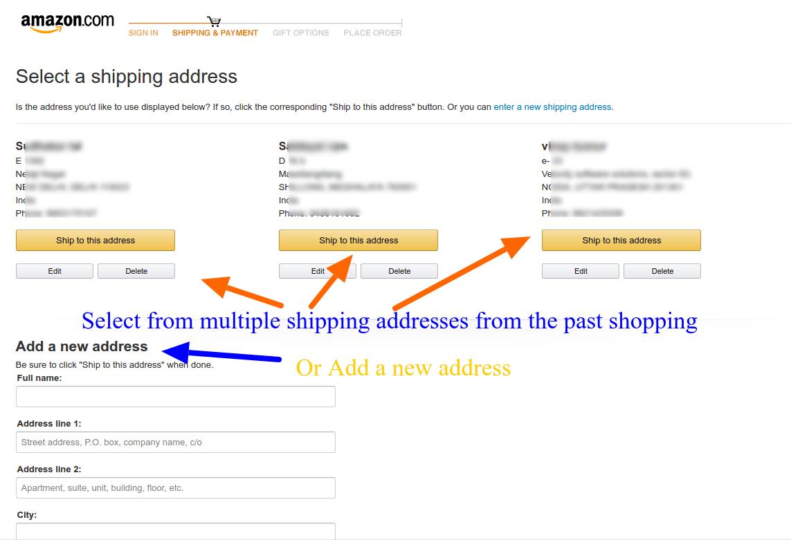
4. Amazon’s checkout
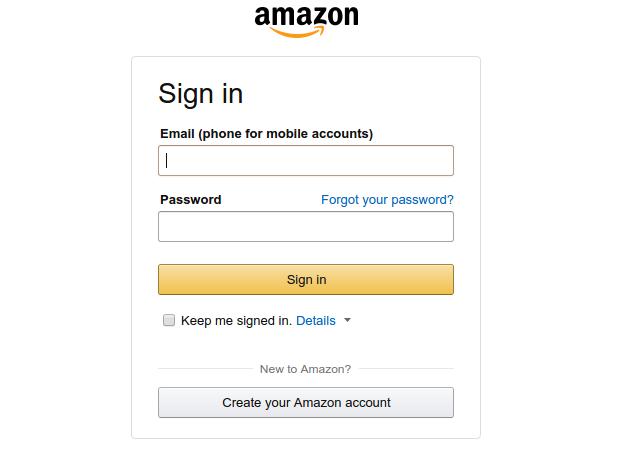
Amazon’s latest checkout emphasizes on account necessary registration
Amazon keeps testing its checkout process now and then. Currently, it is following a unique combination of traditional approach and it’s own peculiar call-to-actions. By highlighting the free two days shipping option on the product page itself, it reduces the task of shipping selection on the checkout page, plus an indirect promotion of Amazon’s prime service.
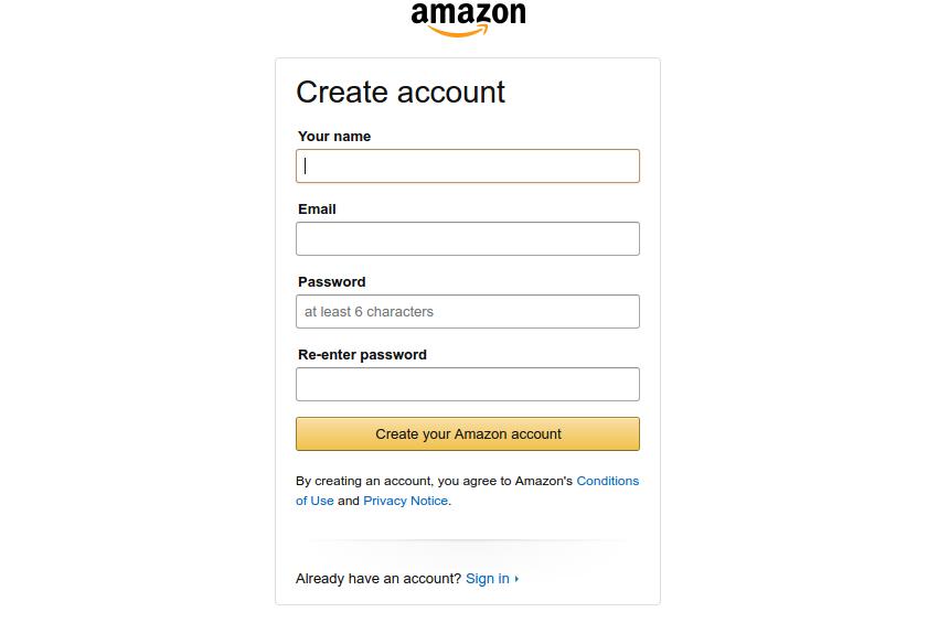
The common perception of an eCommerce checkout involves providing a lot of options like, Add to wishlist, continue shopping, guest checkout and so on. However, Amazon works on a different principle here. It emphasizes on creating a user account before you can proceed to the checkout page but provides a very quick and compact registration page.
Despite the necessary account registration, Amazon still have a high converting checkout
By doing so, Amazon makes sure that customers entering the checkout funnel are not distracted by the leaks and completes the checkout with a personalized user experience. If your customers do not mind filling a very small registration form, Amazon’s approach is is an inspiration for you.
Caution: Amazon acts as almost a monopoly in the eCommerce market for various categories. Customers preferring Amazon won’t find a hard time filing small registration form. It might not be a similar situation in your case. I would suggest a comprehensive A/B testing campaign before finalizing the decision.
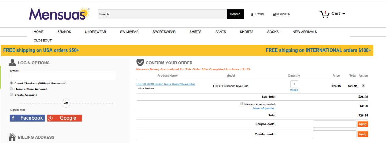
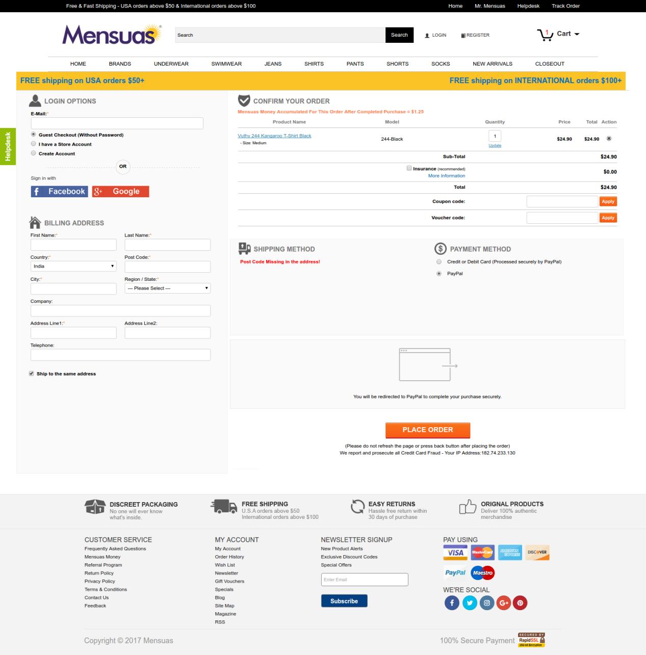
5. Mensuas’ checkout
Mensuas have a single page checkout, with social login option
If account creation is not a preference for you, you might want to look at the checkout page of Mensuas. Mensuas is a leading destination in the US for fashionable underwear for men. Similar to Bellroy, Mensuas too provide a single page checkout to it, customers. However, it goes one step further by introducing social login on the checkout page. One can easily notice the emphasis on login options where you have multiple options to continue with the check out process- Guest checkout, User sign-in, and account registration.
In case you are a new user, you can either checkout as a guest user, create a user account, or just use the Facebook or Google login option for direct login using your social platform credentials. By clicking on any of the social login options, the user can instantly login to the user account without filling a registration form. Thus, saving the customers from a burden to create user accounts manually. Social login makes the checkout experience very smooth and handles multiple reasons for cart abandonment at once.
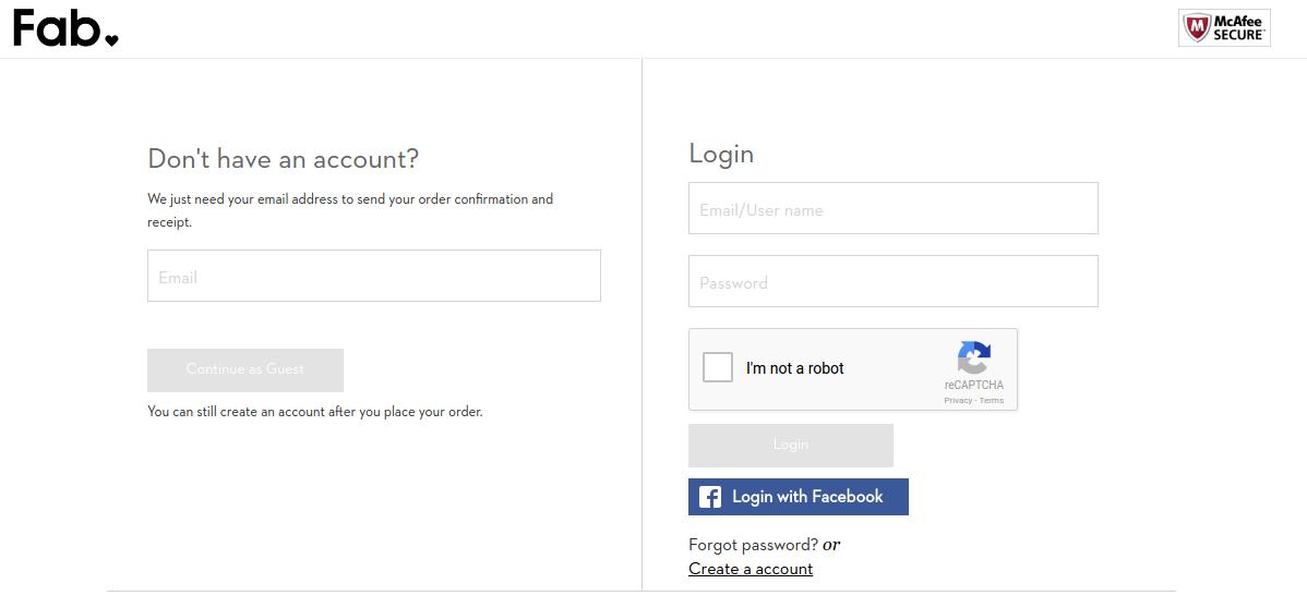
6. Fab’s checkout
Fab provides a multi-step checkout with Facebook login option
Fab utilizes a well optimized multi-step checkout that can be completed without creating a user account manually. If you don’t have a user account already, you can choose from guest checkout or the Facebook login option.
It efficiently utilizes the Facebook login to encourage user registrations which is an important aspect of learning from Fab’s checkout page. It understands the importance of user accounts and how they can be used to create repeat conversions. So, it pushes the users towards Login option without actually forcing them.
The checkout process after login or continuing as a guest presents some well-optimized forms for providing the billing, shipping and payment information. The forms ask only the necessary information and do not demand secondary information from the users.
7. Nike Store’s checkout
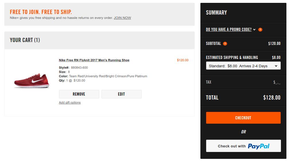
Nike’s checkout is preceded by an optional Paypal express checkout
The speed of the process is a major concern that haunts every store owner. Nike handles the situation by cleverly integrating a PayPal checkout option which provides a more faster and secure checkout. Moreover, for using a Paypal customers need to login using their PayPal account which automatically brings the customers to logged in users’ club.
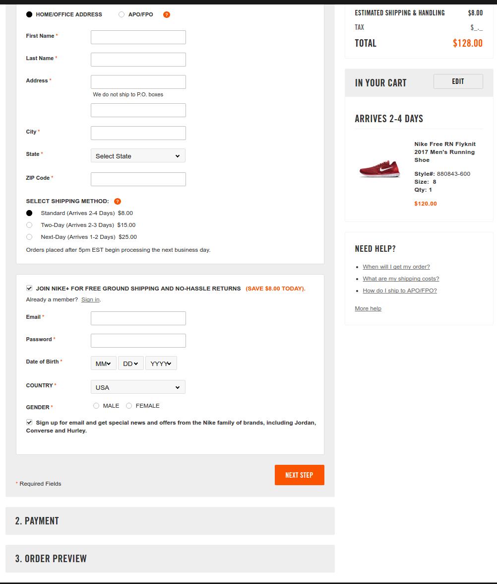
For the regular checkout interface, Nike goes with a partial one-page checkout structure. I am saying partial because all the steps are not unlocked at once on the page. You have to complete the previous step before moving to the next step.
Nike’s regular checkout is inspired by the single page structure
Here users can choose to continue with the checkout without logging in and create the user account at the later part. Furthermore, the shopping cart summary in the right column keeps the users well informed about the miscellaneous costs associated with the cart- Shipping charges, total cost, single item’s cost.
8. Jabong’s checkout
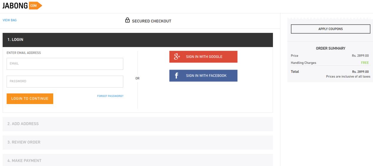
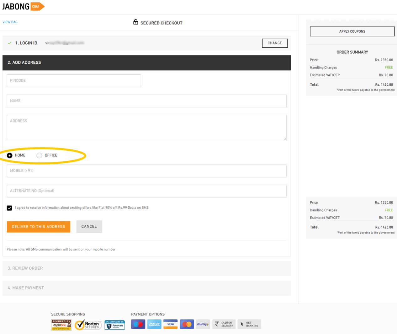
Jabong provides a streamlined check out process that keeps the users informed about the next steps plus allows multiple social login options. The further steps on the checkout page are well optimized to ask only few important details.
The most inspiring option that I found here was the option to specify if the shipping address is a home or office address. It helps the shopping site to deliver the items on a correct time, minimizing the chances for missing delivery. Furthermore, the alternate phone number field is an optional field which customers can choose to skip or provide. I have found this checkout as one of the fastest among the check outs I inspected.
The final takeaways
Summing up the entire case study, it is evident that whether you take UI or UX as the judging criteria, one page checkout is something that makes the process edgy. I will consolidate the entire features that make these checkouts best-of-their kind.
Single page checkout:
As per Baymard, complicated order processing contributes to around 28% of the cart abandonment. This is when a one page checkout can simplify the process for your customers.
Easy Signups:
Guest login options along with ease of signing up can make the checkout process effective. Along with this, social login options can give the checkout process of your site a notch-up feature. Almost all the eCommerce sites, be it an industry giant or a SME.
Implement upselling and cross-selling:
The check out pages should never provide an exit root and a dead-end to your customers. Instead, it should be used as an opportunity to generate additional revenue through upselling and cross-selling. Offering compelling reasons to the customers to browse the store right back is one of the best ways to achieve customer retention. You can do this by offering customers products related to the one that they ordered, or by giving them discounts on future purchases.
Mobile-friendly checkout:
With the latest Google update that emphasis on mobile-first indexing, it has become mandatory to make the entire mobile-responsive which includes the checkout process as well. Mobile commerce will account for almost 50% of the total online purchases by 2020 as per research. So, it inevitable to ensure that your mobile users get a flawless shopping experience. The checkout process of your site should be mobile-friendly as well. At the same time, it should never exclude any of the capabilities of the desktop site, such as social login option and one-page checkout. The mobile commerce experience should be identical to the desktop one in terms of the ability to browse, purchase and pay for products.
Source: baymard.com
Offer a variety of payment and shipping options:
Meeting your customers’ needs is the key to increasing your checkout’s efficiency. As per the result of Baymard’s studies, lack of shipping and payment options are another reasons for cart abandonment. So, you need to ensure that your prospective customers are able to pay and get the product delivered in whatever way is most convenient for them. Offer them as many payment and shipping methods as possible.
Ensure security:
Cyber security is possibly the biggest concern for the online shopping. The only way to keep the customers assured is by optimizing the UI of your site. The site’s design have a huge impact on the shoppers’ perception of your site’s security. An outdated-looking site will give customers the impression that the site is not reliable and will lead to a lot of them dropping off without purchase.
Conclusion
All these eight check outs are the best ones? It depends. I will leave that on our readers to decide, but I think they all have got something for us to learn from.
All of them do not insist on necessary account creation, except for the Amazon (Which was providing guest checkout a while ago). However, all of them including Amazon do inspire us to handle the first step of checkout wisely. While others handle the situation with guest checkout and social login, Amazon handles it through its compact registration form.
I like the approach of Mensuas, which provides the sign-up, sign-in, guest checkout and social login as well. Moreover, it’s single page checkout is well optimized in terms of form design.
One Page checkout have been in the eCommerce industry for the past few years. However, the kind of eCommerce experience that has been improved using these one step checkouts need not any introduction. From quickest checkouts to conversion optimization, eCommerce store owners see one page checkouts as a tool of improvement. Improvement in customers experiences, improvement in conversion optimization, improvement in competitive advantages against the rivals and much more.
In this article, I am basically going to explain how a perfect one page checkout would look and behave with the customers to provide the eCommerce sites a better checkout page.
Reduced entries in one-page checkouts- A one page checkout is basically adopted to provide the quickest checkout experiences. Sometimes, we get confused between a one step checkout and a quick checkout experience. The line between the two is very thin.
A pure one page checkout module would work by compacting each and every step of a multi step checkout into a single page. From customer information, shipping address, to payment options each and every step is reduced onto a single page.
However, a better quick checkout design would not only consist of a one page checkout but would also show a decrease in number of entries. These reduced entries are obtained by skipping the redundant or unnecessary entries from the generic checkouts.
For example, in generic checkouts, we would find different entries for mobile number and telephone number. In quick checkouts, we might have the option to skip the telephone number and provide only the mobile number in the form.
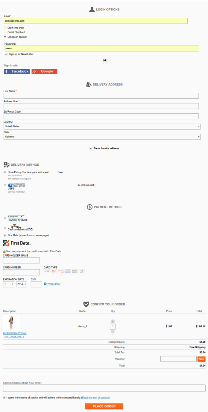
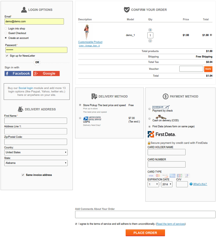
Designs and layouts-There are basically three types of layouts that are used by the one step checkouts to compact the whole process on one page. The single column, the two column, and the three column layout.
The single column layouts are generally adopted by those sites which do not ask much of the information. This information can be compacted in a single page without increasing the page length. In case if the number of the entries required are much larger, then a two or three column layout is a better option.
One column layout2 Column layout3 column layout
By changing the layout options we can re-arrange the one step checkout to switch the designs and constitute the required fields in a single page accordingly.
Checkout speed and steps- As we know that one page checkout would definitely compact the multi page structure into a single page structure. However, just the compaction of steps is not enough to get a proper one page checkout; at least the customer’s experience will not improve until you work on the speed of the checkout. The checkout speed can be increased by:
Removing the unwanted or not necessary fields from the checkout page.
Removing the redundant fields.
If any field on the checkout page can be helpful but not necessarily required by you, you should make it optional.
Pre-filling the customer information from the user account.
Reduced the use of graphics intensive objects like carousels.
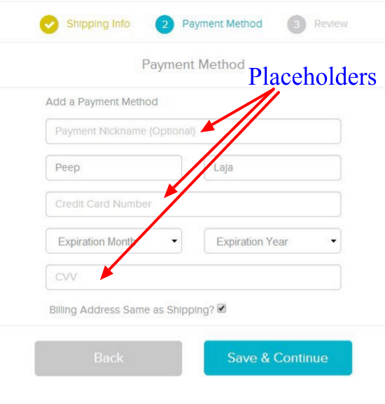
Behavior of fields on checkout page- To reduce the size of the one page checkout and make them conversion friendly, you can skip the labels of text fields and use placeholders instead. However, in some cases, labels are more effective than placeholders. For example, if a checkout form consists of a large number of fields, the user might get confused about the kind of entries he has filled when he reviews the entries afterward.
So, placeholders can be used as a guiding tool to make the fields clearer and it is a better option them using them in place of labels. These placeholders can consist of pre-filled examples.
Placeholders can guide the users in filling correct information
Option of Guest Checkout- There are certain chances that a customer might have come to your online store for the first time and he might not have a user account. A compulsory requirement of sign up would definitely encourage the shopper to abandon your cart. Instead like every effective checkout process, your one page checkout should be able to accept the guest checkouts. The guest checkout just includes the manual entry of email address and customer information. Later on the customer might choose to sign up, but as of now, it would not hamper your conversion at least.
So, like every effective checkout process, you should make sure that your one step checkout is efficiently accepting guest checkouts. It would not only improve your conversion rate but would also help you prevent shopping cart abandonments on your store.
Social login at checkout page-
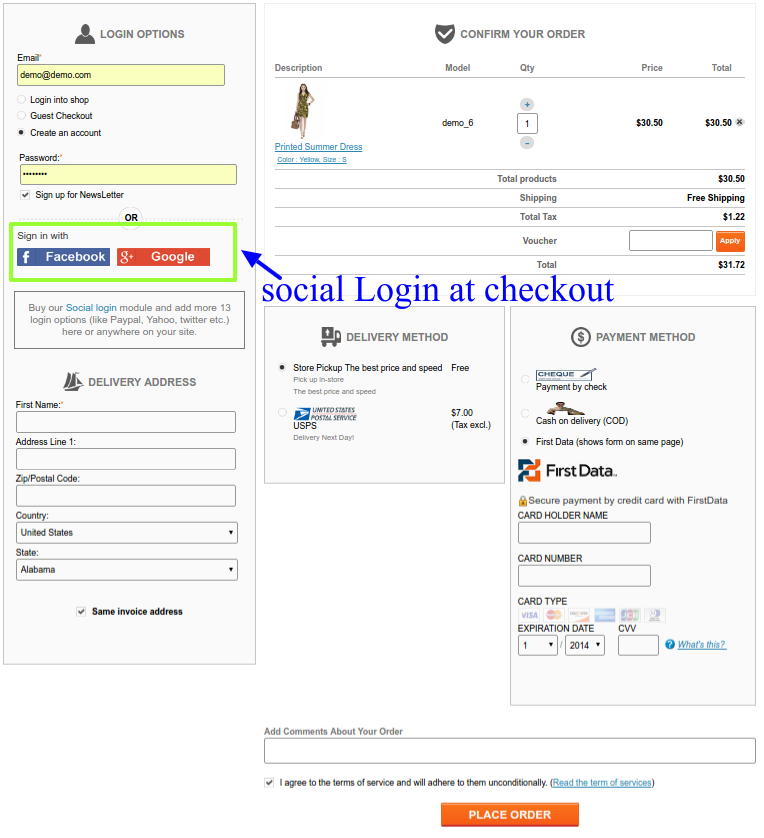
There are various social Login modules that allow the eCommerce store owners to accept social login on their online stores. These social login options allow the users to login or sign up to a site without a need to fill the registration forms. It is one of the ways adopted by eCommerce store owners for conversion optimizations.
It is a useful feature to include in the one page checkout page too. When a shopper reaches to your checkout pages, he would definitely not want to go back and create an account on your shop first. Instead, you can allow the shopper to use his/her Facebook, Gmail or PayPal account to register on the store. Once the shopper sign-ups using the social login, he would be again directed back to the one step checkout page and can continue from the same.
Best Practices and features of a one-page checkout module
Every one page checkout is adopted by the online store owners to improve their sales and conversions. If it goes wrong, it will result in nothing and would destroy the customers experience in addition. Choose a one step checkout module that has at least these basic features. For PrestaShop, OpenCart and Magento stores, Knowband provides effective one page checkout modules that include all of the above-discussed features and much more.