

There has been a sudden spike in mobile usage recently. Further, the indexing system prioritizes the mobile version of a website for indexing and ranking purposes. In this article, we will explore the impact of mobile-first indexing on website rankings and mobile user experience.
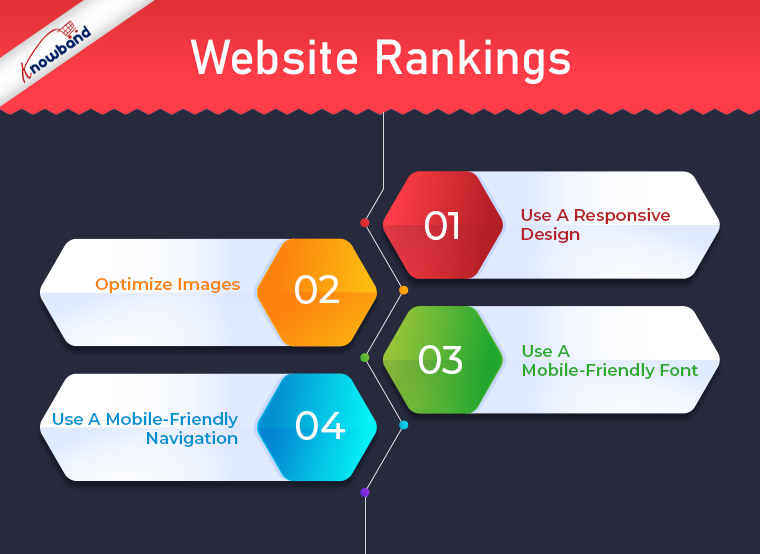
Website Rankings
One of the most significant impacts of mobile-first indexing is on website rankings. Additionally, websites that are not optimized for mobile devices will experience a drop in rankings. Also, it is so as Google will prioritize sites that are having mobile optimization. This is because Google’s algorithm takes into account the user experience on mobile devices, and websites that are not mobile-friendly usually provide a poor user experience. Further, this can result in lower rankings and lower visibility in search results.
There are several things that you can do to improve your website’s mobile-friendliness. These include:
Use A Responsive Design
A responsive design is a design that adapts to the size of the screen it is being viewed on. Moreover, this means that your website will look good on any device, whether it is a desktop computer, a tablet, or a mobile phone. Also, using a responsive design will ensure that your website works with mobile devices.
Optimize Images
Images can be a major factor in the speed of your website. Also, Large images can slow down your website, especially on mobile devices. To ensure that your website has mobile optimization, you should optimize your images by compressing them and reducing their size.
Use A Mobile-Friendly Font
On mobile devices, it is difficult to read some fonts. To ensure that your website is mobile-friendly, you should choose a font that is easy to read on small screens.
Use A Mobile-Friendly Navigation
Navigation can be difficult on mobile devices. To ensure that your website is mobile-friendly, you should use a navigation system that is easy to use on small screens.
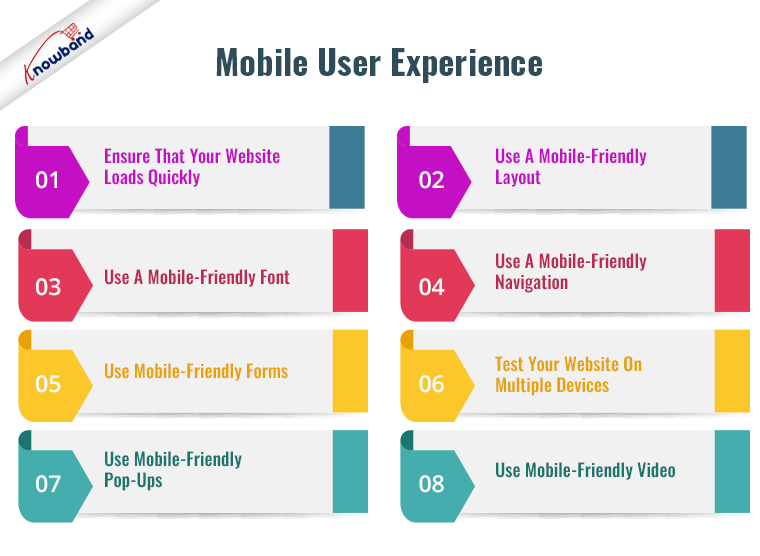
Mobile User Experience
Another significant impact of mobile-first indexing is on mobile user experience. Websites that are not optimized for mobile devices are difficult to navigate, slow to load, and display poorly on smaller screens. This can result in a poor user experience for mobile users, users abandon the site and seek out a competitor that offers a better mobile experience.
On the other hand, websites that have optimization for mobile devices can provide a positive user experience for mobile users. This can lead to increased engagement, lower bounce rates, and ultimately, higher conversions.
There are several things that you can do to improve your website’s mobile user experience. These include:
Ensure That Your Website Loads Quickly
Mobile users have a short attention span, and they expect websites to load quickly. To ensure that your website loads quickly on mobile devices, you should optimize your website’s speed by reducing the size of images, compressing files, and using a content delivery network (CDN).
Use A Mobile-Friendly Layout
A mobile-friendly layout is essential for providing a positive user experience on mobile devices. A mobile-friendly layout should be easy to navigate, with clear headings and a simple design.
Use A Mobile-Friendly Font
As mentioned earlier, some fonts can be difficult to read on mobile devices. To ensure that your website is easy to read on small screens, you should use a font that is easy to read on mobile devices.
Use A Mobile-Friendly Navigation
Navigation can be difficult on mobile devices. To ensure that your website is easy to navigate on mobile devices, you should use a navigation system that is easy to use on small screens.
Use Mobile-Friendly Forms
Forms can be difficult to use on mobile devices. To ensure that your website works for mobile devices, you should use mobile-friendly forms that are easy to use on small screens.
Test Your Website On Multiple Devices
To ensure that your website is working for all devices, you should test your website on multiple devices. Also, this will help you identify any issues that are specific to certain devices.
Use Mobile-Friendly Pop-Ups
Pop-ups can be annoying on mobile devices, especially if they cover the entire screen. To ensure that your website is compatible with mobile devices, you should use mobile-friendly pop-ups that are easy to close.
Use Mobile-Friendly Video
Videos can be difficult to watch on mobile devices if they are not optimized for mobile. Further, to ensure that your website works for all mobile devices, you should use mobile-friendly videos that are easy to watch on small screens.
In The End!!
In conclusion, mobile-first indexing has had a significant impact on website rankings and mobile user experience. Moreover, websites that are not optimized for mobile devices experience a drop in rankings. Google deems them to be providing a poor user experience for mobile users.
In case you have an interest in our mobile app builder plugin then kindly connect with us at support@knowabnd.com. Our team of experts will assist you with your business apps. Also, we will assist with business-specific customizations. Kindly let us know if you are facing any concerns or issues related to the module.