
Motivating the users to download your app isn’t a cake-walk nowadays. Along with the app development, good description, app promotion various other strategies are required for making an app successful. The app icon is one such factor that makes your app noticeable. Creating a stunning mobile app icon that can motivate the users to click on your app is way trickier than it seems.
What was different in the popular apps and their development process that contributed to their tremendous success? This question might have popped in your mind. Well, the answer is that a successful app developer pays attention to each and every aspect. Even a seemingly small factor might play a key role in the success of an app. The app icon is one such factor that can play a vital role in contributing to the success of your app. The small colorful squares may easily entice people to try your app once. Earlier mobile app icons were created mainly for showing app functionality, but now they are created to give users a clue about the core concept of your business. The app icon is the very first thing which a user experiences. In the overcrowded app store, it is one of the ways to attract the attention of the users.
So, here are some tips and suggestions for designing a mobile app icon. Read on to know:
1. Pick a unique shape for the app icon, but keep it clear

Your app icon should look bold, that’s what makes it recognizable among your competitors. For making it noticeable, a unique shape is necessary. Along with uniqueness, it should also be simple enough to portray your entire theme to the user in just one look. Making your app icon unique and simple would entice more users to download your application. Android provides us the luxury of choosing various shapes for icons. Unlike iOS, that only offers the option to choose a round shaped icon.
For instance, Spotify and Google duo both have creatively shaped unique app icons.
2. Avoid image in the app icon, keep them symbolic
If you thinking of using an image in your app icon, I would suggest you avoid it if possible. The image in an app icon reduces your app credibility in the users’ eyes. This would ultimately create a bad impression of your application.
Images can be used for those mobile applications which need to share more information with the users than just the core business concept. However, if the purpose is served with an icon or a letter, it would be a better option. You can even go for vector images or images with symbols if there is no other choice left but to use the image.
3. Keep your brand name highlighted in the app icon, if the text is used
Your app icon size is very small. Considering the maximum permissible size, using a detailed text on the app icon is not feasible. It will neither give the idea of your app to the users nor the users will be able to read the text and get a clue. In every possible way, it will be a total loss for you. Use moderate text on the icon and make the brand name bold.
For instance, BBC news app and ESPN app use the text in the icon but keep their brand name bold and recognizable.![]()
4. Use minimum colors in the app icon, that too vibrant ones
Choosing the right color combination is a prominent issue faced while designing the app icon. There are some icons that use 4 to 5 different colors which don’t look attractive or engaging in any way. Avoid using a lot of colors in the icon. Also, the color chosen must be vibrant enough to attract users with just a look. There are various icons which share the same color, you should make sure your icon color must vary from other apps available, especially in the same category.
For instance, the color used in the icon of Snapchat and Instagram provide them an edgy look. The color combination makes them stand out even in the jam-packed competitive ecosystem.![]()
5. Instead of lengthy words in the app icon, a single letter will do the job
As discussed above, the text won’t look good on the icon and neither will it serve the purpose. Similarly, using words in the icon doesn’t even put effective impression. Rather than going for text, a single alphabet can even make your app popular and would keep you ahead in the competition.
Take the example of Facebook and Pinterest, they technically use alphabets in their icons and are amongst the most successful apps today.![]()
6. Add the outline border, to make app icon stand out
Around the app icon, the simple border can be used to make it visually attractive. Outline/border increases the impact of your app icon as it highlights the actual content of the icon. Be it color, design or letter, the presence of the border makes the icon more attractive. Different 3D borders are also being used nowadays, but I would suggest going for the simple ones.
For instance, Apple uses borders around both the app store and iTunes icons. It makes them stand out from the competitors.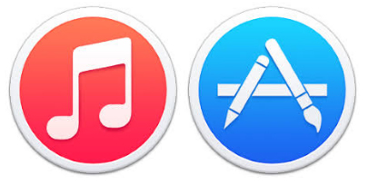
7. Get new ideas and improvise accordingly
Before creating an app icon for your app, go and have a look at your competitor’s app icons. Try to figure out what different are they are doing and what is making some of them popular. Spending some time in this analysis would help you in differentiating ugly and good icons. You will understand how you have to start making yours and what to avoid in the process.
8. Create a prototype first
When you get all the ideas related to icon creation, you should draw a prototype sketch on a piece of paper first. Drawing multiple variations of an icon on a paper will surely help you and your designer in taking the decision. The major motive of this sketching is to get an idea about your app icon before taking the final decision.
9. Run A/B test on an app icon, before making it final
The icon you pick for your application is going to be used for marketing, brand enhancement and more. It is better to test, how engaging your app icon is before finalizing it. For this, there is A/B app icon testing. This testing basically compares two app icons and analyze graphical results depicting which one can get downloads for your application.
10. Make sure your app icon meets size guideline
At last, when you have visually analyzed app icon on your phone screen and you are on the verge of creating it, I would suggest checking if your app icon’s size is all right. It should be proportioned with the screen and easily visible to the user’s eyes.
Apple will also reject your app if its icon doesn’t meet size guidelines. So, this check would save you from your loss of money and time. So, before sharing apps with Apple and Google for app submission, refer following size guidelines:

iOS app icon size guidelines
Android app icon size guidelines
In Conclusion
App icon shows your business credibility, which is a parameter for the users to decide where they can invest their money. So, a refined and well-crafted app icon that can motivate the potential users to delve into your app. Not just this, even the other UI aspects like splash screen and others contribute to the user engagement. Hence, ensure a flawless and user-friendly interface while creating a mobile app and stay ahead of your competition.


Hi,
You have mentioned in your article that we should avoid using image as icon. Actually I am making a gaming app, wouldn’t a character face as app icon be a great approach? Please suggest.
Hi,
Yeah, as far as gaming app is considered choosing a character for the icon would be a nice approach. But, make sure that the chosen character must be popular as your app would be recognized with that.
Thanks.
Hi,
You have suggested not to use long texts on the icon but there are many applications which wre using their full name although a single alphabet for them was equally good for eg. Uber, Amazon, Jabong, Zomato, Voot etc.
So I just want to know that using a single alphabet is really a great approach or not?
Hi there,
It’s totally up to you to choose a single alphabet or long texts on the app icon as far as it acknowledges your brand. Zomato and others have used just a small word which is alright. You can choose the word or alphabet accordingly.
Thanks.