The Importance of Responsive Web Design in eCommerce

In the fast-paced world of eCommerce, where customers are increasingly shopping on mobile devices, having a responsive web design has become a critical factor for success. Responsive web design ensures that your online store looks and functions flawlessly across various screen sizes and devices, providing a consistent and user-friendly experience to customers. In this blog, we will explore the importance of responsive web design in eCommerce and how it can significantly impact user experience, conversion rates, and overall business growth.

1. Enhanced User Experience:

Responsive web design is all about delivering a seamless and intuitive user experience across different devices. With the increasing usage of smartphones and tablets for online shopping, it is crucial to provide customers with a mobile-friendly experience. A responsive website adjusts its layout, font sizes, and images to fit different screen sizes, making it easy for users to navigate, browse products, and complete purchases. By prioritizing the user experience, businesses can engage customers, reduce bounce rates, and increase the likelihood of conversions.

2. Improved SEO Performance:
Search engines, such as Google, prioritize user experience as a ranking factor. Websites that are mobile-friendly and provide a responsive design are more likely to rank higher in search engine results. Google even labels mobile-friendly websites in search results, indicating their commitment to providing the best user experience. By implementing responsive web design, businesses can improve their SEO performance, attract more organic traffic, and reach a wider audience, leading to increased visibility and potential sales.

3. Increased Conversion Rates:

Responsive web design directly impacts conversion rates. Customers who have a positive experience on a mobile-friendly website are more likely to make a purchase. On the other hand, a website that is not optimized for mobile devices can lead to frustration, abandoned carts, and lost sales opportunities. By ensuring that your e-commerce store provides a seamless shopping experience across all devices, you can increase customer trust, engagement, and ultimately, conversions.

4. Cost and Time Efficiency:

Investing in responsive web design eliminates the need to maintain separate websites or mobile apps for different devices. Instead of developing and managing multiple platforms, businesses can focus their resources on a single responsive website that automatically adapts to various screen sizes. This approach not only reduces development and maintenance costs but also saves valuable time. Additionally, with responsive design, updates, and changes can be implemented more efficiently, ensuring a consistent experience for all users.

5. Competitive Advantage:

In a highly competitive e-commerce landscape, standing out from the crowd is essential. A responsive web design gives businesses a competitive edge by providing an optimal browsing experience for customers. When users can easily navigate, view products, and complete transactions on any device, they are more likely to choose a responsive website over a non-responsive one. By prioritizing responsive web design, businesses can differentiate themselves, build trust, and create a positive brand image.

Conclusion:

In the world of eCommerce, responsive web design has become a non-negotiable element of success. It enhances the user experience, improves SEO performance, increases conversion rates, and provides a competitive advantage. Businesses that prioritize responsive design demonstrate their commitment to meeting customer needs and staying ahead of the curve.

To learn more about the importance of responsive web design in eCommerce or for any other inquiries, please feel free to get in touch with us at support@knowband.com. Our team of experts is ready to assist you and provide further insights into implementing responsive web design to enhance your e-commerce store’s performance and success.

What Are the Steps to Follow for Mobile WordPress SEO Audit?

Modern society finds it simple to browse or make purchases online using mobile applications because they are widely used and easily available. With mobile SEO, it will be difficult if you don’t know which tactics are successful and which ones are not. You can review your website, find areas for development, and fix significant problems by performing an SEO audit. 

SEO Audit: What It Is? 

To ensure that your website is performing at its peak, you should conduct an SEO audit. Along with identifying any flaws and how to correct them, the effectiveness of your website’s SEO strategies is also evaluated. There are currently online tools that make recommendations for possible changes you can have to make to your strategy to achieve the best SEO performance. 

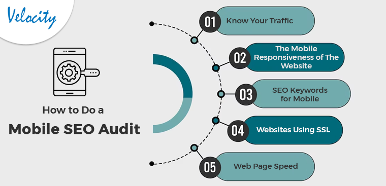
How to Do a Mobile SEO Audit:

Know Your Traffic

You must be aware of how many mobile users there are and what kind of mobile device they like to use to access your website. Using Google Analytics, you can ensure that your website works on a variety of devices. Further, all suitable screen sizes, not simply the most popular ones, can be perfectly optimized for your website. Also, you can plan your keyword approach if you are aware of the many device types that your users have to visit the website.

Knowing which pages on mobile people are seeing will help you ensure that the websites are optimized appropriately. Knowing the search phrases can also help you develop a mobile keyword strategy. You can finally get ready for the continued movement of clients to mobile. Also, by observing how your visitors interact with your website while using a mobile device, you can adapt to the change accordingly.

The Mobile Responsiveness of The Website 

One of the most important things to consider in a mobile WordPress SEO audit is the layout of your website. To optimize performance, it is crucial to have a mobile-responsive design. As soon as all of your site’s optimization is done, the user experience will increase. 

A website is mobile-responsive if it can adapt its design according to any screen size. The good news is Building a mobile-responsive WordPress site is simple. WordPress automatically aligns a component for the mobile version of the website. Many internet tools, like Google Search Console, can help you see how people are interacting with your website. The content should only be displayed when needed for the best user experience. 

SEO Keywords for Mobile

Mobile WordPress SEO primarily relies on keyword optimization when determining how a page will rank in the SERPs. Due to the improved technology in our world today, most searches are coming from cell phones. Users of desktop computers and tablets often carry out searches in a different way than users of smartphones. Instead of using longer, more difficult-to-type keywords, mobile browsers use shorter, more user-friendly keywords. You should re-evaluate your mobile SEO strategy after conducting mobile keyword research.

There shouldn’t be ignorance of the local element. Considering how convenient they are, users favor using mobile queries. A huge population uses google Maps for transportation as it is convenient. Your WordPress site can be optimized by using locally relevant keywords.

Websites Using SSL

The next factor for an SEO audit checklist is determining whether your website has an SSL certificate. An SSL encryption certificate facilitates communication between a user’s browser and your website server. Websites that utilize HTTPS are more secure than those that do not, according to Google and other search engines. If your site is secure, you may tell by looking for a padlock icon in the browser’s search field. 

Web Page Speed

Google gives ranking consideration to how quickly your website loads. When performing an SEO audit, it’s critical to look for factors that can make your website load slowly. Identifying the speed of user access to your website is the first thing you need to perform. Once you have connected Google Analytics to your WordPress website, simply go to Insights then Reports from your dashboard, and select the “Site Speed” option.

You can view a rating for how quickly your site loads on desktop and mobile devices. Other information in the report is also shown, and this information is vital for figuring out how quickly your website loads. Caching plugins are available to improve server response times, and a content delivery network (CDN) is an alternative for increasing website speed. 

In the End

In this article, we have been discussing the various steps using which the SEO audit is possible for WordPress on Mobile. Apart from that in case there are any issues or concerns related to our module then we can assist you for the same. Moreover, if you want to have any customization in our module or want any additional feature to it then connect with us at support@knowband.com. We also provide custom development services which are specific to your business and we will be happy to assist you with the same.