Modern society finds it simple to browse or make purchases online using mobile applications because they are widely used and easily available. With mobile SEO, it will be difficult if you don’t know which tactics are successful and which ones are not. You can review your website, find areas for development, and fix significant problems by performing an SEO audit.

SEO Audit: What It Is?
To ensure that your website is performing at its peak, you should conduct an SEO audit. Along with identifying any flaws and how to correct them, the effectiveness of your website’s SEO strategies is also evaluated. There are currently online tools that make recommendations for possible changes you can have to make to your strategy to achieve the best SEO performance.
How to Do a Mobile SEO Audit:
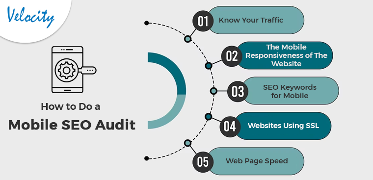
Know Your Traffic
You must be aware of how many mobile users there are and what kind of mobile device they like to use to access your website. Using Google Analytics, you can ensure that your website works on a variety of devices. Further, all suitable screen sizes, not simply the most popular ones, can be perfectly optimized for your website. Also, you can plan your keyword approach if you are aware of the many device types that your users have to visit the website.
Knowing which pages on mobile people are seeing will help you ensure that the websites are optimized appropriately. Knowing the search phrases can also help you develop a mobile keyword strategy. You can finally get ready for the continued movement of clients to mobile. Also, by observing how your visitors interact with your website while using a mobile device, you can adapt to the change accordingly.
The Mobile Responsiveness of The Website
One of the most important things to consider in a mobile WordPress SEO audit is the layout of your website. To optimize performance, it is crucial to have a mobile-responsive design. As soon as all of your site’s optimization is done, the user experience will increase.
A website is mobile-responsive if it can adapt its design according to any screen size. The good news is Building a mobile-responsive WordPress site is simple. WordPress automatically aligns a component for the mobile version of the website. Many internet tools, like Google Search Console, can help you see how people are interacting with your website. The content should only be displayed when needed for the best user experience.
SEO Keywords for Mobile
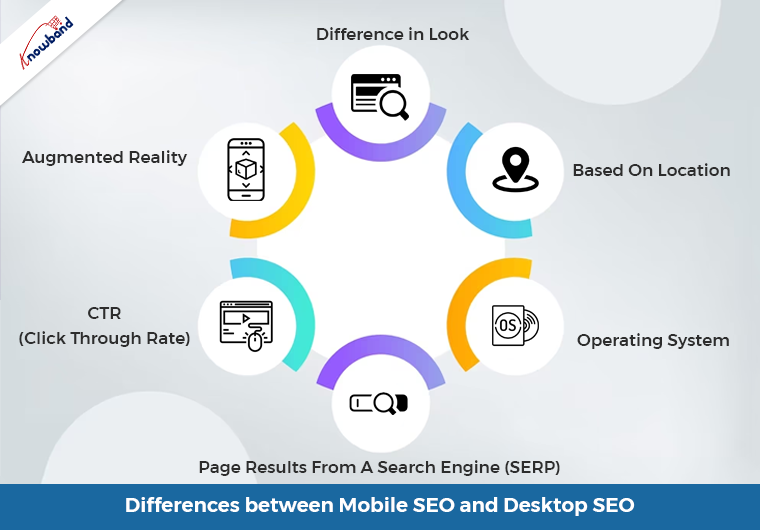
Mobile WordPress SEO primarily relies on keyword optimization when determining how a page will rank in the SERPs. Due to the improved technology in our world today, most searches are coming from cell phones. Users of desktop computers and tablets often carry out searches in a different way than users of smartphones. Instead of using longer, more difficult-to-type keywords, mobile browsers use shorter, more user-friendly keywords. You should re-evaluate your mobile SEO strategy after conducting mobile keyword research.
There shouldn’t be ignorance of the local element. Considering how convenient they are, users favor using mobile queries. A huge population uses google Maps for transportation as it is convenient. Your WordPress site can be optimized by using locally relevant keywords.
Websites Using SSL
The next factor for an SEO audit checklist is determining whether your website has an SSL certificate. An SSL encryption certificate facilitates communication between a user’s browser and your website server. Websites that utilize HTTPS are more secure than those that do not, according to Google and other search engines. If your site is secure, you may tell by looking for a padlock icon in the browser’s search field.
Web Page Speed

Google gives ranking consideration to how quickly your website loads. When performing an SEO audit, it’s critical to look for factors that can make your website load slowly. Identifying the speed of user access to your website is the first thing you need to perform. Once you have connected Google Analytics to your WordPress website, simply go to Insights then Reports from your dashboard, and select the “Site Speed” option.
You can view a rating for how quickly your site loads on desktop and mobile devices. Other information in the report is also shown, and this information is vital for figuring out how quickly your website loads. Caching plugins are available to improve server response times, and a content delivery network (CDN) is an alternative for increasing website speed.
In the End
In this article, we have been discussing the various steps using which the SEO audit is possible for WordPress on Mobile. Apart from that in case there are any issues or concerns related to our module then we can assist you for the same. Moreover, if you want to have any customization in our module or want any additional feature to it then connect with us at support@knowband.com. We also provide custom development services which are specific to your business and we will be happy to assist you with the same.