KnowBand’s One Page Checkout made it simple: CEP Sport website flourishing in Denmark

One Page Checkout is a smart way to put all the fields into a single page and present it to the customer in a sleek and clear format. It is like a box designed to keep your accessories separately but together. A Denmark-based company, CEP Sport added the One Page Checkout Module to their website and they have configured it in a well-designed manner.

The layout customization is quite simple and the addition of the progress bar keeps the user engaged. This article describes how beautifully you can create the Checkout page with One Page Checkout Module and implement the same on your eCommerce website like CEP Sport just did on their website.

What is CEP Sport?

CEPsport.net is a distributor of the German brand CEP and is operated by SportSupport ApS. CEP has the best sportswear on the market in terms of design, feature, and compression. They are even athletes who enjoy being able to move. It is well-supported by the most cutting-edge sports products in the market.

Implementation of One Page Checkout module in CEP Sport Website

From product page to checkout page, every eCommerce website design requires the best UI and UX. It is important to optimize the landing page but more needful to have a checkout page that does not add up to cart abandonment. CEP Sport has chosen KnowBand’s One Page Checkout module for their checkout page and we are glad that they trusted our module for the best Checkout Page Solution.

One Page Checkout has several features that make it best among the other available choices.

-> Visit CEP Sports Store and have a look at their Checkout Page Design by yourself: Click Here

It has a 3-Column Layout with a custom layout design

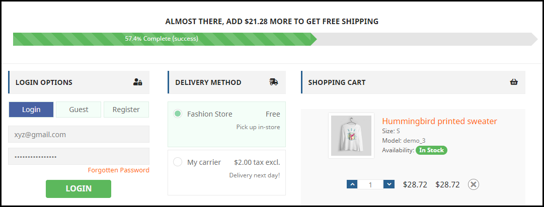
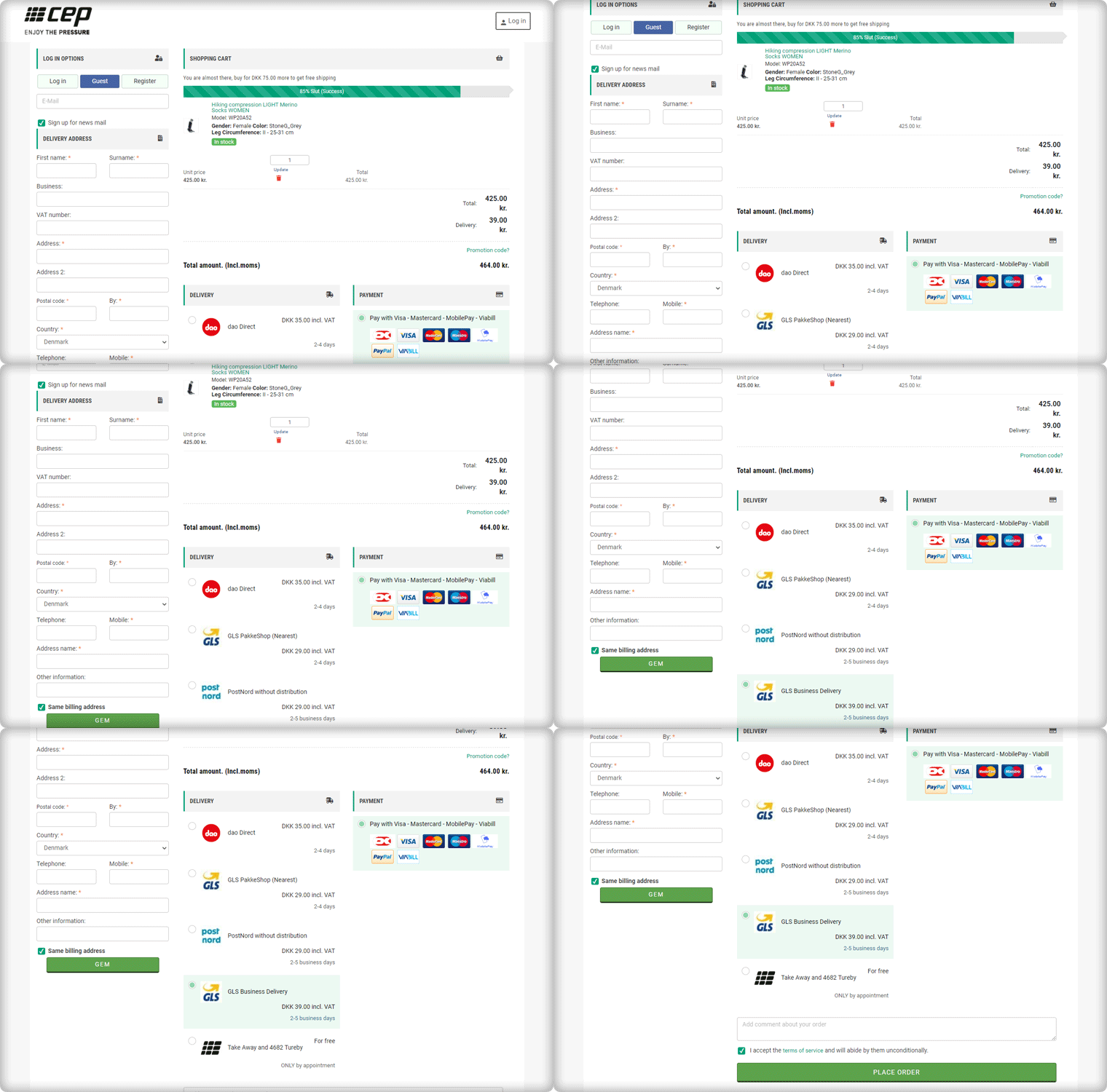
The Checkout page of CEP Sport has a 3-column layout design and the module provides customization features for the layout.

How layout can be customized? It allows you to choose a layout design (1-column, 2-column, 3-column). And, you can shuffle the fields and reposition them with drag and drop functionality.

In the picture below, you can see that the checkout page is customized and CEP Sport has designed it according to their requirement.
Shopping Cart CTA

To reach the checkout page, it is important to have clear CTA (Call-to-action) buttons. The website is incorporated with proper CTAs.
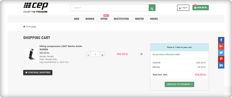
Customers can proceed to the checkout page by clicking on the button ‘Proceed to Payment’ and it will redirect them to One Page Checkout.

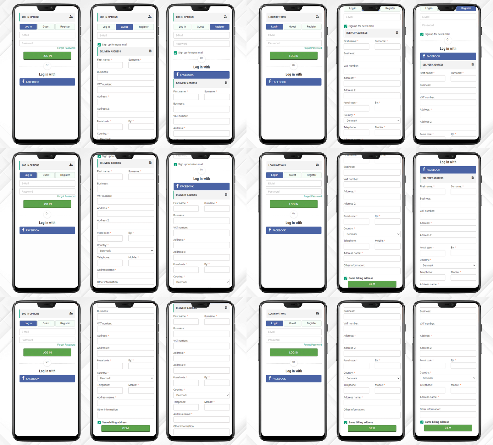
Login, Guest Checkout, New Registration

Once, the customer reached the checkout page he/she has to register himself and if he is in rush then Guest Checkout is also available.

One Page Checkout has three options:

  1. Log-in via email
  2. Guest Checkout
  3. Register as a New User

Log-in and Register with Social Media Account

Registration with a Social Media account like Facebook is quite handy and one does not have to remember the password for every eCommerce site. If a customer is registering via Facebook then he only has to provide the delivery address.

And, Checkout Process is sorted!

After registration, login can be done by entering the E-Mail Address and Password or a user can log-in by Facebook account.

Just one click and you are done!
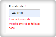
I am Mandatory* and You just filled in the wrong details

The mandatory fields can be highlighted with the Asterisk mark (*). Also, it immediately indicated the errors made by a user during the form filling process, called inline validation.
Delivery and Payment Methods

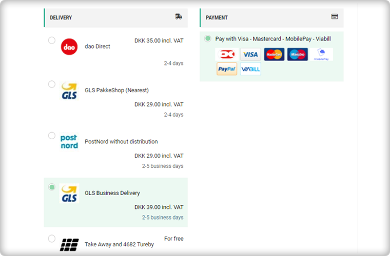
The Single Page Checkout of the CEP Sport website has several shipping choices and Payment Gateways. Along with every shipping method, extra charges (if applicable) are displayed. It is also possible to specify a particular payment gateway with a specific shipping method.
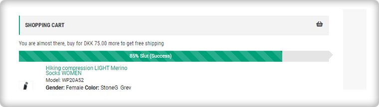
Progress Bar shows the user’s success

This helps the customer to measure the registration progress. If you think this is not necessary then you should know that a human brain works better if it knows how much work is left.
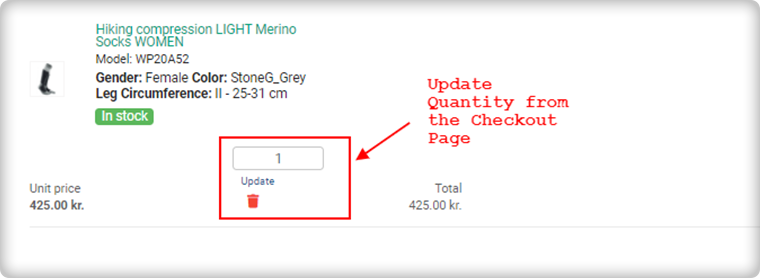
Update product quantity on Checkout Page

Another feature that makes it the client’s choice is the quantity update option. One Page Checkout allows customers to update the product quantity on the checkout page itself.
Add an extra field to collect more information

If a customer wants to add any comment about the order then he has an additional field for the same. Admin can add custom fields in the checkout page to collect information from the customer that can be used during email marketing for personalized email.

Since all the information is added correctly by the customer or the guest visitor.

Now, he/she can place the order!

Why do you need One Page Checkout in your online store?

We have had a successful tour of the CEP Sport website’s One Page Checkout. Now, it is time to understand the value of a single page checkout over the default multiple Page checkout available on eCommerce platforms. The One Page Checkout appears to be simpler because it displays all the fields on a single page before the form filling process. Guest checkout and social media login options are proven methods that increase registrations on the online store. It has a statistics analysis tab that shows the conversion rate and bounce rate of the checkout page. Several features make the One Page Checkout Module the client’s first choice for the checkout page.

The detailed article on Multiple-Page Checkout vs. One Page Checkout can explain this in a better way.

Admin Demo of One Page Checkout

Front End Demo of One Page Supercheckout

User Manual 

Support

KnowBand team is always available to help you with eCommerce solutions. We have 100+ modules available for eCommerce platforms like OpenCart, PrestaShop, Magento, WooCommerce, and Shopify. Visit KnowBand Store to explore more.

Get in touch at support@knowband.com and discuss your website requirements with our experts.

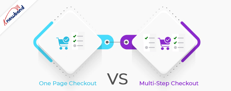
One Page Checkout vs Multi-Page Checkout

The success of your eCommerce business does not depend on how many people visit your website but on how many of them convert. The more conversions you get, the more revenue you make and it majorly depends on your checkout page.

Which checkout process do you follow? One Page Checkout or Multi-Page Checkout?

Customers desire a simplified checkout experience. A long and complicated checkout hampers the shopping experience which eventually results in cart abandonment. For a convenient checkout process, website owners are shifting towards one-step checkout, leaving the traditional multi-step checkout process behind.

The debate revolving around a One-page checkout vs Multi-page checkout is never-ending. While some eCommerce professionals prefer one-step checkout, some feel a multi-step checkout is a better option.

In this article, I will put forward the differences between the checkout process and help you make a better choice.

One Page Checkout

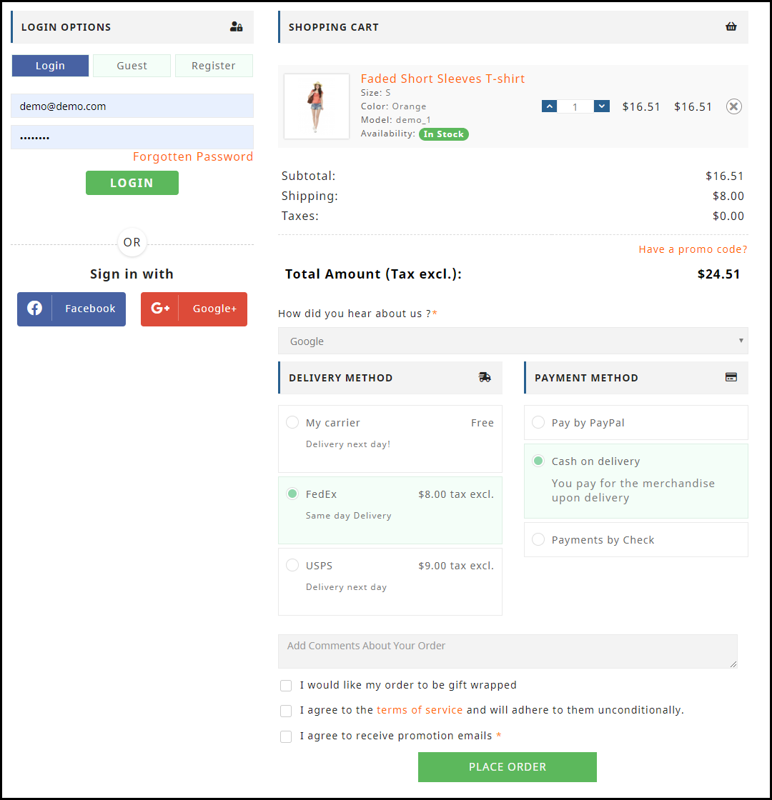
One Page Checkout puts up all the elements of a standard checkout process on a single page and lets the customers fill out the checkout fields in any particular order.

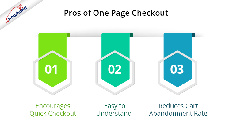
Pros of One Page Checkout

1. Encourages Quick Checkout

With all the checkout-related details upfront, it allows customers to check out quickly. They get rid of clicking multiple times to head towards the next step (in the case of multi-step checkout) and can enter all their details regarding billing, shipping, and payment on the same page.

2. Easy to Understand

A one-step checkout makes the page design simple and easy to understand and presents a clear picture in front of the customers. This also makes it easy for them to verify their details since they do not need to switch between pages.

3. Reduces Cart Abandonment Rate

An intricate checkout is one of the main reasons for shopping cart abandonment. It is therefore important to optimize your checkout process and provide customers with a smooth checkout experience- One Page Checkout is the best way to do that.

Recommended Read: 10 Benefits of Social Login in eCommerce

Cons of One Page Checkout

1. Slow Loading

Displaying a high volume of content on a single page can cause slow loading on your website. A slow checkout can turn away your visitors and make them search for the product on your competitor’s store.

2. Uncomfortable

Customers who are familiar with a multi-page checkout might not find the one-page checkout comforting.  A long checkout form can seem clunky and might discourage a customer from making the purchase.

Multi-Page Checkout

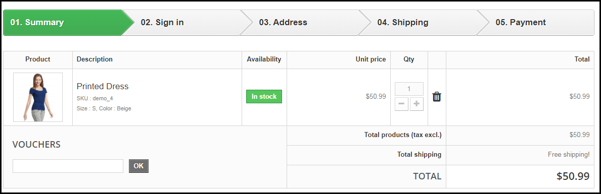
A multi-page or multi-step checkout breaks down the entire checkout process into several pages. Customers have to fill in their details on each page separately to finish the checkout process.

Pros of a Multi-Page Checkout

1. Customers Feel More Secure

Filling all the required details step by step makes customers feel more secure about their purchase, especially if they are purchasing something expensive.

2. Layout Looks Clean

The layout of a multi-step checkout does not look bulky since the checkout fields are divided into several pages which makes the layout clean and uncluttered.

Recommended Read: 8 Checkout Page Mistakes that may be Killing your Conversions

Cons of Multi-Page Checkout

1. Lengthy and Time-Consuming

Because of more number of pages, shoppers find multi-page checkout a lengthy and time-consuming process. Ultimately, customers run out of patience and are compelled to abandon their shopping carts. What’s worse is they decide to purchase from a different store.

2. Difficulties in Correcting Information

Mistakes happen very often while filling out the checkout fields. In a multi-page checkout, customers are left with no choice except to return to the previous page and correct the information. On many e-commerce websites, there is no option to edit and customers are asked to fill in the entire details again. This causes frustration among customers and creates a high chance of cart abandonment.

One Page Checkout vs Multi-Step Checkout: Which one to choose?

If you are in a dilemma about which one has better benefits, I would say- Go with a single-page checkout. These days, a single-page checkout is overtaking multi-page checkout because store owners are more focused on providing customers with a way to complete their transactions in one go rather than asking them to follow several steps.

Consider this: You go to an offline store. After you are done picking what you want, you go to one of the billing counters to make the payment. Tell me which counter do you look for? The counter is less crowded and takes less time for you to make the payment and check out from the store, right? Similar is the case with online stores. Shoppers want to check out as early as possible.

One Page Checkout by Knowband

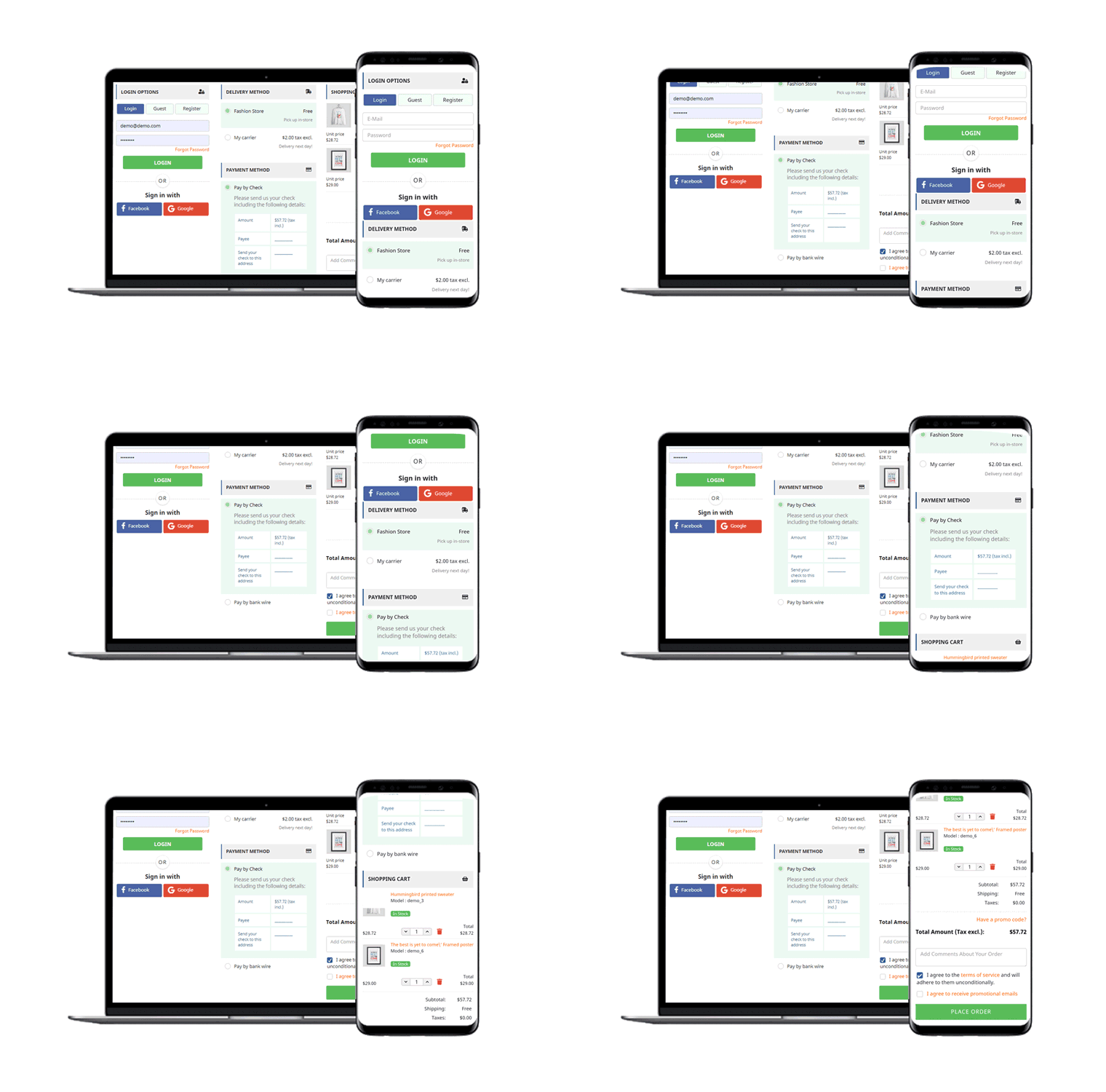
Our One-page checkout offers various rich features that enhance your store’s checkout process and make it fast and convenient. The module is available for PrestaShop, OpenCart, Magento and Magento 2.

PrestaShop One Page Checkout

OpenCart One Page Checkout

Magento 2 One Page Checkout

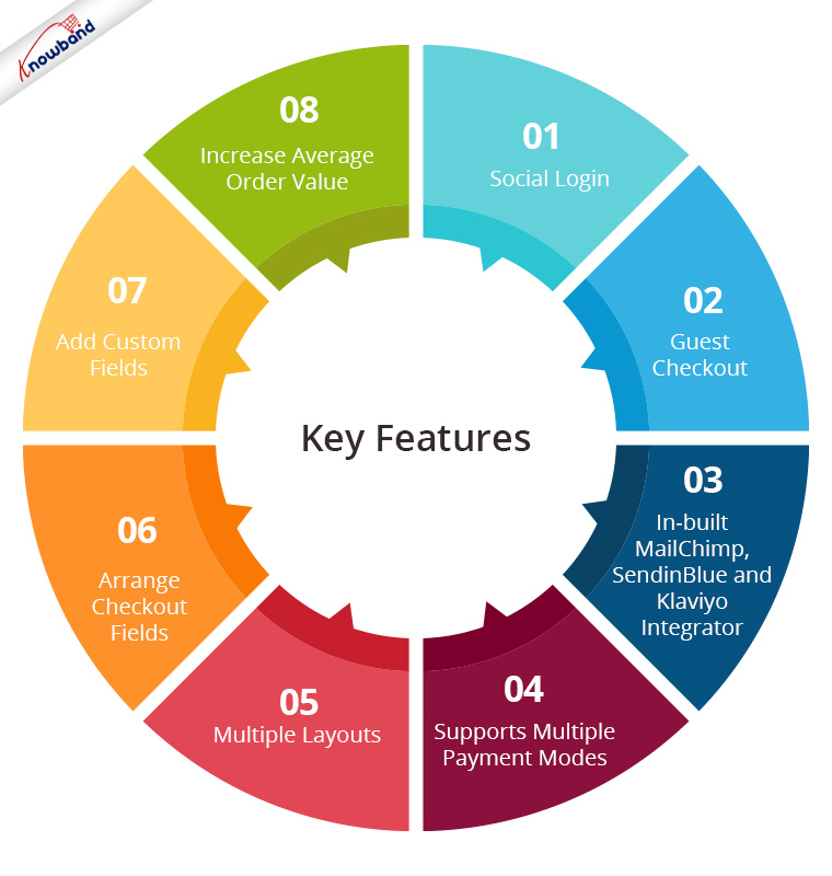
Key Features of One Page Checkout Module

1. Social Login

One page Quick Checkout offers social login options that allow users to register on your store with their Facebook, Google and PayPal accounts

2. Guest Checkout

Visitors who want to shop from your store without getting registered can make a purchase easily with the Guest Checkout option.

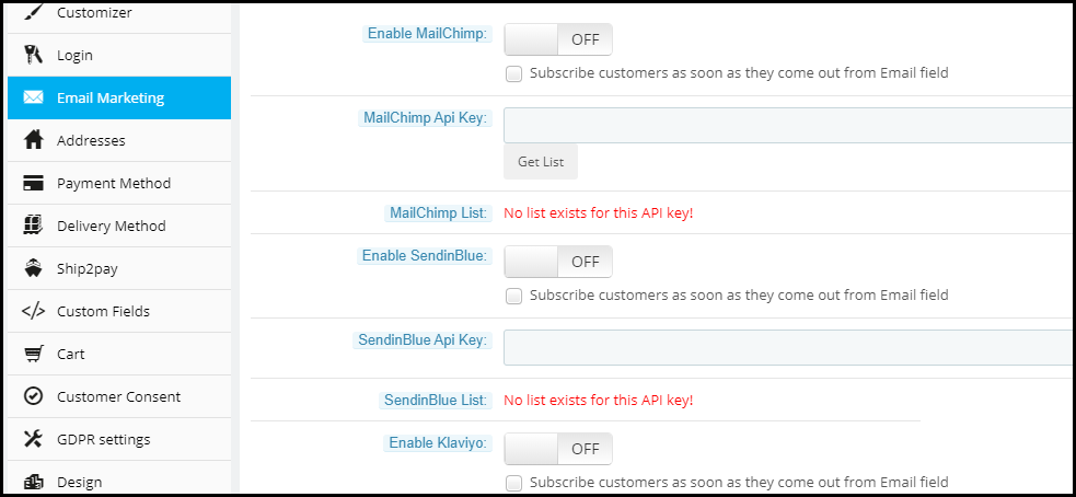
3. In-built MailChimp, SendinBlue and Klaviyo Integrator

You can collect the email address of your subscribers directly from the respective email service providers as soon as they log in to your store or subscribe to your newsletters.

4. Supports Multiple Payment modes and Shipping Services

Apart from Credit and Debit cards, Our Quick Checkout module supports various payment methods such as PayPal, PayU, Stripe, Sage Pay, Mobilpay, Ogone, Pago Facil, QuickPay, First Data, Paysera, Braintree, Checkout, etc.

Besides, it supports various shipping services such as Mondial Relay, So Colissimo, Ulozenka Delivery,  LP Express 24 Delivery, Webshipr, Zasielkovn Delivery, Paczkomaty InPost, Paczka w Ruchu, etc.

5. Multiple Layouts

One Page Fast Checkout module offers 3 layout designs: 1-column, 2-column, and 3-column. You can customize the layout accordingly.

6. Arrange Checkout Fields

Set the checkout fields’ priority with the drag and drop feature. Pick a checkout field and drop it to the desired position.

7. Add custom fields

If you want to add some additional fields to your checkout page, you can do it easily with the One Page Fast Checkout module.

8. Increase Average Order value by displaying a Free shipping banner

This feature is specifically for the PrestaShop platform where the admin can specify the minimum amount for the customers to avail of the free shipping facility. If the customer’s cart amount is lesser than the specified amount, he or she will be displayed the extra amount they need to shop for if they want to get free shipping. This eventually increases your average order value.

9. Choose Total Price Display Methods

The e-merchant can now select from a variety of approaches for how to show the total cost of the items on the checkout page. From the One Page SuperCheckout addon’s back office, the store admin can select the PrestaShop default price, price inclusive of tax, price exclusive of tax, or both inclusive and exclusive of tax.

10) Track Customer Checkout Behaviour

In order to eliminate the pointless processes that are annoying the clients, the admin can evaluate the percentage of data filled or skipped by online users who abandoned their cart.

One page checkout is GDPR compatible and has a fully mobile responsive layout. It has multi-lingual support.

Final Thoughts

Whether you follow one step checkout or a multi-step checkout process, make sure to maintain the checkout flow. Ask for relevant information only. Get into the zone of your customers and try to figure out what changes you can make to improve the customer experience.

At the end of the day, it is totally your call. If you have some more points to add to this article, do let me know in the comments below. I would like to know your take as well. What do you prefer for your eCommerce website?