
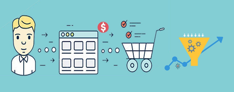
It’s no secret to online merchants that their checkout page is probably the most important and crucial page in their e-commerce business. Whether it’s the checkout page or the payment options, there are many reasons that can hinder their conversion rate. If you take a closer look at a customer’s behavior, you’d find that most of them select the product from the site and add it to their cart. It’s then in the final step, when they have to add their details and make the payment, that they bounce off the page. No e-merchant wants to lose a customer at the end of the entire process. Conversion rate optimization is a technique that allows you to observe customer behavior and modify the checkout page so that the maximum number of them convert.
As for conversions, this blog will detail 11 checkout page strategies that will help you improve your online store’s conversion rate.
One-page order
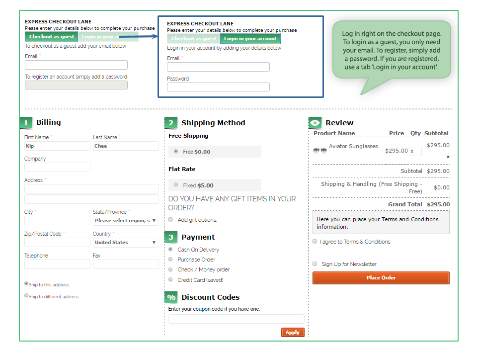
With the advantages and disadvantages of both one-page and multi-page checkouts, you should focus on a simple checkout process that makes your customer feel comfortable and saves them time. In fact, quick checkout is a way to make sure your customer doesn’t think too hard about their purchase, and that’s where they hit the payment buttons. Keeping everything short and crisp with minimal information typed in is essential; drop-down menus work quite well. For example, when a postal code is requested, the rest of the information can be generated within that area, and all the customer has to do is select from the drop-down lists.
This is probably the first thing that draws a visitor or customer to the checkout page. From properly placed CTA buttons at the top and bottom of the page to an optimized page with everything properly grouped, everything can be counted on to make the page visually appealing. Some of the factors that go into the appearance of the checkout page include:
Security Seals: If you want your customers to know you’re trustworthy, you should incorporate security seals like VeriSign and TRUSTe. After all, no one wants to let their money and efforts go down the drain.
Appropriate button colors— this might be an old practice to differentiate the color of the call to action (CTA) from the rest of the page, but it still works. It allows users to decipher which button takes them to the next step.
Don’t be pushy about creating the account
Al forzar a su cliente a convertirse en un cliente mediante su registro en la tienda, que sólo podría molestar a la gente. Usted puede reunir los datos por También pidiéndoles que Iniciar sesión / inscribirse en sus cuentas de redes sociales. Cada persona tiene una cuenta de Facebook o Google, que se puede utilizar como los datos de acceso. Usted puede recoger todos los detalles desde allí y esto ni siquiera se verá agresivo de su lado. Por otra parte, también puede mantener una opción de “Pedido como invitado” en la página. Este se apunta más puntos que el otro.
Dará la opción de “Compra de manera más” o “Continuar” en la misma página. Algunos clientes son nuevos en las compras en línea y la tierra para arriba en la página de pago una vez que añaden algo a la cesta mientras que; quieren añadir más cosas a la vez. Por lo tanto, asegúrese de dar una opción para ellos que les permite volver a la página de destino y recoger todo lo que querían, una tras otra. Cuando la accesibilidad de las diferentes páginas en la tienda está al alcance, un cliente va a convertir sin duda.
Incluir enlaces adecuados a las diferentes páginas
Otra forma de hacer que su tienda de venir a través como un accesible, que puede incluir enlaces importantes en la página de pago. Algunos de ellos incluyen los enlaces a las páginas de preguntas frecuentes, condiciones de envío, privacidad y política de reembolso para que los usuarios puedan referirse a ellos si tienen alguna duda. Los chatbots de opciones o el cuadro de ayuda es una opción ideal. Ayuda a los clientes cuando se atascan o están en necesidad de ayuda.
Inserte la opción de imprimir el resumen del pedido después de la transacción se lleva a cabo
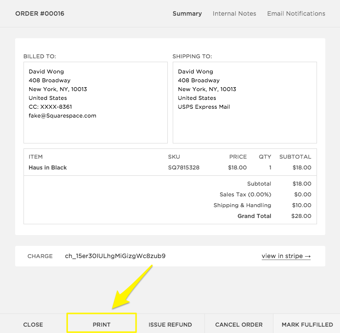
Una vez que el cliente se convierte y hace una compra en su tienda, su trabajo no termina allí. Hay momentos en los que quieren una copia de la transacción realizada con el fin de conseguir que el reembolso o mostrarla a otra persona. Para esos momentos, siempre debe haber una opción para ellos para imprimir una copia de su compra de la tienda. El porcentaje de este tipo de ventas puede ser pequeña, pero la incorporación de esta característica le ayudará a convertir una gran variedad de clientes.
Las recomendaciones deben tener su espacio
Mostrando los productos recomendados en el pie de página es una excelente estrategia para aumentar las ventas. Al igual que Amazon ofrece una serie de opciones que “ los clientes compraron esto juntos ” y otras recomendaciones, usted también debe hacer algo como esto. Al insertar los productos sugeridos en la misma página, hay posibilidades de que el cliente recoge dos de ellos o más productos sobre la marcha.
Evitar cargos ocultos

Do you know what leads to abandoned carts? Hidden charges do. One of the biggest reasons you find your customers leaving your site is surprise charges that add up to much more than the buyer expects. Avoid these types of practices and give the buyer a piece of your mind about the money included so they’re willing to pay so much. Clearly display your shipping, handling, and tax fees. No one likes surprise additions to insurance charges.
Give users the option to upgrade Quantity
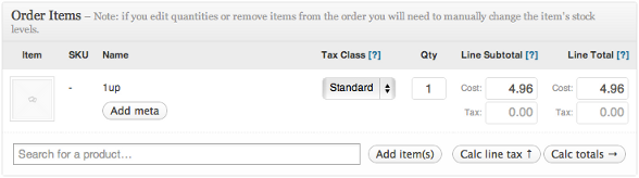
Allow users to add or remove items from their cart right on the checkout page so they don’t have to do it again. Requiring them to update their cart again can potentially result in them exiting the process entirely. On the checkout page, make sure you still give them an option to change the quantity of the product they’re going to buy. There are times when they later (in the shopping stage) feel like “I should buy more of this” or “I should buy less of this,” and that’s when cart abandonment occurs because they have to go all the way back to the product page and make the changes. So, allow the change there.
Have a video

Videos are a great way to engage customers and give them a better understanding of slightly more complex products. Incorporating a product video is a great way to increase conversion rates because a better understanding of the product creates a sense of credibility about your site and therefore leads to conversions.
They offer free shipping
If it’s within your reach and doesn’t affect your profits, offer free shipping. If you charge around $10 for a $30 purchase, conversions will be extremely low because who would want to spend an extra $10 on such a small purchase? Free shipping is like Abra Kadabra for your conversions.
This is definitely not the end of it, but these are some of the most important. As you track activities through A/B testing or using Game Zone tools , you’d be able to make changes based on your customer’s behavior.
Related stories:
- 6 Checkout Page Mistakes That Can Kill Your Conversions
- A PrestaShop module to redirect abandoned carts to Conversions
- Order Module for Reducing Purchase Abandonment and Better Conversions
- How can you increase e-commerce conversions with your site offers?
- How to Drive Ecommerce Conversions Through Email Marketing?

