
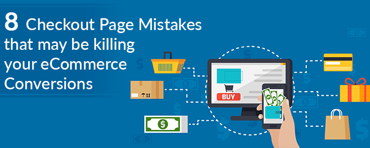
The checkout page is the conversion deciding factor for any eCommerce website. If you are driving a good amount of traffic on your store but the conversions are hitting very low, there are probably some flaws in your checkout page.
Though checkout is not the only barrier (there can be some other factors as well such as the website UX), it is the most vital element among other elements on your eCommerce website.
A huge difference can be made in eCommerce conversions if online businesses rectify their checkout page mistakes. In this article, I have listed out 8 checkout page mistakes that may be killing your eCommerce conversions, along with their solutions.
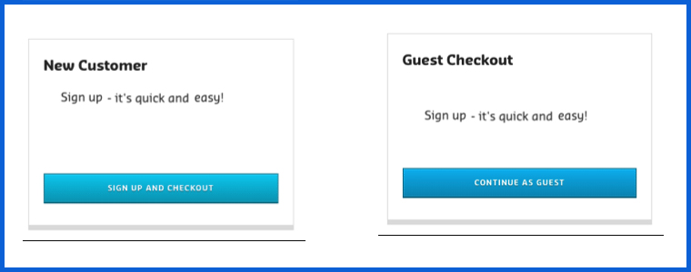
Mistake 1 : No Guest Checkout option
Mandatory registration on the checkout page adds to the topmost reasons for shopping cart abandonment. Online shoppers feel annoyed when presented with a sign-up form during the checkout process.
Forcing visitors to create an account only increases the number of fields to be covered before making the payment. Some of the eCommerce stores even ask users to verify their account, leading to a troublesome checkout experience.
This can be avoided by offering the Guest Checkout facility. Guest Checkout allows users to get rid of the registration process and helps them make a quick checkout, enhancing your conversion rate.
Mistake 2: Not offering Social Login
Almost every eCommerce website today provides users with the facility to sign in using their social media accounts. Not having the social login option on the checkout page can affect your eCommerce conversions.
Providing the social login option eases up the registration task (single-click registration), maintains the checkout flow and allows users to get rid of remembering the password.
Most people remain logged in on their Facebook or Instagram. Hence, a social login option reduces the extra efforts put during the sign-up process by allowing users to sign-up with their existing social information.
Related:
10 Benefits of Social Login in eCommerce
Try out Knowband’s Social loginizer module that provides you with up to 15 social login options to implement on your eCommerce website. Check out:
Magento Social loginizer, Magento 2 Social loginizer, PrestaShop Social Loginizer, OpenCart Social Loginizer.
Mistake 3: Not using the Progress Bar on the Checkout Page
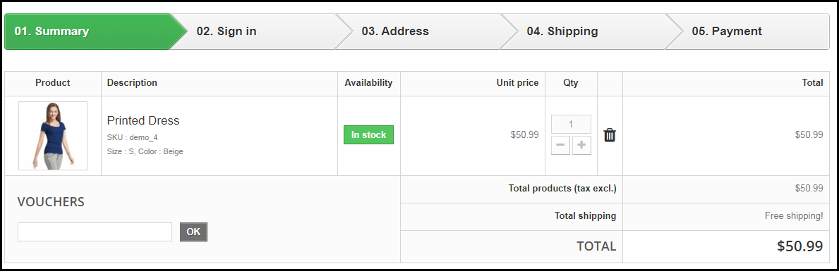
Shoppers might give up the purchase idea if they are unaware of the number of checkout steps involved in the checkout process.
It is important to display which stage a customer is at present when they are on the track of completing their purchase. Showing the progress of the checkout puts up a clear picture in front of the user regarding how many fields they have covered and how many more they would have to go through before they could finally place their order.
Mistake 4: No Trust Factor
With too many online frauds taking place nowadays, online shoppers do not put their trust on a website so easily while making the payment. No matter how amazing your website looks, if customers feel a trust issue, they won’t make the payment. As simple as that.
To build customer’s trust, show off the security badges on the checkout page, and make customers feel relaxed. Add an additional security layer by making your website SSL certified.
Mistake 5: Not having a Proper Return Policy
Online shoppers do have concerns regarding the products they purchase. There is always a doubt regarding a defective or an incorrect order getting delivered. And customers want to ensure what would happen in such cases.
This is where your return policy plays its part. If it is not satisfying enough from the customer’s point of view, they will not proceed further in their checkout.
Pay attention to your return policy and make sure they encourage users to make a purchase.
Related: 6 Pieces of Advice for an Effective eCommerce Return Policy
Mistake 6: Not providing Multiple Payment Options
If you are still stuck with Credit Card and Debit Card only, you are surely missing out on huge eCommerce conversions. Limited payment options would not help you in the long run. Online shoppers look for varieties, be it for products or for the payment methods.
With digital wallets in trend, it would be wise to implement the major e-wallets in your store. It would provide your customers with a number of payment options to choose from and help them choose the preferred payment option while making the payment.
Mistake 7: Not having a User-Friendly Checkout
A lengthy and complicated checkout process involving unnecessary fields adds to the frustration among online shoppers which is followed by cart abandonment.
It is, therefore, crucial to optimize your checkout page and make it user-friendly. One of the ways to do so is by upgrading your multi-step checkout to a one page checkout. A single page checkout puts all the checkout fields at one place.
Related: One Page Checkout vs Multi-Page Checkout
Knowband’s One Page Checkout is amongst our highest-selling modules that lets you simplify your checkout page and grab more eCommerce conversions. Check out this module for various eCommerce platforms-
Mistake 8: Checkout Page is not Mobile-Friendly
The majority of online shoppers these days browse a website through handheld devices. This is the reason why mobile apps are gaining huge popularity. However, with limited storage space, people avoid installing a lot of apps.
For shoppers using mobile devices to make a purchase, it is important to make the checkout page mobile responsive. For your information, around 1.6 billion people use mobile devices to shop online globally, says a report by Invesp. So you can imagine the impact it can have on your conversions.
Make sure that the checkout process works as conveniently on a mobile device as it does on the desktop.
Final Word
Put your feet in your customer’s shoes and think what could be the possible areas for improvement on your checkout page. Are you feeling satisfied? Is it hampering your checkout experience? If so, work on those factors to simplify the checkout experience of online shoppers.
Keep an eye on these 8 checkout page mistakes that could possibly kill your eCommerce conversions.
Found this useful? Drop your comments below.
Also, give a read to:
7 Useful Tips for a User-Friendly Checkout
How to Simplify the Online Shopping Experience of Customers?

Great pieces of advice, Joe. Got to learn a lot.
Thank you, Stephen.
I really found your article super-useful, especially the points about not using the progress bar on the checkout page and not providing the multiple payment options. But I believe the checkout page isn’t the only one to bring down conversion rates. Recently, I read an article by Techosquare about 8 crucial features that might affect your ecommerce conversions and sales if not included. Just like your article, I found it amazing too. Dropping the link so you can have a look:
https://www.techosquare.com/blog/webstore-builders-features-money